What are
/r/BaseballScorecards'
favorite Products & Services?
From 3.5 billion Reddit comments
The most popular Products mentioned in /r/BaseballScorecards:
The most popular Services mentioned in /r/BaseballScorecards:
The most popular reviews in /r/BaseballScorecards:
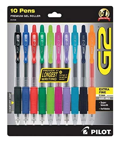
I'm using extra fine (0.5 mm) G2s from Pilot. I'm a big fan, and I just got this pack, from which I think I can get most of the colors to represent each MLB team. I had blue, green, red, and black up until receiving them.
The outlier was brown for the Padres: I think Pilot offers brown ink pens, but not for the G2 0.5, so I ordered this from Pentel specifically for them.
For recording a play either participates in, use the position they were in when the pitch is thrown. It only really matters if you're trying to compile defensive stats for a team, to make sure you properly credit putouts. What you write depends on the scorebook you're using. Some scorebooks have two or three rows per batting order position, to write substitutes, and you could use the position column of the 2nd (or 3rd) line to write their new position.
At least for me, the Look Inside! feature on Amazon for Andres Wirkmaa's book shows page 17, where there's an example scorecard with position switches. It doesn't have rows but has a large enough space to enter substitutes. In this scorecard, the inning where the switch happened is put in parenthesis, for example (T8) for Top of Eighth.
I've done both. I've taken pencils and a sharpener to a live game. I've since switched to a quality Rotring Mechanical pencil to eliminate the need for a sharpener (you'll always need a quality eraser).
I've also rolled with a few, archival quality pens like this set of thin (.3, never more than .5) Staedtler Pigment Liners that come in a convenient case that claps shut. Some of the colors are more useful than others, so I usually buy singles and double up on what I use most often (blue, black and red).
It is true that it's easier to have your ideal set up at home, and this is more frequently the case these days as getting to a game is a luxury of time and money I don't have.
I've mostly seen people (including broadcasters) color code hits, walks, Ks and runs typically.
My goal is to always produce a clean, yet detailed card that is legible and easy to decipher. My best advice is to try and achieve this either with a normal (i.e., not colored) pencil or a single color pen/pigment liner. If you're able to do that consistently, then adding color when you're comfortable will make your card look even better. All the colors in the world won't make a poorly kept scorecard easier to read or look any better.
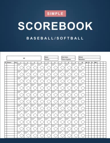
You can find printable score cards on google. Some come as Excel files, so if you're comfortable with Excel you can make tweaks to make what's best for you. I print my own.
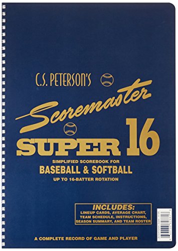
I think you can buy a cheap scorebook for like six bucks but there are a lot of more expensive and expensive options if you were wanting to go that route.
The one I use most of the time is uni Mechanical Pencil Kurutoga Roulette Model, Gun Metallic, 0.5 mm (M510171P.43) but I also bought Uni Mechanical Pencil Kurutoga Pipe Slide Model 0.5mm, Black Body (M54521P.24). The Roulette is heavier and the eraser cap is easier to remove/replace. The Pipe Slide is all plastic and the eraser cap requires a little more force to click into place, and that ends up being the same as clicking to advance the lead.
They both operate the same, it comes down to a hand-feel preference.
Smallest scorebook I've ever used is the Bob Carpenter Fan Scorebook. It measures 8.5"×7".
Here's a 4"×6" option. Don't know if it's any good, though.
I used GoodNotes. It's 100% not designed to do this, but it worked out really nice. All you need to do is digitize your preferred scoresheet, then save it as an image. With GoodNotes you can create a notebook template and insert an image as a page type. That way when you create a new page, it makes a copy of the image you provided.
It's not perfect! Basically it means each score sheet has duplicate items like the totals box and the information area. I am going to mess around today in photoshop and make one single image that is both teams' scoring area and see how that scales.
Like I said, it wasn't really designed to do this, but it worked out. Being able to zoom into each scoring box was so nice, and I ended up using a different color for each pitcher which made the scorecard much easier to scan.
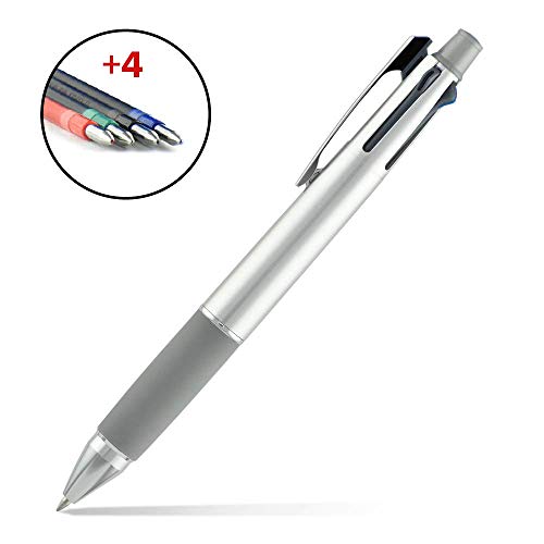
Never heard of that one - a 75 dollar pen ??? Wow. Cool concept though from a quick glance at the Amazon page.
I went with https://www.amazon.com/gp/product/B00F9M5PFE last year. Pencil (normal color), Red (runs, K's), Blue (hits), Green (HBP, BB) to color-code things for easy totals.


