
What is Reddit's opinion of
datapine?
From 3.5 billion Reddit comments
14 reviews of this app found across Reddit:
You seem to strongly believe that a certain amount of people are trans, no more, no less. Statistics are not 100% accurate and you shouldn‘t build your whole opinion around them ( https://www.datapine.com/blog/misleading-statistics-and-data/ ). Maybe some people misinterpreted being trans, but that is their realisation to have, their journey to discover themselves. It‘s not on you to fakeclaim anyone because of their age.
https://www.google.com/amp/s/www.nytimes.com/2016/07/01/health/transgender-population.amp.html
there are some articles about this online, if you want to learn more
Statistics is the art of finding conclusions that fit a theory. Statistics can be made to show a result. There are lots of studies proving the fickleness of statistics. 100% facts. If you want to educate yourself, then look it up. Otherwise just take my word for it that I’m right.
Clearly, that language I just used isn’t really a good faith conversation. But it’s also accurate. So here are some studies to show that your “100% fact” is maybe just a well researched argument that’s possible to refute with other well researched arguments, aka social “science”. No such thing as 100% fact in science, let alone social “science”.
https://www.datapine.com/blog/misleading-statistics-and-data/
https://www.geckoboard.com/blog/sources-of-misleading-statistics/ (especially look at confirmation bias here. Everyone can be guilty of this).
The reason I was going to ask you for studies is so that I could cite equally well researched papers that disagree with your papers by citing them too. That’s not meant to prove your argument is wrong, but to prove that you can’t prove that they are right.
Example from a quick google search: https://www.datapine.com/blog/wp-content/uploads/2014/06/Same-Data-Different-Y-Axis-Data-Visualization-Designed-to-Mislead.png
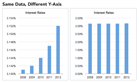
A graph is not just about the numbers, it's about accurate visual representation. If numbers were the only thing that mattered then why even create a graph?
>Wait, are you not doing that by citing one set of stats devoid of any analysis whatsoever, lol?
No, I’m presenting a dataset so anyone can see through any kind of partisan opinion piece claims you’d use to convince people of your narrative.
>I mean, I did write my argument and then linked to data, but you don't consider that data to exist because it's written within an opinion piece.
It’s best to link to the raw data, as in this case your article has cherry picked and skewed data to support the narrative.
It’s incredibly common.
Here’s an article about it, hopefully you’ll use it to learn more and avoid future embarrassment.
https://www.datapine.com/blog/misleading-statistics-and-data/
Have a good day!
It's not so much that the maths is hard but that the majority of people skim articles and mentally highlight the important parts. By presenting a number like 400/per million, people have a harder time comprehending how large that number is mentally and it can come across as 400/per 'really big number.
While this isn't necessarily the case with all readers, statistics should be as understandable as possible while still remaining accurate because it's so easy to manipulate the truth or minimise an issue. No matter how in unbiased a report seems, the way data is presented will have implications for the reader.
As an example, saying less that 1.5% of COVID cases have resulted in fatalities is accurate but could minimise the issue if you don't specify that it equates to 133,000 deaths. Obviously this isn't always the case but it definitely common in the news and it's something that should be heavily scrutinized.
https://www.datapine.com/blog/misleading-statistics-and-data/
Unfortunately due to the backfire effect which causes a person who is confronted with evidence contrary to their predisposed position then it reinforces their own beliefs in the matter.
There is no statistics that will change their minds. Unfortunately also statistics are often used to sway minds when the information presented is misleading the information that should have been obtained by the experiment or study. You can read more on statistics here. https://www.datapine.com/blog/misleading-statistics-and-data/
I wish i had something better to offer you but I noticed there weren't any replies so I thought I might help.
Uh... did you read your own source? Where does it say that 14 unarmed men were killed by cops last year? If you apply the filters at the bottom of the page, it actually says 123 Unarmed Black Americans got shot and killed by the police. The headline is that 1,017 people have been shot and killed by the police, with Black Americans being shot and killed at twice the rate than white Americans, even though there are about four times as many white Americans than Black Americans. If anything, this just proves my point that the police are in the wrong by killing people.
If you know that there are problems with cops planting drugs and other general malpractice, then you know that cops almost never rat out their colleagues. Why would you think they wouldn't just make up a reason for killing someone if they thought they were in the wrong, altering the baseline data.
Plus, statistics always have the capacity to lie. Check this out If you wanted, you could come to literally any conclusion by just altering the way you perceive the data or the specific points you choose to remove as "outliers".
I would suck at preaching cause I stutter a lot.
If your interested in learning about the problem of statistics in partisan media (and I'm using that term because it can be/is exploited by both sides of the political spectrum) then read this article. I personally try and stick to media sources that fall in the middle of this chart of political leanings.
Outside of politics, the field of psychology is currently going through a "replication crisis". Many of their foundational studies can't be reproduced by current researchers. It wasn't because people committed fraud or didn't use hard data. It's because of subtle problems like selection bias, small sample size, and misuse of statistical measures of confidence. Statistics is challenging even when people having formal training to use it correctly.
All my figures are created in whatever data analysis tool is appropriate (Origin, Excel, Python, Tableau, Graphpad, etc), and then polished in Illustrator.
There are all sorts of books on Data Visualization that you can read: https://www.datapine.com/blog/best-data-visualization-books/
"The Visual Display of Quantitative Information" is probably the most often recommended.
That's a tough one.. I am trying to recall my first ventures... we all learn differently.
The first light bulb moment for me was relational database structure and how to organise data in a manner that makes it best be queried. Fortunately it made sense to me very quickly.
Thrown into that a sprinkling of simple queries to understand the basics of the SQL language.
After I got a basic handle on that I started to study more deeply. I had a few hiccups along the way getting my head round more complex data joins in SQL - which seems silly once you grasp it.. like anything I suppose
No harm at all loading up a www.mysql.com data base and start playing around.
Choose a book and go through thoroughly , practicing practicing practicing. You have to practice. There are not shortcuts, unless you are very fortunate with you mind.
Sure, I'm trying to help, but I'm trying to avoid labelling/defining you as one thing or another, since I don't have a lot of information. I'm just trying to get you to do that kind of research yourself...
But if you want me to make some assumptions, then here goes. It doesn't seem like you have the CS background to easily go down the software engineering route. It also doesn't seem like you have the stat/ML background currently to go down the data scientist route. You definitely have some data related skills, and maybe you can try mapping yourself to something like the chart in (https://blog.udacity.com/2014/11/data-science-job-skills.html, but don't take it as gospel -- just one potential perspective, to help you see what you might be missing). Your role currently sounds like some sort of business intelligence development, but I'm not terribly familiar with that space and its' terminology (https://www.datapine.com/blog/bi-skills-for-business-intelligence-career/).
Again, my ask to you was to peruse job postings that you might be interested in doing and figuring out what the gap is between where you are and what you're doing. Also, find job postings that are pretty much what you're currently doing. That will help you define yourself better, and figure out what people doing what you're doing are called.
While you believe that faulty polling makes the statistic unreliable and worthless. This is taught in every first year undergraduate stats course.
From datapine on misleading statistics
The manner in which questions are phrased can have a huge impact on the way an audience answers them. Specific wording patterns have a persuasive effect and induce respondents to answer in a predictable manner. For example, on a poll seeking tax opinions, let’s look at the two potential questions:
– Do you believe that you should be taxed so other citizens don’t have to work?
– Do you think that the government should help those people who cannot find work?
These two questions are likely to provoke far different responses, even though they deal with the same topic of government assistance. These are examples of “loaded questions.”
A more accurate way of wording the question would be, “Do you support government’s assistance programs for unemployment?” or, (even more neutrally) “What is your point of view regarding unemployment assistance?”
The latter two examples of the original questions eliminate any inference or suggestion from the poller, and thus, are significantly more impartial. Another unfair method of polling is to ask a question, but precede it with a conditional statement or a statement of fact. Staying with our example, that would look like this: “Given the rising costs to the middle class, do you support government assistance programs?”
A good rule of thumb is to always take polling with a grain of salt, and to try to review the questions that were actually presented. They provide great insight, often more so than the answers.
start by never watching CNN or fox news. But the hardest thing is to to try to decipher the authors own bias or even political view. We all as humans have some sort of bias whether we want to admit it or not. What I do is treat each topic as if I was going to do a debate. I would research both sides of the argument then try to find the middle ground between the two so that you can formulate your own idea about the subject.
It is true data and facts do not lie, however most data can be manipulated to give either side of the appearance of an advantage. Usually it is best to fact check the data being used. Statistics is one of the easiest data to manipulate. https://www.datapine.com/blog/misleading-statistics-and-data/
Much it comes down to research from multiple sources not just one and try to examine multiple points of views.
hi, something like that ? There are a lot of (visual) drag-drop reporting out there - any more specific requirements? You could even go the MS PowerBI route, now that they are going down Linux avenue :)