
What are
/r/visualization's
favorite Products & Services?
From 3.5 billion Reddit comments
The most popular Products mentioned in /r/visualization:


The most popular Services mentioned in /r/visualization:
D3.js
Plotly
Tableau
elasticsearch
Highcharts
Files.fm
Google Charts
InfoCaptor Dashboard
R (programming language)
Leaflet
Processing
AnyChart
Surfshark
Processing.js
Bokeh
The most popular reviews in /r/visualization:
You can think of it as a Sankey diagram where the x axis is time.
Here's a walkthroughon how to make it in R, with plot.ly.
Just saying:
... Privacy Badger detected 20 potential <em>trackers</em> on this page...
(I'm an r/privacy person)
But the article is pretty interesting, thanks!
Referring to /u/tlted post regarding colors, please make sure that the colors you consider are friendly to those of us who are red-green color blind. Not only does this help folks like me, but it also helps to understand what is going on the visualization at a quick glance. Just found out there is a [subreddit](np.reddit.com/r/ColorBlind/top/?t=year), hah.
Regardless, here is a great resource.
If you can spend the money then Tableau Software will do all the heavy lifting with just a few clicks.
If you have time and not so much of a budget then you can run your own mapserver and store data using postgresql. You'll need to find maps with corresponding shapefiles for zip code boundaries. This data is freely available in the States I believe. In Canada, I think it needs to be licensed through Canada Post.
ArcGIS and other geographical analytical software gives you a lot more flexibility in what you want to do but it's also prohibitively expensive if you're not attached to a university with a site license or a job willing to pay for it
ninja edit: Tableau doesn't have choropleth mapping yet but they do allow overlay of data by region on maps
pvserver is your friend. Start one in parallel on your machine and then connect to it with ParaView.
If it is compiled correctly it is simply
mpirun -np 6 pvserver
Open new paraview GUI go to file>connect and make a new connection with localhost 11111
I just tested this again with 4.1.0 (an old on on my machine) and this works fine.
I am not sure what the generic name would be, but you might consider a discrete value 'ribbon' chart. An example can be seen in the following Grafana plugin:
Perhaps a bubble chart? That could afford you that freedom of avoiding discrete temporal indicators ehile representing freq in the time domain. But it'll probably get ugly.
Or the timelines in this lib might solve your problem: http://visjs.org/
And my favorite: a correlogram. http://en.m.wikipedia.org/wiki/Correlogram
If by bucket and frequency you mean a histogram, you could use d3 or Google Charts. Alternatively, it's straight forward in Shiny if you're using R.
Don't forget Edward Tufte's "The Visual Display of Quantitative Information"! Despite being published in 1983, it contains a lot of information that is still surprisingly relevant. It's a really good read, and copies can be found on Ebay for dirt cheap. I'm personally going to look into the Steele book though, a modern perspective is always nice.
Yeesh. I urge you to read Tufte's <em>The Visual Display of Quantitative Information</em>. The blog you link to is sort-of a retarded version of that. Or if not retarded, then chicken-hearted.
The bog says: > In fact, using the area of any two-dimensional shape to represent one-dimensional data is probably a bad idea.
Tweaking the proportions, or changing from circles to squares does not rescue these charts from the basic error of using areas to compare scalars. The recommendation should be: so don't do that.
Tufte goes further and says that even bar charts are misleading, because the thickness of the bar carries no information.
Tufte's 1983 book The Visual Display of Quantitative Information was highly respected even in the late 1980s when I was a grad student in statistics. But you don't have to be a statistician to read and appreciate the book. Anyone who uses or produces charts and graphs can benefit from reading it -- and that includes almost everyone at some time or other. His later books are good, too, but VDoQI is something of a classic.
Live like animated? Check out grafana maybe.
Or do all your coding on Python and use streamlit to get a little web interface going. Then you'd be in full control of how often the data updates.
Shameless plug too: http://jkff.info/software/timeplotters/ - a couple of command-line tools I wrote for visualizing time series (mainly for program behavior from log files, but some people reported using it e.g. on medical data).
I think the percent stacked splinearea chart uses a bad example. In the thumbnail it shows months, which is fine because it is a sort of continuous variable. However, on the actual page it shows discrete values such as "pomade" and "eyeshadows" so it does not make sense to have a spline interpolation between the values.
Are you wanting to share the visualization or just explore data? What type of data?
tableau is extremely useful for exploration and even sharing some graphs on the web.
d3.js is reasonable, but it depends on the goal of the visualization. Depending on the visualization, there could be a lot of work involved, that might be easier with other solutions, or a wrapper like nvd3. Making visualizations look good in d3 can be difficult, and it doesn't integrate well into some frameworks, as it uses a different paradigm. Also, browsers aren't great at rendering graphs with a bunch of elements.
Its called a Sankey Diagram. How one dimension breaks out into another and they have a type of many to many relationship.
I guess it could also be a Slope Graph but that is usually a one to one relationship.
I used D3 - here's a Svelte Repl with the d3 code for the graph in! The placeholder data is different of course (it's not my messages!)
https://svelte.dev/repl/c23b43904005457981e78ca5042f7dd4?version=3.29.7
Check this out - you can just replace the data with the data you want visualised, happy to answer any questions, but just play around with it and change numbers and see what happens.
https://svelte.dev/repl/c23b43904005457981e78ca5042f7dd4?version=3.29.7
Honestly, you can make nice-looking visualizations with any software. The key is knowing what a nice visualization entails, which I think is what your question is getting at here.
To that end, I recommend learning more about the basics of data visualization and design. Edward Tufte's books (e.g., The Visual Display of Quantitative Information) are an excellent starting point for deconstructing graphs to their key essentials. There's some great blog posts out there like this one that provide some nice examples of how to take a typical crummy chart and transform it into something useful and nice-looking. Read, read, read articles and books by the experts in the field.
As far as how to improve the chart you linked, I'll ask you to do a few things:
1) Consider: What story do you want to tell with this chart? Do you want to show that NY Fashion Week brings in more money overall, but the NYC Marathon brings in more money per day? Or what? Use a different color to highlight the important parts of the data and leave the rest of the bars the same color.
2) Sort the data meaningfully. It looks like you've sorted the data by the event name, which really serves no purpose. Sort by revenue or revenue per day, depending on the story you want to tell with the visualization.
3) Depending on your answer to #1, consider other chart options. Could a scatter plot of revenue vs. revenue per day tell your story better? Or a slope chart showing the change in revenues from the year before?
tl;dr: Don't worry about the software. Think about the story you want to tell with your data, then figure out the best chart type that will communicate that story. Once you've decided on a chart type, use the software that is a) able to create that chart type and b) you're able to create that chart type in.
Median 1 bedroom rent of $814 is way off for King County, WA. Padmapper shows a single digit number of 1 BR apartments for under $850, at least one is an obvious scam, and most of the others are mother-in-law type suites or people literally letting you camp in their back yard.
Based on Padmapper's prices the median rent is actually ~$1600/month, double the stated value. That's a ~$9600 cut to the stated $30k in disposable income.
I actually wrote the app in flutter (dart) to do visualizations like this, you can try it on playstore, also its an offline app so don't worry about data privacy. As for your second problem that's in your hands : )
Since you have hands on experience with Python, I suggest you check Plotly and integrate it with a Dash app. It’s interactive so you can add text for the “on hover” events.
Since you have hands on experience with Python, I suggest you check Plotly and integrate it with a Dash app. It’s interactive so you can add text for the “on hover” events.
I'm working on this at the moment. It's a creative tool for making 3D environments, but I'm considering other possibilities, including live data visualisation. I easily could change the visual style, camera angle, etc. to anything you like.
I'm thinking a Streamed Line Chart.
Y Axis
The Relationship Values were generated from random.org.
The actual character relationships probably will not shift as dramatically as these values.
The higher the number, the wider the band/area, the better the relationship.
X Axis
Time = Scenes in the play
Colors in chart can help cement character relationships, if possible/desired.
Notice: Red(CharA)+Blue(CharB)=Purple, Yellow(CharC)+ White(CharD)=Pale Yellow
Check out Mapbox Studio, its a web-based free* map designer (a lot of functions are free, for more advanced commercial purposes they have pay models I think)
If you find GIS a bit overwhelming and complicated (like me), mapbox is cool because it simplifies GIS stuff for regular people just trying to make good looking maps.
leaflet.js could be an option and fits both points. if you wanted further filtering/functionality you could consider a leaflet.js/dc.js combination
I've used a library called Leaflet (http://leafletjs.com) before in conjunction with Leaflet Markercluster (https://github.com/Leaflet/Leaflet.markercluster/blob/master/README.md) to achieve this affect.
Hey guys, I have seen tons of infographics on the recent COVID-19 (previously known as the wuhan virus), thus I am inspired to re-create the tracker for Singapore cases. It is simple, but I am definitely building more things to visualise other forms of data (such as linked cases).
Also, looking for bounce ideas to improve the UI/UX for the menu filter :)
Credits: CNA and Smashicons (icon).
I've made a graph for each surface.
https://www.desmos.com/calculator/wfhhnlqxic
https://www.desmos.com/calculator/nahf8mrs4f
What I did was make the shaded area equal to y>|average distance traveled/average absolute value of deviation from straight trajectory|
Should I have calculated the shaded area differently? I want it to be comparing the average deviation from a straight line for each
I also love my vertical monitors! (One thing to consider with your UI, most people don't have vertical monitors. Don't sacrifice their experience for a vertical experience.)
If you're committed to Wordpress:
You should be able to find a Wordpress theme that would enable the full width posts. You may need to pay for professional hosting which may be ideal since you're not a web guy.
Here's a guide for getting Wordpress running on Microsoft Azure. (Disclaimer, I work at Microsoft but not in Azure.) It should be straightforward and they have free trial accounts.
I'm unfamiliar with other hosting options, but if you search the web for "wordpress hosting" I bet you can find one. Wordpress.com has hosting, not sure if they're the cheapest though.
If you'd consider something else...
If you're just throwing some static branding around the viz, consider just using raw HTML and doing it from scratch. If scratch is a bit too raw, look at Twitter Bootstrap for a skeleton to start from. Wordpress is great for frequently updated, dynamic sites. Static HTML files are great for rarely updated tiny sites.
Yep, there actually is a button in the top right corner that allows you to switch between the two currently available views:
1) all 50+ chart types one by one;
2) 8 groups by purpose, including:
- Comparison;
- Data Over Time;
- Range;
- Distribution;
- Proportion;
- Location;
- Part Of The Whole;
- Finance.
Thanks for the comment! Actually, there are many circular gauges out there, and a lot of our customers make use of them in really diverse ways. The first version of Chartopedia is designed to provide basic knowledge and main principles on how chart types are different from one another. We said Chartopedia would keep on being improved, and this will also result in making the illustrations better.
It depends what you want to show.
If the difference between the biggest value and the others is most important, go with what you have.
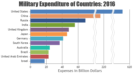
If the variation between the smaller ones is most important, just show those values on an appropriate axis. You could include the bigger one with a clear discontinuity marking - something like this - but it's visually misleading so I wouldn't recommend it.
If you need to show both, then you might just have to use two charts. If space is at a premium for some reason you could include the second one as an inset into the one you already have, since there's a bunch of space there, but it'll look better as two separate charts.
I prefer stacked area charts showing percentage of total. Pie charts don't show trends over time.
Pie charts can be extremely useful if you're trying to push a particular agenda, or a changing variable, such as time, is not required.
Bokeh: Python library for novel, interactive, animated plots, in the browser. If you wanted to do customer, interesting d3-like plots but don't want to learn Javascript, and if you want to do it on really large datasets, then you are the target user Bokeh was designed for.
(There is also the beginnings of a Scala interface, and there is a Matplotlib compatibility layer that is actively being improved. See http://continuum.io/blog/bokeh-0.4.1)
besides the internal chart maker of google sheets, what other alternatives out there? I've tried following this guide from Google Charts using HTML but I know zero programming. I just want to take a stab at programming a simple histogram chart based on this data!
500,000 points is not large at all -- I routinely use highcharts to plot OHLC graphs of twice as many points, zoomable and interactive. Have you tried it?
Try highcharts; sample here. If you need further help, do leave a comment.
Kibana does this really nicely but you have to put your data in ElasticSearch first. Shouldn’t be too complicated. Check out data visualiser here
I think people traditionally host their interactive visuals on something - maybe Code Sandbox or something similar that has an embedding feature. To be honest, you're not going to be able to stop people from embedding easily. It's not like you're running server-side code that you can hide from the user. If they really want to take it, they can. I've also never seen someone charge to embed something. They'll either put it in the terms of use that you can't, or they'll make it easy so you can.
Hosting it first-party is fine, but I've always found it easier to host visuals with other tools.
d3js is comparable to Tableau, and I believe it's totally free. You'll need some coding skills, but there's a lot of good how-to's out there. You could definitely recreate that graphic with this tool.
I don't know what you'd call that specific type of chart. It's clearly tabular data, and it's displayed like a heat map or horizontal stacked bar chart.
Depending on how your data is structured and how comfortable you are with Javascript, it wouldn't be too hard to write up a custom visualization using D3
I have trouble visualising what you're after from just words. Post a snippet of the data. Or look at this cheatsheet for ggplot2 and see what plot might work for you. Remember you can always overlay 2 plots on top of each or side by side.
https://www.rstudio.com/wp-content/uploads/2015/03/ggplot2-cheatsheet.pdf
Check d3js library for raw visualizations.
also check InfoCaptor apart from other BI tools listed here.
There is this online chart builder too https://my.infocaptor.com/free_data_visualization.php
Tinderbox is your friend here i think,
Check up only one of the user that is using CSV on tinderbox.
It is a helpful forum so try there.
A venn diagram with 5 sets is possible and when properly arranged, can give you all the possibilities but it's not easy to parse visually and doesn't lend itself to lists of items.
How to render this all depends on what you want the viewer to be able to discern readily from the display.
If your use case is that you want to make sure the user can clearly see if a given item is in more than one category, you could arrange the data in a matrix like so:
| Category 1 | Category 2 | Category 3 | Category 4 | Category 5 | |
|---|---|---|---|---|---|
| Item A | x | x | |||
| Item B | x | x | |||
| Item C | x | x | |||
| Item D | x | x |
Though this can make for a long matrix (is the set union of all unique items across all your lists)
I highly recommend Interactive Data Visualization For the Web by Scott Murray. Most of the cool visualizations you see are there are done in D3, and Scott and his book do a great job of taking you from minimal programming skills to creating pretty fancy data viz in a relatively short time.
Admittedly, this isn't the short answer you're looking for, but it's a skill you can learn in your spare time in a few dozen dedicated hours. Knowing D3 will help you jump pretty quickly into the "how did they do that" space, and will make it easier to understand the (excellent) site linked by u/gscooter below.
I've read and some bad reviews of Tufte, basically that his style isn't for everyone. I currently report a lot in Excel, thus two of the choices lean towards Excel use. For Tufte, do you recommend The Visual Display of Quantitative Information as the ideal beginner book? Not thrilled about the $40 price tag, but if it's worth it I'll happily pull the trigger.
Step 1. Read Cleveland's Visualizing Data Step 2. Read Cleveland's The Elements of Graphing Data Step 3. Read Tukey's Exploratory Data Analysis Step 4. Read Tufte's The Visual Display of Quantitative Information Step 5. Read Wilkinson's The Grammar of Graphics
Hey thanks a lot, I'm just getting into visualization for my new job and our team is trying to figure out are methods of representation. I'll check out the book.
> Yeesh. I urge you to read Tufte's The Visual Display of Quantitative Information. The blog you link to is sort-of a retarded version of that. Or if not retarded, then chicken-hearted. > The bog says: > In fact, using the area of any two-dimensional shape to represent one-dimensional data is probably a bad idea. > Tweaking the proportions, or changing from circles to squares does not rescue these charts from the basic error of using areas to compare scalars. The recommendation should be: so don't do that. > Tufte goes further and says that even bar charts are misleading, because the thickness of the bar carries no information.
I've read and some bad reviews of Tufte, basically that his style isn't for everyone. I currently report a lot in Excel, thus two of the choices lean towards Excel use. For Tufte, do you recommend The Visual Display of Quantitative Information as the ideal beginner book? Not thrilled about the $40 price tag, but if it's worth it I'll happily pull the trigger.