
What is Reddit's opinion of
Tableau?
From 3.5 billion Reddit comments
100 reviews of this app found across Reddit:
By request, I updated the "More Cows Than People?" map to show pigs instead. Interactive version here - find your county! Thanks for all the positive response yesterday.
Tool: Tableau
Source: 2012 Agricultural Census (dataset for Iron Viz competition)
- Discounts on newspapers/news magazines ($4/month for NYT is what I pay); Washington Post gives you a FREE digital subscription.
- $4.99/month Spotify
- $4.99/month Apple Music
- Free 6 month trial Amazon Prime; after that, half-priced ($49)
- If your school has it, free Microsoft 365
- You can get Apple product discounts (usually like $200 of a Mac)
- A lot of stores will offer student discounts with any ID — somewhere between 5–15% usually. Check your local collegetown stores too.
- Tableau is free for students
- A lot of museums will give you discounts with student ID
- Adobe software discount
I'm wrapping up this series of livestock maps with a quick summary of the most common livestock by county, per the 2012 agricultural census. Interactive version here.
Everything I've posted will be part of my entry for Tableau's Iron Viz feeder competition on agricultural data. Thanks again for the feedback over the last few days. I know this is imperfect data, especially for chickens, but it's still been fun to see how people have found the stories in the maps. I'll post the final project that I submit for the competition when it's done.
​
Source: 2012 Agricultural Census (Iron Viz competition data file)
Tool: Tableau
One more by request, here's a gradient of the ratio of chickens to people. The data available is based on meat chickens sold. Interactive version here.
All three posts in this series are part of my work on an entry for Tableau's Iron Viz competition. There are a lot of talented folks from around the world who will enter, so my chances aren't great, but it'll be fun to try!
I wanted to thank everyone on here for responding so well to the first couple maps I shared. Your questions, comments, and critiques have helped me find the stories in the data. The final project will be better because of all of you!
Also, the highest raw number of meat chickens sold was Sussex County, DE, but the highest ratio of meat chickens sold to people is in Hickman County, KY.
Tool: Tableau
Source: 2012 Agricultural Census (Iron Viz competition source data)
I think that's wonderful! I don't know if you ever played Pokemon yourself but it's largely a numbers game. There's a surprising amount of math and statistics involved. I personally dreaded math as a kid but I'd gobble it up if it involved Pokemon. It was like homework in sheep's clothing. It could be a gateway for your kid to learn something way more useful than OP's oil 'health' class. Here's an example of a father and his son diving into some Pokemon data analysis that you might find interesting. It's a bit of a puff piece for the company that makes the software but I think it demonstrates the potential. Here's a direct link to their interactive Pokemon dashboard if you'd prefer to just play around with it on your own. And here's a different dashboard that might be easier for a beginner to visualize. These were made with the free version of this analysis software so if your kid ever wanted to try their hand at making something themselves they certainly could!
Power BI desktop is free. Power BI online is free, for the reporting services (you really need the desktop app to open the power of Power BI).
As a student, you can get Tableau for free: https://www.tableau.com/academic/students
So, really, they are both free, if you are a university student. Power BI is free, whether you are a student or not. It begins to cost money when you want to share what you make. (not just share the pbix file around).
The Tableau website actually has a whole series of training videos that are a fantastic primer. I work at a university and have student employees who assist me with data analysis. I was start new hires out watching the Tableau' training series. https://www.tableau.com/learn/training/20211
If you have upgraded to 2019.2 I believe there should be a new calc MAKELINE, from looking at the new features page it looks like the calc should be something like this
// making line from 2 points MAKELINE( MAKEPOINT(Origin_Lat, Origin_Long), MAKEPOINT(Destination_Lat, Destination_Long) )
This question gets asked quite frequently here. Check out the useful resources in the sidebar.
Make sure you sign up to Tableau Public and download the free version to start playing around with. There are a bunch of free introductory videos on Tableau's website too. I'd particularly recommend Makeover Monday as a good place to start on Public as you can get good feedback if you share what you build, plus the data can often be quite real-world applicable.
Certs aren't essential, but can sometimes give you the edge. I wouldn't focus on them if I were you though, practical expertise is far more important.
Desktop or Server?
Right now Tableau has their eLearning stuff available at zero cost for 90 days right now. Your boss would likely appreciate you starting there.
It's software that allows non technical people, people who don't code, to analyze data thanks to a graphical interface.
It generally contains, data tables (prepared by technical people) and functionalities to combine tables, create analytic graphs, and create dashboards (a mix of various tables, calculated results and graphs generally fitting in a single screen).
The Tableau video demo gives a good summary of what it looks like: https://www.tableau.com/#hero-video
The inconsistency of spacing between the dashes and dots is really obvious in the light-on-dark, two-color version. My eye really wants the dashes and dots on a grid.
Also, not sure what company this is for, but if it's anything in the data field like the name implies, well-entrenched player Tableau's identity is not far off from this.
You could try to hire a consultant from the Tableau partner program (https://www.tableau.com/partners).
It will be a bit more expensive than trying to find a freelancer, but you'll get a quality developer that tableau has certified. I'll throw in a plug for the consulting firm I work for as we have a partnership with tableau. If you want to go that route I'd be happy to have a chat with you.
You can do this via a spatial join in tableau. You’ll have to find an a shapefile (or geojson) of zip code polygons of the area, which you should find pretty easily.
In the spatial join calculation, you’ll convert the lat and long fields in your original dataset to a “point” in tableau using MakePoint(). This will allow Tableau to do the “intersect” join type. The example here is almost exactly your use case but with neighborhoods instead of zipcodes. Also this has a useful breakdown as well.
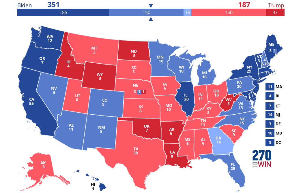
Why isn't this being talked about? There's a "poll" of over 600,000 Americans covering every state: https://www.tableau.com/data-insights/us-election-2020/candidate-preference. Interesting data to see overall trends. These numbers also seem pretty realistic. Trump +4 in Ohio, Biden tied in Georgia, Biden +1 in FL, +6 in PA, +7 in MI, etc.
Export to Powerpoint will be available in version 2019.1 (we’re currently in 2018.3), however it is available in Beta now:
https://www.tableau.com/products/coming-soon
Scroll down and you’ll see the Export to Powerpoint feature listed. Hope that helps.
Survey Monkey has released their weighted likely voter poll numbers for all 50 states in September.
I know, I know, they’re generally considered a garbage tier pollster. Nonetheless, they’re the only one that has done all 50 states lately, and their numbers seem shockingly plausible across the board. I could find few things to nitpick, except maybe a few states here and there seemed a few points more D or R than I expected, but nothing major. They certainly fit my priors, at least. Would not be shocked at all if someone told me these were the actual results.
Here is what the map would be if their numbers were accurate. Color coded so that Solid = 60%+, Likely = 50-59%, Lean=Under 50% plurality. ME and NE district results inferred from state results.
National popular vote is Biden 52-46.
Data Driven Alerts are a thing - https://www.tableau.com/about/blog/2017/4/save-time-data-driven-alerts-tableau-103-67888
Here is a decent list of 8 Books on Algorithms and Data Structures For All Levels
You can also check out Teach Yourself Computer Science
The Best Computer Science Books To Read Right Now:
The Search by John Battelle
Data Structures and Algorithms with Scala by Bhim P. Upadhyaya
Structured Computer Organization 6th Edition by Andrew S. Tanenbaum, Todd Austin
The Second Machine Age by Erik Brynjolfsson, Andrew McAfee
Algorithms to Live By by Brian Christian, Tom Griffiths
In the Beginning was the Command Line by Neal Stephenson.
Superintelligence: Paths, Dangers, Strategies by Nick Bostrom
Game Theory for Security and Risk Management by Stefan Rass, Stefan Schauer
The Self-Taught Programmer by Cory Althoff
The Computer Book by Simson L. Garfinkel, Rachel H. Grunspan
Code by Charles Petzold
Structure and Interpretation of Computer Programs 2nd Edition by Harold Abelson, Julie Sussman, and Gerald Jay Sussman
Computer Science Distilled: Learn the Art of Solving Computational Problems by Wladston Ferreira Filho
The Soul of a New Machine by Tracy Kidder
Hackers: Heroes of the Computer Revolution by Steven Levy
The Chip: How Two Americans Invented the Microchip and Launched a Revolution by,T.R. Reid
Thinking in Systems: A Primer by Donella H. Meadows
Gödel, Escher, Bach: An Eternal Golden Braid by Douglas R. Hofstadter
Another reading list posted here:
https://amp.reddit.com/r/books/comments/ch0wt/a_reading_list_for_the_selftaught_computer/
Everyone's use case will vary based on specifics, but most of the time you'll connect to a database in one environment.
Usually you'll connect to the development environment when you're first building your dashboards. That way in case something goes wrong, you're not affecting end users/customers.
Once you have your view created, you'll probably connect to the production database, as that's the fullest data set. Use the replace data source functionality to swap your data from dev to prod.
Slow performance can be caused by a lot of things. My guess is that your dashboard has a live connection to the database(s). Assuming you're working on a desktop as opposed to using Tableau Server, you should probably create an extract and refresh it periodically. Here's a helpful link that discusses the difference between live connections and extracts.
If you don't want to mess with the live connection vs. extract thing, you could always pause auto updates.
Tableau Foundation leverages their own software to create a dynamic annual report that updates weekly.. Pretty interesting if you know your way around the software!
https://www.tableau.com/solutions/gallery/tableau-foundation-living-annual-report
What tools you use in conjunction with Tableau will mostly depend on where your data is coming from. You'd use those tools (SQL, Excel, R) to get your data in a place where you can ingest it into Tableau. And you can decide based on your skill set and data needs where the bulk of the heavy lifting will take place. Some people might do as much of the heavy lifting as possible in SQL or R and use Tableau as a visualizer/front end only. Other people will do minimal data processing beforehand, connect Tableau right to SQL and ingest the raw data tables and let Tableau do the heavy lifting.
Definitely the best place to start learning is Tableau's free videos. Because they're free and right from the horse's mouth.
Tableau Online is awesome.
Here are a few things you should probably google.
Understanding of medical codes, what they are, how they relate to each other, etc..
- CPT codes
- Modifer codes
- NDC code
- Diagnosis codes
- DRG codes
Types of Medical Claims
- Professional
- Institutional (Inpatient vs Outpatient)
- Rx
Provider Types
- Billing Provider
- Service Facility
- Rendering Provider
- Order Provider
- Referring Provider
- Supervising Provider
- Attending Provider
- Operating Provider
Patient Demographics
- Height / Weight / Age / Race / Claims History / Depression / Claims / Medical History (Diabetes, Hypertension, Cholesterol, etc..)
Other
- Health Outcomes
- Risk
- Cost / Efficiency of care
Once you have a general understanding of all the terms and concepts above you can see how one might combine these things to visualize numerous thing like:
How specific patient demographics impact the medical outcome / costs of care.
How effective are specific types / groups of medical providers?
Trends in medical procedures.
Finally read up on some of these projects / dashboards
Is this for business or personal use? You can use Tableau ProServ, tableau partners, or just look around on fiverr or some other websites for contractors.. (probably not... depends on nature of your data)
You can do schooling, or you can go down the path of certifications.
Google has a data analysis program that’s low cost and you could finish it in 3-6 months, probably about 3.4 to 4 if you study daily. It’s about 40 bucks a month to be enrolled into Coursera to take this program. The faster you finish it the less you have to pay. It’s certified and created by google.
https://grow.google/dataanalytics/#?modal_active=none
Also, you can data an online course a reputable school like cornell university and get a data analysis certificate which both of these paths ive sent you can land a job without a 4 year degree.
The Cornell program I think is 9 weeks and it costs about 2400 with currently offering 30% off if you pay for the program upfront and not in 3 payments.
https://ecornell.cornell.edu/certificates/data-science/data-analytics/
Last, i would consider tableau certification as well. Even entry level. It’s one of the top tools used by many organizations for data analytics and business intelligence. A tableau certified person can make some great money. It’s really not hard I have a couple tableau certs. You can download tableau public free and play around with the tool. It’s a good path. Tableau certs can earn you some great money. Look up how much a tableau certified professional can make and tableau server admins make. Great money.
https://www.tableau.com/learn/certification
Best of luck 👍🏼
I’m pretty sure Tableau has free training courses that I have done before which helped getting started.
https://www.tableau.com/learn/training/20204
As for SQL, you can learn the basics and through YouTube and it’ll be more of practice thing rather than video watching.
Hope this helps.
There's no restriction on updating data with Tableau Online. If you need to test functionality for API pushes, go get a free development site from the developer program https://www.tableau.com/developer. If it works for you, then you can put it into production using a Tableau Online site.
You can absolutely join Excel and databases. You can also join two Excel sheets to each other. I never specified that it has to be in a database. Create a list of dates in an Excel workbook then join that to your main data source. You could also union blank data along with the future dates. There are several ways to do this, trust me you aren't the first with this question.
https://www.tableau.com/about/blog/2016/7/integrate-your-data-cross-database-joins-56724
Tableau has one available: https://www.tableau.com/covid-19-coronavirus-data-resources
Haven't checked for if it's different than what /u/khamisen linked.
Also an individual-case dataset being built up from Liquidata: https://www.dolthub.com/repositories/Liquidata/corona-virus/query/master?q=select%20*%20from%20mortality_rate_by_age_sex
Basically getting these as they come through from Jeremy Howard's Twitter feed.
I'd go with what shaqfuuu said about floating sheets next to a continental US map (like this https://i.imgur.com/b6hgnKO.png ).
If you don't mind using a slightly abstract map of the US, try making a hexmap http://www.sirvizalot.com/2015/11/hex-tile-maps-in-tableau.html
Here's a slightly more in-depth tutorial https://www.tableau.com/about/blog/2017/1/viz-whiz-hex-tile-maps-64713
I was able to answer my own questions. Instead of deleting this post, I thought I'd share how I fixed it by simply referring to this community thread on Tableau: https://community.tableau.com/thread/196812, which had the solution pointing to this: https://www.tableau.com/about/blog/LOD-expressions.
Um…. You need a Creator license to use desktop? You can explore online in your server, publish, etc.
https://www.tableau.com/pricing/how-to-decide
And your server admin needs to enable LBL. It’s enabled by default in upgrades, so it was shut off deliberately.
https://help.tableau.com/current/server/en-us/license_lblm.htm
Referring to /u/tlted post regarding colors, please make sure that the colors you consider are friendly to those of us who are red-green color blind. Not only does this help folks like me, but it also helps to understand what is going on the visualization at a quick glance. Just found out there is a [subreddit](np.reddit.com/r/ColorBlind/top/?t=year), hah.
Regardless, here is a great resource.
Hey. Thanks so much.
As far as my 'eye' for them goes: So I've just had a casual interest in it for a long time. Things like r/dataisbeautiful and blogs like Information Is Beautiful are just something I've aspired to make. Another book that I've just started reading that I really like is Good Charts. It's pretty cool to just think about the things that make charts good/bad, without specifically talking about making them with a specific program.
I'm also a 7th Grade Math teacher, so I naturally enjoy charts and data. But basically it's just been looking at dataviz, and keeping note of the things that I think make the ones I like look good.
As far as making them goes: I've played around a lot with Google Sheets using the Explore feature in the bottom right to make some graphs automatically. But then I started moving into making my own visuals using Adobe Illustrator. Which I am still learning as I need to do new things. So basically tutorial here, play around there. Learning bit by bit. My next step is making interactive graphs. So I'm messing with Tableau and Google Data Studio.
​
So as far as where to start? Find a blog you like, or r/dataisbeautiful and observe. Then I guess decide on which program you have access to, and start watching videos and tutorials.
I think this might be what you are looking for: Perform advanced spatial analysis with spatial join
It requires version 2018.2
Hi Xilc
Dorian's post is aimed at someone who is familiar with Tableau. His instructions, fairly, assume the user knows how to export data, create sets, and build scatterplots. His beeswarm is downloadable from Tableau Public, too, so you could download it and take a look at what he's done.
My next advice is that you should focus on the basics for now in Tableau. A beeswarm is a specific chart to solve a specific problem. Tableau is much more powerful than that; I recommend you watch much more of the training videos to learn the basics of Tableau. You will know you are ready to make beeswarm plots when you can read Dorian's post and see it for what it is: a well written tutorial aimed at intermediate/advanced Tableau users.
(Disclaimer: I work at Tableau)
Congrats on your job!
Have you checked out the free learning videos we have on our website and YouTube? They are pretty good for getting a broad overview of the features of the product. For example, the specific feature you talk about - tooltips - have two videos available showing you how to create them; one for regular tooltips and one on how to embed a viz in a tooltip.
The free training can be found here: https://www.tableau.com/learn/training Our YouTube channel is here: https://www.youtube.com/user/tableausoftware
Good luck!
Tableau has a color pallet specifically for color blind users as well. You can include that in the requirements. Good stuff from them here: https://www.tableau.com/about/blog/2016/4/examining-data-viz-rules-dont-use-red-green-together-53463
3 - 5 minutes seems fairly long. Can you provide a high level overview of what you are attempting to do? I wouldn't expect that long a wait until you have significantly under what you need hardware wise, or are doing extensive ETL work (using Tableau) against millions or billions of rows.
I'm sure you've seen this before, but it's well worth a read. https://www.tableau.com/learn/whitepapers/designing-efficient-workbooks
Tableau has some decent learning materials on their website. You can use those materials to become certified as well - since it is a platform specific certification there may be a bit more value than general certificates.
It’s a great map! Don’t see anything wrong, but then I’m partially colorblind, so It’s hard for me to tell the blue and purple colors apart and the red and orange (though I could still differentiate thanks to 1500 hours in the game :-)..
Here are some tips if you want to make it a little better for us color-blind folks.
Cheers!
Data structures and algorithms. That is the real language of the problem space. Learning the syntax of a fairly easy and intuitive programming language is the least of your challenges.
Here is a decent list of 8 Books on Algorithms and Data Structures For All Levels
Use relationships instead of joins in tableau. Join the relationship the same way you would use a join. This way your totals will be correct when trying to sum or do whatever calc you are looking to do.
Yes. It is excellent at building a good CS foundation. After taking this course i would recommend a decent data structures and algorithms course or book. Here is a decent list of 8 Books on Algorithms and Data Structures For All Levels
data structures and algorithms are endemic to converting that which is in the problem space to the solution space. Regardless of programming language or operating system or hardware.
Where did you see that they have changed the test format please? On the Tableau website it says 30 questions with multiple choice, multiple response, and hands on.
https://www.tableau.com/en-gb/learn/certification/desktop-specialist
I recommend you learn the language of the problem space. This language is not python, or Java, or even C. Its core principles of computer science. Its understanding how a computer works and the data structures and algorithms that are endemic to converting that which is in the problem space to the solution space. Regardless of programming language or operating system or hardware. Study from first principles and the programming language will come naturally based on the best fit for your problem. Whether that's embedded, cryptography, kernel, ML, DS, AI, Web, etc.. learning the language is the least of your challenges. Over time you will pickup and put away programming languages as your domain and interests change and as new languages show themselves to be useful. In my 30 years of development I have written code in ASM, C, Perl, Java, TCL, Bash, Awk, Python, Ruby, elisp, Scala, and most recently Rust.
Take the CS50 course. It is excellent. Also check out these resources;:
Here is a decent list of 8 Books on Algorithms and Data Structures For All Levels
You can also check out Teach Yourself Computer Science
And finally, play the long game when learning to code.
Linux Programming Interface
Beej's Guide to C Programming
C Programming: A Modern Approach
Modern C
Head First C
Algorithms in C
The Standard C Library
Expert C Programming
21st Century C
Advanced Linux Programming
Linux Device Drivers
Linux Kernel Development
Linux Systems Programming
Hey , Tableau has opened up it's paid learning service for free. You get 90 day access a whole slew of things. You should check that out as well. From design to tableau Architecture. Look it up https://www.tableau.com/learn/training/elearning.
Tableau also has set of curated datasets.
Make over Monday and the tableau community are good options for datasets as well.
Because you don't have permission...
>The trademarks, logos, and service marks ("Marks") displayed on this Site are the property of Tableau Software or third parties. You are not permitted to use the Marks without the prior written consent of Tableau or such third party that may own the Marks.
If you insist and want to risk them finding out: https://dev3lop.com/tableau-logo/
I actually send new hires here instead:
The other online videos go fast and are solid but this gives you a starter workbook, a completed workbook and has a great classroom pace.
Set actions in version 2018.3 will sort you out in no time. Upgrade if you can. Check our this article on set actions - pretty cool stuff.
Open on a desktop to play with the dashboards yourself.
So OP, here is my advice, I have performance tuned multiple dashboards before (mostly connecting live to a SQL-Server database) and here is my 2 cents.
Context filters used to force Tableau to throw data into a temp table and was a way to speed up performance if done right. This is also noted in the link shared by /u/Donahub3
However this has since been changed and is no longer the case. Using context filters is now only a mechanism one should employ if it makes sense given your calculations and the Tableau order of operations - i.e. you want a dynamic Top 10 that always show top 10 given the filters or you need a FIXED LoD to work a certain way. (https://onlinehelp.tableau.com/current/pro/desktop/en-us/order_of_operations.html)
This is further solidified by Alan Eldrige from Tableau Software in his whitepaper "Best Practices for Designing Efficient Tableau Workbooks" which all Tableau developers should read.
Alan writes and I quote:
"You should no longer use context filters as a mechanism for improving query performance."
https://www.tableau.com/sites/default/files/whitepapers/designing-efficient-workbooks-v10.0.pdf
So therefore the short answer is: Poorly, multiple context filters most like affect performance poorly in your case.
Hey, so I'm trying to create a Viz for NBA teams win improvement over 5 years after selecting the 3rd overall draft pick. I really like this viz on Tableau's page: https://www.tableau.com/solutions/workbook/day-of-week-analysis With the Wins in the Rows, and Years on the Columns, and teams on the key. But I'm having difficulty setting up the data in Excel to be able to recreate it.
Does anyone have a suggestion?
Most companies including tableau have exams (associate / professional / partner levels).
Exams are ~$250 usd but the training costs <1k . You can find alternative training books online and people will often write blog posts about how they became certified using only open/free online resources.
Tldr: search "tableau associate free training blog" many people have asked and answered this same question. Best of luck
I would recommend Tableau's Training Videos to get an overview of the product and learn some of the lingo. I could throw terms at you, but without context that wouldn't be very helpful.
You don't absolutely have to go through the co-op program, you can just apply independently for internships. However, co-op can make finding an technical internship much easier if you don't have too robust of a portfolio/projects, or you're not a very aggressive networker (e.g. I know someone who met a hiring manager at Tableau Vancouver through the PolyglotVancouver social group).
It wasn't three tips per minute but these women were amazing with 21 tips in 25 minutes:
https://www.tableau.com/events/tc/2021/tableau-speed-tips-shortcuts-and-tricks-all-skill-levels
I would recommend starting out from the link below. The videos are manageable and easy to get through, and they've categorized everything so you know what you're getting yourself into. It's also on Tableau's website. This really helped me when I first started: Tableau Training
Additionally, going to Tableau Public is a great way to learn. You can see other people's vizzes, and if you see something you like, the publisher usually has the workbook available for download where you can reverse engineer it and learn how to make it yourself: Tableau Public
you could also use Tableau Prep Builder to split the "Flavors" column, then pivot the data with those fields so you end up with a table that looks like this instead:
Contact Number Flavors Name Zip Code
111-111-1111 Chocolate John 12345
111-111-1111 Strawberry John 12345
111-111-1111 Vanilla John 12345
222-222-2222 Strawberry Sarah 54321
333-333-3333 Chocolate Kevin 12345
444-444-4444 Strawberry Liam 32145
444-444-4444 Vanilla Liam 32145
From there you would:
1) put "Flavors" on the Rows shelf
2) Convert it to a Count Distinct (click on the blue pill, find the "Measures" sub-menu--> Count)
3) Put a new copy of "Flavors" on color to build a stacked bar chart
4) ...and/or place another copy of "Flavors" on the Columns shelf
5) Turn on the Mark Labels to see the values on the bars
It's worth spending some time on the free training videos on the Tableau website as well, they're helpful.
The maintenance version (the bit at the end) is important though you see so maybe try 2020.2.13 which was released April 2021 https://www.tableau.com/support/releases/desktop/2020.2.13
​
*Edit fixing link as I saw the same issue you did with the "not found" error
You can find an explanation @ 31:30 in the webinar link below. I walk through exactly how to use a parameter and calculated field to swap a dimension in a chart but you can also do the same thing with measures.
https://www.tableau.com/learn/webinars/beginner-banking-demo-topic-part-2?ssologin=true#video
Well I’m not sure what companies but if you love data, enjoy telling stories with it and you want to make great money I would look into Tableau Desktop certification. Not sure if you know what tableau is or not but it’s in high demand right now (Power BI is as well but not as much). Adding a tableau desktop certification to your resume will make you stand out.
A ton of organizations are using Salesforce/tableau or some kind of analytics/intelligence tool.
https://www.tableau.com/learn/certification
I’m currently a business intelligence analyst with about 10 years of experience as a BA and BIA. I have a few tableau certifications myself. I was tasked with hiring an entry analyst to work with me and I found a few right out of college. There was 1 of them that had a tableau cert and power bi experience so after interviewing all 3, the person with the cert was my choice.
I also am a member of the IIBA. You don’t have to do that but it’s a good path.
https://www.iiba.org/business-analysis-certifications/iiba-certifications/
Best of luck buddy
I thought Tableau now has viewer licenses? Still $15 for the cloud-based version. If that's accurate it costs more for a viewer in Tableau than a dev/viewer in Power BI.
It's been a few years since i've worked with Tableau so I'm a little out of touch on recent changes.
This article talks about different color schemes that work, scroll down to point 3 for the actual suggestions. Blue/Brown, and Blue/red work ok for my family. One family member can't tell if there is a red dot on a gray background, because they look the same.
>I'd like to pursue training in tableau and a certification in project management.
Official Tableau licenses and training are free for students.
You might want to look into a certificate program in project management through one of the public colleges or universities there.
Big hint.
Tableau run a course in visual analytics that focuses on the aesthetics including how the brain processes visualisations and how to make them user friendly. You get a lot of resources with it including workbooks full of example dashboards.
It's pretty expensive but a good couple of days if work will pay.
Follow the link at the bottom of this page to verify your student affiliation and obtain the one-year license,
Microsoft SSRS - integrated with PowerBI for click drag and drop reporting on a dashboard - maybe with some Tableau thrown in for good luck.. have fun!
Tableau actually has some data sets available and suggestions for just this sort of thing that you can check out! https://www.tableau.com/learn/articles/free-public-data-sets and https://www.tableau.com/about/blog/2019/2/public-data-sets-102221
Get your Tableau certification.
Certifications are good for graduating students because they help HR to filter you in as familiar with a tool. Anyone can add a line to their resume saying they've played with Tableau. Having the certification will get you in the door. This advice is only applicable to entry level individuals. Once you have some work experience, certifications like this are less important. A portfolio is also important but Tableau Public makes that trivial in that respect.
https://www.tableau.com/academic/students
FYI - your question will likely get deleted by the mods as it belongs in the entering/transitioning thread.
From what I see, only the the Desktop Specialist certification (which is also the only one with a 50% discount) is worth doing as there is no expiry of the title. Both Associate and Professional titles have a time limit of 2 and 3 years respectively so you basically have to keep retaking the exams every few years. If you could get your company to sponsor it, it would be great. Otherwise, I think it makes more sense to take only the Specialist certificate but continue bridging what the Associate and Professional exams are testing in your online portfolio website.
For a second there I thought I'd got his name wrong constantly and he never corrected me - but you're right, there is another VP with a ver similar title to Mark's (Product Management instead of Marketing) called Dan Jewett: https://www.tableau.com/about/blog/contributors/dan-jewett-0
Now I want to know if they're related as well!
Hey everybody, I made a few posts last weekend showing the ratio of different livestock to people. Those posts did really well on here, and I wanted to say thanks again for all the feedback and engagement.
Those posts were part of my project that I'm entering in Tableau's Iron Viz competition. Explore the dashboards and check it out!
Source: 2012 Agricultural Census (Iron Viz feeder competition dataset)
Tool: Tableau
One more by request, here's a gradient of the ratio of chickens to people. The data available is based on meat chickens sold. Interactive version here.
All three posts in this series are part of my work on an entry for Tableau's Iron Viz competition. There are a lot of talented folks from around the world who will enter, so my chances aren't great, but it'll be fun to try!
I wanted to thank everyone on here for responding so well to the first couple maps I shared. Your questions, comments, and critiques have helped me find the stories in the data. The final project will be better because of all of you!
​
Tool: Tableau
Source: 2012 Agricultural Census (Iron Viz competition source data)
Building database tech/software that intercepts Tableau queries and rewrites them. This is done in a couple other pieces of software - for example, [AtScale] (https://www.tableau.com/solutions/atscale).
*** Full Disclosure: I work for Tableau ***
Definitely check out the Academic program. Tableau offers a 1 year Full Desktop + Prep license to students (and Instructors) with the ability to renew each year you're in the academic program.
https://www.tableau.com/academic/students
- Irwin
So I have yet to use poker data, and for the sake of anonymity I'd rather not post my own TableauPublic page (probably should have used a throwaway for this) which has examples of projects I've been a part of.
I've taken a look at all sorts of data recently though and found weaknesses in businesses and such, so I'm hoping this program can be used to find weaknesses in someone's game more easily. But to be honest, as I haven't dealt with poker data before, this would be a learning experience for me. And hopefully I can draw something interesting out of it for you.
Here's a quick image of an example of how Tableau is used to visualize data https://cdnl.tblsft.com/sites/default/files/stories/dashboard_1.jpg
Here's a decent link that shows some other examples.
If no one wants to offer their own, I'll likely do my own for practice and eventually post it, I just don't have enough hands to draw anything significant out of it.
Hi, if you’re able to download a local copy of the data source and depending on what version of tableau you’re on you should be able to get the database and excel in the same tableau source so your calculations work. This would be a temporary fix till your IT person can get the data in the database. I have attached the description from tableau that describes this process since I know if I tried I’d butcher it.
https://www.tableau.com/about/blog/2016/7/integrate-your-data-cross-database-joins-56724
Hope this helps!
Does your customer have access to your Server or own their own Tableau Desktop?
If so, you can just expose the data source to them: https://www.tableau.com/about/blog/2017/6/unleash-your-data-sources-data-server-71878
A few additive points to all the great comments:
"When I'm afraid at the moment is my personality. Basically I'm a shy person." -- You can't live your life around your weak points. Join toastmasters, go to a counselor and ask for advice on how to work on your confidence, or read 'How to win friends and influence people'. Introversion itself is fine (makes you a good listener, means you're fine with silence which can be useful in certain conversations) the CTO of my company is an introvert and does very well.
Get an internship. I can describe to you all day what it's like to do systems integration or applications support, but it's not going to tell you a lot about how you'll like it. Heck, even the short period of an internship isn't enough to know but it's 10 times better than nothing. Try to get into a rotational internship program. Having no internship outside of certain degrees (engineering, CS, nursing) guarantees a longer job search when you graduate.
"Analyzing data and all that kind of stuff seems really fun to me." You can definitely make a job of that. If there's a free excel course, take it. Grab all the student trial software you can (tableau)[https://www.tableau.com/academic/students], AWS & Azure. Take the databases course. There are two sides to it, the tech side which includes building the reports and getting the data available and the client side which includes digging into the data to find out what's going on. They work together a lot and with a decent amount of overlap (sometimes one person does both).
I have it on good authority that everything up to and including intermediate accounting is incredibly useful for understanding & communicating in business & public sector.
I could tell it was Tableau based on the general look and feel.
You could aggregate it by state and create a tool tip on hover that would show another visualization by city. (1)
Also, condense your industry categories into 7 main ones. (2)
If it helps your cause with the whole “can’t connect to a CSV” argument from IT, there are some prebuilt dashboards for ServiceNow here ( you should be able to download them) https://www.tableau.com/products/dashboard-starters
Believe there is also a native connector to it if you have permissions so you don’t have to go to Excel then Tableau.
I'm on mobile, so I'm sorry for the bad formatting. I think the most beneficial thing for me was just playing with the program. I wanted to learn, so I thought of different things I'd like to visualize and I would play with the program until I could figure it out. I think one of the most important things is coming up with a project or an end goal and trying to accomplish it with the program. I have a background in mapping with ArcGIS, so a lot of what I wanted to do revolved around that. GIS shapefiles integrate into Tableau pretty nicely, so I was a little ahead of the curve when it came to that stuff. As far as helpful resources go, I'd say that r/Tableau and r/dataisbeautiful were very beneficial. Not only was I able to ask questions, but I reached out to people on these subs for help. Not always, but typically people on here are very helpful. Another great resource was the help section on Tableau's website found here. There are videos and training tutorials covering a ton through there. Lastly, I download workbooks that people posted on here or on the Tableau Gallery and reverse engineered them to learn how they developed different functions and visualizations. Through all of this I was able to get a pretty good grasp of a lot of the program, but as I said I'm still learning as well.
Maybe this would help? https://www.tableau.com/fast-pace-innovation?qt-new_feature_archive=6 (Scroll down, but it only goes to 9.0)
https://www.tableau.com/10-0-features
I'll admit that I don't always remember which features came in when though, especially if I don't use every single feature every day, so I'd be worried to be judged based on my familiarity with the entire feature set.
Desktop is the tool to build reports and dashboards and Server is the place to distribute those findings.
Online is more or less equal to Server.
You need Desktop and Server or Desktop and Online.
Tableau has changed their setup a bit. So you are buying offerings. You need at least 1 Creator license (Desktop and Server access) and as many Explorer/Viewers as clients you want to allow access to. Just ask a sales rep from Tableau
boy, i had no idea. website shows:
System Requirements:
- Microsoft® Windows® 8, 7, Vista, or XP; or Server 2012, 2008, or 2003
- 40 megabytes minimum free disk space
- 32-bit color depth recommended
- 32-bit or 64-bit versions of Windows*
unfortunately, the asterisk next to the last line isn't explained anywhere on that page.
You may not be able to do what you want in the native Tableau Desktop interface, you probably can with custom SQL queries. Alternatively you can use a separate program to prepare your data before hand. Alteryx has been the typical go to suggested by Tableau themselves for some time, but its relatively expensive (~$5k base annually). Tableau recently released a program called Tableau Prep you could try.
This is some hardcore world building.
If you already have these 2000 people created, my suggestion for indexing them would be to have a spreadsheet for the raw data and then use a visualization tool like Tableau Desktop for easy navigation.
it's free for students https://www.tableau.com/academic/students
It is packaged with desktop in their Creator offering
https://www.tableau.com/pricing/teams-orgs
Existing customers have it for free 2 years on existing desktop licenses under maintenance. Have to convert to the new price model to keep the tool.
You have clearly done a ton of research! This is good content! You should add a section to any peer reviewed studies or reliable scientific sources you've found that back up your statements. I've never seen that scale before, it seems accurate, but I wouldn't point anyone to your website because it doesn't make sources obvious.
Also the blue font on the blue background makes it hard to read. For some people with specific color blindness, it might be impossible. Here are some articles on readability and color selection.
- https://www.tableau.com/about/blog/2016/4/examining-data-viz-rules-dont-use-red-green-together-53463
- https://www.viget.com/articles/color-contrast/
If I were you, I would also pick a sans serif font. It also helps a lot for readability.
I'm not trying to nitpick, but since you are building an informational resource for people with a disability I figured I'd give some pointers to make it more accessible to everyone and increase credibility.
Thanks for your work! It really is a great resource. If you have any questions or would like any help with fonts, colors, css, or overall structure I would be happy to donate time to contribute to your project.
This list has some good suggestions.
Though if they don't have red/green colorblindness, I don't know what they could possibly be worrying about with this color palette.
> I have near-proficiency in Stata, statistical programming experience in R, moderate experience with Python, and weak knowledge of Excel and SQL.
For data analyst positions people are generally looking for stronger knowledge of Excel and SQL and are less concerned with R or Python. If you're not graduating this year, definitely take a class focused on SQL and data analysis.
If you don't have time to take a class, learn SQL through a MOOC, a few handy tricks in Excel (would suggest learning how to use everything under Formulas, Logical, and Reference), and explore some data visualization tools. If you have a student email, you can get a Tableau license for free and get started there.
i'd recommend checking out the white paper tableau put out on it. it's entirely possible your books are slow because of how your filters are organized and what you are filtering.
https://www.tableau.com/learn/whitepapers/designing-efficient-workbooks
Sure. My understanding is that color perception depends a lot on the individual with color-blindness, so there is no single solution. I think Edward Tufte has a good principle to use as a starting point:
“The often scant benefits derived from coloring data indicate that even putting a good color in a good place is a complex matter. Indeed, so difficult and subtle that avoiding catastrophe becomes the first principle in bringing color to information. Above all, do no harm.” -- Edward Tufte
That said, Tableau has a good resource and I think the advice here is useful as well.
I'll summarize here:
Use color only when needed
It's not just red and green
Use a color blind friendly color palette when possible (check your colors against a simulator)
Use different values (light and dark) for each color
Encode critical information in a way that does not depend on color perception (dashes and dots, arrows, labeling, direction, etc.)
If the chart is interactive, take the time to allow users to select the color
I don't usually deal with these problems, ecause we have a guy who does BI at work i only know the software he uses, so that's the only thing i can help you with:
https://powerbi.microsoft.com/es-es/
I'd like to learn about this technology, so if you get some data from itm okease share a post about it. I'd love to learn about it :)
I would start your investigation by using the Performance Recorder to understand where the performance slowdown is occurring, there's no reason to say this is definitely due to RLS, it could be design or other areas that is driving the performance issue, this http://onlinehelp.tableau.com/current/pro/desktop/en-us/perf_record_create_desktop.html - also read this whitepaper to understand how to optimize workbooks for perf https://www.tableau.com/learn/whitepapers/designing-efficient-workbooks
This sounds odd. I found a help article about creating groups from culsters. It specifically calls out the following constraints:
You will not be able to save Clusters to the Data pane under any of the following circumstances: * When the measures in the view are disaggregated and the measures you are using as clustering variables are not the same as the measures in the view. * When the Clusters you want to save are on the Filters shelf. * When Measure Names or Measure Values is in the view. * When there is a blended dimension in the view.
Even if it is one of these cases, it sounds like it is being handled poorly. You should open a ticket with Tableau so they can fix it.
Something like Tableau will do this ten times more efficiently: https://www.tableau.com/products/desktop
This CAN be done in Excel, like most things, but requires a good bit of logic. There isn't a lasso select in excel, but you could hold down CTRL and select the cells you want to be the "middle", that's not hard. Then from there.... I would want to list the selected cells out into an array (because when we make the squares later there will be a lot of checking against the list to make sure we aren't more than X number of cells away from the edge). Past that, I hope someone else can chime in. Too tired to think.