
What is Reddit's opinion of
Lumos - Icon Pack?
From 3.5 billion Reddit comments
Popularity Score: 26
This app was mentioned in 41 comments, with an average of 2.80 upvotes
Best Comments
Lumos. It's the only icon pack I've paid for and I love it. The simple design, muted colors and rounded squares makes for a calm and nice homescreen.
I'll try to put it all in a list.
- Lumos icon pack here
- Nova Launcher, running latest beta
- "Hover Hail" wallpaper, exclusive to the Backdrops app. I think the wallpaper is free.
My Nova settings are all set to match the Pixel Launcher (including blue accents in the app drawer) with the exception of the Google search bar using the full logo in gray (I think it looks nicer), as well as Night Mode applied to folders, app drawer and search bar based on automatic sunset time location.
Icons across desktop, drawer and folders is set to 150% size (relative to small Display size in system settings, scale icons down to 130% if you use normal size DPI). The dock icons are set to 125% size (110 or 115 on normal DPI). I use the official names and icons for apps even if I use a third party app - eg. I use Sync, but I have it presented as Reddit with the Reddit app icon. I'm really picky with all of it.
That's probably overboard on info but hopefully you can try it too and make adjustments to your liking!
I use icon packs on Android because I hate how bad the default icons can be in Android. It makes everything feel standardized.
I have used the Lumos icon pack since forever and will never go back.
EDIT: to go a bit further I particularly like how I can set up my home screen in Android. I have a main home screen which let's me access close to 90% of my 100+ apps from that one screen, plus search at my finger tips and music control at the top. That is like 90% of everything I use my phone for, all accessible from that one screen.
I am currently using Lumos, but the dev also has other packs you might enjoy. I don't think there are many B&W icons in those, but I really think they're beautiful.
Been rocking Lumos for a while now. Haven't found one yet that has made me want to switch.
Probably the same as my 6P.
https://alpha.wallhaven.cc/wallpaper/191402
Paired with the Lumos icon pack from kovdev.
Not OP but it's the Lumos Icon Pack. Currently on sale!
https://play.google.com/store/apps/details?id=kov.theme.lumos
I personally prefer Lumos.
I just really like the uniform shapes, and the clear but a little muted colors.
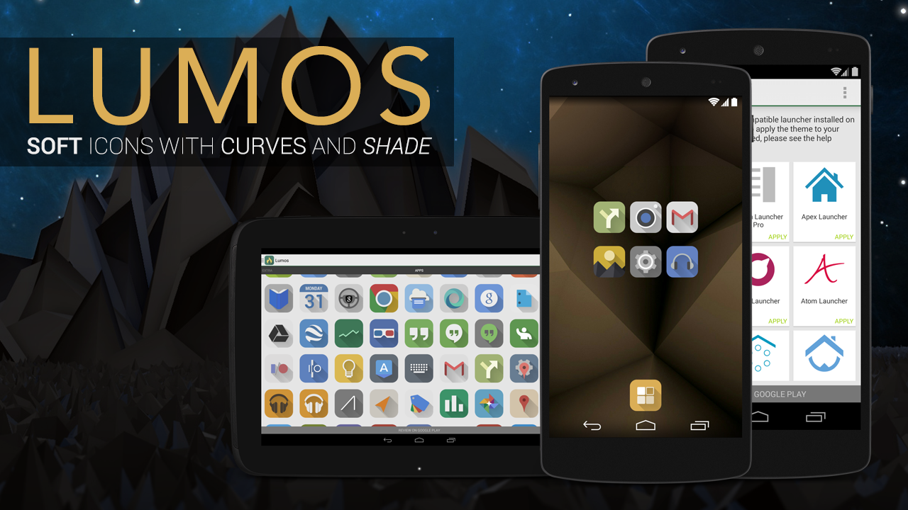
Icon Pack - Lumos
Icon Pack: https://play.google.com/store/apps/details?id=kov.theme.lumos Wallpaper: https://imgur.com/UP1UuJX
Wrong app, this is the correct one
https://play.google.com/store/apps/details?id=kov.theme.lumos
Wallpaper: In Imgur link
Launcher: Action launcher
Icons: Lumos Icon Pack
Widgets are both custom ones built in Zooper.
Lumos. Very clean and elegant https://play.google.com/store/apps/details?id=kov.theme.lumos
It appears to be the same one I use which is Lumos
The icons ported from android are from the Lumos Icon Pack
Here's an earlier post here about the theme. http://imgur.com/1Za6Pgd https://www.reddit.com/r/iOSthemes/comments/370bls/question_what_theme_is_this/
basically i dont want any shine if possible like Lumos https://play.google.com/store/apps/details?id=kov.theme.lumos iRide UI is pretty close also
i have the icon pack so i know it is https://play.google.com/store/apps/details?id=kov.theme.lumos&hl=el