
What are
/r/ArtCrit's
favorite Products & Services?
From 3.5 billion Reddit comments
The most popular Products mentioned in /r/ArtCrit:


The most popular Services mentioned in /r/ArtCrit:
Vectr
HubPages
Pixabay
GIMP
Shutterstock
Tapas
Files.fm
Adobe Color CC
Gumroad
DeviantArt
Krita
Imgur
Scholarpedia
Google Arts & Culture
Processing
The most popular Android Apps mentioned in /r/ArtCrit:

The most popular reviews in /r/ArtCrit:
You've made a beginner's mistake in assuming that dark = black. It is the other way around. Black is a dark color but it is only one of many. Many beginners use black to induce shadow (and produce light), but in earnest black and white are less useful for the final color composition. For some classical reference: On Divers Arts (amazon link), provides a very interesting set of instructions on the painting of flesh tones from 1122. Still, you likely won't get the best instructions from a 900 year old manual. Color (amazon link) is a great (really great) introduction to color theory.
As for composition, it mostly works in my opinion though I might suggest that the leaf under the eye on the right distracts from the eye itself. Furthermore, the clarity of the leaves and eyes causes the abstract shapes cutting through the painting to be called into question by their unspecific nature. Thereby, there are elements within the painting that are extremely specific and others that do not have purpose past compositional fixes. These 'edges' appear as though chrome and serve to transition and conjoin the disjointed elements within your piece and I might add have a flair for the surreal. I can only suggest that this comes off more as an ends to a means rather than as careful and pointed. Take the 'transition' away and your problem still remains, see what I mean?
Regards, D
hatch marks are best used to describe form. Try to have them go around or along the form. You go in the direction of the form ok in many places. Than you counter it with a stroke that is a right angle to your first one. Use the cross stroke to describe the other direction of the form. be sparing with the second direction. often it is used to describe a change in form and not just darker.
as a compositional element you can think about the level of harmony and noise your marks give off.
check out Jean Baptiste Greuze
I recommend the book The New Drawing on the Right Side of the Brain, which dedicates many of the early exercises to making you draw exactly what you see, and spurs you to abandon drawing shortcuts that you've learned over the years.
I don't have it in front of me, but the idea is that most people have learned to draw by collecting a toolbox of symbols: for example, if we were to draw an eye, as you did there, we'd render and subtly reshape a memorized pattern of lines, and, at the end of the drawing, we'd have only managed to incarnate another instance of a symbol that we've internalized.
The book's exercises require you to perceive things differently and to discard those rudimentary, visual symbols that represent eyes, a nose, lips, etc. In one exercise you have to take a drawing of a man, turn it upside down (to confuse the part of your brain used to tokenize those symbols), and dutifully render the lines as you see them, ignoring that you are drawing an eye, or a mouth, etc.
This post explains it better still.
You suffer from Symbol drawing. You draw the lines that you think should be there, not the ones that are actually there.
Never draw both sides of the nose, indicate it's 3D shape with light/shadow.
In general, keep studying the shape of the head and it's features. If you are looking for rescources, check out this.
EDIT: Oh and This could help you too. It's the first 3 hours of a 15 hour course, the rest is behind a paywall but there is more than enough information in these 3 hous to keep you busy for a while! Hope it helps.
Keep on studying and remember to have fun!
I think you were successful getting different textures, so nice job. As general advice I would say try to leave more white areas for contrast. This requires a lot of restraint, especially when drawing dark things like leather and fur and sunburned, wrinkly dudes but the limitations of ink demand it. This may mean you have to invent a strong light source and imply things without actually stating them.
I know that sounds cryptic so if you want some examples look at the work of Joseph Clement Coll. He was great at getting all kinds of textures with just the pen and brush. Also there is a great book called Rendering in Pen and Ink that goes into great detail. As of this post it looks like there are some used copies, hardback, for $6. Worth ten times that if you are interested in inking.
It's not in perspective with the head. Before you do stuff like this, draw it out 10 times until you know how to draw it right. I can't really tell you how to just fix it, because it involves a lot of just knowing how to do it from a lot of practice. Best I can do is refer you to books that I found helpful in learning how to draw heads in different perspectives. Andrew Loomis Drawing the Head and Hands is one of the better ones on structuring the head and face. The Artists Complete Guide to Drawing the Head is also really good.
Don't focus on improving this picture. Focus on improving your skills.
Don't try create "masterpieces". Don't draw things just to get approval or attention from others. Study. It will take a long time, but once you are good enough you can create whatever you want. If you need a place to start check out this
Right now this piece is flat because the colours behind and in font are all one note. Most abstract pieces hold strength because the artists have studied some colour theory. All of this red, orange and yellow but no green or teal to clash against. Lots of artists these days use a palette site to help them have a framework of what to use. These kinds of sites can help anyone whether they have a taste in colour theory or not!
You're welcome. :)
Don't worry about line weights (or anything, really) not feeling intuitive, I think we all start out that way. I got into drawing via manga and comic books so that's where I studied lineart the most. They're not great for learning things like anatomy but very good at highlighting line weight and composition what you can do with them.
"Heavier at overlaps" is good rule of thumb but that rule can be fleshed out more for sure. This tutorial highlights some other guidelines for which parts of your lineart to thicken for various effects. And this one I think does well explaining the technical side of putting down lines and how to think about contrast in line weight.
I'm also just gonna throw in one more piece of advice I wish I had gotten sooner: as useful as tutorials and technical understanding are, they're no match for practice. People tend to think of art ability as some inherent or mental talent but it's actually very physical! You aren't just thinking up things to put on paper, you are training your hand and wrist to sync with your eyes and brain. So sometimes even though a tutorial gives you a huge mental breakthrough your pencil is just not going to move the way you want it to, and the only way to get through it and improve is to practice, practice, practice.
Dang, I honestly dont recall hearing this tale or song. But its all there in the Painting / Song. The swan, the woman, the Harp, the Farmer the Gold strings made from her hair. The arches and pillars of the kings court & more. WTF?
This is a great start! I love Drawing on the Right Side of the Brain. Your proportions appear to be solid and well measured, but the line work could use some work--it seems like you are drawing over the same mark multiple times rather than working in one fluid line (most obvious around the ear, the shirt, and the jaw).
While it's obvious the desire to do this comes from wanting the final form to be correct, it results in a 'hairy' blurry sort of drawing. I find a better method is to mark the edges of things with dots or short lines, and then connect them. Rather than start at the bridge of the noes and draw slowly down to the tip with many small lines, mark the bridge, mark the tip, and draw a smooth line between them without lifting your pencil. This will feel weird and unnatural at first but the end result will be much cleaner more confident looking works. If you do want to 'sketch' something in to see if you've got the proportions right, do it with light fluid single strokes rather than many little lines. This gives you a quicker read of if what you are doing is working, looks better, and takes less time. You can practice this on a blank piece of paper by just making long continuous lines with the pencil as you vary pressure--see what kinds of marks you can make and think about how they might be useful to the drawing (ex: under the nose is almost always darker than the bridge, so it's usually useful to apply more pressure when drawing the line under, and have a very light touch along the bridge--this is a subtle way of indicating the light that is hitting the face).
Good luck, and again--great first start!
My harshest criticism is simply to tell you to draw from life. Study figure drawing and leave the cartoon drawing off for a while. If you're looking for guidance, Bridgman's Complete Guide to Drawing from Life is my personal favorite, and Loomis has several good books floating around.
To risk sounding cliche, you can't do something wrong, just in a way that doesn't get the results you want.
I'm not great either, so you can take what I say with a grain of salt, but I've heard beginners most commonly struggle with symbol drawing, and that's what it looks like you're doing.
I'd check out Betty Edward's Drawing on the Right Side of the Brain, which basically focuses on getting you to draw what you see instead of what you think is there. I'm using it right now and it's helping me a ton. My drawings have gotten much more realistic.
The problem I see is in the nostrils and ball of the nose, and mainly how they interact with the form of the mouth. Mouths have a sort of cylindrical or spherical shape beneath them (our teeth). On the side nearest us, you can see how it sorta 'wraps around' the form of the mouth. On the side that's away from us, it appears to flatten rather than wrap around. It's some subtle adjustment of the nostril forms that will solve the problem, one good resource for some old school drawing advice is Andrew Loomis' Drawing the Head and Hands: http://www.alexhays.com/loomis/Andrew%20Loomis%20-%20Drawing%20the%20Head%20and%20Hands.pdf
For simplist:
The book, Andrew Loomis Fun with a pencil. Follow along to the first section. It will be easy to follow along and will help with getting the placement of the features and symmetry to look face like. Online copy here
For more advanced:
Drawing the Head and Hand, by Andrew Loomis.
Online copy here
You can find them online for free at the links, or purchase a published copy. The copyright has expired, which is why you can find them online. They are also still for sale in book and art stores, as well as online. Both are great books. Alternatively you might find Drawing the Head and Figure by Jack Hamm useful.
For expressions references are very useful, you can look up online a facial reference books. Like The Artist's Complete Guide to Facial Expression by Gary Faigin
basic problems in anatomy, form, and construction. the rendering is actually pretty nice despite a lack of value and tone. also you have a confidence in your line and work which will take you very far. this is a solid amateur drawing but i would end up writing a book if i really got into what needs improvement......luckily others have already done that.
for you i would recommend this book if you want a nice boost up to the next level.
as well as the classic Drawing on the Right Side of the Brain to improve general drawing skills as well as to get you thinking a little more about drawing itself.
keep it up!
It's neat. I think the edges, especially in the foreground look artificial. You might get better results if you took each layer and "import image as plane" in Blender, in a diorama fashion, then render it to get the depth-of-field you're going for.
Dang, you're pretty good for a 15yo. Nice work!
​
My thoughts:
- You should post these at the correct orientation as this helps us review it. Use GIMP if you need a free image editing tool to make changes like that. https://www.gimp.org/
- Try to avoid having your subjects facing directly at the camera. It's a stiff pose that you don't actually see very often. Even turning the head just a bit would improve this one a lot.
- Make your darks just a smidge darker. Pushing that contrast a bit will really make your work pop.
- Your expression is off ever so slightly. Your eyes and mouth are too big and one eye is looking a bit upwards. Pay extra attention to the whites of the eyes to avoid this
- Your expression also doesn't really communicate much about the emotional life of your subject and instead depicts a rather generic smile. You don't have to make up what the subject is doing but with some practice you can learn to emphasize certain parts of the face to bring out and highlight the expression that's already there (if that makes any sense at all)
- This isn't a problem with this work per se but in general try to draw people doing things, even if the things they're doing aren't terribly dramatic (checking their watch, using their phone, etc). This will make your work more relatable (because it now tells a story) and give you more challenging material to work with.
- Consider experimenting with painting. Oils are a pain but I think your style would adapt well to them. You can also use gauche or acrylics if you want something that dries in hours instead of days.
​
This is a great piece. Keep it up!
Circuscommando already gave a great critique, but I just also want to mention that you're symbol drawing. You're drawing aspects of the face as what you think they look like, not what they actually are.
http://hubpages.com/art/how-to-draw-learn
/r/ArtFundamentals/
I would suggest start working first on basic construction of simple forms. There's lots of great lessons and resources out there. Keep it up.
Gimp is a free art program like Photoshop. Mspaint isnt doing you any favors. https://www.gimp.org
Inkscape is free too if you want to do vector art. Its a bit hard to get the hang of though so look up tutorials. I like Nick Saporito on YouTube. https://www.youtube.com/channel/UCEQXp_fcqwPcqrzNtWJ1w9w
He does gimp tutorials too.
I took a workshop from keys over the summer online and he has the videos available online for individual purchase. The most important is the Observations but there is also one on yellow roses if interested. 😊 https://sellfy.com/danielkeys/p/CXoX/
there was nothing in the original post to say that it was a digital painting, although that is common enough these days.
I gave my own response without considering the media. In my mind it almost had a watercolor or similar feel.
At this link we can compare the face geometry between the two versions. I have placed lines marking the levels of the mouth, eyes, cheek bones, etc.
The one on the left is the original, the one on the right is my perspective correction.
I will admit that mine is stretched too tall, and could be made more square. The original has problems in the face geometry illustrated by the red lines (which is what prompted me to the perspective correction.)
Although it is also true that human faces are not perfectly symmetrical, but once you get a past a certain point, it just looks off.
It is easy enough to photograph or scan a hand rendered image so that it looks clean and digital.
Just a first impression
It depends on how true to life you want it. You might like it as it is, and it is interesting as it is.
It feels like the paper was down at an angle when you were doing this.
If we apply a typical perspective correction from photography to this portrait, we end up with a picture that seems more natural and true to life.
Therefore this seems like you were looking at the paper at this angle, while you were drawing it, and when you look at the picture square on, it looks a little off.
This shows the importance of actually having the paper square to your eyes when you are drawing, because it is very hard to correct for this otherwise.
You are off to a great start, and /u/squidp has some good advice, but I would like to add to that.
1) All your studies use the human figure, which in and of itself is challenging to draw. Try making a few drapery studies so you can focus just on drawing the folds. Also, look at drapery studies from the masters and try copying one you really like, for example: http://www.wikiart.org/en/leonardo-da-vinci/drapery-for-a-seated-figure-1
2) Another good style to study if you want to get better at drawing folds is Ukiyo-e. Ukiyo-e works of art do not use shading for their drapery and instead, rely solely on the contour of the line to create the illusion of weight, depth, and movement. Many of the European impressionists and post-impressionists were greatly influenced by the Ukiyo-e style, especially Monet, Toulouse Lautrec, and Van Gogh.
Hope that helps!
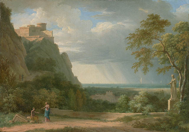
The first thing that your painting reminded me of was the Academic approach to historical landscapes. Here are some examples;Classical Landscape with Figures and Sculpture, Pierre-Henri de Valenciennes, French, 1788, Oil on panel and Thomas Cole. These paintings were made out of pure imagination but each of the buildings looks like they could actually exist separately. While your water is done well, the buildings and rocks look clumped together in a way. The rock face on the left edge needs much more refinement since that is the thing that is closest to the viewer. Push the shadows and highlights there. Also the rocks that are under the bridge on both sides needs to be either more refined or blurred out. The rocks on the top of the mountain are done really well and I think it would look nice if that was continued down. As for the buildings, it's clear that you meant to bring focus to the dome building with the highlights but I agree with Skeddles that the highlights would help throughout the piece. Shadows on the actual buildings would help greatly. Go beyond painting the doorways a solid dark color, add variety to look like there's depth inside.
I think there's some interesting ideas here. It reminds me of /r/vaporwave.
You might be really interested in interactive art, applications like vvvv, or Processing. You can take your photo ideas and add motion, interactivity, web connectivity, camera input, etc. There's a bit of programming involved, but it is pretty accessible, and I think it's a natural progression for you.
I can't think of any courses or videos that would be particularly helpful for illustration like this this, but I can run through the basics real quick.
First goal is to create a focal point. The area of focus should have these three things
Highest contrast in the image (especially value contrast, but a bright pop of color contrast can have this effect too). Contrast will immediately attract the eye. Not an drawings can help you plan out this aspect.
Harder edges/ more detail than the rest of the painting. This gives the eye an area to hang out, makes it so the viewer wants to look deeply at the detail.
Lines that lead the eye into this area. (you could us the shape of the smoke cloud to pull this off).
Next time you're scrolling through art images on insta or reddit or deviant art, make an effort to analyze composition. The best way to know a composition is good is with your gut. When a painting stops you in your tracks, and you want to keep looking at it for a while, chances are there's something compelling in the composition. So take a few minutes and figure out what exactly made you pause.
With a graphic style like this, it would be worth checking out the principles/elements of design. Balance is a big one to really consider, it's probably the biggest concern in this piece. I didn't have time to read this article, but it seems like a good overview. https://www.invisionapp.com/design-defined/principles-of-design/
And here are some composition pitfalls to avoid: https://emptyeasel.com/2008/11/18/avoiding-tangents-9-visual-blunders-every-artist-should-watch-out-for/
Artists kinda suck at explaining composition, not gonna lie. I remember learning about the golden ratio and understanding none of it. Nothing stuck until I started taking film & photography in college.
I’d recommend reading ‘The Filmmaker’s Eye: Learning (and Breaking) the Rules of Cinematic Composition’ by Gustavo Mercado. It’s a textbook we used in class, and it goes over pretty much everything you need to know. It’s only $33 on Amazon— cheap for a textbook, and it’s well worth the money. Here’s the link: https://www.amazon.com/Filmmakers-Eye-Learning-Cinematic-Composition/dp/0240812174
You can also search “Film Framing” and “Photography Framing” on Google or YouTube and find a lot of information that way. I’d still recommend using the book though— it’s a lot more convenient than finding everything by yourself, but I’m sure you can do it if you do your research.
Good luck!
Drawing on the Right Side of the Brain is available free online and the exercises in it are basically the same kind of exercises you do in art school. Doing tons of studies teaches you how to see what's in front of you properly.
Keep it up! Pulling parts away from the whole is a great way to study.
One think that is hard for beginners is moving away from drawing symbols. You "know" what a tree looks like, roots, truck, leaves, so you draw that, however a tree in life is more complex and has more variety. I would suggest that you take some time to train your self away from symbol drawing. Draw from life or pictures, draw your images upside down even. It will help train your brain to draw what it sees rather then what it knows.
A great book to read is "Drawing on the Right Side of the Brain" which discusses this in detail.
Hey guys!
Just wanted to get some eyes on this so that I know what people think is wrong with it.
I off and on go through fundamentals, mainly for drawing and some anatomy, so painting in general is an entirely new beast to me.
A book that I've really enjoyed so far is "Fun with a Pencil" by Andrew Loomis, and I'm wondering if anyone happens to know a similar book for painting. I don't have any materials to do traditional painting, nor do I have the space, so I've kept to digital painting with a tablet. I've tried to not let the program do much of anything for me, and find brushes that give the most 'acrylic' kind of feel, even if that isn't what my end goal probably is.
I know there is many many days, hours, weeks of practice ahead of me, but what do you think I should really narrow down on?
Eventually, after I understand realism more, I want to move towards a surreal and somber art style, with melancholy landscapes, people, and situations. Is there any resources for going in that direction, or am I just going to have to figure that out on my own?
Thanks guys!
Drawing is like riding a bicycle. As long as you are physically capable you can learn at any age. Some people are talented at riding a bike. But it's a skill everyone can learn. And once you learn it you won't forget.
Also, 25 is young.
Purchase Drawing on the Right Side of the Brain. The author realized that it was so easy to teach people how to draw that she started going around doing day long events with companies.
The idea wasn't just to teach people to draw from observation, it was a way to show people that they can learn a skill in one day.
I like the shading.
I usually start a head by mapping out a sphere and the planes and the lines that the eyes and nose and other features are going to be on in very light pencil, then erasing them after going over everything in heavy lead or ink. Maybe you're already doing that. Another thing is to practice drawing in long lines, with a single sweep of the hand. It'll take a while to get used to it, but the edges won't look as fuzzy as they do when you draw them with a lot of small, short lines.
I don't know if maybe you've already heard of him, but there's an illustrator called Andrew Loomis who worked with something called the "ball and plane" method of drawing heads back in the 30's. Most of his books are online as PDFs. "Fun with a Pencil" and "Figure Drawing for All It's Worth" both go over the ball and plane method. His other books are written assuming some familiarity with those two.
They look perfectly fine as stylized lips, but the edges are very defined and symmetrical like a cartoon or lineart. In reality when you look at a face there are no outlines, sometimes shadows obscure details completely making a lost edge. Scroll down to the Rembrandt on this page and you can see a lost edge where the hat and head meet.
The lessons in the book Drawing on the Right Side of the Brain are usefull if you want to draw realistically. It teaches you how to draw from observation. Instead of learning to draw lips, you learn to draw anything. Once you learn to draw this way drawing lips and eyes and teapots from observation become pretty much the same technique. Ignore all the parts about how the brain works though those parts are bunk.
There's a great book called "Rendering in Pen and Ink" by a guy named Guptill, and it's fantastic. It's pretty old, but full of great info. A lot of it may not apply to digital, but on the other hand it isn't that expensive, and it has a lot of ideas on different kinds of textures you can get with a pure black+white medium.
I'm no expert, but I believe you need to focus less on trying to define the face only with a few outlines and more on defining volumes using shading and lines of varying value to suggest the underlying structure. You should probably also study the eye and draw it less as a representational symbol, as you've done here, and more as the complex object it is. (Though this will require reference.)
If you're not familiar with it already, there's a new edition of a very popular book: Drawing on the Right Side of the Brain. It covers a lot of those topics, and I believe it'd be a good resource for you to strengthen those fundamentals.
This is certainly a good start, though! When you do Drawing on the Right Side of the Brain you start out by doing a self portrait, and then do it again at the end. You'll already have a good head start for the first portrait, based on your submission.
Your value scale is off. On the head, you're doing a pretty great job. On the body, your shadow scale is far too severe. I'm not sure what's going on with his chest, and under his chest. His lower left arm is a bit too dark for that shadow as well, I think.
The torso anatomy and maybe perspective is a bit off. His right side is larger in the chest area than the left, but I think maybe you just didn't capture the perspective just right and his left is supposed to be at a bit of an angle? Also, you've recessed where his rib cage would be under his chest, and that looks strange. The mark on his right lower stomach seems to suggest his rib cage, but you've got it much higher up in the rest of the image. That, to me, suggests that you're seeing where his ribcage is there, but you don't understand that and kind of faked it above that area.
Overall, draw and paint what you see, not what you think you should see.
I've found Bridgman's Complete Guide to Drawing from Life to be really helpful here. Bridgman is a student of Michelangelo, and his drawings have a very sculptural bent. It's about understanding masses and where the shadows and highlights fall. Basically, you don't need to understand the latin name of every bone to make a convincing figure, but you do have to know how a body is built in general so you know what to look for in a body form.
I want to stress that I really like what you've done with the head and face. When you nail the rest of the body to that level of proficiency, that's when you're going to improve by leaps and bounds.
This may be a result of using several sources but the underlying structure of the head seems a bit off; some areas seem in conflict with each other in regards to angles.
I'll breeze over the mention of the mouth/teeth since that has already been commented on.
A much smaller thing I noticed is that although the area around the eyes is shaded to suggest roundness the eyes themselves seem flat. This could probably be fixed with some slight reshaping of the irises so that they hug an orb shape.
I'm not sure what your process is in approaching drawing a head; do you "build up" from a foundation? I've found that this approach helps me to get features in the placed more accurately both in terms of viewing angle and their relation to one another. Working up from an understanding the underlying shapes will get rid of features appearing in conflict with each other (as with the mouth/teeth to the angle of the head).
Have you ever looked at any of the books by Andrew Loomis? I'm thinking specifically of Drawing the Head and Hands but they're all available online as pdfs and might be helpful.
You can find them here: http://alexhays.com/loomis/
Compliments on the shading; I think you've done a good job of suggesting the planes of the face.
I dunno, maybe it is to everyone but me... Lol. Sorry for being so harsh. Anyways, if you want to get better, look at the stuff of people you admire, and see what you're doing differently. For example, if you like how someone draws noses, observe how they draw it at different angles, and figure out what the different lines represent in 3D. (Not as complicated as it sounds.) As you look more at other people's art, the better you'll get at seeing how your art can be improved. Deviantart and tumblr are both good for this, as you can find artists and keep tags on their work. Also, I'd reccommend Andrew Loomis' Fun With a Pencil for practicing 3D shapes. He has some other books too like Figure Drawing for All it's Worth and Successful Drawing which are also pretty good. Here. Drawing Comics the Marvel way is good too if you want to buy something, it doesn't sound so impressive but it's got all of the important stuff. For advanced anatomy Michael Hampton's Figure Drawing Design and Invention is good, might want to get this later though once you've got proportions right because the book doesn't have that. Don't get overwhelmed though, these are just suggestions for later. You don't even have to do everything in Fun with a Pencil or any commitment. These are just some suggestions. Above all don't give up. As you get better you'lll notice more mistakes in your work. But remember "failing" at drawing something doesn't mean anything. Everyone has had to make a lot of mistakes to get where they are. If you make more mistakes, you can know what you can't do, and then improve. Good luck!
When you're drawing the form of the object do so lightly and with a harder graphite (something like a 4h ought to be good). Once that is done, there are a couple of ways to approach value: starting with the darkest and working to the lightest or the other way around. I prefer dark to light when I am working with pencils and it is important to remember to use the side of the pencil when shading, not the pencil tip. You may notice that some videos of people working in pencil have a lot of their graphite exposed, it is for the purpose of shading. Good practice to learn shading with pencils is to draw spheres, cylinders, boxes, and other simple 3D shapes.
Personally, I like to use these mechanical pencils when I use pencils (although I've pretty much switched to pure digital now). You can also get 2mm color mechanical pencils as well, which are neat.
If you can, charcoal is also an excellent medium for drawing, just be sure to draw the shadows and smudge out of them to make the form.
I'm not sure how compatible those styles are tbh. One is realistic and moody, the other expressive, colorful and stylized. By all means give it a try, but it's harder to get technical critiques.
If you just ask "is there something wrong with X", in a stylized piece like this, it's nearly impossible for anyone other than you to know. You're almost better off just finishing the piece and asking others "what do you think of this style?"
I guess if you feel like you're not getting a sense of volume (it's feeling flat) and don't like the lighting, then you'll have to understand form and light a bit better. Maybe get a copy of Color & Light:
https://www.amazon.com/Color-Light-Realist-Painter-Gurney/dp/0740797719
One quick tip for volume and lighting is to respect the basic forms of things like the head (essentially an egg), arms, legs, torso (basically cylinders). Shade them according to those forms first, and make sure that any detailed features sit on top of that, not just on a flat surface. In other words don't ruin that overall basic form shading when adding in the details.
Hope that helps a bit. Good luck!
as mentioned, your focal points are too close to each other, so you're getting a really tight corner. one other thing to consider is that we're seeing the house from up high. your eye is at your horizon line, so the viewer is floating up near the top of the roof. that's not necessarily wrong, but most of the time, we see things from about 5 to 6 feet off the ground. if your drawing was drawn from the ground plane, your eye would be somewhere in the middle of the front door. my guess would be slightly higher than the door handle. your texture work is getting better though, your hatch for the roof is a good example of looking at how to imply texture, instead of drawing it all.
​
you might want to check out this book: https://www.amazon.com/Rendering-Pen-Ink-Techniques-Illustrators/dp/0823045293 it has GREAT information on how to use hatching and linework as texture and tone
Oh no lol I had the wrong brand lol. I just looked at mine. It's Fineline! https://www.amazon.com/Fineline-Applicators-Masking-Fluid-1-25oz/dp/B0026A1W7W/ref=mp_s_a_1_4?crid=2ZVKU8WMBOMNG&keywords=fineline+masking+fluid+pen&qid=1657565712&sprefix=fineline+%2Caps%2C269&sr=8-4
You can find it at Michael's
The head and neck are too small for the body. Also proportionally, thighs are almost never same size or larger than the waist. There are some incredible old school art books that teach about proportion and anatomy, it'll make drawing figures much easier for you. https://www.amazon.com/Dynamic-Anatomy-Expanded-Burne-Hogarth/dp/0823015521
You need The Animators Survival Toolkit
The Animator's Survival Kit: A Manual of Methods, Principles and Formulas for Classical, Computer, Games, Stop Motion and Internet Animators https://www.amazon.com/dp/086547897X/ref=cm_sw_r_cp_api_glt_i_ZZMQZARCR0TXGQ13G0EB
the exposure seems dark or the color choices are too dark, i can't tell which. wonderful characters! there appears to be no light source, that could help or hurt depending on the style you are going for. the pink and red are too similar i think, lending the apple and surrounding intestines/brains to be too similar.
thought: maybe adding sharp highlights could help emphasize the surreal/plastic nature of the characters.
https://www.shutterstock.com/image-vector/realistic-red-plastic-bag-shadows-highlights-482328460
the surface that the fruits are on looks like brown paper now,
are you going to still paint it further?
you could do horizontal wood patterns, [table textures] Something light:
https://www.shutterstock.com/search/wood+table+texture
and simplify the background in contrast with vertical strokes of a pattern there.
copy your image into a paint software and desaturate it, this should help you see the tonal errors like the jacket. it has no form. if youre going to light it, do it all not just some parts!
Or maybe just let people draw what they like to draw? You are using Arcane as an example but maybe we will talk about her original design? And Riot Games have a really high standards when it's comes to the art.
You are so against "male gaze" but you kinda forgot about fact that many artist draw things the way they like and that's the thing that help them grow, not simply because they want to make it appealing to someone else. And here you are trying to force someone to stop drawing things they like.
With the skill will grow the internal needs to draw diffrent things. People will start with a few subjects but they may end up doing professionaly something diffrent. The worst thing that someone can do, when literally starting learning to draw, is not to draw things they like - that's a super quick way to give up on it.
You are on this sub and instead of encouraging people to draw you do the opposite
Both! Take a life drawing class at your local cc and then grab some loomis. Check this link out too, it has a huge amount of information (and some great drawing books in e-book format) https://sites.google.com/site/4chanic/training-tutorials
You need to learn a program called renp'y. You will need to learn some mild coding, and of course amass art assets, music, writing.
I'm personally doing the writing/coding and art, but I have a guy doing the music- I have no musical ability, and I have voice actors.
I guess its worth linking to the actual visual novel info, which can be found here-
http://lemmasoft.renai.us/forums/viewtopic.php?f=43&t=30195
or here http://www.indiedb.com/games/anticipation-apprehension-adolescence-book-1
To jump off of what /u/fold5wrap6 said: since you're interested in characters, you may want to pick up a good beginner's book on anatomy drawing. This will cover: contrapasto and gesture drawing, forms, proportion, lighting, tone, and many other formal basics. I would recommend starting with the absolute basics (drawing an orb, for example) while also applying what you have learned into your daily sketches.
there are many online sources you can use to further your studies for free as well. Try this one or almost anything you get from looking up: "beginner figure drawing" on google, for the most part, the lessons and advice follow a similar format and I can guarantee you'll be able to pull something out of that.
Onwards and forwards, D
gods i've had that problem a LOT when sharing things i drew in SAI, haha. i get you there. also, thank you for explaining the name! i do see that it could have appeal in that sense.
i'd suggest continuing to play with sans-serif fonts (serif fonts rarely work well as a main font in a comic). ideally you should also use 'p q b d t i I l 1' as part of the preview text when looking for a font, and make sure i I l 1 in particular have clear distinctions. it isn't necessary but it definitely helps with accessibility.
also, perhaps something like this? the most important thing is that the images should be displayed at an appropriate resolution and the rest of the theme should be simplistic. my current favorite tumblr-hosted comic uses this, and with some small tweaks it can look really nice.
the speech bubbles used to all be white and if an offscreen character was speaking, nobody would know who it was, so I added color to them(ex: his are gray and hers are rainbow, the other ones are yellow, pink and black). :/ I could make them lighter colored so the black text shows up better. Sometimes I do make them pretty darn bright. The rainbow speech bubbles are rainbow because the character's name is Rainbow...if that makes any difference. Are you thinking outlined speech bubbles maybe? I do that in another series.
I tried to make the snow look small and flaky with little tiny crystals, so the pixels really looked well to me, but next page that has snow in it I could try to make it match the smoother style.
This is the series. I am looking for critique on anatomy, backgrounds, dialogue, humor style, and pretty much anything. This comic is almost 10 years old, and I'd like to make it better to attract more readers.
Ignore the downvotes, it's completely irrelevant in this sub. I can only imagine people who downvote stuff like this are just people who need to feel superior. Usually people who actually try and are polite get decent critiques/thoughts on this sub.
Anyways, you are obviously just starting out, so i will try to point you in the right direction. Study the fundamentals, and draw from real life. Style comes at the very, very end of your studys, and it will come naturally. A great place to start out is here
Also, forget about color for now. Focus on figure drawing, and maybe try to put in some values, but color theory is a complex topic that you should dedicate time to when your fundamentals are stronger.
Also, this character is from jojos bizzare adventure, right? fun fact: Hirohiko Araki (Author of Jojo's bizzare adventure) learned to draw by studying da vinci.
Don't give up, no matter how frustrating it gets, and keep studying. You will improve in no time! Cheers.
You suffer from symbol drawing, that becomes apparent with your eyes. It makes the image look weird because our brain notices that something dosn't look right, and it makes the image look flat.
What symbol drawing that means is that you try to draw the lines that you think are there, not the ones that you can actually see.
Get a sheet of tracing paper and lay it on top of your reference. Try to trace the lines of the eyes and compare them to yours.
Keep studying! If you need pointers on where to start, check out this
Add more details closer to mouth. More fur texture there. I mean, right now it looks like shaved face there... Everything else is great, just add more accents in white parts. I see you have light shadows there - work with them a bit, add more darkness here and there (but not to crazy), I think you feel it yourself. That part is good enough - I mean only super little touch up!
Here's a link - it's different style, I know, I just wanted to be clear about ''mouth'' part - fur is there. Mostly our eyes walk from eyes to nose and to mouth. Nose is good and soft. Add fur and it will be great. Fur on upper lip to overlap tongue a bit (1 -2 mm). And maybe a little more gradient to tongue from darker to bright.
https://www.shutterstock.com/image-vector/siberian-husky-144068158?src=iqRJQwcKp7PvwGcihQf8cA-1-85
As a beginner you just need tons of practice in all areas of drawing and painting.
Start with painting and sketching from photos. Don't bother with those paint-with-me youtube videos. They are fun if you've never painted before but if you want to learn the will hold you back from progressing.
Get some photos of landscapes. Start by sketching and drawing them with pencils on paper. Get a good feel for how the foreground, middle ground, and background layer on top of each other and work together.
Practice drawing trees from actual photos of trees. Beginners tend to make the mistake of drawing and painting symbols of what they think objects look like instead of looking at the object and drawing what they see. For example what you've painted here is a symbol of a tree. Real trees have complex branches that appear to overlap each other because a tree is a 3d object. If you had been referencing an actual photo of a tree your painting might look more like this: https://www.shutterstock.com/image-vector/vector-tree-19488244
That's not to say in the future you can't use symbols in your art, but as a beginner wanting to learn you should stay away from those kinds of shortcuts.
https://color.adobe.com/search?q=rocket
Abode has a great selection of themes and keywords you can search up to find a pallet derived from the real world or other similar topics. I typed in rocket and got some pallets to share. Love the tools from Adobe, they're a great help
Great question. The best way to improve is use a reference! Croquis Cafe is a great free source, as is Pexels.
I would also suggest clumping a few lashes together at the tips, as this is what happens naturally. Lashes don't fan out individually. See this example. I hope this makes sense.
Hmm not sure, but possibly pixabay? for me I think the fish's face is too interesting (!), and it draws you away from the main subject. Actually making the fish flatter and less light attractive might do the trick!
The technique is a fairly simple one, so going bigger would make it more imposing - but not necessarily impressive. A little bit of literal is a good anchor for a technique like this that is the exact antonyms of the word literal.
The technique itself is interesting and has infinite potential, and like CG special effects in movies - it's icing on a cake. Delicious, but better on a cake than spooned from the tub. Your task as an artist is to figure out how you want to employ and combine it with the other skills in your artistic arsenal. Do you want to assault and confuse the viewer, or do you want to engage and intrigue them? Maybe a bit of both?
I have thought of doing this quite a bit. I've even set up two different names for illustration and abstract. I'm fairly creative with concept (no works seen here, of course), but I've had no projects to go off of. I have tried to create my own pretend illustration projects, but It always sort of feels like I'm wasting my time. I get pretty in detail with some of the work, and it can be hard work, which at the end of it all, leaves me feeling sort of less motivated that it's not going towards something. I feel like if I'm producing a concept illustration work, it is only satisfying if it's meeting the demands of a client, because there in lies the challenge. This is a mistake and I should probably just buck up and do some pretend assignment to build up the portfolio. Here is my portfolio now: https://www.dropbox.com/s/sigooq77h5ffrjd/profolio%20to%20Pixar.pdf .....which is still pretty outdated and too varied in style to boot. I should probably put time aside to make just the kind of illustration your talking about. Thanks for making me realize it.
If your passionate about art I'd say go for it. I'm (24) starting in NCAD in September never to late to learn. Get a portfoilo together, I used the NCAD brief and submitted it to IADT and DIT also. Your drawing skills are good but collages want to see how you think and experiment. So if I was you I'd start work on a portfoilo for 2016 if this is the route you want to take.
Edit. Typo
I like the perspective styling of the text, however, as many have said, it's too small to read when scaled small *which, most of the time a logo will often be scaled to 75x75-100x100.
That said, I like the yellow/pink. The black doesn't complement the rest of the palette very well though.
I would recommend using a dark orange? or something that complements the rest. Try using adobe color if you need help with it. https://color.adobe.com/
The fracturing also seems a little too random and possibly unintentional, I'd suggest having some pieces falling out of the background, almost like it's falling out of the frame. Overall, the idea is there, but try and make purposeful decisions throughout.
Hope this helps.
Generally, objects should be placed in odd numbers. Look at any still life, and you'll see that groupings of 3, 5, 7, or 9 are more aesthetically pleasing.
Love the flowers individually, but not much of a fan of the piece as a whole. It doesn't tie together very well. A unifying theme in the background might help. Some sort of an underlying design or texture that crosses (but not necessarily covers) most of the canvas and makes the flowers feel like they're a part of the whole, rather than floating by themselves. Maybe just a thin line engraving-type drawing in white... like this? Or maybe more of the marbling effect you created -love that- but on a larger scale and with a third color. Speaking of color...
Not sure if it's the lighting in the video or not, but I don't think your color palette gels well. The pastel pink is very delicate, and gets lost against and doesn't match with the darker, grey-toned green. Either add more red to your pink, or more yellow/white to your green. And then the natural gold-brown of the leaves is really lovely, but doesn't quite go with either color. I would have picked a warmer palette to use them with.
That all sounds kinda harsh, don't take it wrong, I do think it's pretty :)
her head look a little off on my screen.
I'm not very good but maybe this help:
https://vectr.com/theabsintheart/bgQcQ6tSB.svg?width=640&height=640&select=a4Cltylvh
Your head is off. The second link has some examples of the problem, it is very common mistake people make or something. If you can find book 'drawing on right side of brain' at library, read the section on heads. It explain it really well. I'm still learning. heh, gonna rework the book next year probs.
​
https://vectr.com/theabsintheart/b45UNrSVfl.svg?width=640&height=640&select=ebElDbRFk
Maybe this help?
You have some really nice features in this. That nose is really pert. the more front hand is really nice. the red hair is nice use of only color.
I think your proportions are off. I'm not expert. But like this?
https://vectr.com/theabsintheart/bgQcQ6tSB.png?width=640&height=640&select=dCebadraQ
​
I also really like the eye detail.
I remember how bad my wrist ached after one or two pointillism projects!
I think it's a really neat effect you've achieved with the skeletal hand enveloped in curvy darkness. The contrast, both in shade and line style, gives it a super neat effect. I can't read what it says on the right hand side, but I'm guessing it's a signature. That does draw the eye, and thus weight the piece more heavily toward the right side, which leads me to feel slightly unbalanced.
The flower represents a great pointillism study but it feels disconnected from the rest of the piece. It's floating in space - without a background to the piece, the flower is only supported by its contact with the top of the frame. What is its relationship to the skeleton hand? Is the hand spreading the darkness to it? Is the flower pushing the darkness away?
One thing I think might really help - throw it into an image editor (GIMP is a great free option) and play with the brightness and contrast until you like it. Right now, there aren't any bright whites and your darkest black is concentrated around the bottom right hand corner - and on that one flower petal... new pen? ;)
Really interesting piece overall, I would love to see you keep working it! I hope this is helpful.
Although your painting is still, it kind of reminds me of some paint on glass animation. Here are a few examples of it from an anime called Mob Psycho 100
I know you mentioned Shading an all that. But the main thing I see is that you're stuck in the pattern/shape system where you draw what you think you see and not what you actually see. That's perfectly normal, and common for almost everyone starting out.
This is what you should focus on, to get out of this and being able to draw what you see. This is really the most important first step (because otherwise you can't really start studying from anything in drawing properly).
The classic for this is Drawing on the Right Side of the Brain. It's a bit of a controversial book, and the whole right brain, left brain "science" it was based on back when it was written, is shaky at best from our understanding now. However, this can all be ignored, because it is very successful in teaching you exactly what it sets out to do, drawing what you see and breaking out of those patterns.
It's also not very long at all to work through.
The book has been wildly successful and in print forever (and you really don't need the most recent edition), so you should find it easily in any library if you aren't sure if you want to spent money on it yet.
I hope this wasn't discouraging, it wasn't meant to be, keep drawing!
Critiques Welcomed :)
Skills:
Line Drawing
Botanical Tangles
Paper:
Drawing paper
Ref: The Book of Botanical Tangles for Inspiration.
Oh, I found a site, I didn't have time to post, hold on, I'll find it.
I took 4 semesters of fine-art design in my foundation art classes (first 2 years, works on skills). Gosh it's hard to find stuff that isn't graphic design.
This one looks good: https://www.amazon.com/Illustrated-Elements-Art-Principles-Design/dp/1562906658
This page looks like a decent place to get started on the larger ideas. Feel free to talk these things over. I don't know why my fellow art students tend to be so secretive about what they've learned in design. It's all stuff many of us would come to on our own just through observation, really.
Take photos of anything, just arrange the frame around things so they make sense, they say something just in terms of composition. Take a photo of your dinner table. What happens when you rest the very edge of a plate on the very edge of the image? What happens when the edge of the image perfectly bi-sects the plate? What does it feel like when the plate lies, say, 25-30% beyond the frame?
Are you using drawing pencils with different lead hardness? It may be helpful for shading. Pencils with harder leads will draw lighter and hold a sharper edge. Pencils with softer leads will be darker and make shading in darker values easier.
I like Faber Castell, and thus set is on sale right now on amazon.
Faber-Castell 9000 Graphite Sketch Pencil Sets Art 8B - 2H set of 12 https://www.amazon.com/dp/B000I5MNC0/ref=cm_sw_r_cp_apa_i_8b1rCbK7FAFMF
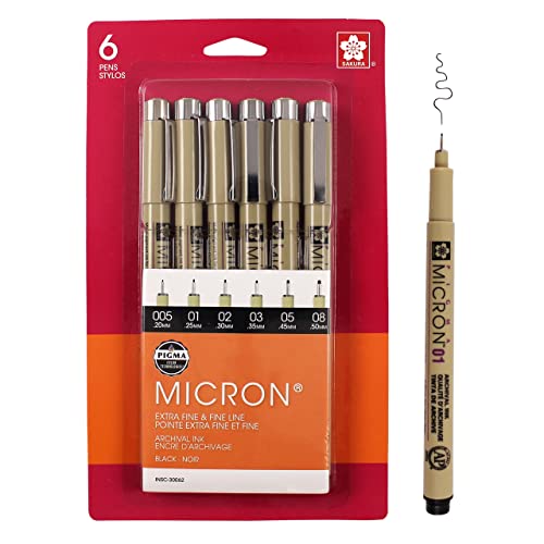
Is this done with only one pen? I would say get pens with different widths. Personally I like sakuras micron pens Get them on amazon- https://www.google.com/url?sa=t&source=web&rct=j&url=https://www.amazon.com/Sakura-Pigma-30062-Micron-Blister/dp/B0008G8G8Y&ved=2ahUKEwjft_Sjkp_kAhVKx1kKHeKeDT0QFjABegQICRAB&usg=AOvVaw0MvEK4W2rXQ9XTTMObAdyf
I would also consider adding more stippling on the steps..
I think for now it would be best to focus on your facial anatomy and your hands. That's two areas I see that need improvement. In the meantime don't worry about color, just try to get your anatomy and proportions correct.
Really you should try to get a proper graphics tablet, if you get a HUION they are pretty cheap, for example: https://www.amazon.com/Graphic-Drawing-Function-Battery-Free-Pressure/dp/B07DPC98DT/ref=sr_1_3?crid=2JNP86XERW7J0&dchild=1&keywords=huion+h610+pro+v2&qid=1603572393&sprefix=HUION+H610+pro%2Caps%2C224&sr=8-3
If you have any questions feel free to dm me!
use a ruler on the legs, one of them is longer than the other, it makes her look more chubby than I think you were going for. If perspective is to blame, make the foreground leg a smidge bigger from the knee down.
collar bone to breast distance looks a little off as well, draw the bones in to get the position correct
I like the pose, I've started drawing anime style as well, its a lot of fun!
You might wanna look into a drawing tablet on amazon, resizing junk in digital is so easy.
Your shading is very good and simple, I like it!
I understand, maybe save up money for some drawing charcoal then? It’s a bit cheaper, if a tiny bit messy, but it’s good for learning how to shade. Also It might be cheaper to buy from an art store than from amazon. If you don’t have access to the perfect tools you can still improve your art, for example a normal pencil is perfectly fine for practicing your line work. Maybe look up cheap ways to do art since y’all are on a budget, there are some creative ways to save money on art. For example one woman painted a watercolor painting entirely with old coffee!
sure thing!
in this book https://www.amazon.com/Carlsons-Guide-Landscape-Painting-Carlson/dp/0486229270 he talks about integrating elements into the scene. I can't find a free version but it's definitely a good book even though it seems kind of old fashioned.
You got this!
Glad to have been of some help!
The book is Mastering Composition by Ian Roberts. I've known about the rule of thirds and the golden ratio, etc. since high school, but this book has made me look at composition in an entirely new light. It's a short read but packed with info and good exercises.
This can't be considered "finished" by the realism standards, you should consider filling the contours with pencil, even if lightly, and if you still have your reference, try to look a little more at it, see how light and shadow behave on its surface. Realism/drawing from life is mainly observation, would be great if you read some books on the subject. keys to drawing and drawing on the right side of the brain are a good place to start. They may help you learn how to hold the pencil correctly, measure effectively, also may show the basics of light and shadow, and perspective.
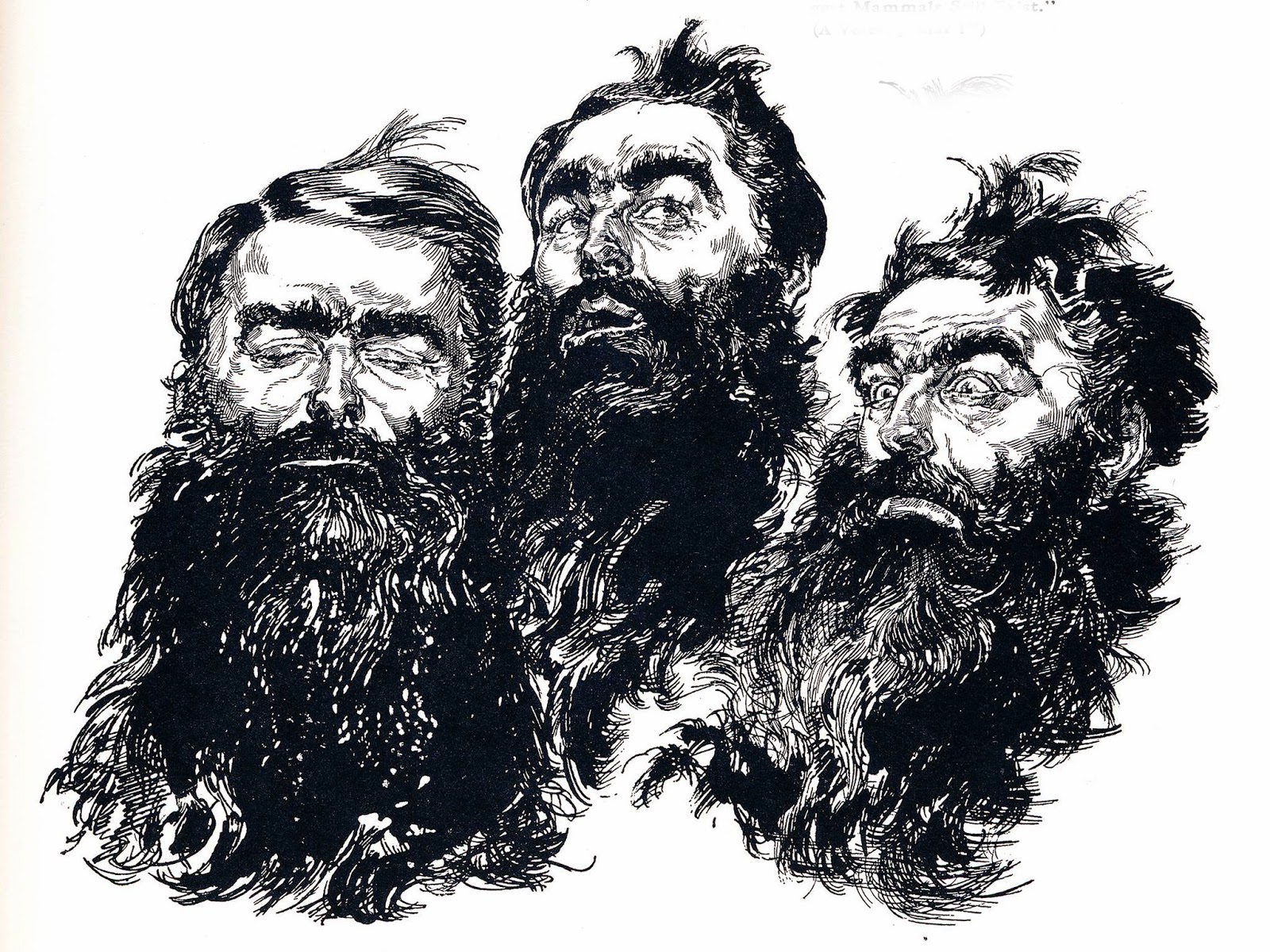
well, I don't really understand what's going on in the neck region, it kind of looks like a pyramid with the head balancing on top. Just for a reference, here's a photo of a boy. Necks usually don't slope to so severe of a point, and the eyes you've drawn are very flat. Those are the two problems that jump out at me, but there are many others. Might I recommend buying a book on drawing, for example fun with a pencil?
For starting to learn to draw on paper (I suggest reading: Keys to Drawing - Bert Dodson), then practice life drawing and still life a lot to build your visual library.
Also, I insist very much on perspective. Because I really am struggling with it, but has been helping me majorly. (A good book is: Perspective Made Easy - Ernst Norling)
As for digital, you can use your smart phone and a stylus. I use sketchbook pro, it kinda feels like photoshop.
Rendering in Pen and Ink is a really good resource. You'll learn a lot in terms of what it means to convey changes in contrast / value, which is at the base of texture, really.
One piece of quick advice is to try and think in shapes rather than lines. That'll force you to approach things differently than how you've been. As an example, maybe challenge yourself to draw a piece as a collection of "x"s. See where that gets you.
I don't have any great links because my learning style is better suited to classes (my local art association has a million affordable classes, check for one near you!), but you could try this one: https://youtu.be/Y5U2KTHD2oY
I hope I linked that right, I'm on mobile at work... ;) I would also suggest the book Drawing on the Right Side of the Brain (I think I have the name right?). You can get an older edition (much cheaper!) and skip buying the workbook, but I highly suggest doing the practice work suggested in the book.
Also if you enjoy drawing, you should invest in some good paper. My preference is using a toothy paper, like lighter weight cold press watercolor paper (mostly I just have a ton of it lying around, lol), but better quality materials are much more fun to work with. You don't have to go crazy on artist quality high end expensive stuff, just try some other things as often as you can until you find something that feels good to you/your hand.
I love Jeno Barcsay's Anatomy for the Artist as a general anatomy resource. I just got Andrew Loomis' Drawing the Head and Hands and love it so far!
Again, this is something that will improve with practice. You have to train yourself to see and interpret the underlying structure rather than the symbols of body parts, if that makes sense.
Great start and good on you for taking the initiative with "Keys to Drawing". If you want to accelerate your progress, get into some life drawing / still life classes. You'll learn a lot from those instructors. If you can't make it to classes, there should be local meetups in your area that you can find. If you can't make those, just keep drawing people in real life.
Just in case, few informations: -I started drawing 2 months ago -First thing I started was practicing over lines and that stuff -Now I'm learning how to draw with Bert Dodson's "Keys to Drawing". -With those small pointers, I marked where I see my own mistakes, so I can use it as a hint in future. -Sadly, I wrote 'em in my language, so not many users will find it useful.
If i were you, id try and study some straight on/ profile views. Try and understand the shapes youre drawing, then move onto the much more difficult 3/4 down view. Andrew Loomis- Fun with a Pencil has some great tricks and ideas to help break down the face in every angle. http://alexhays.com/loomis/ TenorioArt definitely has a great breakdown for your drawing though!
Also get the (man it looks like I'm a shill) Bridgman book "Complete Drawing from Life" which is an anatomy book (IMO the best) but many swear by "Figure Drawing for All It's Worth" by Loomis.
You really only need an anatomy book and maybe a book on perspective to get to a very good level. 99% of drawing books are garbage so don't bother. Time and motivation are everything.
> I think a lot of people get frustrated and give up when they don't have a clear path to follow.
That's exactly my problem. I just don't know what to do. Should I spend a few months purely studying musculature, and how the position of muscle on bone ultimately defines the shape of the limb/body/face? And if so, how? Biology books? Life drawing? Or should I just practice hands, or noses, or ears?
What really got me started thinking about art again was seeing some pictures from an artist I liked a lot back in my late teens - Mark Demsteader. Liked him, forgot about him, 15 years later I see a picture of his and BOOM! "I should really start doing something arty again."
> Drawing on the Right Side of the Brain
I shall look into this.
Thanks for taking the time to comment.
Spend some time following other artists you admire and find out what it is they do and how they learned to do it. Don't follow some drawing lesson just because someone told you to, ask yourself if it's going to take you in the right direction. For example some people find hyper-realism exciting, while others find it incredibly boring. Don't follow a hyper-realist's instructions if it doesn't get you excited. I think a lot of people get frustrated and give up when they don't have a clear path to follow.
Loomis is all about illustration and drawing complex things from imagination, he's not someone I'd follow if I wanted to do landscape paintings or impressionism. If you have trouble with Loomis then you might need to start with something else and come back to him later.
A book like Drawing on the Right Side of the Brain is great for learning to draw what you see, but it's useless for drawing from imagination.
The reason drawing from imagination is so difficult is because you have to be able to draw what you see, then understand light and shadow, perspective, anatomy, color theory, etc.
Excellent! This is a pretty quick tutorial on using planes to define the face: https://www.youtube.com/watch?v=qWLS3fki6oM It's called the Reilly Method.
I also highly recommend Bridgman's Complete Guide to Drawing from Life. Which, apparently is up as a pdf, so you won't even have to buy the book: http://www.pdf-archive.com/2013/10/01/bridgman-s-complete-guide-to-drawing-from-life/bridgman-s-complete-guide-to-drawing-from-life.pdf.
It looks like you're using a "symbols" system of drawing. I'm not sure what your background is as far as teaching yourself how to draw, but one of the common beginner mistakes is using those traditional "shapes" we think of when we talk about noses, mouthes, eyes, etc (like how kids draw a half a triangle for a nose instead of thinking about what a nose actually looks like. I would recommend a few things moving forward:
Look ten times more than you draw. For every one second spent drawing, you should be spending at least ten seconds looking (REALLY looking) at your subject. Look at how the light hits it, and what the shapes really are, the angles, proportions, etc).
Practice drawing upside down. Take a photograph of something you want to draw, flip it upside down, and start copying. It will force you to pay attention to shapes, shadows, contours, and proportion, and shut off that "symbols" system of drawing.
Get yourself this book:
Drawing on the Right Side of the Brain. While definitely not all-encompassing, it's spot-on for beginners, and will really get you THINKING about how to draw correctly, and make you aware of simple mistakes we all make. While there are definitely some better books out there, this one is readily available anywhere.
Good luck, and draw, draw, draw.
It's great that you are practicing drawing people, I can see that you have a grasp on where things should be placed. The most important thing you can do is draw from real life people or photos. Some of these are bordering into the comic/anime style, which is cool, but it's best to learn the realistic versions of people first before stylizing them! Trust me on that! The nose, mouth, and chin appear to be about right in all of these. The eyes appear to be a little stretched and pulled away from the nose too much (especially in #4). The ears are off in all of these. Look at photos. At this angle, most ears are almost 'laid out flat' in a 'half-heart' shape. Hair is all about shading, not lines. See the way you shaded the neck in #4? Do that with sections of hair! See the shadows and highlights in your photo or friend? Copy those! They are real! Lastly, check out these books by Jack Hamm: Drawing the Head and Figure and/or Cartooning the Head and Figure. Good luck!