
What is Reddit's opinion of
Adobe Color CC?
From 3.5 billion Reddit comments
➔ Adobe Color CC website
By popularity on Reddit, this Service is:
100 reviews of this app found across Reddit:
I agree with the other poster about keeping consistent line widths. I also think you should try to simplify the color palette a bit and stick to only those colors (3-6 maybe)m it would give them more consistency and look like they're a part of an actual set. The purple you use in the night sky in one can't be seen in any of the other icons, nor can the gray from the UCB building, etc. Use shade variations on the school colors, or use a site like Adobe Color for inspo.
> d6ce22
I thought it was a hex color code. Which apparently makes a nice amber color
Furries (and honestly everyone) would benefit from knowing how colors work together. For those who just want a cheat sheet of sorts I do recommend adobe's color wheel, it has a mode that shows complimentary colors as well as other pairings (monochromatic for those of you of a single note).
This is a fun little thing. If you guys want more stuff like this check out:
https://color.adobe.com/create/color-wheel/
I use it alllllll the time.
Adobe Kuler has a similar site as well! You can also browse other people's color themes.
Edit: wrong bracket used. hahaha
Here are mine!
I am religious about my color palette. I wear it year-round. I do not under any circumstances buy stuff that doesn't fit. The only thing I'm a tiny bit lax about is that I love the color green and, while my greens are primarily darker (first box in swatch 2), I do sometimes buy and wear more grass or kelly greens.
It makes getting dressed a billion times easier. As I have said in the past with these kinds of posts, I have anxiety and can get overwhelmed by too much choice. Removing a lot of choices has made me so much freer and improved my style significantly. I no longer try to match orange tops with green bottoms (spoiler: I look like puke or a UF fan). Everything matches and everything goes. It's so liberating.
(I made my swatches using Kuler, which is a brilliant tool for this kind of thing!)
So the reason I made something colourful this year was that my first year of art school heavily relied on teaching the basics of shape and colour theory, so I think I can explain what helped me understand colours better.
With this in mind, if you want to apply yellow lighting to a red object, you need to think how much of the lighting is going to control the object, and then mix that amount of lighting with the base amount of colour on the object. Yellow light on a red object would in most cases mean an orange object.
You can see that I did this on Ori's face. I wanted to challenge my colouring skills so I took red/orange and cyan lighting. The colours you see on her face are a smooth scaling of every colour in the spectrum between cyan and red.
So when you want to fade between colours, remember to add in every colour in the weel between the two colours of your choice! :D
(I didn't cover greyscale-to-colour fading here because I don't feel confident enough to use it, but I'll explain what it does next year)
OK well, color is a big part of it. Try the https://color.adobe.com/ site to generate some useful palettes as starting points. You can load an image (map you like) into it to extract the colors used.
After that - you need to think about how it's going to be presented. Power point? Print? Web? Format your work for those different mediums.
Browse the ESRI mapbook galleries: http://www.esri.com/mapmuseum for inspiration.
Try to present your data clearly - don't focus on the base data - this should be there, but not have focus.
Edit to add:
Pay attention to typography - don't use too many fonts. Choose your font based on the overall graphic design for your map - sanserif=modern/contemporary serif=classy, traditional.
https://color.adobe.com/create/color-wheel
​
adobe colour can also help if you've got a colour in mind and want a few ideas about what to pair with it.
Go lighter on the box-shadows. The color scheme @Experience & @Education is not easy on the eyes. (Have a look at color.adobe.com).
Same for @Projects. My suggestion here is to grey-scale the projects and color them on hover. (CSS -> Filter), leave them colored on mobile resolutions, since there's no real hover.
Speed up the scroll animation. It takes waaaay too long for that. Usually 400ms - 700ms is good enough. Currently, I'm waiting seconds(!).
For @Projects & @Education: You could combine them. Left side Education, right side Experience.
Happy New Year!
You want feedback? Fine. All you did was make a pentagon with two in-game character models in it with some dropshadows and halftones in the background. You break the rule of thirds, the universal law of framing, by having both character models face the same way, confusing the eye on where the focal point is. Having them both facing away or towards the focal point allows the eye to travel more naturally. The colors are flat and don't go well together. A lighter red and a more greyish color would be better. Never use pure blacks as it's really hard to get good color schemes with them (I personally use adobe color to get my color schemes just right) The skyforged white contrasts severely with the black of the "logo", with an unnatural look to it. Unless you're working with only pure blacks and whites, never mix them so close like that. The text is bland, a default font that comes on any computer. Don't be afraid to install any new font packs online. There is no color correction with curves/vibrance/HSB so everything looks like it's on seperate ends of the color spectrum.
Nice to see another gooner on Github.
I would recommend choosing a colour scheme that matches your intended ‘minimal’ design.
You can select a group of colours and get the hex codes from: https://color.adobe.com/create/color-wheel
This helps you pick colours that go great together. You can set it to colour harmonies like triad and analogous and it will pick out colours according to the colour harmony. It even gives you the RGB and hexadecimal value.
This guide is crap. There is no guide or legend to indicate what each color means. Red and Blue are listed as the extremes, but then you have violet in between them?
I've been a rainbow-head! Red, pink, blue, purple, more different purple, blue/grey, blue/purple/other purple/pink all at once...but I digress. First off, realise that literally no outfit you wear is going to look "boring" because you have a built-in very eye-catching accessory. In fact, the more basic and minimalist the outfit, the more attention your hair alone will get (and it looks lovely, by the way!)
I found that the best way to really set it off was to wear a white or black top (less stark neutrals - grey, tan, ivory - do seem to tone it down a little). Colorful bottoms can make the outfit a little less "badass superheroine chic" and a little more "happy modern," but plain colors closest to my hair seemed to show it off the best.
Alternately, you can break out the ol' color wheel and choose a palette that includes the colors already in your hair; whether you prefer the analogous, complementary, triad, or other options is up to you. I'd probably still aim to keep the bottoms simple with a colorful top.
10P with 6xSRM2 is stupidly annoying.
Only patterns that look ok IMO are Davion and Steiner. Use a black for the first color, and then bright colors for the other two. Steiner looks ok with black, a blue, and the default orange.
Vagabond looks ok with 2 channels set to camo grey and 1 contrasting color.
When in doubt: https://color.adobe.com
If you missed it, u/not_acatlady posted an Imgur file of color schemes that I thought we're super helpful for inspo. Here is a link to her Imgur post. I hope it helps! Here!
I also use these two links when I'm desperate or have a lot of time to plan a look: HTML Color Mixer and Color Wheel (Also from other redditor's past posts that are too old for me to credit, sorry)
Think about using complimentary, triadic, or analogous colors. Each of these color palettes would be a different vibe, but it's backed by theory. So if you're having a hard time choosing a color, this may help.
Mess around with Adobe Color and I bet you can find something that is cool.
This is accurate.
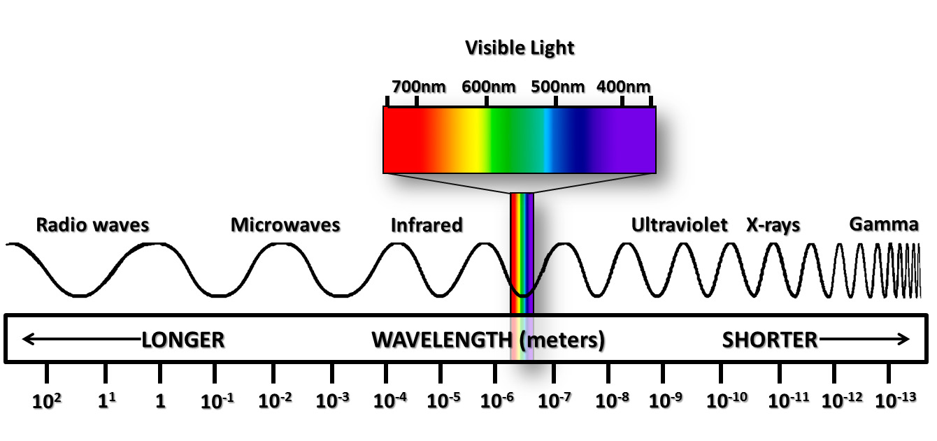
Color is a subjective experience of wavelengths of photons exciting specialized molecular structures.
You can actually see "colors that don't exist."
http://www.ledr.com/colours/magenta.jpg
In this example, your monitor is putting out red light and blue light. Both red light and blue light "exist" in the physical world in the sense that they can represent a stream of photons all with the same wavelength.
"Well what about, say, yellow, or cyan? To make yellow your monitor puts out red light and green light."
True. And it takes advantage of how you only have 3 color receptors to achieve this. But you can also have "pure yellow" light of a single measurable wavelength.
Magenta, as your brain perceives the above image, is rather weird.
Magenta cannot, under any circumstances, be reproduced with light of a single wavelength. Magenta, as a wavelength of photons, does not exist.
Magenta is what happens when you have a mix of red wavelength photons and blue wavelength photons.
As far as the Universe is concerned, the following wavelengths of light exist: http://www.ces.fau.edu/ces/nasa/images/Energy/VisibleLightSpectrum.jpg
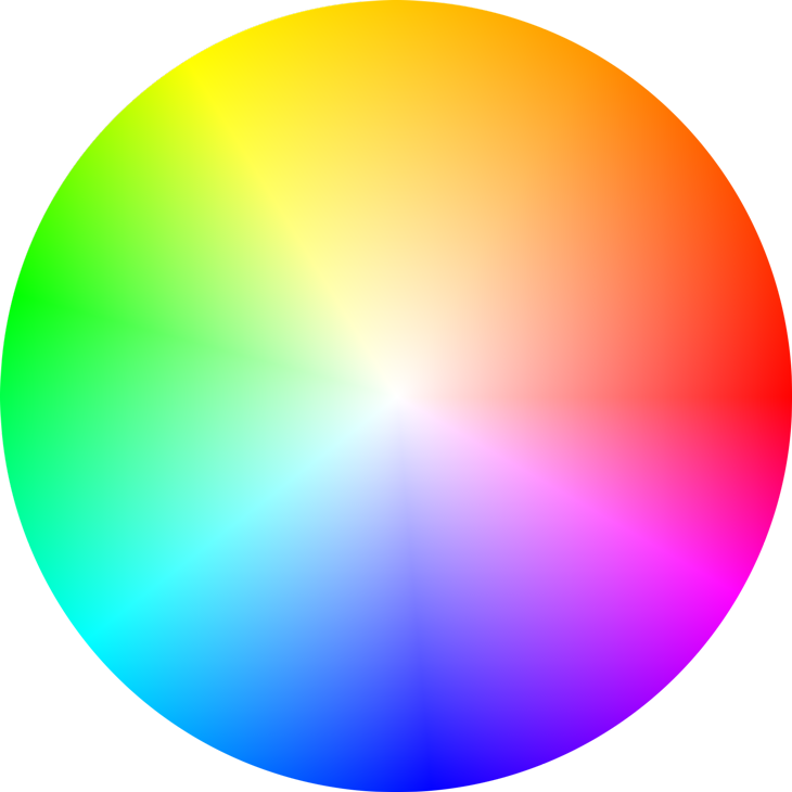
Note how magenta is not present. It doesn't exist. Yellow exists. Cyan exists. Magenta does not exist. The visible wavelength hues start at red and end at violet. Magenta is not included. Your brain, on the other hand, can perceive a continuous color "wheel" which has no endpoints, and "links" the far ends of the spectrum together using magenta, a nonexistent color. https://color.adobe.com/build2.0.0-buildNo/resource/img/kuler/color_wheel_730.png
Let that sink in for a second.
Good design takes just as much time (if not more time) to learn than coding.
I suggest you just copy. Look at common and modern styles here and here. Copy them, tweak them ever so slightly.
Find your colors with the adobe color wheel. Look at the 'Explore' tab for ideas as well.
What's nice is that they usually go with the sponsor color, who's colors can usually be found online with a quick Google search.
I would Google the sponsor colors or use Adobe color to extract the colors from an image you upload.
Despite the previous owners having every color under the sun in this picture, I think with modern furniture you might have to worry a little more about colors clashing with the pink. I'd suggest using a site like this (or really any color palette site) to make sure colors match before buying furniture unless you are strong with color selection yourself. For example, I love the style of the dark green and blue furniture another user posted but I feel like it might clash. A different user suggested light colors and I agree with that -- creams, whites and golds will match well. There's a lot of trendy cream marble with gold accent furniture out there these days that I think would fit.
And this is just my 2 cents but a few people suggested clear plastic chairs. I think anything plastic is going to look cheap in such a fancy room. Sorry to be a hater >.<
It kinda is: color wheel
This is a very useful tool: https://color.adobe.com/create/color-wheel
The best tip I ever got was not to use the whole colour wheel but use a limited palette instead. Also I recommend reading James Gurney's blog and book, he provides lots of easily digestible info on colouring.
I'll disagree. Yellow is a good compliment to all the blue. It cements the plane as the subject in this environment. I get that it's more in the foreground and all, but you've really lucked out with this color pairing, even Kuler agrees: https://color.adobe.com/create/color-wheel/?base=2&rule=Complementary&selected=0&name=My%20Color%20Theme&mode=rgb&rgbvalues=0.05904977533970049,0.13707112930345644,0.7,0.09999999999999998,0.2095548700440758,1,0,0.12172763338230...
CHOICE OF COLORS
How I select my colors for a flag design, of course, depends largely on the background of the place/locale, including its geography, history, and culture. Analysis on such background should as much as possible be highly in-depth that you swerve away from the shallow idea of using blue and green to represent the sky/sea and the land^(reference to /u/artykoma's comment in the July 2015 Workshop).
TINCTURE
Honestly, the concept of tincture only arrived to me firsthand while scanning this post. I've known then that I've thought too leniently against this "rule". Take this work of mine, for instance, which violates the rule by putting metal on metal. It's great that, for the good of this workshop's purpose, /u/jabask brings up the idea of contrast between colors (and fimbriation, too) in the flag, which, for me, enhances resolving power when viewing these colors. To conclude, contrast is what you worry about more than the rule of tincture, which is a fraction of how gnarly tradition is.
SHADES AND TINTS
Simply, I detest the notion of using neon colors for my flag design. (No wonder we do not observe this amongst all national flags but do correct me if I'm wrong with that.) Adoption of a color scheme may bring the design closer to the sense of complementarity amongst the colors used. This eventually brings convenience to how people see that flag. In situations like this and in fundamentally selecting colors, you might want to go to Adobe Kuler or Paletton for that.
Unfortunately, this design is not very good.
There's a lot of colors clashing which mades it very difficult to read. Try to pick colors which are starkly contrasted. I would suggest browsing Adobe Color for assistance with picking a color combination which is pleasing.
On the information side, I'd consider reworking this too. Unfortunately, it doesn't feel balanced at all. Consider switching fonts, making certain text bold (such as your name), etc.
Browse google images/design blogs for inspiration on successful business card designs.
I would also remove the facebook logo next to your name. If it's suggesting that you search for you on there, it doesn't seem like a good idea.
I'm not sure how common your name, but it may not show up first result. They have no reference to what they correct person would be. They also shouldn't they shouldn't just go to your personal account.
The back design with the logo needs some work on the colors as well (whatever new colors you pick, keep the colors consistent throughout the card). I would also consider revising the text. It's difficult to read with that gradient and it looks blurry.
Keep trying! Although this design may not be good, your next one could be stellar. Failures are an important part for anyone mastering a skill.
I could talk open web to you, but something tells me this would fall on deaf ears.
So here's the thing. Leaving almost 10% of the market share overboard doesn't sound like a solid business decision. And that's assuming this app works for Safari.
There are several colour palette web apps/sites (like Colourlovers, Paletton and Adobe Color) that work just fine with Firefox. What's this one's excuse?
Try this for your font/background needs. It gives you a good color palette to work with. Basically, use one of the colors for text, one for background, one for outlines...etc. They go well together.
The colors are terrible, you can't even read the news text on the bottom. I suggest making them less sharp and stinging, also I'd clearly rethink the choice of colors, they're not very pleasant. Maybe this tool can help you find some colors that go well together: https://color.adobe.com/
I might be in the minority but I liked the change to Sims 4 because I had gotten so frustrated with Sims 3's terrible performance. Obviously they took a lot out, but it felt like they did a quality over quantity shift that I wasn't mad at.
The only thing I want them to bring back is the custom color tool. I used to be really meticulous about getting good color combinations. I can't even imagine how great my shit would look now with something like Adobe Color to help me get the right color scheme.
It's mostly preference. Which way looks better to you?
Something I like to do is compare the more apparent colors in my photographs to certain 'color rules'. This is Adobe's color wheel, but there are others that do the same thing. It allows you to see how certain colors can work together or not.
I find that too many colors make a photo too busy and not as fun to view - black and white is a good option here. However, if you have a photo that is dominated by two colors that are near complimentary for example, leaving color is a good option.
But again, it really is preference.
EDIT: Also, sometimes you can somewhat desaturate a photo to give it a more monochromatic feel that can be very beneficial.
I like to use this kel website.. Its amazing for picking colors using known coloring techniques or find presets with explore. I used flower bed color theme for this mirage.
http://i.imgur.com/6afW4iK.jpg
Edit: I'm stupid at formatting.
As I always say: if you want to improve on something have practice, even if it is a simple doodle during class, practice.
Something that also helps is to observe other works, such as speedpaints (there are several on Youtube). It worked for me lol.
There are other things that make up art, like perspective, anatomy, color theory and the list goes around. It’s something you learn over time, but you can search around if you want to dive into these topics.
I use Pinterest to search reference and things like this. And for seach colors I use Adobe Colors and Coolors.co (color schemes generator). So I think I'm done.
I hope I helped you and Go for it!
The old Adobe Kuler, now called Adobe Color. They should still have a native plugin you can use and add it as a palette to Photoshop for free. You can:
•Search color palletes
•Make your own and export them to use on your programs
•Apply rules for your chosen color like Mono, Complementray, Shades/Tints
•Extract color from an image
•Gives you color # for all the major modes (CMYK, RGB, WEB, HSV...)
Clean up the sky, push the blue luminance and sat up a good bit. Correct keystoning, lift shadows (less contrast). Play with the green tone, should be more playful/vibrant. Pull the RGB values from his images and try to match them, Adobe Color is good for that.
Ok so lets start from the bottom here: this is a totally common thing and you are one of many people who are struggling to branch out from the "dull" (although I would use "common" in this case actually) dress. MFA even has a term from it - graduating from basic bastard (BB being the most basic way to dress nicely, easiest to start with).
I'll echo BATCAT in that you need to get over the whole "looking too feminine" or "gay" if you dress differently or "out of the norm". YES people may assume that, how often - depends on where you are and your social comments, NO it doesn't matter.
Now to actual advice - start with colours. Adobe Colour Wheel is a godsend for figuring out good colour combos - go wild on it, find a good combination and get some stuff. Just remember that bright coloured items require backdrop of muted colours everywhere else to really shine. There are exceptions, and once you know the drill you'll be able to combine all bright, but for starters go for something simple.
Prints are another way to go - avoid those "pop culture" stuff like Made By Humans like the plague, but abstract or floral prints are all the rage now. Also consider patterns - microprinted shirts, stripes, etc.
And last but not least - texture. To me, texture is the highest form of outfit construction mastery. You can have amazing contrasts between same colours in different textures, having amazing visual combinations. Really adds dimension to your outfit. In general, there are loads of interesting materials, that may not look much different in the grand scheme of things, but will make all the difference to you in appreciating the pieces and how they fit into your outfit.
It's a creative skill that comes with experience! There is no trick! But, there is a great resource to help you find some awesome color palettes and create your own: https://color.adobe.com/explore/?filter=most-popular&time=month
I like coolors.co myself. You can make random schemes and pick the colors you like and randomize the other coors in the scheme to fit with those ones.
color.adobe.com also has an excellent more technical color scheme generation tool.
Also more iOS specific the Colours Cocoapod has great programatic color scheme generation as well as other great color utilities.
Work on the colors a bit, perhaps pick one of the primary colors from the guidelines. and run it through adobe's color tool to see what matching tones you can find with this. Make your secondary color, whatever you pick, a little more washed out so they aren't competing with each other. I'm not sure what goes well with that royal purple, but its a cool base IMO.
Also, on the edges of the canvas where you have drop shadows, they end before the canvas ends. Run your shape a little more off of the visible canvas area to ensure that your drop shadow runs fully off the canvas and it doesn't stop like you're seeing in your image. (your bottom shadow actually looks correct here)
Your three drop shadows don't seem to match very well. The middle one is darker then the outside ones. I like how they go from big to small, but the opacity of the shadows should reflect that more.
Lastly, you have a bit of opposite symmetry it looks like with the top and bottom pieces the same size, then the two middle pieces similar as well, but if you look at the top right and bottom left corners of the canvas, you can easily see they don't quite line up with each other. They both would probably be ending their shapes right at the corners, or if not, should at least match with each other.
It's a great start though, I think you've got a good grasp on the concept of material design, you just need to work on the fine tuning of it all. Good luck!
Bad color matching. Try this tool: https://color.adobe.com/create and study color theory.
Also, don't tilt. It'll be hard for people to give feedback properly.
I dig the background image though :-)
These are both excellent color-pickers that allows you to situationally pick colors that pair well with each-other.
Well, the first thing that I noticed when I opened the image: colors don't fit. There are some nice tools like Adobe Color (https://color.adobe.com) or you can have a look at Google's Color Scheme (https://material.io/design/color/the-color-system.html#tools-for-picking-colors). Play around with these and you'll find a better solution.
Next thing that screamed at me was that you didn't use a grid. Things are all over the place. Starting from the links in the navigation bar to the elements itself, everything differs in width. I also noticed that you tried to implement a creative element by cutting the corners. But they are all differently cut.
I couldn't say what is clickable and what is not. There is nothing to lead the eye - you're not making clear what you want the user to do. If a user has to think, (which costs energy and can get frustrating) he will rather leave the website if it isn't really important to him.
Headlines, links, text, everything has different styles, sizes, fonts. There is no concept of hierarchy, which is again confusing for the user.
Maybe you can work on these aspects and ask for feedback again. I will have a second look and help you out.
By the way. I don't know if you're planning on coding the website afterwards, but you might want to pay attention to that aspect as well. Some parts of that would be really annoying to realize for the browser. I'm sure you can work something out and the result will be fine in the end. Good luck and keep it up!
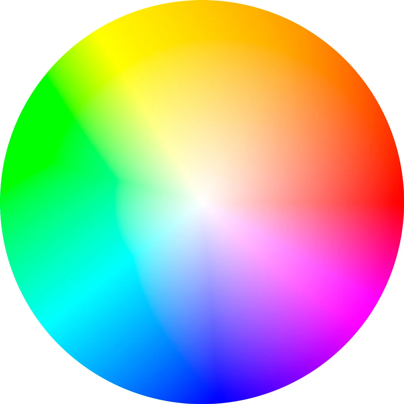
I’ve been going to adobe’s color wheel all the time, which is overkill for many things. But it’s still super useful:
You're in luck, graphic design isn't art. It's communication.
Can you take an idea or concept that's written in words and sketch it out in a visual form? You don't need to be able to draw, just to visualize a concept to make it clear and understandable - drawing is generally left to professional illustrators, a completely separate profession.
Only a select few people are good at both graphic design and illustration. I've been a professional designer for over 30 years now, and the only things I can draw are squares, circles, triangles and stick figures. If you push me you might get me to put wheels on a box and call it a car.
In terms of color choice, that's not even a particularly worthwhile talent any more either. You can literally let Color.Adobe.com pull a complementary palette for you.
The more important skills you'll need to develop as a designer are layout fundamentals (grid, contrast, hierarchy, geometry, balance, white space etc.) and Typography.
So nope, 22 is a fine age to get into design. So is 32, 42, 52, 62, 72...
Sweet! also something to help you with color if you want AdobeCC Wheel
I use this a lot when trying to figure out how to make colors work well with each other.
Also for the top of your trees. you should use the direct selection tool (keyboard shortcut A) the points and Convert -> "selected anchor points to corner". This will get rid of the little twirl at the top.
You can use something like this or this to create the palettes. But first, you'll want to understand which colors are used for each market (usually, a social network and an energy drink site should use completely different palettes, for example) There is a lot written about this on the Internet although I don't remember any specific site right now (it's been a while since I read about that)
Another thing you can do, is to check on the sites that sell complete templates, and copy the palettes from there (if you open the chrome developer tools on any site, you can use a color picker to get the hex codes)
Color wheel! I love to mess with this one. You really can't go wrong with any combinations you pull up there. You've already got some great idea of placements from /u/lightning0027, so I'm not going to go into that. That said - TRANSITION COLOR. oh my god don't forget your transition color. It's what transforms a makeup look, especially one with crazy colors from looking horrible to looking professional. It's what I forgot in high school and made me look like a panda :(
Here's some ideas - you have a bunch of great silvers and blues. I did a look once with mostly silver all over lid, blended into a deep blue outer v, with edges blended out. Blue and orange are also one of my favorite color combos. You can try red panda all over lid with midnight dreary on the lower lashline.
Edit more ideas - I also love doing pink all over eye with green lower lashline. I'll post more as I think of them haha
I had done some color scheme studies as part of an environment design class a few months back.
Complimentary color schemes always work well. A good rule of thumb is to have a lot of similar colors with something different. Think about a ratio of 70/30, where you use the color compliment of the primary color scheme sparingly.
If you need help coming up with color schemes, check out Adobe Color.
Sorry friend. There's not a whole lot of good going on in the poster.
Here: http://imgur.com/WUzcABE
If you want the photoshop file, message me and I'll send it over to you.
Edit: Okay, here's real feedback since you're trying to learn.
Pick a color scheme; keep it simple. Use https://color.adobe.com/explore/
Pick a font. Any font except the one you used. Try something san-sarif for a modern feel. Pick a second font if you want. Or don't.
Choose an image. Outline it. Fill it with a color from your palette.
Figure out hierarchy. What is important? Where do you want your readers' eyes to go?
I suggest you use yellow #FFF100 which is the complementary colour to your purple #5600FF. If you want something different, try green #09B224 which is a triad of your purple.
Cool color tool here.
Can you ask the person who invited you for more details? Is it a very traditional debutante ball or modern? I participated as a debutante in high school - but it was through my church youth group, so expected dress for attendees was more conservative. If it's supposed to be a more modern event, that dress is probably fine.
If you want to accessorize, what you should think is balance.
Starting with color: if you don't know much about color theory and the color wheel, Adobe's Color applet can help. Generally colors opposite the color wheel go with each other; so for that navy dress, a gold/yellow would make it pop. If you'd rather go more muted, try mauve/nude/beige. Charming Charlie is a great place to get cheap accessories, and it's easier to shop b/c they're sorted by color! Bring the dress in to help with your matching, and the employees I've run into seem to know a bit about the specifics of color in regards to accessories.
Other accessories: since the top of the dress is the focal/interesting point, you don't need a lot in that area (stay away from big, heavy, or long necklaces). Longer earrings, smaller purse/bag (a clutch might be nice), lighter/not-bulky shoes (gladiator sandals?)...like I said, balance.
There may be an invitation for guests to dance, but I don't think there's a requirement for you to participate. If you want to dance, someone will probably help/show you the steps. As a lady, you generally let the guy lead, but it should be a lot of fun!
First off, go here https://color.adobe.com/pl/search?q=dark%20cold, find yourself a nice color scheme and apply it. The game will immediately look 1000% better.
> designed to challenge players to use both sides of their brain simultaneously to control two separate player objects.
I like dexterity and puzzle platformers, but this seems more like an idea for a torture (or a diagnostic test) than a game.
I agree with the person above, it seems as if there's like 10 different fonts for different sections, definitely have like at most 3-4 fonts on the site.
I also think it could benefit from some color theory, you should have your thumbnails follow some basic color combos for each ones, right now scrolling down and looking at all the thumbnails they all look very different and messy. Anyway I'm not a design professional and have no education in this shit so take all this with a grain of salt.
For colors and stuff I recommend color.adobe.com
I know there are traditional approaches to generate color palettes but they are limited to a few certain types (color harmony rules) e.g. https://color.adobe.com/ . Idea here is to use the data created by people and go beyond simple generated palettes. Some of data includes palettes from famous playstore apps. I am not sure if there exists some approach other than machine learning for such task.
Adobe has this built into many of its applications, and you can also access it here https://color.adobe.com/create. The trends tab on the website, especially, helps put this into context.
My only issue with this theory is that there should be two big red Xs through the orange and teal shades, with a "fucking stop already" disclaimer below each of them.
I don't understand the point of finding color through using hex number formulas instead of training your eyes with tools such as Adobe's color wheel or something like coolors.co. The hex numbers themselves have never really mattered to me besides some common ones I always use (prefer #f2f2f2 for backgrounds)
Plus you get to pick the exact base color you want and work off of that.
For pure color theory consider using Adobes color wheel
https://color.adobe.com/create/color-wheel/
You can create all kinds of color harmonies starting with a dark red Ruby base. play around with it to see the different color relationships you can make.
In case anyone cares, my approach to automatically generating decent looking palettes was something like this
Pick random number from 0-1. Congrats, you already have one hue
Decide a type of palette to create - complementary, analogous, tetradic, triadic, or something else. Check out Adobe's color tool if you haven't seen it before.
Use Mathf.repeat and add or subtract depending on which type of pallette was determined. For example, since complementary colors are direct opposites you'd add 0.5. Analogous colors could be roughly 30 degrees apart so maybe you'd add .083.
Do this a bunch of times. It's okay to add and subtract like crazy, mathf.repeat has you covered. You're now grabbing hues at specific intervals based on the main hue, just like with the Adobe tool.
Suppose you generated 0.333 as your initial hue. Suppose you want a tetradic palette, so that's a 60 degree variance which ends up being intervals of 0.166.
There's a ton ways to approach this, one idea is to store a bunch of these hue values in an array/list and then randomly choose a couple of them
All that's left is to invoke Color.HSVToRGB
I'm doing this to randomize-yet-correlate the light & fog colors for my (largely procedurally generated) project and it's working really well
If you'd like a contempoary style, which is already present from the photo, a bold coloured rug, perhaps a yellow or orange to match the seat, I would recommend trying to get the colour for the seat and then using something such as Adobe Colour Wheel to match shades.
This said, due to your planters you could get away with a white rug something like sheepskin which is natural and flows with the contemporary vibe along with being VERY nice to lay and walk on, however white will stain much easier!
Remember that less is more and you're killing it with that at the moment! I'd love to use your photo in a blog in the future with your permission.
Both colours are often seen together in nature (tree leaves and bark, earth and grass etc.) and considered fall colours. Plus, they do work in a triad.
Yeah my fellow pal, i suggest you to switch the background color like our good friend Baconberry1 wisely advises
>Nice! Looks good. I think it might be a little more visually compelling if you swap the background colors like this though: http://i.imgur.com/RvYKQXW.jpg
I also would like to give you another piece of advice: you should use a proper font, with more good looking colours, try this.
If we're talking about color scheme generators we have to mention the mother of all online color scheme generators:
Adobe Color (previously known as Adobe Kuler)
There are websites out there that help select a palette. They're generally for computer work with unlimited colors, but you should be able to use them to find close thread colors. They use mathematical formulas to generate related colors that look well together.
Two I know of are:
https://coolors.co/8789c0-45f0df-c2cae8-8380b6-111d4a (press space to generate more)
and
https://color.adobe.com/ For this one you grab the little arm things and drag them around to adjust the colors.
Recall that every complex number has a magnitude and an argument (direction).
The whole complex plane is the input "axis". The output value is given by the color of the coordinate: intensity indicates the magnitude of the result, color indicates the direction (argument).
This works because arguments are angles: they lie on a circle. Similarly, colors can be arranged to lie on a wheel.
Color theory is more about exposure to palettes and context than simple, strict rules.
As has been mentioned before, check out Adobe Kuler, and specifically their most popular section. Take a look and you will start to see commonalities and trends. Think of ways you would use these, or even just what they remind you of.
If sets your brain to think of the context of colors, and will make you think more about them moving forwards.
A good effort if you are just starting out. Here are a few of my thoughts
- Read a basic book on design. Maybe a book like http://www.amazon.com/Non-Designers-Design-Edition-Designers-ebook/dp/B00125MJYM/
- Your site is lacking stuff like alignment, contrast and repetition. Read a basic book and follow it and you site will look so much better.
- Go to a site like https://color.adobe.com/explore/ and pick a color scheme. Your current blue is a bit too harsh.
Hope that helps.
Honestly I don't know. I'm not very artistic in that way, I just know the yellow is screaming. Something more subdued. I just use Adobe Kuler when I need to do something with colors.
It looks muddy. You can't just choose whichever colors you like and assign them randomly. Maybe this will help you https://color.adobe.com/pl/search?q=deep%20ocean. But, honestly, if you care about this game - get someone who understands color grading.
> The idea is kind of that these alien hives act similar to coral reefs
I'll try to say it gently: don't get married to an idea that no one besides you may care about.
It's definitely a good starting point, so very well done. Personally I think it's missing some depth and contrast in the UI. You need to define a more rigid visual heirarchy to differentiate between section/panels.
Your icons introduce too steep a learning curve - they aren't very familiar patterns, so it would be laborious and prone to errors when training users on the system and expecting them to get used to it.
I would introduce some interactions on the modals when they popup - because they appear onclick right away, it can be easy to miss (especially when coupled with the lack of visual heirarchy) - some intro animation could help with this, but also consider a background overlay, and box shadow on the modal itself to focus on the highlighted content.
Overall the colour palette does nothing for me. It's RGB, full red, green, blue etc. with some neutral tints and shades. I think you need to define a proper brand colour palette with a little more subtletly than shown here. Possibly consider consulting some like Kuler, or another palette generator?
Nothing really goes with everything apart from blacks greys and whites. But you can often find a third colour to make two clashing colours work better together and adjusting saturation and the layout on the model can help too.
https://color.adobe.com/create/color-wheel I've used this before when I've needed some inspiration it's similar to this chart in that in follows the same principles but it lets the user pick the colours and it'll recommend that'll go with it.
For a purple car, I would go with purple or a magenta or blue. Try playing around with Adobe's color wheel to get some ideas-- https://color.adobe.com/create/color-wheel
Now that inexpensive LED strips are available, I think its high time for underglow to come back. I bet your buddy's purple Eclipse will look dope as hell.
Here's an idea-- it looks like many of the LED kits available are full RGB. Some of them offer a rainbow effect, which would be kind of cool, but it would be even cooler if you could sync color changes to your music. You could have the system programmed to go through a range of purple colors depending on low frequency sound amplitude. So, as you're driving along playing music, the car's underglow shifts in hue in unison with the bass line of the song. That would be hella fresh.
If you want to do the work to photograph your colors and pull the hex code, there's Adobe's palette tool.
​
I don't think that a tool like that would be as useful as you think it might be though. Miniature paints tend to be multi-pigment mixes and they don't always do exactly what you'd expect the way that single pigment (artists paints) do. And honestly, I've never once found a color wheel to be a useful tool, they're just missing too much information. You're almost always going to be working with colors that are tints and shades that are "off" your wheel and they're going to goober things up because adding black and white isn't accounted for on most color wheels.
As much as I'm shitting on color wheels, that palette tool is really cool though, especially if you don't have a great eye for colors and you need help sorting out what goes with what.
Great tutorial ! For colour schemes, an easy trick is to use complementary colours using a colour wheel like the Adobe kuler for example : https://color.adobe.com/create/color-wheel/ I usually choose a pastel or faded colour for the walls and use a complementary and more vibrant colour for details like cornices and beams... Try to limit your building to two or three colours max, as they say : less is more !!
I've always been curious, since color is a spectrum, parts of this just looks grey to you, right? At what points do the colors fade away, like how far into blue from red does color start to appear? Can you see shades of purple? Sorry if this is rude but I've always been curious how this works
Looks like the original source for this is a colour palette challenge using the adobe colour wheel which is a great online tool for picking colour palettes. https://color.adobe.com/create/color-wheel/
Practice tring "new" edits. Or try to imitate your favourite photographer/cinematographer's edits.
Also helps to use the colour wheel to check which colours go well with each other. Usually people add colours in split toning section or change the hues in the actual individual colours.
There are a couple of issues with this. The first one is that our taxonomy-system (the system which divides stuff into species, races, families etc.) is a bit broken. The reason is that evolution doesn't really just make a new species so that you have species A, B and C.
In reality evolution is much more fluid as species slowly evolve from A to B - but still leaves a lot of cross-species inbetween. So, when do you put down the line? It's a bit like colors: Green and blue are obviously different colors but there are also a lot of colors inbetween - so when do you put down the line and say "these is green colors" and "these are blue colors"?
This has lead to a number of really muddled definitions of races and species but it has always required the taxinomists to find clear differences in the species.
Some of the scientists who worked really hard at dividing the human species into race was the nazi-scientists who made all kinds of assumptions - which you might have guessed ended up being nothing more than racist propaganda.
In reality there aren't really that much of a difference between humans. White people from Scandinavia might look a lot different than the aboriginies from Australia but there isn't really enough to warrant a divide.
There are some online color wheels/scheme pickers that might help a lot. This one is by adobe and you can save it as well. And here is another that you can try out to see which you may like better.
I am not a sports photographer so take this with a whole can of salt, but I'd say that there's three primary things going on.
Shoot with a relatively long focal length to achieve that depth compression of the stadium against the player, BUT also keep aperture relatively high to maintain a large DoF and keep the stadium seats somewhat in focus. You want just a slight blur on the seats but not crazy enough to turn everything into blobs.
Use those powerful stadium lights as hairlighting (have your subject block out one of the stadium lights). Hairlighting always gives things a very cinematic, epic feel. Makes subjects look larger than life, which is what we want here. These players aren't just players. They're god damn warriors.
Red and green are complementary colors and thus pop out when they're against each other. One tool that I love is https://color.adobe.com. This will show you all the different color theories that are commonly used by photographers. Start spotting these colors when you shoot and make them work together to emphasize subjects. I think during postprocess, this guy must have upped saturation on the reds and greens, maybe even adjusted hues to make them more complementary, and then did a slight desat on the other colors.
Anyways, that's just my two cents.
Experience:
A full-time professional web developer. I am not a designer, however I have an eye for what is not right and have worked with multiple grid systems.
Review:
Oddly, you are using bootstrap but many areas of your website are out of alignment.
Your container-fluid class should have a maximum width, that is to say, when you increase the size of the browser, the elements do not stretch all the way to kingdom-come and that the text is legible.
Your website does a poor job of outlining the companies brand. You use purple sparing across the site (Good) but their are too many shades of grey. You can use tools like https://color.adobe.com/ and http://paletton.com/ to help find colour schemes that match brand colours, or create you own.
Your vertical alignment seems off. Spacing between headings look too tight and elements look too close together. Consider making use of margins.
The idea of having space set out on the right hand side of each colour band seems cool when your text is only a few letters long, but think about how it will work when more text is added. I don't think that this design will always work.
While on mobile, the footer looks fine, on desktop, it looks a little scarce. You could add useful things like social links, subscribe form, Google map with address or a contact form to fill out the space.
You have used height: 100% on the banner to make it full-height, but did you also know you can use "100vh"? This means you can remove the html, body 100% hack.
I haven't used bootstrap 4 but it looks like you or bootstrap are making use of CSS variables. This is good but consider the idea that naming your variables after colours such as "--white: #fff;" is not typically a good idea. Consider using something like "brand-primary" or similar.
I'm always happy to help code-wise, so feel free to PM me with your problems.
First off, cool form! This may seem like I'm tearing you apart but I promise I'm not - all with good intentions. Feel free to use/don't use what you will...
The type feels too separate of the image to me. Not so much the band name but the track.
The song title is too large, maybe just switch to small caps and see if that's enough.
The parenthesis around "passion" takes away from the title and the image. It's like having a comma in the, middle of a sentence ;). You can fix this if you change the parenthesis to something a little more unique and form fitting (maybe just thinner?) or choose one name for the title. This will also help with the overall weight issue (too bottom heavy).
Since your main image is balanced, perhaps your type should be too, center it out. Or if you want it more unique then you can have it vertical on the left and right side and it'll hold up that Alien feel a bit more by changing our reading direction. (I say Alien because that's what the type is like right now) you can even have them both facing inward! (Yeah do that)
Side note: I gave your track a listen and this definitely could use some bolder colors - more colors. Have you tried inverting it or playing with curves? If you need some color inspiration here are a few resources to check out:
https://color.adobe.com Colourlovers.com Designspiration.net Iso50.com
I recommend finding a color palette you like and repurposing it. It's not stealing, these are colors and feelings we're talking about.
Great work! I look forward to the final version. :)
Rakarth Flesh, Combination of Druchii Violet and Seraphim Sepia to wash
The Druchii blends with the purple well and makes flesh look palid and contused. The Sepia will add some subtle warmth to help the flesh not clash with the gold.
And then Palid Wych Flesh to highlight.
Here's a good resource for working out complimentary colour pallets https://color.adobe.com/create/color-wheel/
Hey greetings! Already loving the dedication there.
I'm a designer myself, so thought I try to help a bit. Sorry if I make word or grammar mistakes, English isn't my native language. :)
So the color scheme is nice, but hard on the eye. Not something you want to read so often. Neon(ish) colors aren't so great for that.
Dark colors or shades are the best, but you can go with the general reddit style though. Well that is a bit easier than the current one, not by all means better.
In this case I would use the header to represent the topic, not the body itself. Your title and bg colors strain the eye. Also this way the sidebar pops out too much and don't fit.
Maybe I would go with a dark grey tone (night reveries) and put wine colors in the text. Some neutral tones. At least if you wish (understandably) to go with that idea.
My advice is to check this site for inspiration on color schemes.
Make some colors Adobe Kuler https://color.adobe.com
Reference some colors Movies in Color http://moviesincolor.com
Average some colors Colors of Motion http://thecolorsofmotion.com/films
Happy coloring.
Have you ever used an image editing program like Photoshop, where you can have two layers and erase part of the top one to see through it?
That's what's happening. There's a layer of footage, and then another layer on top of it. On the top layer, you tell the computer "erase all green pixels", and now you can see through to the layer below. Make the top layer footage of your human actor and the bottom layer CGI footage of a dragon, boom, magic.
Green is used for a few reasons. Most important is that it's the opposite of pink on the colour wheel, pink being the colour of human skin, so deleting green is the least likely to mess with the actor's skin. Digital camera sensors are also usually twice as sensitive to green as other colours, which helps on picking it up at the edge of shapes. (This is because there are three types of microsensor -- red, green, and blue -- but they're arranged in squares of 4, so one colour is used twice, and it happens to be green.) You can use any colour screen you want if you don't care about that stuff -- if Kermit was the star of your movie you might use a pink screen for example.
Before computers were used for VFX, they were typically blue screens. That was down to some property of film and crystals on the negative that made blue the easiest to wash off, or something like that -- I'm not sure on the details there, before my time.
Hey, tattoo artist here, I saw there wasn't too much constructive criticism so I'll give you some tips.
I know it might sound kind of boring, but reading up on some art theory stuff would really help you out. Obviously art can look however you want it to, but I have found that reading even just about the basics of color theory and the principles of design really helped my artwork. I have been told you need to learn all of the rules, know how to use them, and then learn how to break them.
The owl is really cool, but I would maybe try a few alternate color schemes. It looks like you spend a great deal of time perfecting your work and think with just a few bits of knowledge you could knock it out of the park. I noticed this piece is influenced by tattoo style artwork which is why I decided to reply to this post. Something that can make a huge difference in this style of art is line weight. Things in the foreground having thicker lines and details having thinner lines, and background having no lines.
Another thing that I think might help you after you read about the principles of design is putting contrasting elements in your artwork. One of the most obvious ways to create contrast is with lighting and light sources, another favorite way of creating contrast is using texture, smooth vs detailed (like in the 2nd image)
With your dinos, they are awesome! You use nice contour edges, use these contour edges in everything you do, not just realistic stuff. Sometimes we do things that work, and we don't know exactly why they work. I hope this was helpful, I wouldnt have wasted my time if I didn't think you could do it. Good luck!
Easiest way to find the perfect complimentary colors https://color.adobe.com
https://en.wikipedia.org/wiki/Design_elements_and_principles
Try adding light streaks of light brown/tan to Emi's hair to make it more blonde/light gold rather than yellow.
Also, why is Akira staring into my soul? I feel like she's debating devouring it or not.
Edit: just practice different layers of different colors on a separate paper to get hair colors. Also, look for a good color wheel and, if you don't have a specific color, layers those around it to try to get it.
Hi, i think it's an interesting concept but i have a few problems with it:
precision: you really need to take care of the way things are positioned and spaced. take example 3 and 4 and look at the way r and l almost meet but in the end they don't either sperate them clearly or join them completly. or the way the & is placed in #2 it's squezed into the opening of the color-wheel.
color: i like the concept of the color wheel it's of course not new (Spanish premier fotball league) but hey what is, but as /u/mqken pointed out the palette you are using might be a bit obvious. I still think it's not a bad choice but maybe try some variations. I would also suggest using CC Color, former Adobe Kuler, as an inspiration and/or tool to help you find your right colors: https://color.adobe.com/create/color-wheel/
"claim": i would get rid of that, at least in the current state it does more harm then good. makes the whole thing less logo like. you can always sepereate something like this from the logo itself. no need to combine it.
Just to give you a new perspective i played around with your concept a bit and made a new version:
It's amazing how much can change when you pick the right colours. Use this colour site to help you choose them.
Also have some spacing between some of your inputs (your dropdown box and repeat input are touching) and a submit button will usually go down the bottom of the form, not the top right.
Start here; Find non-clashing colors
edit: Also, the <hr /> tag will give you a 'horizontal rule' so you don't have to type those hyphens out every time.
edit again: You should be indenting your source code.
<html> <head> <title> My Title </title> </head> <body> <p> This is a paragraph </p> </body> </html>
is much nicer than:
<html> <head> <title> My Title </title> </head> <body> <p> This is a paragraph </p> </body> </html>
Tor emove the recycle bin, type 'recycle bin' into windows search, 'show or hide common icons on desktop' should come up, click that, and uncheck the box next to the recycle bin, and hit apply.
For the visualizer, right click on it and click on "- Open Variables" And find the section that has this:
>Color=255,255,255 ; Color of the visualizer bars/monstercat cover in RGB(a). ; Here are the values for the different genres (and black/white): ; ================================== ; EDM=193,193,193 (Default) ; Electro=230,206,0 ; Future Bass=154,152,252 ; Trap=140,15,39 ; House=234,140,0 ; Drumstep=243,33,136 ; Drum & Bass=242,25,4 ; GlitchHop=11,151,87 ; NuDisco=28,171,179 ; HardDance=1,151,0 ; Trance=0,126,231 ; White=255,255,255 ; Black=0,0,0 ; ==================================
Change Color= to whatever you want. I'd recommend using Adobe Kuler to find what color you want, rather than spend time guessing what color.
If you want to be a front end developer then design will always be something that you will have to deal with. Most developers view design as a luxury, but it makes a big difference to the clients. Since clients cannot see your code, they judge the quality of the site by the design. I suggest reading up on typography and white space. Here is a Small Preview.
Bootstrap is a good framework to use because it adds some default best design practices and it makes your font helvetica by default which is one of, if not the most liked fonts.
I personally have a CS degree and can't draw if my life depended on it, but I know some basic rules to follow. Also I will use already made themes and if all else fails I will pay a graphic designer to help me out.
Here are some things that i suggest:
As with everything it takes practice. If you look at your CSS and you're not using a lot of margins, padding, letter-spacing, line-height, font-size and changing the color of the text then it's probably not designed properly.
Piggybacking on this comment, adobe kuler can be a nice tool for those of us with poor sensitivity to color combinations.
First of all. No one is born with "a natural eye for fashion", or a good eye for colors for that matter.
Color matching is actually very easy, and is based around colors creating high contrast in our eyes and therefor is easier to distinguish edges between two colors like this. You probably have seen sort of the same image where the edges becomes blurry, that is low contrast.
So, when you do basic color matching you just pop this page up and just pick a color and go to the opposite side of the circle and find its complementary color.
For more advanced stuff you pick out three colors and try to pick them so that things that creates lines in your outfit either have higher contrast (i.e. further away from each other in the circle) or have no contrast, i.e is tone-in-tone. Things that is not connected can have less contrasty colors.
To arrange things and get a feel of things I use pinterest to create a log of stuff I like. Then I just mount them onto a page in photoshop to get a feel for how it looks, and try to use the simple rules outlined above. At this point I also take texture into account.
I also use pretty simple pattern matching also, which is kind of simple too. If you match same patterns (squares and squares for example), you want different size of the patterns. If you match different patterns, you want the same size of the pattern.