
What are
/r/graphic_design's
favorite Products & Services?
From 3.5 billion Reddit comments
The most popular Products mentioned in /r/graphic_design:


The most popular Services mentioned in /r/graphic_design:
Dribbble
Behance
Google Fonts
Adobe Color CC
Font Squirrel
Inkscape
Unsplash
Shutterstock
COLOURlovers
Adobe Fonts
Codecademy
SkillShare
Freepik
GIMP
Gumroad
The most popular Android Apps mentioned in /r/graphic_design:

Wire Flow Wireframe Design

Relay for reddit

Sync for reddit

Auro

Banded Icon Pack

POP 2.0 - Prototyping on Paper

Glitch! (glitch4ndroid)

BlackPlayer Music Player

Grand Theft Auto: iFruit

Uber

Medium
Iconic: Icon Maker+Logo Design
Golly
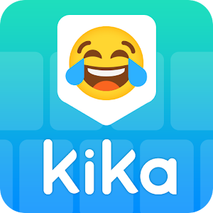
Kika Keyboard - Emoji Keyboard, Emoticon, GIF
Triangulate it!
The most popular reviews in /r/graphic_design:
There's not really an easy way to do it. There are some plug-ins for adobe AE (around 10$), but that's about it.
Processing has a piece of software, where you can apply pixel sorting algorithms to images.
Here's a link for a basic tutorial. I used the ASDF algorithm for my image too. Just started playing around with it about 2 days ago.
Have fun!
I agree with the other poster about keeping consistent line widths. I also think you should try to simplify the color palette a bit and stick to only those colors (3-6 maybe)m it would give them more consistency and look like they're a part of an actual set. The purple you use in the night sky in one can't be seen in any of the other icons, nor can the gray from the UCB building, etc. Use shade variations on the school colors, or use a site like Adobe Color for inspo.
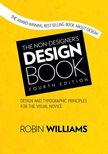
The Non-Designers Design Book. Talks about Contrast, Repetition, Alignment and Proximity. But in very simple terms and is seriously the first book you should pick up when you have a hard time understanding why or where you should place items in a layout which hopefully, is very early in your education. Its a great starting point for learning good practices with layout and organization.
go to openmaps you can hit the 'share' button on the right and download a vector PDF. Open it in illustrator and use the 'select same' tool to remove everything you don't want. Hey presto! you have a scale-able styled map.
I found that when I was looking for design jobs, most required at least a basic understanding of html/css. Even if your job doesn't require you to code, you may end up designing things for web, and it helps to know what's possible/feasible to develop in the timeline you have. You could design something really awesome that's a nightmare to code.
Like you, I focused on print all through my design studies. Learning to code definitely helped me land the job I have now. I do a bit of light coding and enjoy it. It's nice to do something that's strictly logic-based after working on creative projects all day.
I used Treehouse and did their deep dive courses on HTML and CSS.
Dell Ultrasharps are the way to go. I miss mine. I have a HP something or another that's beautiful, but I miss the Dell Ultrasharp...
ALSO, its on sale on Amazon right now for under $500.
https://www.amazon.com/Dell-UltraSharp-27-Inch-LED-Lit-Monitor/dp/B00P0EQD1Q
Every designer should read Robert Bringhurst’s The elements of typographic style at least once a year.
In my freelance work, I take a nod from the book Logo Design Love.
- Learn about the client, identify key words.
- Mind-map those key words to find associations.
- Create at least a dozen different sketches or concepts for that brand.
- Take 3-6, design into grayscale.
- Take the one grayscale model they really like, add colored variants.
I'm certain that that's fairly common.
As for workplace dynamics, read The Seven Habits of Highly Effective People. 99u.com also might have good suggestions.
Yes, and anyone else who wants to make this poster can download it from shutterstock.
Workflow. Workflow is the biggest most important thing. Come with your own, and be prepared to integrate with theirs.
For instance, my coworkers and I heavily use Google products in our workflow. We are all under the same organization and share files across Google Drive. Properly named project and client folders allow us to instantly have access to the right files anywhere anytime, no time wasted on "do you have that file for that one client and can you email it to me or get it on a flash drive and walk it to me?"
Workflow you should think about:
- Photoshop actions.
- Printer and Exporting presets.
- Keyboard shortcuts. checkout this program
- File naming schemas.
- CYA emails after meetings. (To my understanding we discussed "this" and I am responsible to do "this.")
- Font management software. recommend
- Make sure your Adobe window layouts are exactly how you want them.
- If you're coding use a preprocessor and make a database of code tidbits you use all the time.
- For bloody hell name and organize your layers if someone else will ever open that file.
- Every now and then save a new version of your working file. A crash when you haven't saved really sucks, but a corrupted file of the only save you have is heartbreaking. Absolutely. Heartbreaking.
Thinking with Type - Ellen Lupton
Grid Systems in Graphic Design - Josef Müller-Brockman
Interaction of Color - Josef Albers
Explorations in Typography - Carolina DeBartolo
Film Theory and Film Sense - Sergei Eisenstein
u/vvsleo_ look at this set here: https://www.behance.net/gallery/78709259/36-days-of-type-2019
The artist says they used Illustrator to design the letter and [https://www.filterforge.com/](Filter Forge) to create the metallic / chrome effects.
It's good to know; 1. What it is you do. 2. Your target audience. 3. Your competitors / similar things to what you're doing. 4. What makes you unique. 5. Designs / logos that you like the look of.
Although the first 2 things are the most important really, and these are the sort of questions that, in my opinion, the designer should be asking you anyway. If you already have a vision then the best way to get it across is to find stuff that is visually similar to what you want. Brand New and Logo Design Love are really good branding blogs with (mostly) high quality work to look through if you want. Mostly as Brand New does has some bad work on it, but the writer goes into detail about why they think it's bad, and when there's sorts of post it's usually about big brands.
You fancy a large font library and don't use any font management software? For shame. Using OS X's inbuilt font browser is fine for casual use, but when your font library is in hundreds, you want to enable only the ones you're using in the current project.
Otherwise they start to be an actual memory hog not mention programs that render the font list to display each font as they appear.
I use FontExplorer X myself, do your self a favor and give it a run.
ps. also, I believe you can install fonts to Font Book by just dragging 'n dropping.
If Illustrator: Make some text with an ultra condensed font like six caps
Object > Envelope Distort > make with Mesh 7 rows, 1 column.
make a circle with a circumference 4 times the distance of one of the rows of the envelope mesh.
move this reference circle so that the right vertex is on top of the fifth row vertext on the text deform mesh.
deform the next row down to be at the bottom of the reference circle, the handlebars going horisonaly.
deform the next row from that to be at the left of the reference circle, the handle bars going virticaly up.
move the last row up from there and fix the handle bars.
move the reference circle to the other side and do the same.
make it isometric. https://design.tutsplus.com/tutorials/quick-tip-how-to-create-an-isometric-grid-in-less-than-2-minutes--vector-3831
As you'll see there's a bit more to it, and that may not be the best way, but if you can figure out the above, you'll figure out the rest in a better way.
Ellen Lupton's The New Basics and Philip Megg's Megg's History are both essential reading for any designer imo.
First off I'd like to say: do what ever the fuck you want, enjoy it. Don't enjoy it? try out something new.
6 months is nothing, usually you start in the early ages and develop your skills over time, visit schools, go study etc. Especially when you study graphic design you have to work in different fields and explore everything. Which has the benefit that you naturally find out what you like the most. That is hardly doable in 6 months.
So, just do what you enjoy. IMO every field is saturated, a ton of people became graphic designers due to its low entry point. But most of them are shit. If you look online for logo design inspiration you get your usual uninspired stuff where, with some experience, you see its faults. That goes for everything. Good work is always needed, no matter what how saturated something is.
What I saw coming up in the past couple of years is the need of graphic designers that also can code. So frontend. But I probably live in a completely different country then you, so don't take me for granted.
What I can give you on your way is to get your typography skills down. It's the most important aspect of graphic design in my eyes. I've seen the best layouts get ruined by bad typography.
Books to read:
A Type Primer – Typography book
Thinking with Type – Typography book
Elements of Typographic Style – Typography book
Making and breaking the grid – Layout/Grid book
Grid systems – by Josef-Müller Brockmann Layout/Grid book
Those should get you somewhere.
Read a lot.
See a lot (designspiration.org/behance.net/siteinspire.com etc).
Find someone who can mentor you in some way.
And do a shit ton of work. (There are sites out there where you can apply to, they send you fake jobs with a short briefing so you can emulate getting real work e.g.: thirtylogos.com)
Hope that helps in some way, sorry for the not so good english :)
Perhaps you should look at UI (User Interface Design).
"User interface design (UID) or user interface engineering is the design of user interfaces for machines and software, such as computers, home appliances, mobile devices, and other electronic devices, with the focus on maximizing the user experience."
UI provides a great balance of design, psychology and programming, all of which are skills you have. It would be a waste to throw your programming skills away and pursue just web design, you would be shooting yourself in the foot.
It sounds like you already have a great basis of knowledge for that career path, you will draw on your technical skills as well as your elements of your psychology degree in terms of user behaviour.
I work in graphic design primarily but my university thesis was about how UI and UX work in harmony.
Don't listen to people that tell you to get into UI&UX. They don't know what UX really is, theres no design in UX, it's largely market research, A/B testing etc, researching the 'user experience'.
I would suggest reading The Design of Everyday Things by Donald A. Norman as an introduction.
The best part, is that the average salary for an experienced UI designer is $95,000 (Here in Australia at least).
Hope that helps! Happy to answer any questions
EDIT: In terms of getting started if you wanted to pursue this, I would continue to do your normal job for a few months and spend every night reading about UI, and in terms of technical practice I would spend my nights learning how to design web apps, landing pages and other digital elements, you can essentially forget about print based media. Your core programs to learn are; Adobe Illustrator, Adobe Photoshop, Adobe Edge Animate, Adobe Edge Reflow & Dreamweaver.
Check Invision's reading list. It's pretty extensive and has a good variety of books around design
The ones I can personally vouch for from the list:
Just My Type
The Elements of Typographic Style
Thinking with Type
The Design of Everyday Things
The Vignelli Canon
Obey the Giant
Logo Design Love
Don't Make Me Think
Grid Systems in Graphic Design
How To Be a Graphic Designer Without Losing Your Soul
Meggs' History of Graphic Design
Designing Brand Identity
Steal Like An Artist
Other books I can think of from the top of my head:
No more rules: graphic design and postmodernism
Wally Olins. Brand New.: The Shape of Brands to Come
Branding: In Five And A Half Steps
The Medium is the Massage
Ways of Seeing
Looking Closer 4: Critical Writings on Graphic Design (The Whole series is great actually, worth getting all of them)
How to use graphic design to sell things, explain things, make things look better, make people laugh, make people cry, and (every once in a while) change the world
Graphic Design History: A Critical Guide
Milton Glaser: Graphic Design
Looks a lot like this... https://dribbble.com/shots/2580051-Daily-UI-002-Credit-Card-Checkout
Love the style, anyway. Colours are fab, and you've nailed the irreverence of Memphis. My one suggestion would just be to drop the size of the text in the input fields. Type in general looks a bit wonky. Inspiring stuff though. Might give this a crack myself!
Learn HTML & CSS, but beyond that, learn how to compose a usable, HTML email template. Custom emails are something every company will undoubetly want to use and its actually a fairly simple process to create one. Once you have the basics of HTML & CSS down, take a look at the free PDF available here. It will give you AWESOME information on how to develop them for multiple major email clients and make them look super cool in the process.
Nah, they are all sourced from old books. Some sourced from the British Library and others are sourced from old books we bought from charity shops etc, scanned in and retouched.
<Shameless self promotion>
I built a website called LibreStock that allows you to search through many many commercial free not attribution required stock photos:
</Shameless self promotion>
Fair enough, you bring up some good points. Squash and stretch isn't going anywhere - that we can definitely agree on!
I guess I just think these are a bit over done, but maybe I just prefer a more subtle style. Also animations don't always match that companies branding (Googles actual logo animation for instance is very clean and quick, as opposed to this one which bounces around and takes its sweet time)
Not necessarily. It's like asking if a print designer should know how to run a press.
UX focuses around the user experience and usability. Why something should be designed the way it is. For instance...on a door, the type of handle will either influence the user to push or pull. Watch this video that explains that well. A great book to read about this is The Design of Everyday Things by Don Norman. You'll get a clear understanding for UX (it was first published in 1988, so the idea of UX has been around for a very long time).
UI will focus on the design itself. You take the ideas from UX (research, testing, etc) and you make it come to life in way that's pleasant to look at. There are some great applications out there that help a lot. Almost always, the person doing this will have to prototype this design and show that it works and how the interactivity works. They'll do animations to show transitions between two different pages, or the action of a button once it's clicked...you get the idea.
If you can code, great! Most of the time that design will go to a developer who can code it to look just like the designer wanted, with the usability that the UX designer wanted.
Make sense? If anyone has any correction to make to what I said, I'd love to get better knowledge of the process—I'm just a lowly print designer.
Meh, the creative process is different for different people, some may work better with music and some may work better without. I'm not a designer myself, but when I write/code/have a big project I'm working on I feel much more motivated and productive with Rainymood and the Skyrim OST.
It could very well be a product of acclimatisation (I worked well in the past with music playing, so it puts me in "productive work mode"). In fact, I'm sure it has more to do with that than background noise suddenly giving me brilliant writing powers!
Probably worth noting that while an original illustrator created these assets, it's more than likely that the designer who created this display art cobbled it together from stock bits https://www.shutterstock.com/search?searchterm=isometric+house&search_source=base_search_form&language=en&page=1&sort=popular&image_type=vector&measurement=px&safe=true
I'd probably draw the unique stuff that's the focal point of the piece and fill in the background with stock vectors.
Nice work. Would possibly try using a different, less limey palette though but that's just personal preference. You could get a palette from Genji himself or here:
http://www.colourlovers.com/palettes/most-loved/all-time/meta
Also I think the sun could do with being removed or reworked
I currently have (now for 4+ years) the Canon ix6520 although the newer wireless version is the Canon ix6820 and it is incredible! I bought mine when it was $200+ but I guess prices have dropped now.
What I love about it:
It's wider format (I've done 1 2x18" paper easily as well as 4"x6" backto back)
The ink is easy to replace - I buy non OEM inks for cheap on Amazon and they last a loooong time (I printed about 1000 greeting cards without needing to change cartridge at one point)
Maintenance has been incredibly easy
I've used 120# cover in it as well as inkjet photo paper, stickers, and regular 20# printer paper - feeds it well
the quality is GREAT, I've had almost little to no streaking, and if there is usually it's low on ink or the printer head just needs to be realigned which is easy to do on the printer settings.
Cannot recommend highly enough. I run a greeting card business out of my home office and I am literally about to get a second one.
Fraser Davidson taught a SkillShare class that shows how to achieve this (or come remarkably close to it).
It looks like it's done in After Effects, and it looks like a fun class. You can check it out here: http://www.skillshare.com/classes/design/Simple-Character-Animation/1750772942/
Dude is a boss.
I believe its done by printing a word and then scanning back in. While scanning though you drag it around and mess with it and you can get some pretty cool visuals. Simillar piece: https://www.behance.net/gallery/3933743/Dont-answer-the-phone
this guy on dribbble did a Verizon one that I think is a better logo than what they went with. Same concept just executed a hell of a lot better. https://dribbble.com/shots/2229326-Verizon-Rebranding-Me-Pentagram
It's not free but I've been using Skillshare. It's like $5/month and there are tons of classes all taught by industry professionals. I love it! http://www.skillshare.com/
Edit: it is $9.95/month. I remembered incorrectly. Either way, I feel like it's worth every penny.
This is one of three illustrations I made for the onboarding process of a test prep app... That was a mouthful.
Anyhow, I made this piece using Adobe Illustrator and later imported it into Sketch for the screen design. The app is supposed to help high school students prepare for their college examinations (SAT).
I also posted the version with the onboarding text here (in the attachments).
Got a question about it? I'd love to answer it!
If the font license say "free for commercial use" then you can use It how you want It. Usually i have a site that tells me Witch font I Can use and have license free but I dont know if I Can post a link here.
After 2 minutes of research, I'm sorry to tell you I've learned that you cannot legally use the rabbit image as part of your logo.
The rabbit image is part of the stock illustration available here, it's a reversed copy of the upper-right rabbit.
Shutterstock's licensing terms do not allow for their images to be part of a logo, see Part I, restriction 2, line h:
> YOU MAY NOT: Use any Visual Content (in whole or in part) as a trademark, service mark, logo, or other indication of origin, or as part thereof.
Sorry dude, I hope you weren't planning on going public with the logo
Little late to the party, but no one mentioned Hexels.
https://www.marmoset.co/hexels/
Personally, haven't tried it, but it is on my list of software to trial once I have some time freed up for R&D.
You could get her the best design gadget of all, a book!
For $40 you could get one of these:
+ 'How to be a Graphic Designer without losing your soul' by Adrian Shaughnessy
+ 'How to Use Graphic Design to Sell Things, Explain Things, Make Things Look Better, Make People Laugh, Make People Cry, and (every Once in a While) Change the World' by Michael Bierut
+ 'Pretty Much Everything' by Aaron Draplin
+ 'Josef Muller-Brockmann Pioneer of Swiss Graphic Design' by Lars Muller
+ 'A Smile in the Mind' by Beryl McAlhone, David Stuart, Greg Quinton & Nick Asbury
+ 'Make Your Own Luck' by Kate Moross
+ 'In Progress' by Jessica Hische
+ 'Make enemies & gain fans' by Snask
I drew the polygons by hand in Illustrator saved it as an SVG and then used a JavaScript library called TweenMax to animate the individual polys.
Here is the tutorial I used to create the SVG.
https://www.behance.net/gallery/16579635/Low-Poly-Self-Portrait-Tutorial
And here is a CSS Tricks article that walks you through creating the animation.
http://css-tricks.com/polylion/
Good luck if you make one for yourself! Tracing in Illustrator was the most time consuming part.
I've been drafted less than a month ago.
First of all I completed my website and put my best projects in it, I created a Behance profile with the works too and a blog in tumblr where I put my logos, illustrations & websites in 800x600 just like I was on Dribbble.
The obviously next step was putting my best shot on http://draft.im/, it's a great gallery where you can post your shot for a month and dribble players can see it and choose to draft you if they want.
Then browse https://dribbble.com/search?q=invite (on twitter too, who knows!) and send your 3 best shots via email to all the players that have an invite, I did that for 3 days but I've been pretty fortunate to be drafted through draft.im!
Well, no one quoting Tufte? I guess I should then
>Graphical excellence is that which gives to the viewer the greatest number of ideas in the shortest time with the least ink in the smallest space
>- Edward R. Tufte, The Visual Display of Quantitative Information
The Nike Lab instagram is another really good example of a similar technique. They have a few 3-post-wide banners, & they always post in sets of 3 matching posts.
I had a bit of time to spare, so I recreated it. Here's a large image, and the vector file in a pdf. It's worth emailing them to yourself so you don't lose them again, and I'd recommend the vector file for printing really big.
(the font I used is Gadugi, and it's pretty similar to the original but not exactly the same, if you have windows 8 or above, you should already have it on your machine, if you wanted to use it for anything else.)
I would call it pop art, was popular in advertising in the 50s and 60s. Made a popular style by illustrator Andrew Loomis who created a book called "Fun with a Pencil" learned with. The style was kind of resurfaced when The fallout games took inspiration from Rich Uncle Pennybags from Monopoly, who shares this style. To the best of my knowledge, there is no straight name for the style, but pop art was popular with advertising in the 50s and 60s.
I'm definitely not suggesting that your work isn't original. Your stuff looks good man and you have a unique style. If you want to work for a company like Google, then I personally believe that RISD might even just get in the way of something like that!
Google is an IT corporation and are generally looking for clean, commercial work. You're already doing that and if you just keep at it, you're going to be crazy good in a few years. Get familiar with the IT industry (maybe learn a little bit of code) and apply for an internship, you'll get in. Now if you want to work at a company like IDEO, then a RISD degree might be a little more meaningful.
Also, just get into any design program you can. Get really good with the fundamentals, which most people will teach the same. A sound foundation in typography is pretty important for most corporate jobs (buy Thinking with Type and just study it to death). I dunno, just keep doing what you're doing. Your work looks good.
> I just feel like being able to photorealistically render a bowl of fruit in charcoal won't help me get that job. And I guess that's what frustrates me.
That's not what RISD is looking for either. They are looking for good design thinkers. You are very good at making pretty things, which is great for landing a job, but not necessarily what you need to get into RISD.
Trust me, just keep doing what you're doing and you can get a job at a place like Google no doubt. You're on the right track. Your illustrations are rad man, I'd love to see them screen printed on a poster or something.
<em>The Elements of Typographic Style</em> by Robert Bringhurst
I've also ordered Thinking with Type: A Critical Guide for Designers, Writers, Editors, & Students by Ellen Lupton, but can't say anything about the book yet.
I agree. Well this is just a quick reference that I did in a quick jiffy. I could take the time to do one page at a time, but it requires a bit of patience to get it to fit on standard paper sizes.
....so I did it here! There are about 12 Display fonts per 11 x 17 page:
https://drive.google.com/file/d/0B8wiLfKFL7h1UlJhTDVqMEx0cm8/edit?usp=sharing
edit: I added a link to a compilation I did for all of the display fonts for Google Fonts!
Have you heard of f.lux? I use it on my home and work machines for the last two years and it works great for cutting down on eye strain. Also, does a fantastic job of making it so that if I'm on the computer late at night, I get sleepy at the normal times my body should be tired at.
This is fairly similar to Lakeside Sunrise by Louis Coyle. I'm guessing you drew some inspiration from it?
Love the style in any case. Also curious in the choice of Sketch over Illustrator.
Mr Eaves Sans along with Mrs Eaves are my two most used fonts right now. I️ love these two fonts so much that I’m constantly trying to find new ones to use instead.
But theyre just so perfect that I️ go back to them project after project.
Dribbble has its problems. It is a circle jerk, I wish people were more critical. There is a decent amount of people who are just on there for likes and follow, like seriously who has the balls to request someone to follow them (follow me on dribble!) . And I just went threw the process of trying to get an invite, which I finally did. I can tell you you'll get the "like this shot, follow me on dribbble, give me your soul, retweet this, and email me, I might actually look at it" routine. Besides those points dribbble is probably the best option for designs/artists.
Also younger me entered 34 contest on 99designs, when I didn't have respect for myself, I came in second so many times. Never won. 34 ( + all the alterations ) designs made, from logos to websites, all for nothing. Trash.
Since you have a Mac, I'd recommend Affinity Designer. Seriously cheap for what it is, because they want to make a name for themselves.
If you want to play around with something browser based then maybe try Gravit.
No Logo Design Love? The person who compiled this list must have been drunk!
All jokes aside, good post op.
Here are two more exhaustive lists for those interested:
I have a BFA in Graphic Design and I would suggest going online to different schools that offer a Graphic Design Bachelors degree. Usually schools list their graduation requirements, including the titles of courses you would be taking. This can give you a very good idea of the foundational concepts you would learn from a bachelors program.
I highly suggest "Drawing on the Right Side of the Brain" by Betty Edwards. Even if you think you can't draw at all - just Google the ways people have improved after working through that book. Working through it can also just help with creative thinking in general. An art foundation to design is very important.
Anyway, I'm in kind of the opposite boat - I wish I could get a BS in computer science, since I spend most of my day as a UI/UX designer but don't have a formal programming or computer science background. I can program well enough, but I never learned the foundational languages, etc. and it can be very frustrating trying to wrap my head around a completely different way of thinking.
Good luck!
Edit: for spelling
Screen capture with OBS, add the cursor in with After Effects, save our a .mov, import into photoshop, save as gif.
I believe you can leave the cursor on to be recorded in OBS.
Illustrator is good for illustrating. The tools it has are much better suited for "drawing" things where photoshop has tools better suited for photo manipulation. I use illustrator mainly to design logos. The biggest difference for me is that illustrator is vector based and Photoshop is pixel based. Vectors are infinitely scalable and pixels aren't. This means that you can print it/display it any size without any pixelation. When you designed that penguin in Photoshop you only created a penguin the same physical size as your image, if that makes sense. (Here's a really cool graphical breakdown: https://www.behance.net/gallery/25772653/Illustrator-Vs-Photoshop).
Do you own photoshop or are you on creative cloud?
- I just found dafont.com
- I just found dafont.com
- I just found dafont.com
- I just found dafont.com
- I just found dafont.com
- I just found dafont.com
- I just found dafont.com
- I just found dafont.com
You'll really need something bigger and bolder or thinner and fancier. Look at all the different ideas about halfway down this page: https://www.behance.net/gallery/8550121/THE-GREAT-GATSBY
Note that most of these aren't fonts, they are hand made.
I haven't used behance too much, though I know I should more. I really like that it can be a source of inspiration when following others, and a great way to host a portfolio. I know I need to integrate it more in my daily routine and check it like I do Instagram to gain inspiration on the daily.
I think you have a nice range of work. In your Murder by Moonlight feature, I noticed think a couple of photos could have been done without and seemed to be filler. I ran into similar problems when looking through the Meatporn one as well, where some images were just not needed. In general, though, your project photos are nice and show detail where detail is needed.
I might add that you may need to brighten up a few of your photos of your printed products (at least I noticed this in your images from the research document) because they seem a little too dark.
I really like your choice of background and it compliments your work nicely. It creates a nice aesthetic in The Lighthouse and Gaslight.
A$AP Rocky's Instagram is another cool example of this. It's a little jumbled and not as themed these days but if you go back far enough you should see some huge collages.
I personally started with this http://www.skillshare.com/classes/design/Simple-Character-Animation/1750772942
It's a good way to start doing something simple yet rewarding without getting drowned in the menus IMHO.
I don't know if it's still the case but back then you had a free trial week when subscribing (that you can cancel at any moment iirc)
PS : I recommended this course a few times on this sub already and it will soon become suspicious, so I must say that I'm in no way affiliated with the platform or the author of the course nor do I get anything in return for sharing this link. It's just that I found it very easy to make a very satisfying first animation and get my hands on the software and genuinely think this is a good way to get started ;)
P-PS : if you already used flash, it's same same but different (most of the logic is the same but the menus and the way to link objects are quite different and I found it easier to learn from a tutorial than figuring out by myself, trust me, I really tried)
Now days, I rarely hand out any business cards. I dunno, it just feels so impersonal to hand out a piece of paper. But when I do hand one out I usually try to squiggle some illustration or write something on them (always carry a gold marker, and a sharpie with me). The last one I handed out had "Everything is an illusion, but a pretty damn good one" written on it (me and the woman I gave it to had been talking about a similar subject).
Well, enough backstory, here's my cards (and full profile): https://www.behance.net/gallery/16591575/AWIDENTITY
David Airey is legit! His book, Logo Design Love, is incredibly insightful. Not trying to advertise, I just really love his book! It's a great resource for design concepts and learning the process of applying them. Also a handy guide for dealing with clients. His site is great too, tons of great content. Highly recommended for those who don't know already know.
Yes, that's what scares me :D
People are going to tell you to learn programs, watch videos, and copy until you're good. I'll go another way... buy a few books. Anyone can copy, but a good designer knows why they're executing stuff.
Get a book on color theory, a book on layouts, and a book on typography. Off the top of my head Ellen Lupton's "Thinking with Type" is excellent, as is Erik Speikermann's "Stop Stealing Sheep & Find Out How Type Works". "Making and Breaking the Grid" is also a good one. It will cost you less than $30 and give you tons of insight on design execution and why designers do what they do.
Thinking with Type is definitely my favorite typographic resource. Even having read dense stuff like Elements of Typographic Style by Bringhurst, Typographic Systems of Design by Elam, and even lighter stuff like Krause’s The Type Idea Index I keep going back to Lupton as one of the most complete and accessible guides on using type effectively.
Infographics are about taking complex information and presenting it in such a way that it is easy to understand and to make connections. Therefore, you should start with complex information. Find something that you are passionate about, and find a complex dataset that relates to it. Then, think about how you might present that data in a clear and meaningful way.
As far as reading, Edward Tufte is easily the king of this realm. I can't say that I've read any of his work (something I want to do), but he is widely regarded as one of the great thinkers in this field. The Visual Display of Quantitative Information seems like a good starting point.
Thinking with Type by Ellen Lupton
i don't think its as thorough as Robert Bringhurst's book, but i would recommend reading thinking with type first. it gives an amazing overview of type, which should soften your brain up before getting into any real in-depth study.
An Essay on Typography by Eric Gill
this is a great little book from 1931 that goes into oft unexplored aspects of type. its not by any any means similar to Ellen Lupton's book. its more like musings on typography, the effects of industrialized, and the designers role as a craftsman.
I tried making the corners of the E and M bigger.
I also tried reversing the M, but that didn't work out at all. Font is Delicate for anyone wondering.
Please take a look at this as it it a whole project, including packaging and advertisements. It might clear things up :) https://www.behance.net/gallery/26929911/Nurofen-Redesign-Designbridge-Dogs-Bollocks-award
What will your title be within this firm, since you're no longer an intern? Junior Designer? Designer? Looks like the average salary for a Junior Designer in your area is 41k - which converts to an hourly rate of $19.71. That being said - not sure what kind of budget this company has. They might be able to match it, or they might offer you something below that. Usually when I'm negotiating pay, I ask for something a little higher than what I'm looking for. But again, this all depends on how much they're willing to negotiate, and what their approved budget is for your position. I wouldn't bring up whether or not you have a degree - clearly you can do the work, since they've decided to bring you on and discuss pay.
Anyone else having issues with it playing nicely with photoshop? It's not recognising the variations - maybe a naming issue? Any easy fixes?
EDIT - In case anyone has the same issue the only way I found to get around it was to rename the fonts so that PS recognised them all individually. I used typograph which seems kinda crappy but it's free and it worked.
Not exactly on point but there was a pretty cool project I saw either on here or on Behance a while ago that did each country's name in a different style that gave a nod to their culture and history. I can probably find it if interested.
Likely it would be sketched out by hand, then scanned into illustrator and re-drawn.
As for learning how to do it, you'd need to devour a lot of inspiration and then practice a lot. After a while the 'language' of this stuff will fill your mind and start to connect. Just like a musician playing 'freely', once you've hit a certain saturation point, you should be able to create images from you own imagination.
See this guy for inspiration.
Definitely not. I'm using Polymer right now. Polymer is just a way of using webcomponents and the Shadow DOM with polyfills for browsers that don't support it yet. Yes, you can build full apps with Polymer, but that's just because they have a lot of pre-built components you can use that make it possible.
I'm betting SVG / CSS. Here is a cool breakdown of how some of the icon animations are done.
Shutterstock 204686611 Your design looks exactly like the stock image. Why would you want you logo to look like a stock image.
You are asking if copying someones artwork is okay, but at the same time so paranoid about someone stealing your work that you put a water mark on it... I think you can answer your own question.
The old Adobe Kuler, now called Adobe Color. They should still have a native plugin you can use and add it as a palette to Photoshop for free. You can:
•Search color palletes
•Make your own and export them to use on your programs
•Apply rules for your chosen color like Mono, Complementray, Shades/Tints
•Extract color from an image
•Gives you color # for all the major modes (CMYK, RGB, WEB, HSV...)
I found an image of a mountain with fog and made a clipping mask in photoshop over the text. Many amazing HD photos completely 100% royalty free and can be used however you want here.
Ellen Lupton's book is the first recommended reading for my degree I guess thats a place to start will update when I get home and see the full list if you want to know what a uni recommends?
Link to amazon copy: https://www.amazon.co.uk/dp/1568989695/
Make sure you read up on the gestalt Principles, somehow that got glossed over in my education but they're a very important foundation for design. Other than that, I have a little book called The Pocket Universal Principles of Design and it's full of a bunch of different helpful things. And always look at other peoples work, constantly! I have my portfolio on benhance.net and it's so useful for looking at other peoples work.
It might be a bit of a struggle as it will end up too portrait. I would maybe try making this a bit wider if you can.
Maybe you can arch the horns more and make that the 'A' in GOATS. (luckily it is the middle letter so would be symmetrical. And have Annapolis in smaller above.
Here is a link to some examples of college sports teams for more ideas:
https://dribbble.com/search?q=sports+team
I like what you have got so far. In my opinion, I think you need to add more 'points' to the features (similar to the nose and the eyes). And maybe change the stroke profile so it has thicker and thin areas rather than just a consistent stroke width around it all.
I recorded my illustration process from sketch (created in procreate) to final artwork (all created in Illustrator) in the hope it would help people/would spark some discussion on how we do these sort of things and exchange tips or comments.
The final is here - this is going to be used as a hero for a car cost calculator in the future, so we wanted something swish. Do you guys work the same way? Funnily when I take it from the sketch I actually start to use a mouse over a tablet...
This is a very misleading headline and article. The logo is not a revamp of the New York Times Logo, it is a logo for Times Video.
For the icons above and these [incredible icons](https://www.behance.net/gallery/5890873/iOS-App-Icons} (same artist), how do you achieve such a realistic, beautiful texture,lighting, coloring effect?
Most notable for me are: leather texture on book icon, bubbles in coffee mug icon, lighting/texture on boxing glove icon. Are these gradient mesh or some 3D program? No idea how to achieve this
Just adding Razer Deathadder (on a cloth pad) to that list. It's the best mouse I've ever used for design.
Edit: I should add that if you're on a mac, use the SteerMouse driver with this mouse, not the Razer driver.
Coolors is a good site for choosing colour palettes. User generated swatches that have 5 in each, just keep pressing spacebar until you come across ones that you like. If you register an account you can save the swatches that you like.
In case you're still curious about it, the effect in the image you posted is not made using polar coordinates. It is a stereographic projection of a panoramic image.
This is visually similar to the polar coordinate method, but using polar coordinates creates a circular image with a hole in the middle. Stereographic projection creates a square image that covers the entire 360 degree x 180 degrees of the panorama.
Here is a link with more information about different kinds of projections.
You're in luck, graphic design isn't art. It's communication.
Can you take an idea or concept that's written in words and sketch it out in a visual form? You don't need to be able to draw, just to visualize a concept to make it clear and understandable - drawing is generally left to professional illustrators, a completely separate profession.
Only a select few people are good at both graphic design and illustration. I've been a professional designer for over 30 years now, and the only things I can draw are squares, circles, triangles and stick figures. If you push me you might get me to put wheels on a box and call it a car.
In terms of color choice, that's not even a particularly worthwhile talent any more either. You can literally let Color.Adobe.com pull a complementary palette for you.
The more important skills you'll need to develop as a designer are layout fundamentals (grid, contrast, hierarchy, geometry, balance, white space etc.) and Typography.
So nope, 22 is a fine age to get into design. So is 32, 42, 52, 62, 72...
Seconded. $50 will get you a month's access to all the Adobe programs. If you are a student, $30 a month. I switched from a standard Production Premium license to Creative Cloud.
That said, there are cheap(er) alternatives out there. Vollol already mentioned the main open source applications.
CorelDraw is cheaper than Illustrator for vector work, about $200. If you are on a Mac, I've heard Pixelmator (http://www.pixelmator.com/, $30) is OK as a Photoshop clone.
I'm not saying these are completely equivalent (there is a ton of depth to the aforementioned Adobe programs), but you could make a professional looking flyer with them.
/u/d0ged is correct. Also, professional logos usually have smoother cleaner lines. Gimp is a fine tool for illustration and light photo editing, but you should probably be working in vector for logos. If you're looking for FOSS, check out https://inkscape.org/
Alphons Mucha's Job rolling papers(?) ad strikes me as one of the first times someone tried to merge fine art with advertising. It's certainly amongst the most iconic examples.
I can’t recommend Müller-Brockmann’s “Grid Systems” enough, especially if you find yourself drawn to Swiss layout and typography.
Please take a look at this as it it a whole project, including packaging and advertisements. It might clear things up :) https://www.behance.net/gallery/26929911/Nurofen-Redesign-Designbridge-Dogs-Bollocks-award
I use NexusFont for PC (not sure if they have a Mac version), and really like it. It does exactly what you are describing. I only keep about 25 "standard" fonts (i.e. Times, Arial...) installed at all times. The rest of my font collection is kept separately.
NexusFont allows you to create Groups and Sets (admittedly there is no clear difference between the two). Personally I use Groups for more general categories, like "All grunge fonts" or "Dingbats". Then I use Sets for projects, like "Web design for Company X"
You can also customize the example text when you are browsing through your font collection so you'll be able to see exactly how a font would look for what you are doing.
I have a few others. One for video game Destiny and one for an indie game called That Dragon Cancer
https://www.behance.net/search?content=projects&user_tags=993255 http://99designs.com/designer-blog/2012/12/19/presenting-the-winners-of-the-brand-yourself-contest/ Some examples, some good, some kind of bad.
I would think it is a good idea to self-brand because you are inherently showing your skills by offering up a solution to a somewhat daunting problem. You are also communicating qualities about yourself in the process.
I really do not understand what your professor was saying. It seems like it was lost in translation. He/She may have some valid points if there were more elaboration.
I would have both; a plain old-fashioned resume and a snazzy personalized well designed resume with some kind of brand identity.
If you're still small I would wait and just claim whatever amount you make for tax purposes at the end of the year, it's by no means necessary but I know there's people on here that will beg to differ. As for the domain name, I bought mine for $15 per year off GoDaddy.com and just pay for that out of pocket. Obviously you'd be able to charge that as a business expense once you do go the LLC route but it's a pretty paltry sum for now.
Best way to showcase your code and website for this sort of thing is definitely Github. Github pages, specifically.
If this is the only thing you've made, though, I'd say it's too simple, and it's just... not well done. Looking at your code you don't even seem to understand how header and paragraph tags work, which I would categorize as "basic knowledge." All your paragraphs have the same size text, all your headers have the same size text. <p2>, <p3>, and <p4> tags don't exist. You should just repeat <p> each time, same with the headers. <h1>, <h2> etc are generally used for different size headers (<h1> for title and <h2> for subtitle, for example), not as counters for which header they are on the page. You can repeat them. And then in your css you can just style them once, rather than repeating the same information in 10 different places. And I'm just going to leave it there, for now..
But! That being said. Keep making stuff! If you're enjoying it, it's a great skill to have. You've taken one class, don't worry too much about not having these things down yet. Do you need to be able to say you know these things on your CV today, or do you have time to keep working on your skills for a while?
It's really hard to say what exactly is enough to claim knowledge. Why not say you've taken a class? Or show people what you've made so they can see your level first-hand?
Hi Adriano! My most used webfont is probably roboto. I like that is has a really solid sans serif style but also a slab serif version that works great in certain headlines.