
What is Reddit's opinion of
Font Squirrel?
From 3.5 billion Reddit comments
100 reviews of this app found across Reddit:
Details
- Get the conky here
- Needs Helsinki font
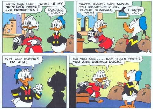
- I made the comic panel using GIMP.. so here is the XCF
- The superhero pictures I got by DuckDuckGoing.
Stan Lee was not dead
He just became The One Above All
Edit Delayed my-last-post. It takes more efforts than I thought.
Edit Again
FAQ
> Q : How did you slice those images like that in GIMP
> A : GIMP has no slice tool like photoshop. So, a bit tricky.
- Create comic-panel-frame with rectangle tool, paint bucket tool, & rotate tool several times
- Merge them all
- Open a superhero picture as layer (Ctrl+Alt+O).
- Swith layer to the comic-panel-frame layer
- Use fuzzy selection tool to select a column in comic-panel-frame layer
- When the selection still active, switch layer to superhero picture
- Menu > Layer > Crop to selection
- Menu > Selection > Invert (or Ctrl + I)
- Menu > Layer > Add alpha channel
- Erase tool (Shift + E)
- Then erase the unecessary part of the superhero picture
- Repeat that step for every superhero pictures
Alternative title: I hate Snake Plant and Ascension 17, upvotes to the left.
Minor edit of the Council of Ghosts because I recently found what the StS font is (It's called Kreon and can be found for free here).
Bonus Living Wall edit for when your discord members want change.
FontSquirrel has it. I haven't utilized it too much yet, but some of the glyphs are really harsh - sharp edges and less-rounded corners than you might expect. I haven't tried the Mono version as a screen font, but that might be where its value is.
Neue Helvetica Neue it isn't.
If Illustrator: Make some text with an ultra condensed font like six caps
Object > Envelope Distort > make with Mesh 7 rows, 1 column.
make a circle with a circumference 4 times the distance of one of the rows of the envelope mesh.
move this reference circle so that the right vertex is on top of the fifth row vertext on the text deform mesh.
deform the next row down to be at the bottom of the reference circle, the handlebars going horisonaly.
deform the next row from that to be at the left of the reference circle, the handle bars going virticaly up.
move the last row up from there and fix the handle bars.
move the reference circle to the other side and do the same.
make it isometric. https://design.tutsplus.com/tutorials/quick-tip-how-to-create-an-isometric-grid-in-less-than-2-minutes--vector-3831
As you'll see there's a bit more to it, and that may not be the best way, but if you can figure out the above, you'll figure out the rest in a better way.
Hey, glad it helped! Unfortunately not; I've been out of the graphics/video editing world for a while.
I do have a suggestion though: take a look at YouTube channels that you like the look of, take a screenshot of their font, and use a font detector like this to figure out what they're using.
No one will judge you if you steal a font idea or two!
Check these out:
Font matches for "ROCKET"
Font matches for "LEAGUE"
From what I can tell, they're possibly two different fonts. Just go to those links and scroll down to see the closest matches.
Oof. None of the above. Hit up Font Squirrel or Lost Type co for some better fonts. They are free. These seem over stylized and in my opinion that is when stuff starts to look cheap-o
Thanks! I really appreciate that (*^ ω ^*)
If you're curious the font I use is called "Komika Hand" and you can find it available for free here, I use it for almost all my posts.
If I'm being honest though the one thing that's bothering me is that the tail and ears don't match in color, I totally overlooked it and now it's just all I can notice (*μ_μ)
Another year, another test! Seems like despite the girls' best efforts to stay on top of things, Mori-sensei and the rest of the teachers always win in the end! Douzo!
.ass file for your own personal copies. I suggest you take a look at the comments in the file for no reason whatsoever.
Lato font for the subs file if you don't already have it on your computer.
Special thanks to /u/jarringjade and /u/kaigaifukei for helping me out with editing and proofreading!
As /u/twitchveygrr said it may be handwritten, but if it is a font it isn't anything I found. I did find this font which seems to emulate it pretty closely. Here it is in the comic. Something else to consider is that the kinda poorly put together, completely different font aesthetic of these kind of memes might add to their value rather than retract from it (like /u/JustinML99 said).
Yeah, which makes it all the more horrible that this image has used comic sans for Hanako's words.
"Playtime with Hot Toddies", folks.
Download your font. Open FontExplorerX if you need to locate the font. Sometimes the font will be given a non descript name like 12323eee.ttf or some crap in your file system. FontExplorer will list the actual name and point you to the correct file.
Then, open the file inFontForge. Start going through the options, stripping out glyphs you don't want/need. Make sure you rename the font to note that it is an edited variant. Dont mess with any of the letter spacing, and avoid messing with any of the ligatures (if the font has them) as that can jack up letter spacing. When you have what you need, export and use. You can also combine paired font families into a single pack in Font Forge if you desire. Like, maybe you want to use a different italics family for the italics variant (I do this with my IDE so that my comments are made using Operators script font while the main code uses Fira Code).
Then, I use fontsquirrel to generate my local font embeds which I then drop into my CSS.
That document was put together in a very old (but very well-respected) system called Latex which is still commonly used in science and academia, but rarely outside of those circles.
It predates most of what we now think of as document creation and management software (i.e. Microsoft Office), and so works very differently - including the fonts it supports.
If you’re struggling to install it, try this version: https://www.fontsquirrel.com/fonts/computer-modern
Cursive? Long and complicated backstory, but I'm working on a personal cursive mostly based on American Scribe Regular (based on the character forms used in the Declaration of Independence) with elements from England Hand DB (based on an earlier English Roundhand). Both of these in their original form were written with quill pens, but fountain pens (especially with a bit of flex) do an adequate job for me. Consider them to be an approximation of Copperplate written with a 'normal' pen. These days Copperplate seems to be (1) reserved for calligraphy, and (2) written with an offset dip pen.
Hope this helps.
If the font license say "free for commercial use" then you can use It how you want It. Usually i have a site that tells me Witch font I Can use and have license free but I dont know if I Can post a link here.
Depends on what it's being used for. For fun things, I like Lobster. For more serious documents, Poor Richard is very nice.
Here are links to download the fonts: https://www.fontsquirrel.com/fonts/ProFontWindows https://www.fontsquirrel.com/fonts/MomsTypewriter https://www.fontsquirrel.com/fonts/impact-label Hope this is useful!
I would add Font Squirrel as well, which is a handpicked collection of fonts available for free. Also, there's a project called Typewolf, from a guy named Jeremiah Shoaf, that reviews fonts over the web, and has created a list of free alternatives to famous fonts. It's a great, great site about type.
I think u/elzadra1 is right about it being custom. Matcherator has some with similar feels, though, if that points you in the right direction.
https://www.fontsquirrel.com/matcherator?token=tmtrf1fhpfxxdymq
Note that Microsoft specifically commissioned Selawik as a open font to distribute with Electron applications because they couldn't distribute Segoe like that.
They love Electron for some unknown reason, and that requires distributing the full font file for included fonts, so give them some time and they'll have more fonts for electron projects.
Also, Android didn't crush Windows Mobile; Android and iOS got to the Jobs-style smartphone market first and there was no room for Windows Mobile to even try to enter.
White text with a black outline, some of that was hard to read because of how light everything is in the scene
Well, is it necessary for it to be exactly the same font as on another book? For example, if I check on https://www.fontsquirrel.com under the tag Calligraphic (tag, not classification) or Elegant I'm usually quite happy with what I find.
I can't tell you the name of this font, but a font, very similar to this one, is called "this". It's free so you can't go wrong with it.
Hi!
I can totally help with this. My indesign files got corrupted pretty much immediately after publishing those cards, but I should have my fonts saved somewhere. I'll get back to you tonight!
Edit: I found an old HDD with a backup! I'm actually reworking them to include the complete SRD spells now, but if you want to match the style in the meantime, the body fonts are PT Sans (6pt), the other font is Marker Felt (12pt header, 28pt number, 7pt class name in banner, 6pt book name in page number pointer, 12pt page number)
I ran it through a font ID site. This link might work to see the results: https://www.fontsquirrel.com/matcherator?token=7c22lnghyjwcscz2
Most similar to my eye:
- Exo Soft Bold
- Core Sans M 65 Bold
- Galapogos BRK Normal
au contraire - there are 36 different styles available for free from the designer. Download them here for use in desktop/print projects, or with CSS @font-face to self-host the weights/styles you want (look up Fontie Webfont Generator if you need help converting OTF into all the formats for @font-face).
Edit: poor reading comprehension on my part - OP was referring to Varela Round, not Montserrat. Derp. Thanks /u/_poptart
Do you mean Charis SIL? It looks fine to me; there are some specimens here.
I never particularly liked Gulliver, and its licensing terms are amusing:
> Gulliver is available exclusively to organisations and companies whose printing work will do justice to its space-saving capabilities... To guarantee Gulliver’s exclusivity, no more than 100 licences will be issued worldwide. Licensees automatically become members of the Gulliver Club.
Aren't you jealous you aren't a member of a font club? Think of the benefits! Exclusive airport font lounges, typesetting concierge services, free copies of The Elements of Typographic Style...
Interest!
But could you use a more comic-friendly font? Not sure which one of these fonts is the closest to the font used in the speech bubbles here, maybe the VTC Letterer Pro.
I have spent probably waaaaaay too much time on sites like fontsquirrel and DaFont looking at fonts. You need to pay close attention to the licenses, but there are a lot of ones that are 100% free for commercial use. I include the fonts I use in the credits, of course.
As an aside, you can probably do better than Arial! Choosing a font is a great opportunity to express the individual aesthetic of your game. It doesn't have to be fancy -- there's a lot of really solid basic sans-serifs that can still add a unique flair to your game.
I downloaded this font and did exactly as the instruction says, and it works.
Here are what I've done:
- download the font named bell_mtbold;
- open the link https://www.fontsquirrel.com/tools/webfont-generator ;
- select `upload fonts` and uploaded the font file(.tff);
- select EXPERT... and choose `Base64 Encode`, checked agreement and hit `download your kit`;
- open the zip file and open the stylesheet.css;
- copy all the content and paste in a new tiddler in your tiddlywiki, rename it to bell_mtbold(name it as you want, it doesn't matter);
- add a tag `$:/tags/Stylesheet` to this tiddler;
- choose the tiddler type `text/plain`;
- save this tiddler and reload the wiki;
- open control panel - Appearance - Theme Tweaks like I said above, and add a `bell_mtbold`(like your tiddler name just added or add single quotation marks if there are spaces) to the start of the content (like `bell_mtbold, system-ui, -apple-system, ...`);
- you will see your wiki changes the font immediately.
Hope this will help. Enjoy your journal in the brilliant TiddlyWiki!
The best collections of free fonts out there are Google Fonts and Font Squirrel. You'll find there's a lot of overlap between the two.
You don't have to get anything special for a Mac. Most fonts will be either a .ttf or .otf file, both of which you can simply open and install on macOS, as well Windows and other operating systems.
I tried using this site, not sure how accurite it is.
Says that Strato Pro BlackMostardesign is the one that matches the most, but feel free to try it yourself
I think the font on the shirt is Peixe Frito. I used the font squirrel font identifier and then checked it with dafont.com. The font in the second image looks like some typewriter style font
It's become normal, because alot of front end devs are lazy and use plugins for everything or aren't technically adept to do anything beyond changing colors in CSS.
You do not need Google fonts to get custom fonts on a website. You can easily embed the font with a little CSS and load it directly from your webspace: https://www.w3schools.com/css/css3_fonts.asp
Not sure how to get a font file? Create one! https://www.fontsquirrel.com/tools/webfont-generator
Sure. Just look for instance at other games. Prime example here being Neko Atsume: Kitty Collector. Now of course, your two games are very different. But this is about the interface.
Your game uses a cartoon-y style, mostly. The interface elements, in this case level and time at the bottom of the screen, are just drawn with a completely unrelated font. The font you are using (which I am guessing is Palatino Linotype, but I could be wrong) is not the right font to use. If you're cartoon-y, think of something like Cartwheel or Helsinki. Also, the black of the text doesn't match the rest of the game. Maybe mix a hint of green in there and give it a black stroke for better visibility. All that would make the game (in my opinion at least) far more enjoyable to look at.
EDIT: Also, maybe update your app icon. It doesn't really match the android guidelines.
EDIT RELOADED: I just turned sound on and found out that you might be even better off if you'd change the style from cartoon to Retro. It could really benefit you.
https://www.fontsquirrel.com/matcherator?token=wde2rspajg4buuqi
This gives me "Baufra Bold". It's close but not exact, the 'N' for example has some overspill in the image.
Hi there!
I don’t don’t recognize it off the top of my head, but there are some websites created to serve this purpose! Try What The Font or the Font Identifier, and see what shows up :)
I’d try for you because I’m now dying of curiousity lol, but I’m on my phone.
Good luck!
I used this https://www.fontsquirrel.com/matcherator
Is fun because you can use it on anything and it's super accurate! And if you want to sound like a snob you can take pictures of store signs and be like, ugh... Papyrus? That's so 2007.
Similar (or maybe the same?). It's called Chinese Rocks. It's free: https://www.fontsquirrel.com/fonts/chinese-rocks
I've used it because it is very similar to the style Saul Bass was using for his posters!
I literally searched for "Exo font" and both the first and second link include the license terms for the font.
You're probably fine for commercial use.
Using some online resources, looks like it's 'Brock Pro', the medium/regular size, not light or heavy. Here is what I used: Link. If the link didnt work, all I did was uploaded the text to fontsquirrel to identify it.
The closest FontSquirrel came up with isYoung doesn't have the little flick Oki the bottom of the 'f' though.
Sure, it's Luxi Mono. I used to go with Ubuntu Mono but eventually switched over to Luxi. It's a great, great font!
Kinda reminds me of writing tons of Delphi code in Courier, which I think was Borland's default font back in the day :D
Hope that helps you out :)
Blank cards can be found here: https://www.reddit.com/r/inscryption/comments/qu0sgd/some_blank_cards_of_every_kind_for_custom_card/?utm_source=share&utm_medium=ios_app&utm_name=iossmf
Font for the text and numbers can be found here: https://www.fontsquirrel.com/fonts/heavyweight
Most drawing portraits are just pixel art in black and a transparent black.
And sigils can probably be found somewhere on this subreddit.
This can all be put together in any free drawing (photoshop-esque) program. Recommend gimp for drawing.
That’s about everything you need.
SIL Open Font License v1.10 This license can also be found at this permalink: https://www.fontsquirrel.com/license/Titillium
Copyright (c) 2008-2010, Accademia di Belle Arti di Urbino (www.campivisivi.net|[email protected]), with Reserved Font Name Titillium.
Typefaces at that time did not exactly have names. It's quite an academic question to dig into where this book was printed, whose types would likely have been used by that printer, and so on. Is that your question?
If you want something you can use to reproduce a similar look, Igino Marini's IM Fell types are completely free and are a good place to start.
If you don't find it... I've used this quite a bit with good success. There are a few other similar tools out there
https://www.fontsquirrel.com/matcherator
Edit, for those curious but not enough to check it out: You upload an image and it picks out the text (you correct it if it guesses letters wrong), then it searches for similar fonts.
Ooh thank you!!
Also, I’m a graphic designer and work with random fonts all the time. There are actual font identification tools out there that you can use for free! Obviously getting the info straight from the source is best but when you’re in a pinch, there’s a tool for that!
In case you were wondering, Bionicle (and about half of all movies from the '00s) use a variant of the Trajan typeface in their logo. If you're looking to make something with a similar typeface for free, though, consider Cinzel.
This image has made its way around the crafting community for months; many folks have suggested similar options, but I haven't seen it positively identified yet. Empire State Gothic looks like the closest, but isn't an exact match.
Here's a collection of tall, skinny caps fonts at Dafont. Most of these are free for personal use.
I also like Amatic Bold, a popular freebie, for this.
I found the issue and got it working. Browsers don't render all the same font file types, and Chrome wasn't rendering TTF. I went to https://www.fontsquirrel.com/tools/webfont-generator and generated the woff and woff2 files from their free generator. I renamed them to match the naming standard you had (After-Shock.woff, After-Shock.woff2), and put them in the same directory (at the top level).I updated the @font-face properties to this:
@font-face {font-family: "After-Shok";font-weight: normal;font-style: normal;src: url("After-Shok.ttf") format("ttf"),url("After-Shok.woff2") format('woff2'),url("After-Shok.woff") format('woff');}
Edit: Copy/paste error in code from me
I think it's Snapchat's label font - if you want it for your computer, Office Code Pro Regular by Nathan Rutsky seems to be the closest I can find to it.
There is a font called Bitstream vera sans mono that is used in programming. Learn to write like that and you'll be in buisness.
Poppins Semi Bold! https://www.fontsquirrel.com/fonts/poppins
I make a folder named Fonts inside the World of Warcraft/_retail_/ folder
Place the .ttf file for the font four times in that folder, and rename them to:
- ARIALN.ttf
- FRIZQT__.ttf (that's two underscores)
- MORPHEUS.ttf
- skurri.ttf
So essentially you have the poppins semi bold .ttf file inside the new Fonts folder but renamed to those four names, and it'll replace all of WoW's font with it.
There might be an easier or better way with addons, but this is the method I've used since WOTLK haha.
This is so cool. I think it's close to perfect.
​
My only suggestion would be to make the text and logo sync up with the image a little more. At the moment, it feels strange to have clean, white, modern typography over the distorted, grunge-wavey photo. You could do this by:
A) changing up the typography up top, maybe to something a little more digital / grunge / typewriter (check out Special Elite or this vhs font).
B) Adding some distortion to the logo and text to make them similar in quality to the image. Something like in this tutorial.
​
Hope that helps!
I don't really play the game, but it might be similar. The font I've used it's called Chinese rocks and it's free to download: https://www.fontsquirrel.com/fonts/chinese-rocks. The reason I've picked it up is because is very similar to what Saul Bass used in his posters! Cheers!
FYI, there are websites like FontSquirrel, MyFont's WhatTheFont, and FontSpring that can help identify fonts for you if you have a clear gif or jpg.
You need woff type font. Convert here https://www.fontsquirrel.com/tools/webfont-generator Use ../ in the url to go down a folder
font-family:'SF'; url('../fonts/fontname.woff') format('woff')
Novecento Wide is a free font that is close. Some proportions are a tiny bit off and the vertex of the "M" doesn't touch the baseline, but it's an option.
Not OP, but we’re using Montserrat as a plain font to offset the cursive on our invites. It also looks really sharp in all caps with wider kerning between the letters.
Kimberly Geswein's KG The Only Exception.
The other font is Vernon Adams's Amatic, btw.
It’s Dosis Bold, but more importantly it’s also the first result on Google for “vr chat font”. Please take a few minutes to research in advance before asking :)
Scroll a little further to check it out: click "Custom text..." and try it
Thanks 😁
I did spend a lot of time scouring the Internet for a font that almost exactly matched the original. I think I watched an entire World Series game while I was looking.
What program did you use to make yours?
I used GIMP.
EDIT: The font I used was Rajdhani Bold
There's just no reason at all to disallow it because in a programming font the difference between the O and 0 is as great as the difference between o and 0. This is by design.
Look at https://www.fontsquirrel.com/fonts/fira-code (try the "test drive" tab). The dotted zero makes it abundantly obvious that one is a zero and one is the "O" character.
If you look at that and say "well, I may accidentally..." -- then you're being careless and no notation can save you.
Another graphic designer here! Yeah, the current Kirby logotype is just that, a custom logo. It's not a font you can download or purchase.
That said, if you're interested, the fonts that are currently used on the official Kirby are "Sniglet" and "Dosis", both of which are free.
I haven't been able to find a vector copy of the series' logo, but I'm sure it's out there, somewhere on the Googles.
Two things:
1) run your OTF file through FontSquirrel to get all the file types you need for it to be cross browser compatible
https://www.fontsquirrel.com/tools/webfont-generator
It took me forever to figure this out, dunno why there’s no basic tutorials
2) you can achieve the bold and or italic effect either by uploading a new font with that style with the thin font face OR just allowing the browser to modify the existing version. It won’t look as good like this. You’d need to thin extended font face to get best quality. I’m not 100% sure how to get that.
I don't have my kobo with me to check right now, but from memory, I use Charis SIL.
A quick google search gives me this: https://www.fontsquirrel.com/fonts/charis-sil
Does look pretty good, so I'm guessing I remember right. I wouldn't be surprised if I use the bold version.
I can say with 99% certainty it's a custom font. You can let this run to see what fonts were -possibly- used. The cracking is done by a designer, and the O is custom as well. https://www.fontsquirrel.com/matcherator?matcherator_img=tuwtqeu7bket2aan0cgbupou7c7o8dqs
Did it actually change? Or did you recently install a local version of a font with the same name or a slightly different font that is being loaded?
You could also check font squirrel and see if that's the version you want here
Hey funny coincidence! I just was looking into that myself a week or two ago. I know they use a few fonts but if you use https://www.fontsquirrel.com/matcherator and just find a pretty high quality image of the text that you want to match the results seem really accurate!
Both can be installed with ttf-ubuntu-font-family in Arch; it's been a few years but I think that's the name of the package in Ubuntu as well.
Beautiful font.
The website https://www.fontsquirrel.com has a lot of free fonts sorted by licence cases, I download a lot of stuff from there and sort them by what I can use them in. For stuff like Helvetica or other super ubiquitous typefaces I just assume fair use for the most part.
I'd check out fontsquirrel.com and then Google Fonts... Google Fonts you can use on your desktop or use them for web. Supposedly they are optimized for web use to help with load times too.
I think "POINTE" could be Flat-It's Bebas Neue Bold.
The ampersand is from Font Bureau's Farnham Display Light Italic.
I don't think Adobe Typekit allows for that. It's intended to be used in the Adobe Creative suite.
However, it is an open source license, and /u/_onionwizard linked an alternative site: https://www.fontsquirrel.com/fonts/fira-sans
That file (lcallig.woff) will need to be in the same directory as this stylesheet for it to work. If the path to the file is wrong, you'll see an error in the browser console saying it couldn't find the file. If the path is right (no errors in the browser console) and still isn't working, it could be an issue with the format and your computer. You can generate a cross-browser-friendly webfont with your woff file on fontsquirrel.
Looks like <strong>Alternate Gothic No. 2</strong> by Linotype, squished to about half the usual height. If you need a freebie, <strong>Bebas Neue</strong> is a similar tall, narrow serif.
(The font designer in me begs you, though: don't squish a tall font like this; I recommend finding a font that's already the height/width you need.)
It's one of those old transitional serif fonts – Scotch Roman, the kind of thing Computer Modern was designed to imitate. Latin Modern Roman might do, if you want to re-create this.
I am not a proffessional but You should take look at fonts.google.com. All fonts are presented as Free for Commercial Uses. https://www.fontsquirrel.com/ has free fonts too. Just don't forget to review their licence.
Perhaps post a picture of the font in question.
Also there are actually font search engines that work just like Reverse Image Search but for finding fonts. Just upload a picture of the font and see what it pulls up.
https://www.fontsquirrel.com/matcherator
https://www.myfonts.com/WhatTheFont/
Always use monospace fonts. "Roboto Mono" is used in the terminal. And the weird spacing happens if you use non-monospace fonts. Although some non-monospace fonts work just fine. Like this Pacifico font.
Fonts don't come with drop shadows in colour – that's something you'll have to create yourself.
You'll have to decide for yourself what's "similar" enough. Fontsquirrel has good-quality free fonts. So does Google Fonts.
These fonts were of a class called "transitional". They still exist. Many academic papers are written using Computer Modern, which is a transitional. Latin Modern Roman is another example.
I don't know about dafont. But I'd recommend Segoe Print & lilly. They're free too!
It's ř, mainly. If something has ř, it usually has all the others.
I remember trying to message "FontSquirrel/Czech" about the fact that some supposedly Czech fonts don't support Czech characters but I was essentially told it's up to the font creators to specify the languages correctly, not them.
České fonty is quite good, though, although (obviously) they don't have a huge selection.
By the way /u/jackfirecracker I finally found an almost perfect match for the KvS font! Work Sans.
https://www.fontsquirrel.com/fonts/work-sans
Specifically the ExtraBold style. It's pretty much spot on. I've noticed a few small differences on some of the letters but I'm convinced that if the KvS font is either this font or a slightly modified version of this font. For instance, the KvS font seems a bit more squished horizontally but that's easy enough to replicate in photo-editing software.
I seem to change favorites often. Up to recently it was Fantasque Sans Mono, it's a squiggly fun little font. At the moment it is Cascadia Code, it looks very nice and has ligatures, good one Microsoft!
If you're trying to redo this look, you might want to use Igino Marini's IM Fell fonts. For "Burthen to their Parents" maybe try JSL Blackletter. Lots of letterspacing.
Pretty sure the song titles are either some variation of Goudy or Garamond. Or something very similar. It’s a little tough to tell with the resolution.
The title is IM FELL Great Primer Pro (may have some additional distressing done to it)
Sounds like you already have a copy of the font. Type up a sample, screenshot it, put it into a reverse font search:
- https://www.whatfontis.com/
- https://www.myfonts.com/WhatTheFont/
- https://www.fontsquirrel.com/matcherator
and choose a font that comes up which looks similar and has a better license.
Off an old map? You probably can't match it exactly. Scotch Roman is the sort of thing you're after. Free fonts, Latin Modern Roman or Old Standard TT are good and both have italics.
Well this is custom made, but if you Just want a simples font skwiggly lines I would recommend going for Amatic SC or take a look at Evan Eckard's fonts