
What are Reddit's favorite Graphic Design Apps?
Shutterstock
Dribbble
Behance
Font Squirrel
Figma
Freepik
ArtStation
Canva
Aseprite
Affinity Designer
Vectr
GraphicsGale
dafont.com
Toon Boom Harmony
Burst
PosterMyWall
BirdFont
Sketch
Lunacy
TVPaint Animation
Penpot
enve
Tile Studio
Truelancer
motosha
Creary
OFFEO
Desygner
LibreSprite
DesignBold
Karbon
Alva
Polotno Studio
SketchPort
Picmaker
Keyshot
iVinci
StockUnlimited
PixelStyle
Top Reddit reviews mentioning Graphic Design Apps:
Here is a significantly higher resolution version of this image. Here is the source of this image. Credit to the photographer, Frank Augstein.
> Iranian soccer fans cheer as they wait for the group B match between Iran and Spain at the 2018 soccer World Cup in the Kazan Arena in Kazan, Russia
> June 20th. 2018
Virus assembles itself like lego.
Long blocks get snapped together.
This caps the blocks with a 1/3 height smooth block.
Virus segment: https://www.shutterstock.com/image-illustration/single-red-building-block-isolated-on-155314379
+
Drug: https://www.brickowl.com/catalog/lego-tile-2-x-2-with-groove-3068-63327
= can't connect.
Edit: FYI, this explanation isn't perfect. The better one from the expert (and reinterpreted) is below.
Great answer. As an addendum to your last paragraph, I'd like to add that a few different backdrop colors have been used over the years for the purposes of special effects in film. For example, Disney used to use a certain shade of yellow, as you can see in this shot from the set of Mary Poppins.
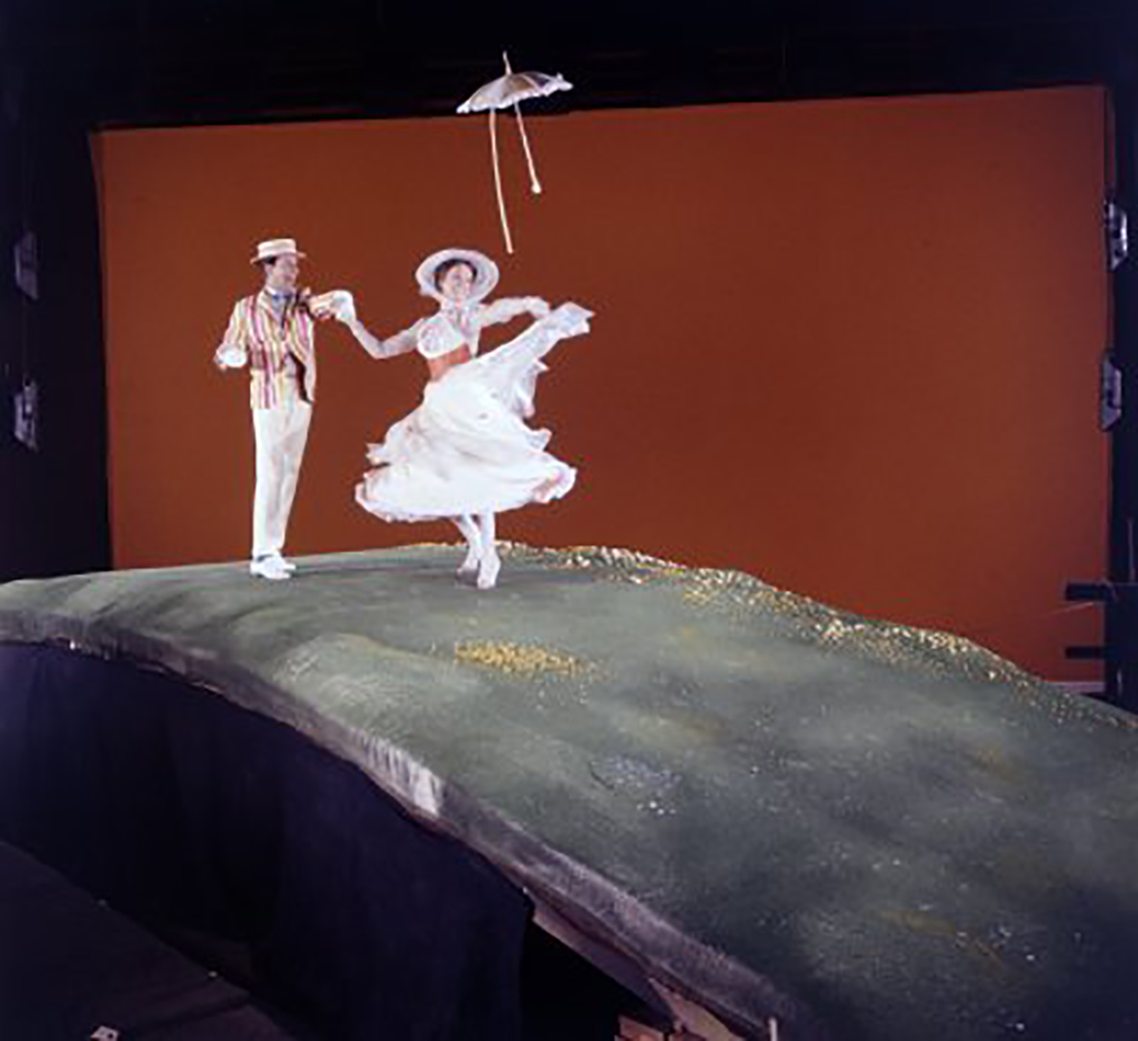
I'll just quote the article that I got that picture from:
> In what is sometimes called the “Yellow Screen,” renowned film innovator Petro Vlahos developed the sodium vapor process for technicolor film production. This process, which utilized a very specific light wavelength as a backdrop, would effectively “key” out certain colors through a very special camera, which Disney used heavily in the ’50s and ’60s.
Photograph was taken by Kanok Sulaiman at Luoping,Yunnan, China.
Here is the source of this image. Credit to the photographer, Abedin Taherkenareh, who took this on June 12, 2009. Per the source:
> An Iranian Female Shows Her Ink-stained Finger After Casting Her Vote at a Polling Station During the Iran's Presidential Elections in Tehran Iran 12 June 2009 More Than 46 Million Iranians Are Eligible to Vote and a Record Turnout is Expected to Be Reached the Four Candidates Are Incumbent President Ahmadinejad Former Prime Minister Mir-hossein Moussavi Former Parliament Speaker Mehdi Karrubi and Former Revolutionary Guards Commander Mohsen Rezaie Epa/abedin Taherkenareh
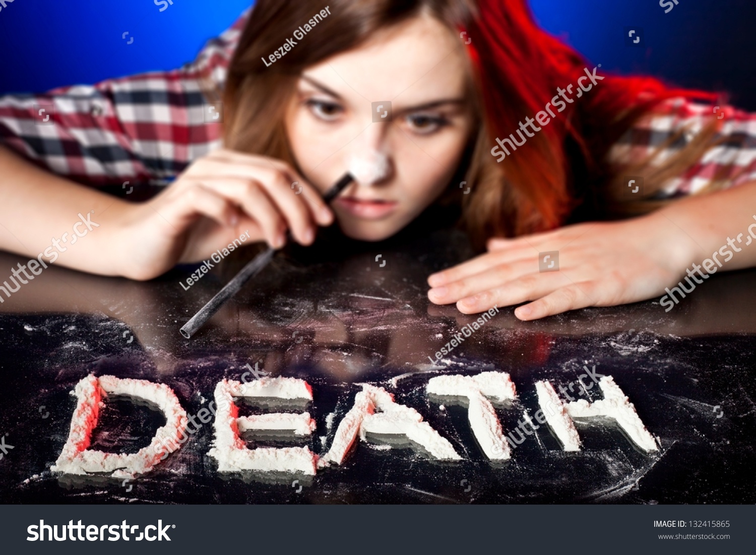
This is actually a Pictionary advertisement and not real.
However, here are some real ones.
I shared your skepticism, looked into it and found that the original graphic is on ShutterStock, so I suspect this to be true.
https://www.shutterstock.com/image-vector/round-maze-vector-art-illustration-easy-39495838
*DEPARTMENT OF PHOTOSHOPP
IN
G
Looks like the building was from this stock photo.
I found the original. And here's their entire portfolio on Shutterstock. I think they're a non-native English speaker. Their English is good enough for these kitchy, Target-esque one-liners but every once in awhile they have a print that doesn't work, like "Explore world."
And here's the shutterstock link:
https://www.shutterstock.com/image-photo/young-potatoes-carrots-on-white-background-32118229?src=-KPOiU1FEgRGIkBXfb88Dg-1-62
I think it would have been 199$ to license to license this image for merchandise use.
Not Japan , it's the Ho Chi Minh City international Airpot
This type of map is called raised-relief map, and to make elevation features stand out more the vertical scale is magnified by a significant factor.
This is part of a collection by Anton Balzah, full album here: https://imgur.com/gallery/3kDqX, more of his raised-relief work here: https://www.shutterstock.com/g/antartis/sets/61479
CTRL+F: source author
If you ever need any artwork/designing done I don't mind helping out the /r/hiphopheads community with it. It's the only thing I'm slightly above average at and I definitely owe you guys something back just for being awesome.
*Edit - I feel like I should at least try and back that up. Here's a Port Folio of sorts...
In regards to people loving their videos but not their music Damian once said:
Think of it this way: I’m a chef, and you’re in my restaurant. We’re world-famous for having incredible desserts. And your question is: Do people have to eat the desert to enjoy the main course? From where we stand, it’s a wonderful thing that that we have such good desserts, and we feel blessed that they’re known around the world for being delicious and singular and unique and unlike anyone else’s. If millions come in for the desserts, and hundreds of thousands also find they like the main course, awesome. There are no bad customers in this restaurant.
https://www.shutterstock.com/blog/the-making-of-a-viral-video-ok-go-take-us-behind-the-wall
You can't just say that without also giving a url
I found https://twitter.com/ajabernathy/status/932689088360140801 which has the meme soap opera thing but doesn't have the other pics from this meme...
edit: gotta catch em all? Use https://www.shutterstock.com/search/models/13719317,14852057,16696529?context_photo=297886754
http://www.artstation.com/artist/sarmati
Some words from the artist regarding this piece:
Rusałka is a slavic female demon usually appearing around lakes, ponds or rivers. She deceives men and drowns them. I wanted to show her as a dead corpse that uses a charm, so that she looks like a pretty woman when out of the water.
I've had some voices wondering about the swastikas on the rims of the guys shirt. So to make it clear. I have no connotations with any extreme right wing parties nor do I keep any nazi or racist oriented beliefs. Swastika has been used for hundreds of years in Poland, before Hitler stole it and spoilt it for everyone. The action of the image takes place in 9th or 10th century. If you want to know more about swastikas just wiki it. There is a really broad and interesting article written about it.
This is a pretty direct rip off Alex Eiman's national parks series.
I'm all for using things other people have designed as inspiration, but showing off something that's a blatant copy isn't a good look.
They shot a bunch of them at once with different messages, I'm sure some of them could find use in some addiction pamphlet or whatever.
Also, it appears to be a simple edit of this one saying "DEATH" which is minimally less silly, hence the weird capitalization.
There's certainly suits of different degrees of quality.
For most beekeepers, they probably aren't even going to bother with more than a veil because there's no need. A bee might occasionally find their way into a veil like that, and 95% of the time that it happens you can just take the veil off and let her fly away without a sting.
OP's dude with the angry hornet is a different story.
There are few abilities as iconic as Divine SMITE!
As a DM, I still always get surprised by just how much damage paladins can put out in one turn. So, here is an animation of a paladin doing what they do best. Just use your imagination to add a vampire or fiend getting hammered, after which the DM silently adds another 50 HP to make sure they won't beat the big bad in just two turns.
This one took longer to make, since the body moves a lot more when doing attack moves than just standing there and casting a spell. The paladin in question is the dragonborn paladin of Bahamut of a friend of mine.
Note that divine smite is typically just one big whack, and here it's three attacks. I just liked the way it looked better this way. Maybe in the future I'll do one the other smite spells and make it look more like a singular nuke like smites typically are.
Software used: Aseprite - https://www.aseprite.org/
Instagram: https://www.instagram.com/eyalunya/
No pixel art on there (yet).
Here is the source of this image. It provides the following caption:
> Funny little red-haired boy in earflaps hat is stroking a cat in the country in winter. Cat is standing on its hint legs as it is wanting so much to be stroked. Image with selective focus and toning.
Credit to the photographer, Marianna Smolina.
It's a shutterstock model with tattoos shopped on. The before pic just has muscles and beard shopped off. Here are more 'Young handsome muscular man standing in blue water looking away.'
Edit: I misspelled 'tatoo'
This isn't a FAKE COMPLETE FAKE OMG LIKE SUPER-FAKE, it's a digital illustration by Andrew Forrester.
You can see other work by Andrew here:
https://www.behance.net/andrewforrester
You'll find this one in the "Steampunk Illustrations" section.
Here's another one and here is the original Source - Glad you all like this sort of stuff!
These stones appeared seemingly put of nowhere, their origin is unknown as is their purpose. Some believe them to be relics of a lost civilization, such as Atlantis, whilst others wonder if they perhaps came from another world.
The stones hover silently, no pattern in their dispersal can be found and they seem to non discriminatly scatter themselves across the entire worlds oceans.
What happens next remains to be seen, until further notice these monoliths are off limits to all, including military and governing bodies.
I take back what I said about it being impossible the last time I saw this pic on reddit. If you look closely at the pictures in this link (renders),
https://www.behance.net/gallery/22614295/Swirl
it looks like there are two counter rotating cylinders, one inside the other, and the curling streams of water don't actually touch each other, as most of the images seem to suggest. Physically possible, and pretty if they can pull off the engineering, but a pain for those with hard water, and probably quite expensive, which would offset any potential water savings for a long time into the future.
Interestingly enough, open-source software are not necessarily free. I was quite surprise when I ran into a paid open-source software: Asprite.
The code is on Github (maybe not the latest version, I don't recall), and you can obviously compile it yourself but it is a paid software.
You can check this question in the FAQ which answer the question: "how do you sell it if it's open-source?"
what it actually looks like The image in the post is distorted by the panorama setting.
Take a look at OP's Instagram page at grafixart_photo. Everything is heavily shopped. Generally that's not an issue. But claiming that this image is "the best photograph" is disingenuous. Also, not crediting the photographer of the picture they edited (i.e. ventdusuds) either here or on Instagram isn't too cool.
Edit: Perhaps OP incorrectly titled this a photograph because his first language is French.
A guy from r/laclippers took the same elements and, in far less time than the 2 months Ballmer and the team spent, re-rebranded the uniforms: https://www.behance.net/gallery/25535885/Clippers-Re-ReBrand
Yes it is.
Notice the thumbnail URL is straight from shutterstock. You can buy the image here: https://www.shutterstock.com/image-photo/man-pull-out-empty-pockets-low-611747735
After some of the other weird shit on this sub, nothing should surprise you!
The artist's Behance and ArtStation.
This image is based upon a couple of lines from Andrzej Sapkowski's 'A Grain Of Truth':
"... She was a jolly girl, I tell you. Do you know what she thought up? We'd both frighten unwanted guests. Imagine a guest like that enters the courtyard, looks around, and then, with a roar, I charge at him on all fours with Fenne, completely naked, sitting on my back and blowing my grandfather's hunting horn!"
Hi, my name's Gareth, I made the first one of those silly things. The other one was made by Moran Goldstein, a super talented artist and designer and actually a massive inspiration to me. In fact I'm pretty sure it was one of his designs that made me start learning 3D Design in the first place a few years ago. This will probably get buried, but I just wanted to say thank you. You put my work up alongside the work of someone I admire and respect and who was in fact a driving force behind my own creativity, not that he knows that.
Might be a common trend for him.
Looked at another one of his submissions: P90 Wild Anansi
It very obviously uses another one of Ihor's patterns: Seamless spider web
Most of you are probably like me and have seen all the new smart watches being released and hating them. Most of them look terrible and I would never have them anywhere near my wrist but this kind of design is something I would genuinely look into getting.
You can view more about this concept by Gábor Balogh here (https://www.behance.net/gallery/Smartwatch-Concept/14929833)
Not sure about the typefaces, but that helmet is the work of Justin Pervorse which can be seen here or on his business card in my hand here. So, I hope you're just using it as a mock up and not claiming it's your own work.
First off, I think your boy looks amazing. The color transitions are great. I *can* see how he looks more pastel than albino, though, and my suggestion is to use some reference pictures of albino lizards. (Crocs and gators work too, but they tend to be EXTREMELY white with very little pink. But here's a neat exception: https://www.shutterstock.com/image-photo/albino-alligator-141056980?src=orTGcGSW162oTw_E2eF_yw-1-0 )
If your pink is kept more toward the recesses near the center of the body, and not on the more raised areas - which I think is something you could enact on the non-belly scales - that would be a fast way to get you looking closer to albino. (Especially if you combine that with lightening the darkest pinks around the head. It's a beautiful color, but I think it gets too dark for this particular project.)
I've been wanting to do an hourglass lately, and after scrapping 2 original ones I couldn't get quite right I decided to ease my mind a bit by animating a cool minimalist design I saw by Arief Setyo Wahyudi instead. Replicated in Adobe Illustrator and animated with Trim Paths in Adobe After Effects, can also export as JSON if any one is interested.
Edit: I was toying with framerate before I rendered, didn't preview before I settled, and now I'm really bothered by that ending jitter. Sorry for the eyesore!
I guess they weren't happy with all the other grammatically correct ones.
Hey downvoters, watch this video and cut this guy some slack. https://youtu.be/pnv5iKB2hl4 What he is trying to say, is that overly detailed items don't work well on flags. The eagle is cool, but could be simplified perhaps. Love the design, nice work.
Apparently i came off as an ass in my other comment, but i just explaining its easy to do if you have photoshop! Follow the quick step by step and boom got a quick good looking present!Here you go! https://www.freepik.com/free-psd/open-a5-magazine-mockup_1826866.htm#term=open%20magazine%20mockup&page=1&position=1
I was starting with making a Turn Undead animation, but in the end, I shuffled closer to the Light Cleric Channel Divinity: Radiance of Dawn.
This animation marks the 6th class, which means that we're halfway to them all (excluding Artificer). I got to say though, I have no idea what I should animate for Fighter once that one comes along. ...I'll think of something.
The cleric in question isn't a direct replica of one of my players' characters, but still, this one is in honour of one of the clerics I've killed as a DM.
On instagram you can see the scrapped version with lightning instead of light. It's not as good, hence why it's scrapped.
Software used: Aseprite - https://www.aseprite.org/
Instagram: https://www.instagram.com/eyalunya/
Another comment below mentioned he commissioned it in 2014.
However, the ape vector art was published on Shutterstock by Fun Way Illustration on 2013-11-14 (view the source for "datePublished").
So if that "2014" date is actually correct, the artist either used old stock imagery by someone else, or recycled their own slightly older art.
Definitely! This is just a prototype I made up in figma.
I started learning the basics of figma while earning this google design certificate and then from there just found lots of tutorials on youtube for specific things i wanted to incorporate.
And now I'm on the final step of actually publishing the design and programming it to be fully functional. Hope that helps!
Next time go there with a year's worth of beard growth blue jeans and leather jacket like this guy . but wear flat black nail polish. When she out's you raise your hand and say something like ".... ya this guy's not afraid to wear nail polish." In theory that should make mom look crazy and you as just a progressive dude.
https://www.behance.net/gallery/28058837/Munich More images from the same Photographer.
EDIT: Wow, being downvoted to hell for providing more work by the same artist. Probably time to leave this sub.
Alternative title: I hate Snake Plant and Ascension 17, upvotes to the left.
Minor edit of the Council of Ghosts because I recently found what the StS font is (It's called Kreon and can be found for free here).
Bonus Living Wall edit for when your discord members want change.
Ist ja auch nur ein Stock Photo
Immer toll, wenn man Bilder mit "Stock Photo sport woman dab white headphones" sofort findet.
For the sake of discussion I'm going to assume this is a genuine post and not a troll. With that said I have a few notes for you to consider.
If you're looking for a professional portfolio website, don't use Deviantart. It doesn't give the impression of a seasoned photographer and robs you of credibility. Look for a more professional site that caters specifically to photographers, or put in the money to get a personal portfolio site made for you.
When promoting your work keep it clean and simple. Link to a gallery and let people browse. By hitting us with a wall of text and steep prices before we can even see the quality of your work you are stripping away the chances of anyone actually clicking on a link. Also learn to hyper link, this is more attractive than this: https://www.behance.net/gallery/9538549/The-Moon.
Know the audience you are speaking to. Wander through the sub before posting and ask yourself, are the people here likely to pay four million dollars for a print? We do get a range but generally the upper limit is four figures not seven. Generally people looking to spend that much shop in galleries not Reddit so look into submitting your work there to maximize the chance of finding buyers.
Look at your work critically. You've priced some of your work for the top tier of fine art photography, does it live up? If you have found people to purchase your work at the prices you have set then excellent, but what are you doing advertising on reddit? If no one is buying your prints maybe it's time to reexamine your business model.
Again, if this is a genuine post, I wish you the best of luck.
Some background. Every weekend I try to do a PPS, which stands for Personal Project Sunday. Essentially I try to use the PPS to try a new style or a new technique. This was the result.
​
Full project here: https://dribbble.com/shots/5703840-Work
Peter! What r u doin with that watmelones?
This is one of Anton Balazh's portfolio.
https://www.shutterstock.com/g/Anton+Balazh
he took NASA pictures (and other sources too), and created poligon models so he could render them using artificial lightning and projections. He tweaked quite a bit of variables in the process until they were visually appealing so not sure you could do the math on any of these.
If we look at kodiak island, the larger island at around 3, and knowing it's 150x60km more or less, I can roughly see the mountains there are 4-5 times smaller than the width. Call it 10-15km.
Knowing the largest elevation on that island is 1,362.2 m (wiki) it's safe to say he used something like a 10x magnification on the elevation scale to make it it appealing.
Elevation must be non linear though because Denali (6190m) does not appear to be 5 times taller than Kodiak island elevations although the perspective is very tricky and heavily distorted by the also unnaturally small curvature of the earth.
Hi guys! I just recently lost my job as an illustrator so I'm trying to earn some extra pocket money to buy more battlepass levels. You might have seen some of my other doodles like Io wearing pants. I'm making those illustrations for USD$5, so if you're interested, just post here or shoot me a message! <3
You can find more of my work here: https://dribbble.com/LisalyGR
At first I thought "Not only did they leave in the watermark, they forgot to pluralize the "makes"! How dumb can you be!"
But no, that's in the original:
>“2) Evergreen’s Day of Absence was not ‘reverse racism.’”
I like how he uses quotation marks, even though nobody uses that term but SJWs.
>“4) The Tucker Carlson interview unleashed a flood of hate toward Evergreen.”
Yes, that's what happens when the public learns about people acting like horrible people.
>“6) Racist hate mail and threats targeted free speech at Evergreen.”
http://dynamic.uoregon.edu/jjf/defineDARVO.html
>“9) Liberal arts and intersectionality are both about increasing available viewpoints.”
Interesting info, but the presentation of type & images make it confusing to read.
I see you've made a few of these, so I'd suggest looking into "clean" infographic design.
Behance has a good resource of them: https://www.behance.net/collection/Clean-(info)graphics/14976129?sort=list_item_created_date&time=all&page=3&collection=14976129&privacy=profile
This is great stuff, it's just a shame it's really hard for readers to parse the info. I'd love to see your stuff in a much cleaner format. So I hope my comments are more helpful than hurtful. This is really cool what you're doing.
Wow thank you so much guys :)
The car is no particular one, just my vision of a good looking F1 should be, simple and clean lines, smooth like the wind hehe
I will make a wallpaper version with ultrasoft's :)
EDIT: Here is the T-shirt and other stuff you can buy on.
T-SHIRT: https://www.redbubble.com/people/timetodoit/works/25876688-f1-aerodynamics?asc=u
WALLPAPER https://dribbble.com/shots/3395665-F1-Aerodynamics/attachments/741115
.
That's really fucking amazing. I love that. Nice find OP and thank you so much for OC! Also thanks for sharing.
Also, that
https://www.behance.net/astoralexander
is the official site of the artist. You can find some more nice work of him there.
I think the artist is implying that this planet is a giving mother in a sense, not meant to be abused solely/greedily by corporations for profit. You can read more about it here: https://www.behance.net/gallery/6426537/XII-Encontro-Regional-de-Agroecologia
Edit#4: As the link says, the motto of the event was "The land is the source of life, not profit!" - we should all know what kind of profit he's referring to. Not the type where the guy is trying to make a living. More so the type where giant entities massacre natural resources and life in exchange for not just financial gain, but dominion. A lot of people here are giving poor examples as to why the artist is a hypocrite, as if the artist is saying no one should use the planet for any benefit. So many grammar nerds here are raging over it, instead of trying to understand the artist, who happens to be from Brazil.
I really don't think it's a wood holder. typical rounds are cut at around 16" and this looks to be more like ~8-10" across. Typically firewood holders are made to be wider/deeper than the logs fro stability. Additionally, they are usually made in a spot that makes sense in terms of accessibility, and with the four feet of lawn you have between your walkway and the structure, it seems more like a privacy screen.
It is more likely a brick fence with wooden spans that have been removed, or like someone else said there was a lattice between them on which plants could grow.
source: contractor, although that doesn't mean I'm right!
I appreciate your enthusiasm and thought that went into this presentation. ;)
Fun fact is this was part of the original concept (before it became a tweak) as I'm a big fan of single-input interactions (as you may've guessed by auxo 2's quick switcher). We never really spent time on implementing such a thing as it proved to provide a minimal speed advantage once we got the flicking of stacks to be as responsive and quick as they are (you lose the awesome feeling of opening a stack dynamically, and replace it with a pre-canned stack opening animation instead). It's certainly something we can pursue in the future, post-iOS 8 jailbreak (as well as more app-slot options).
I checked the original source and unfortunately;
Attention: this is a non-profit project, only for study and experimentation, made from images that I don't have the rights but which have been publicly distributed in network and from there I obtained my personal result. I can't send wallpaper for this
To whom it may concern, the pattern is originally created by Ihor Patsay who online goes by the name of Ihor_Seamless on many vector based websites (shutterstock etc.).
When shadows lengthen up, and fog tongues intertwine at the vortexes, even the familiar crackle of #TheZoneArt transmitter sounds mystical. Followed by the steady blinking of the lamp, grim and tense arts by d.vishnevsky are appearing on the screen.
Autumn is that mysterious time when legends of the Zone come closer to the folks. They intertwine into people's tales and thoughts, glimpsing somewhere around. And more and more often, old stories are heard about «Locomotive», «Endless Tunnel», and a dark figure wandering between trees.
> There's no way they're producing a ton of custom art for these things - it's gotta be a stock image.
mm...I don't really see any of the normal cues I would use to narrow down the location here. Honestly I couldn't even be 100% this is in Japan, but then again there's a whole lot of Japan that I'm not familiar with so I can't say one way or the other.
The only thing I've been able to find of even remote interest is this stock photo taken by a Thai person that resembles the streetlamp in the photo, with an extra middle lamp. Sorry I couldn't be of more help, but on the other hand I have just discovered that I am a hack compared to /u/DavidLasnier and the good people at /r/whereisthis
/r/ImaginaryMindscapes - The Art of Imagination
A subreddit dedicated to surrealistic landscapes and thought-provoking imagery.
About Project: A legend about five kingdoms in a world named YUNZHONG. The five kingdoms have different powers:earth,metal,fire,wood and water.
source: https://www.behance.net/trylea
I first saw them used in some of the Pokemon Reorchestrated covers: https://www.youtube.com/user/skotein
The video description says "Album Artwork by Franz Anthony".
I believe this is the project page from the artist's website: https://www.behance.net/gallery/15889407/Pokmon-Reorchestrated-Double-Team
here: https://www.shutterstock.com/g/antonioguillem?searchterm=disloyal+man&search_source=base_gallery
Found it on this blog over google image search: https://www.buzzfeed.com/bradesposito/distracted-boyfriend?utm_term=.slzppypJr4#.svJPPLP1ex
I can do art but seems like everyone's already upvoted some other guy.
Portfolio: https://www.behance.net/iamjasonpun
Worked for Clarity Gaming, Copenhagen Wolves, Dignitas, Titan, Red Bull eSports and a whole lots of others.
Now. I do have some experience in Cinema 4D since before, but i've been curious to try out Blender for real at some point.
I've watched the Blender Guru donut videos this week and that's about it.
This is a contribution to the annual "36 days of type"-challenge. It's a recreation of my "A" from last year (link here).
shamless plug incoming:
You are welcome to follow my journey on my instagram
Here is the source of this image. Per there:
> Sheregesh, Kemerovo region, Russia - April 16, 2016: Grelka Fest is a sports and entertainment activity for ski and snowboard riders in bikini.girl bikini swimsuit on a snowboard
Here's more work from the artist: http://feliciachiao.tumblr.com/
She says she's very appreciative of all of your comments! Thanks :)
Edit
The artist asked that I also include her portfolio link which can be found here: https://www.behance.net/FeliciaChiao
Jeez people, it's as if you've never seen make-up and Instagram filters before. 🙄
She looks like she does normally, and by normally I mean not made up as Ciri where the make up is designed to knock 5 years off her age.
Edit: here she is at SDCC 2019
To są photoshopowane stocki. Narodowości nie znam, ale są darmowe a licencja wymaga wzmianki o pochodzeniu.
Credit the source please.
Also this is one of the subreddits top all time posts.
Answer: TL:DR I believe it is in reference to users fighting back againt the ban TiKTok is facing from the U.S.
In-Depth: Generally hands holding each in a circle like the image provided, represents unity and solidarity especially connecting to race as it is depicted with different skin colours of each hand.
This COULD be in reference to racial tension in the U.S. though the hands all being one colour and being told " The war has just begun" suggests something else.
Best guess it may represent "Internet Unity" as users on TikTok fight back against the ban of the app placed by the Trump Administration.
Couldn't find that, but how about pretty black girl holding watermelon?
I've seen these signs on the back of buses around the grid. This stock photo model probably didn't envision his sweet mohawk photos being used quite this way.
Remember to wear a helmet before you go to war.
Here's some stock footage of a truck driver's POV. He probably couldn't even see the guy at the time of impact.
You could make photocopies of some of the creepiest journal entries and have a friend mail them to her anonymously from a different state/province/country. Let the old hag wonder who stole her precious journal and what evil blackmailing plan they have in store for her.
Or have a series of nice artsy posters made of some of the choice phrases from her final diatribe (like this or this ) and have them anonymously shipped to her one at a time over a series of months.
For those that are interested in the background, the artists name is Mikael Gustaffson. Below is a link to his Dribble page, he also has an Artstation page with his prints. Lots of great art! Go support him!!!
Most of these shots were filmed with a DJI Mavic Air. The trick is making sure both shots are filmed horizontally at the same speed. Then combined together in After Effects. ✌
Video tutorial here: https://www.shutterstock.com/blog/create-inception-inspired-effect-with-drone
FontSquirrel has it. I haven't utilized it too much yet, but some of the glyphs are really harsh - sharp edges and less-rounded corners than you might expect. I haven't tried the Mono version as a screen font, but that might be where its value is.
Neue Helvetica Neue it isn't.
I used get something similar when I saw tall grass in the sun, kind of like this (link to shutterstock), or this. It wasn't sadness, more maybe like longing. I only remember I used to get this feeling, I only have a faint memory but it is coming back. It was never super negative. Can you tell me if you get the same feeling? I'm sorry if it makes you feel sad. I just want to remember.
Thanks! Well I have used a 32" 4K monitor without scaling and 32" for me is as small you can go without scaling. 40" works great without scaling. I don't code , but i do use Lightroom and Photoshop. And i love it. The mouse is OK, I have had some issues with it. If it was to far away away from the base station it would lag. And when that happend I didn't think it was that far away (< 1m) But that could be some interference. The rubber things on the isde is starting to come of, so if I would buy a new mouse today i wouldn't have chosen the mamba.
WALLPAPER: https://dribbble.com/louiscoyle/projects/243171-Lakeside
Yes, and anyone else who wants to make this poster can download it from shutterstock.
I'm going to guess the first word is "Fuck" and the second word is probably the last name of a prominent politician.
Edit: Actually, from this image search, it says Impeach Biff.