
What is Reddit's opinion of
Behance?
From 3.5 billion Reddit comments
➔ Behance website
By popularity on Reddit, this Service is:
100 reviews of this app found across Reddit:
This is actually a Pictionary advertisement and not real.
However, here are some real ones.
If you ever need any artwork/designing done I don't mind helping out the /r/hiphopheads community with it. It's the only thing I'm slightly above average at and I definitely owe you guys something back just for being awesome.
*Edit - I feel like I should at least try and back that up. Here's a Port Folio of sorts...
This isn't a FAKE COMPLETE FAKE OMG LIKE SUPER-FAKE, it's a digital illustration by Andrew Forrester.
You can see other work by Andrew here:
https://www.behance.net/andrewforrester
You'll find this one in the "Steampunk Illustrations" section.
Here's another one and here is the original Source - Glad you all like this sort of stuff!
I take back what I said about it being impossible the last time I saw this pic on reddit. If you look closely at the pictures in this link (renders),
https://www.behance.net/gallery/22614295/Swirl
it looks like there are two counter rotating cylinders, one inside the other, and the curling streams of water don't actually touch each other, as most of the images seem to suggest. Physically possible, and pretty if they can pull off the engineering, but a pain for those with hard water, and probably quite expensive, which would offset any potential water savings for a long time into the future.
A guy from r/laclippers took the same elements and, in far less time than the 2 months Ballmer and the team spent, re-rebranded the uniforms: https://www.behance.net/gallery/25535885/Clippers-Re-ReBrand
The artist's Behance and ArtStation.
This image is based upon a couple of lines from Andrzej Sapkowski's 'A Grain Of Truth':
"... She was a jolly girl, I tell you. Do you know what she thought up? We'd both frighten unwanted guests. Imagine a guest like that enters the courtyard, looks around, and then, with a roar, I charge at him on all fours with Fenne, completely naked, sitting on my back and blowing my grandfather's hunting horn!"
Most of you are probably like me and have seen all the new smart watches being released and hating them. Most of them look terrible and I would never have them anywhere near my wrist but this kind of design is something I would genuinely look into getting.
You can view more about this concept by Gábor Balogh here (https://www.behance.net/gallery/Smartwatch-Concept/14929833)
https://www.behance.net/gallery/28058837/Munich More images from the same Photographer.
EDIT: Wow, being downvoted to hell for providing more work by the same artist. Probably time to leave this sub.
For the sake of discussion I'm going to assume this is a genuine post and not a troll. With that said I have a few notes for you to consider.
If you're looking for a professional portfolio website, don't use Deviantart. It doesn't give the impression of a seasoned photographer and robs you of credibility. Look for a more professional site that caters specifically to photographers, or put in the money to get a personal portfolio site made for you.
When promoting your work keep it clean and simple. Link to a gallery and let people browse. By hitting us with a wall of text and steep prices before we can even see the quality of your work you are stripping away the chances of anyone actually clicking on a link. Also learn to hyper link, this is more attractive than this: https://www.behance.net/gallery/9538549/The-Moon.
Know the audience you are speaking to. Wander through the sub before posting and ask yourself, are the people here likely to pay four million dollars for a print? We do get a range but generally the upper limit is four figures not seven. Generally people looking to spend that much shop in galleries not Reddit so look into submitting your work there to maximize the chance of finding buyers.
Look at your work critically. You've priced some of your work for the top tier of fine art photography, does it live up? If you have found people to purchase your work at the prices you have set then excellent, but what are you doing advertising on reddit? If no one is buying your prints maybe it's time to reexamine your business model.
Again, if this is a genuine post, I wish you the best of luck.
Interesting info, but the presentation of type & images make it confusing to read.
I see you've made a few of these, so I'd suggest looking into "clean" infographic design.
Behance has a good resource of them: https://www.behance.net/collection/Clean-(info)graphics/14976129?sort=list_item_created_date&time=all&page=3&collection=14976129&privacy=profile
This is great stuff, it's just a shame it's really hard for readers to parse the info. I'd love to see your stuff in a much cleaner format. So I hope my comments are more helpful than hurtful. This is really cool what you're doing.
That's really fucking amazing. I love that. Nice find OP and thank you so much for OC! Also thanks for sharing.
Also, that
https://www.behance.net/astoralexander
is the official site of the artist. You can find some more nice work of him there.
I think the artist is implying that this planet is a giving mother in a sense, not meant to be abused solely/greedily by corporations for profit. You can read more about it here: https://www.behance.net/gallery/6426537/XII-Encontro-Regional-de-Agroecologia
Edit#4: As the link says, the motto of the event was "The land is the source of life, not profit!" - we should all know what kind of profit he's referring to. Not the type where the guy is trying to make a living. More so the type where giant entities massacre natural resources and life in exchange for not just financial gain, but dominion. A lot of people here are giving poor examples as to why the artist is a hypocrite, as if the artist is saying no one should use the planet for any benefit. So many grammar nerds here are raging over it, instead of trying to understand the artist, who happens to be from Brazil.
I checked the original source and unfortunately;
Attention: this is a non-profit project, only for study and experimentation, made from images that I don't have the rights but which have been publicly distributed in network and from there I obtained my personal result. I can't send wallpaper for this
/r/ImaginaryMindscapes - The Art of Imagination
A subreddit dedicated to surrealistic landscapes and thought-provoking imagery.
About Project: A legend about five kingdoms in a world named YUNZHONG. The five kingdoms have different powers:earth,metal,fire,wood and water.
source: https://www.behance.net/trylea
I first saw them used in some of the Pokemon Reorchestrated covers: https://www.youtube.com/user/skotein
The video description says "Album Artwork by Franz Anthony".
I believe this is the project page from the artist's website: https://www.behance.net/gallery/15889407/Pokmon-Reorchestrated-Double-Team
I can do art but seems like everyone's already upvoted some other guy.
Portfolio: https://www.behance.net/iamjasonpun
Worked for Clarity Gaming, Copenhagen Wolves, Dignitas, Titan, Red Bull eSports and a whole lots of others.
Here's more work from the artist: http://feliciachiao.tumblr.com/
She says she's very appreciative of all of your comments! Thanks :)
Edit
The artist asked that I also include her portfolio link which can be found here: https://www.behance.net/FeliciaChiao
Champion Concepts are cool right? https://www.behance.net/gallery/Lool-The-Curser-of-Noxus/14860799
If not here are these DJ Zilean and Ghost Train Threash
**Feedback and questions are much appreciated, or just comments in general
Here's some of my doodles that i've done as an industrial design student! I do tons of more original designs too, but unfortunately dont have any of those sketches up on the site right now.
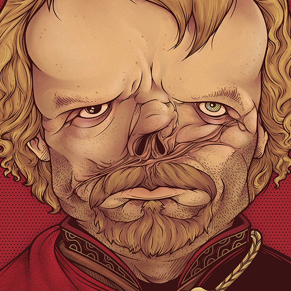
My favorite artistic rendition of Tyrion Lannister.
No tufts of black hair but other than that in my head this is spot-on.
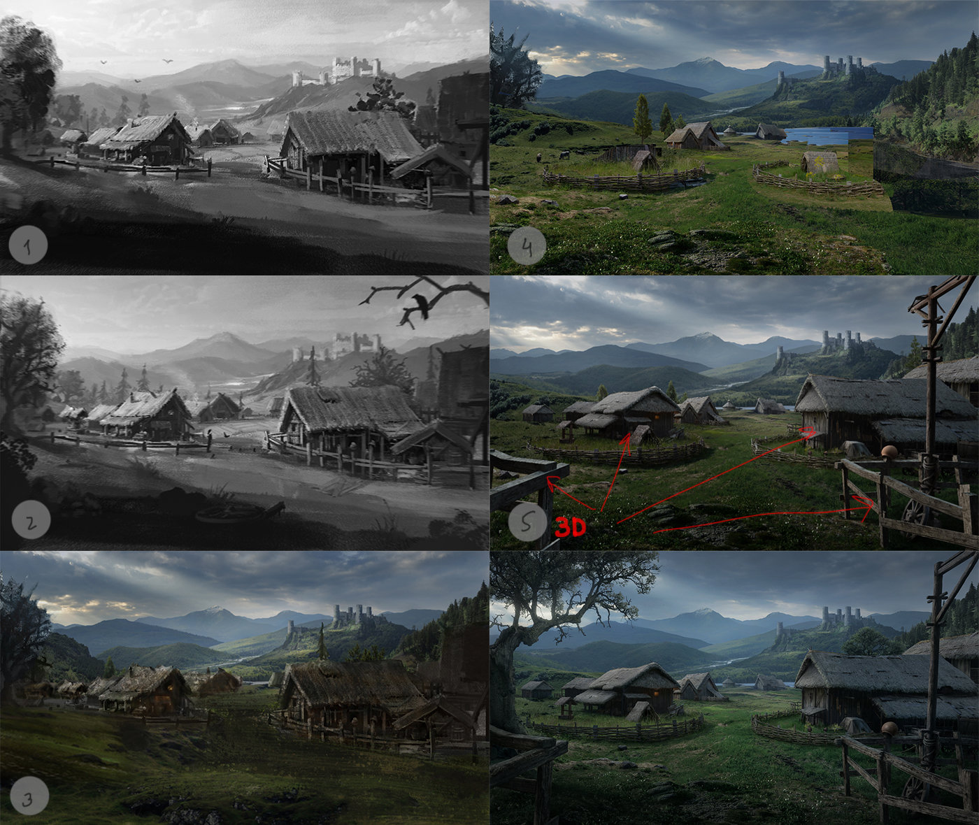
This is concept work, a "matte painting for Life is Feudal. I was lucky to work for Hardcore Realistic medieval multiplayer Sandbox RPG and MMORPG Game."
Here's the process piece.
The artist's Behance and ArtStation.
This is NOT a poster for Batman vs Superman. These are two separate posters joined upside down. These two are a part of a series of posters the artist did for superheroes. There is one for Iron Man, one for Spiderman and a couple more. Can't remember the artist's name but will come back here if I do find it.
tl:dr - NOT a movie poster. NOT even a fan-made poster. Someone plagiarized an honest artist's work (not sure if OP is guilty or ignorant)
Hey there,
I'm a reddit newbie and an infographic designer and I'm crazy about photo-real infographics. Here is my fresh poster about Su-30 fighter family. What do you think? Can it be interesting on this subreddit? If you like have a look at my other military posters on behance! * Sorry in advance if I'm doing something wrong.
Another reddit user posting to his own website full of stolen work. Here is the source of the artist don't support these websites that make revenue for just rehosting images.
Yeah I couldn't remember "Faces" for some reason and it didn't look right while I was looking through the installed apps. I used "SimplePasscodeButtons" to clear the numbers and letters and used "Faces" to use images I downloaded to replace them. I used the images from here and then just Googled and Pikachu one to match.
I've been working on this poster series inspired by the latest Cosmos, a poster for every episode. Halfway finished!
Here it is:
Well, i've made a post of this, but repost here. My name is Elcio and i'm a brazilian adversating student and freelance graphic designer.
This is my new project: Create logos for all League of Legends champions, as if they were brands.
Reviews and suggestions are welcome, and in fact, I already have my list but you can give ideas of champions brands too.
You can find all the already made and follow the progress of the following links:
Thanks guys.
If I could find concept art like this for other characters, I would! But this was pulling from an awesome set of images from the artist Khoa Ho, who made a whole series of them here.
The client also really enjoyed FFXI lore, especially concerning Blue Mages, and so we incorporated the outfit, weapon, and spell from said lore.
Also, here's my previous FFXIV piece "Together we Soar": http://lindseyburcar.deviantart.com/art/Together-We-Soar-507238294
And you can see the rest of my portfolio here! (best of the best of my work): https://www.behance.net/LindseyBurcar
If the Redskins ever are forced to change their name, this is the best redesign concept I've seen for them.
Credit to Brandon Moore, image taken from this site: https://www.behance.net/gallery/11458543/Washington-Redhawks-Brand-Identity-Proposal
I'm writing a post on my blog explaining how to do that, please be patient come back in 20 minutes I'll update this comment with the link to the post. Stand By.
unfortunately, I made this as a gift for a friend, but if you were looking to comission, here's some of my other stuff I've done! I work digitally, traditionally, etc. my porfolio Feel free to PM me if interested!
More info here: https://www.behance.net/gallery/18819041/Vicon-Apex and here: http://www.vicon.com/products/vicon-devices/apex-interaction-device
Its an optical tracked handheld controller with vibration feedback and active LED markers. Simplest configuration for tracking is two Vicon Bonita cameras. I guess Oculus did their research or this is simply a funny coincidence. First mention of the device in a Vicon press release from 19/03/2013.
My only set to print so far is KTK, so from that my favorite card name is [[Empty the Pits]], and my favorite flavor text is on [[Rite of the Serpent]]. Gameplay-wise, I'm thrilled to have landed the flavor text on [[Seeker of the Way]], although it's a little pulpy for what I try to do.
If you want to see the full gallery, actually, it's online here.
Posting this here for visibility:
Calm down guys, this is just some kid who is figuring out Photoshop (you can tell by his deviantart uploads). This isn't something new or revolutionary, is it neat? Sure, but I'm going to assume this kid is still in High School and just saw one of those many Behance posts: https://www.behance.net/collection/9449523/polygon
Now hes probably geeking out thinking he might be the next greatest artist on the internet for making this because it took him 24 hours to make in Photoshop and he has about 4k views. Instead of calling him delusional or a hack, just give him some tips to improve. I would say that Photoshop is probably not the ideal tool to use to get this effect. You can make this a whole lot easier and in a lot less time in Illustrator. You simply use a picture(which you should always either pay for, or take your own) then turn on grid, connect to either points or to grid. Use the pen tool to make objects(they should click easily to the points). I also notice you have a lot of artifacts on your image, you might want to look at saving files as PNGs as it would reduce the blurry clusters of pixels. Doing it this way is a whole lot easier and a task that might have taken you 24 hours, could be done in about 2-3. This is why people are not as impressed as you would like them to be. Also I notice you use a "logo" on your picture as well, many artists consider it a little bit tacky and pretentious, especially for something that doesn't really require that much skill or since your piece doesn't have any originality. Since this effect is quite common, a url for your blog or your name would make it seem less egotistical. Don't get discouraged but also realize that effects =/= style and to take on a more humble approach.
Imma spend some time making some this week. What five albums should I do? Im thinking because the internet and Acid rap would be nice..
link to some minamilsm posters ive done https://www.behance.net/gallery/Simplistic-Ghibli-Movie-Posters/11823977
Hey guys! I love your Feed Five initiative. I'm an illustrator based in Toronto, who's created Tshirt graphics for years.
Contact me anytime and I would be honored to create a tshirt design for free for you guys if you ever need that down the road. My email is (link to my instagram / BEhance / Tumblr)
Reminds me of "Conspiracy theory" by Pierre Grenet - which is like the photo retouching version (xpost /r/retouching)
Edit: I know this thread is already dead, but the artist has some great 3D animations from pictures here. Props to him/her! And thanks to /u/ZombyDoo for helping me and all of the other RES users out there haha.
~~vimeo.com/73895178~~
~~Ninja edit: I'm on mobile, so I'll make it an actual link later.~~
Hire a shader programmer? Hire competent artists? Like, the reason why Unity games don't look good isn't as much the engine as the people working on it. Unity just has an extremely low barrier of entry, so the vast majority of people don't have nearly the same skill or experience levels as those that working with more traditional engines.
Just spamming a bunch of post-processing effects in your game won't make it look better. It has to match the overall look and feel of the game.
That being said, if you want a low-budget style that looks pretty good I recommend HDR Bloom, with flat-surface shading, flat colored textures, hard shadows, ambient occlusion, either a purple-ish or orange-ish ambient lighting, and plenty of light sources. Looks something like this: https://www.behance.net/gallery/Woodbot-Enviros/2174439
Yeah yeah, I know, /r/hailcorporate. I don't care, I want Lego to become (even more) super-rich. I for one welcome our new plastic overlords.
And I found this on Behance. Here's another if you're into football: https://www.behance.net/gallery/LEGO-UEFA-2013-Finals/13636269
...and here's yet another cool Lego ad campaign from 2013: https://www.behance.net/gallery/LEGO/12506973
This lamp is made of 76 layers of cardboard and covered with plaster. The inner perimeter lamps stacked LED ribbon on the remote control. Dimensions approximately: Height - 1500 mm (59 ''); Width - 600 mm (24 ''); Depth - 400 mm (16 inches). I will be glad to hear your opinion. More pictures and information on the lamp making process the following link: https://www.behance.net/gallery/27690041/O-floor-lamp-with-LED-Strip-Light
Followed Breno Bitencourt's tutorial since it was my first time trying this (https://www.behance.net/gallery/16579635/Low-Poly-Self-Portrait-Tutorial). Took around 6 hours start to finish with some experimenting/redo's at the beginning. All worked over just regular unedited photo (I wish I'd played with the colors a bit more, can always do that post though).
The keyboard is a Ducky Shine 3. As much as I like the fancy LED's, I wanted to go for some custom keycaps. I saw Ingrid Pierre's pokemon keyboard and thought it would be a lot cooler with the unown alphabet!
I tried to pack as many pokemon themed icons as I could into it. I have the first 8 badges for fn1-fn8 (which are all relabeled as HMs like in Ingrid Pierre's layout). I even changed the exclamation mark and the question mark to be little unown characters.
EDIT: Forgot to mention, MX Browns
Also, so far the WASD printed keycaps have been doing fine (I've had this for almost 5 months now). You can actually feel a bit of a bump on the keys where the print is which is distracting at first but you get used to it. I was worried that I would rub off the art but so far I haven't seen any wear which is great!
hahahaha I'm pretty sure they're normal condoms with a pizza wrapping I totally agree pizza condoms would be GROSS. I guess it's inspired by FRIENDS but I can't seem to find a place where you can actually get them...
Terribly dated, the fonts seem like free generic versions that came with your ios, try looking through some of these as inspiration for cake companies with a more modern appearance.
Thanks man. I'm planning on doing Mick Jenkins next. I've actually done a lot more, feel free to check some of them out here https://www.behance.net/spahn. Not here to advertise my portfolio, but I thought I'd share since you asked. I can take it down if it breaks a rule or something.
these illustrations have been around a few times. i already checked my library and if i can find the source but sadly i dont save "fanart". there are just too much interpretations of the same designs, thats why i save concepts only. ye i know, would be helpful now....
edit: found him https://www.behance.net/artofmine
We don't use Flash very much for Archer actually. Archer is primarily done by drawing everything in Adobe Illustrator and then animating it in After Effects.
Flash gets used every once in a while for like, fist fight scenes, where each frame needs to be a new drawing, because of how fast and dynamic the motion is. But if any frames can get reused, and the pace is relatively slow, than it's all done with AI and AE.
I believe its done by printing a word and then scanning back in. While scanning though you drag it around and mess with it and you can get some pretty cool visuals. Simillar piece: https://www.behance.net/gallery/3933743/Dont-answer-the-phone
x-post from /r/ImaginaryMindscapes - The Art of Imagination
Some Words from the artist about his project:
> I have always believed that the science and art can be used for a larger social purpose. As a creative person, this gives me more satisfaction.
> Yin Yang is a result of the same kind of belief and thought process. Everyday natural disasters and environmental hazards triggered the observation that the state of environment is imbalanced. Hence the idea – “Bring back the balance” was born. To visually depict it, I used the popular Chinese symbol “Yin Yang”. The symbol describes the state of balance between two opposites with a little bit in each. I wanted to explore this irony that exists between the symbol and the present state of environment.
> It was quite a time consuming campaign. Before starting off, I invested a lot of time in doing research regarding the factors, causes and reasons behind different kinds of environmental pollutions. It was followed by a number of sittings with the illustrators in my team to finalize the style and scale of detail of the artworks. The rough sketches were done for more than a month by me and 2 illustrators. The original illustrations were hand drawn on wall sized sheets. I tried for as much detail and reality as possible. The illustrations were then painted with watercolors, photographed and digitalized. The last leg of the campaign involved the laborious task of retouching. It was pretty challenging to keep the synergy of earth colors (green and blue) intact while bringing forth the black and white of Yin Yang in the artwork, at the same time. It took the team more than 6 months to draw & paint and 3 months to retouch the whole project keeping in mind every single object in it. Now, here is the final result in front of you and it seems now the effort was worth all the time.
Vlado Krizan's Behance and deviantART gallery.
About this image, the artist says, "What if the British Empire didn't collapse after WW2 but spread to the whole world and beyond..?"
I like it because it conjures up feelings of ominous danger. At least to me. But then you see that couple in the far-left of the image, just sitting there, casually taking in the whole scene with no hint of alarm or care, suddenly the whole pic takes a different turn. It's analogous to how technology can, with familiarity, lead to a kind of shrugging acceptance rather than trepidation.
I'm working on new header art for this subreddit. It'll be multiple images instead of one. If you have any favourites that you've seen in this subreddit, please share those URLs or send me a PM.
Well they are getting paid for it. I have friend that does storyboards for these kind of videos with no interest in fotball at all. He is very proud of his work, he gets to have it in his portfolio and I suppose for him who has more interest in other subject these promos are a fun challenge.
EDIT: here is a link to a storyboard he did for a Premier League promo (includes video): https://www.behance.net/gallery/10237277/Emil-Maxn-VIASAT-Love-Premier-League
Well /u/MeatyElbow I didn't see that it was your day. Hopefully I will have time to make something meaty!
Until then I did happen to make this free font that I would love all of you to download and play with!
Apparently it's made out of titanium and it's not something that you're printing out at home with a maker bot it's something done at a facility that's made to do this.
Found with cropping the photo and google image searching:
Dual monitor ones (first few in giant album are futurama themed)
and
xoxo
Edit: Found the guy's website who made them but the images seem to be smaller than standard wallpaper size.
This Maine-based artist creates editorial-type art and book covers, among other stuff. The image above is for a book by the same name by Robert Michael Pyle.
More of Douglas Smith's art can be found on Behance and Cargo Collective.
> It's just a bunch of screenshots stolen from this video/artist.
I wouldn't say it was stolen; OP gave credit to the artist (Alexey Zakharov) in the thread title.
The artist has both the "screenshots" and the videos on Behance: https://www.behance.net/gallery/18362139/FUTURAMA-3D-part-1
Thanks so much! It was a fantastic company to work for, and I look forward to seeing what Ken does next. I have several sites, but this is a pretty complete collection right now: https://www.behance.net/ZoeBrookes
Link to the original artist's Behance page: https://www.behance.net/gallery/Siege-of-Shanghai-Battlefield-4-fan-art/10579099 Looks like he enjoys doing game related photo manipulations, check out the rest of his stuff.
I'm constantly impressed by the amount of work that goes into the details of this game. Seeing the work laid out (like this) shows how thoughtful Bungie's artists are.
To me, there's a big difference between a cool font and a usable font. This one reminds me of stuff like Polar Vertex, Silent Lips, Mad Squire, and others. They're all very cool, very interesting fonts, but they can be difficult to read, and I don't think they're very useful, unless you're coming up with band posters all the time. They look great overlaid on a simple background, but not in very many other situations. I think more often than not, these types of fonts are going to be used poorly. (I guess you can say that for any font though.)
But I do think they're very cool, and I like that they're pushing the envelope on what letterforms can be. If you can create your font and maintain both readability and utility, I'm all for it. And if not...well, I'm always up to look at something cool and/or clever.
The source of this vintage style poster is a talented guy called Noah Ortmann who had originally posted it here: https://www.behance.net/gallery/19358331/Canyonero-Poster
He truly deserves the credit as I want this on my wall as a poster badly.
Thank you all for the criticism, support, and inspiration. Reddit's community has consistently been the best source of feedback and interaction online.
My website if you want to see any new projects before they get posted here.
Thanks! I have, it's a great site.
I didn't participate in the contest because I didn't actually live here yet when it was going on, but I do have my own sort of unconventional map I did, in addition to this, which you can see here if you'd like. I don't necessarily think it's a better map, it's just a neat idea.
I also did the to-scale Metro map that was posted here a while ago.
... I like maps I guess is what I'm saying :B
It was me, actually! Here's the original post from last year: http://www.reddit.com/r/washingtondc/comments/1mkmj1/the_new_metro_map_to_scale/
You can also find a little more detail on my Behance site: https://www.behance.net/gallery/10965947/Washington-Metro-Map-to-Scale
>OK, let me explain. In this case, 30 degree angle can be created using CSC very easily.
OK, fair enough about the 30 degrees, but how is the stroke width of the C defined? In the VW, how are those stroke widths defined?
> https://www.behance.net/gallery/553179/Radon-Corporate-Brand-Identity
Unless I'm missing something, nowhere in that presentation does it give any explanation for how the logo can be created. It's just a bunch of arbitrarily placed circles and lines that could not possibly be described without measurements. Yes, the logo is created out of circles and lines, but that's it. There is no rhyme or reason to their placement, sizes, or lengths.
>If you are interested, I will find some time down the road to produce a follow up post on the construction of nike and McDonalds' logo.
I would love to see this. If you could show me a way to accurately recreate those two logos using only a straightedge, compass, and string, I would be genuinely impressed.
Those are some elaborate, highly-stylized digital illustrations that were done mostly in Illustrator (I think) and then there are some photos that have been heavily manipulated, probably in Photoshop, and composited in.
Those processes are probably proprietary information that was developed by the artist.
I think if you're really interested in learning how to do this, you'd want to start by becoming a very advanced user of Illustrator and Photoshop. But the amazing creativity is something the artist was probably born with. I mean, I've been using Photoshop for most of my life and am technically extremely advanced. I couldn't even come close to creating something like that. There really aren't any filters or anything that could give you that look. These illustrations were developed bit by bit.
The artist is James White. He's Canadian. You could email him and ask him more about his process.
Highly recommended: interview with Michael Doret, the guy who designed the Knicks logo. It has a bunch of other designs he presented as well:
https://www.behance.net/gallery/5381991/Behind-the-Knicks-Logo-with-Michael-Doret
I might actually do that, but I feel like Jordans already have tons of different colorways as it is.
This is something I've done with Jordans though, I think you might like a pair or two : https://www.behance.net/gallery/15730993/Air-Jordan-Signature-Shoes-x-Classic-Rap-Albums
Agree, looks like someone peed on them.
Same photos/jeans posted elsewhere, sans filter: https://www.behance.net/gallery/13136913/3-YEARS-RAW-JEANS-TO-CRAZY-JEANS
Honestly I think this is marketing.
- reddit post: Matt Young Too
- Behance (creative marketing portfolio web site): Matt Young, with link to website. Italy Morn
- www.italymorn.com (which sells these jean for $32!?)
- broken english on websites, and posts that illuminate age inconsistency (claimed to be both 2 and 3 in different places).
Ruins of metal by Quentin Mabille
/r/ImaginaryMindscapes - The Art of Imagination
A subreddit dedicated to surrealistic landscapes and thought-provoking imagery.
source: https://www.behance.net/gallery/10401339/Ruins-of-metal-3
I drew the polygons by hand in Illustrator saved it as an SVG and then used a JavaScript library called TweenMax to animate the individual polys.
Here is the tutorial I used to create the SVG.
https://www.behance.net/gallery/16579635/Low-Poly-Self-Portrait-Tutorial
And here is a CSS Tricks article that walks you through creating the animation.
http://css-tricks.com/polylion/
Good luck if you make one for yourself! Tracing in Illustrator was the most time consuming part.
About this image, the artist says, "[It's a] character capable of unfolding itself over and over again to represent emotions and moments, debates herself between lights and shadows to tell us a story a little dark but so colorful."
Alfonso Elola's Wacom gallery, ArtStation and Behance.
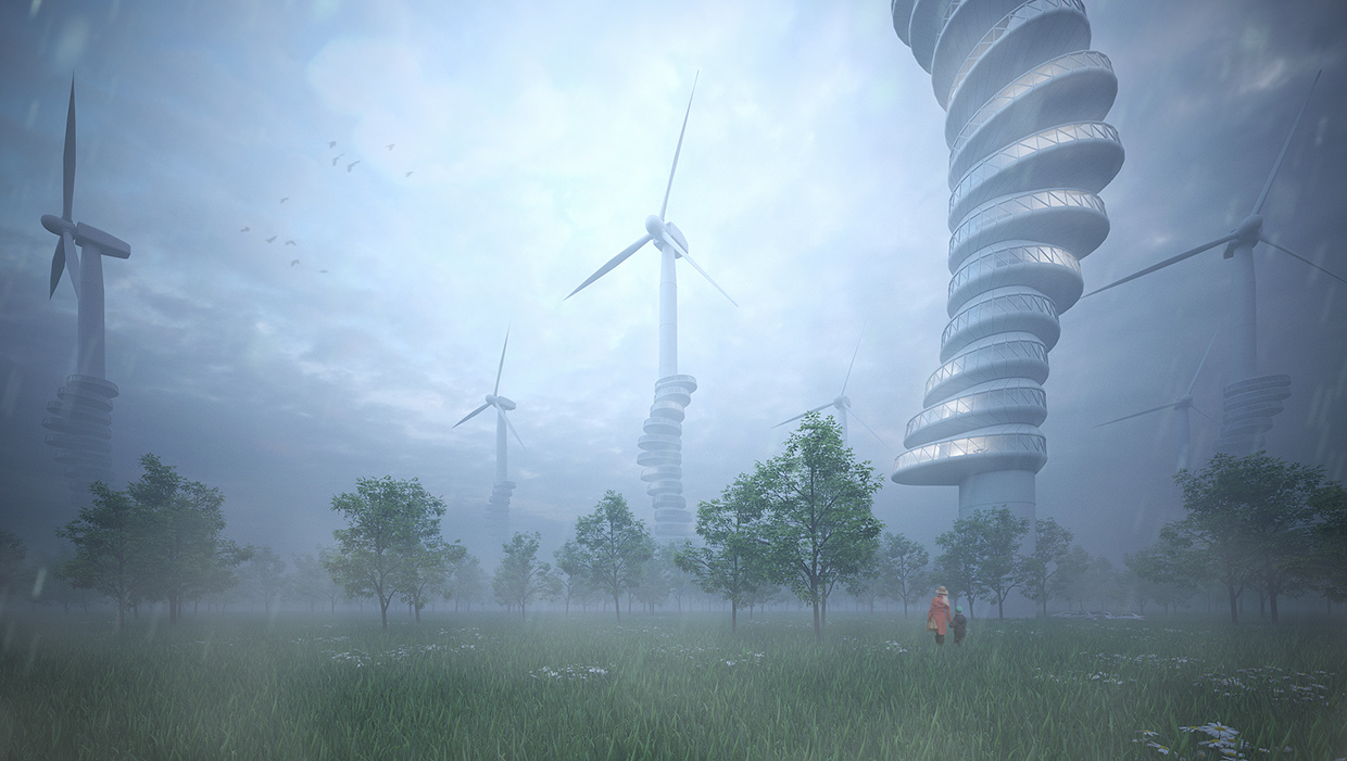
Here's a much bigger version found on this Düsseldorf-based architect/designer's Behance. And here's his website.
The artist says, "The concept arose out of an increased awareness to the appearance of large wind turbine structures on both the sea and land.
"Wanting to transform the large energy sources into something more than just functional machines, they are designed as habitable dwellings.
"The units are formed from highly-insulated capsules that are wrapped around the gigantic trunks of the wind turbines – residents are able to access their apartments through a hollow vertical tube that leads them up the shaft."
Hey, /u/mike_pants, you should crosspost this image to /r/ImaginaryTechnology.
I found a little more information:
https://www.behance.net/gallery/22536831/ROBOTIC-EXTRUSION%286-Axis-KUKAABS-3D-Printing%29
It seems the advantage over a single strand of same cross sectional area is increased stiffness in bending (see figure 'Structure Simulation Before Fabrication '). It's hard to tell from the picture provided, but I would bet that there is a significant stress concentration at the nodes. They don't test or simulate any axial load cases, presumably because this is much more compliant than a single strand axially. I wish they would compare bending and axial stiffness to a single strand and an annular strand to this new structure. Perhaps a curved I or H beam would make an interesting comparison as well.
I suppose this could be useful anywhere you need a very expensive strand of stiff plastic in pure bending.
Washington Warriors featuring the '65 spear helmets and coupled with any number of awesome looking logos.
No, they didn't.
From MacRumors: > As part of its advertisement, China Telecom used an iPhone 6 rendering from a Behance gallery posted early last month by Tomas Moyano and Nicolas Aichino. The renderings have been fairly popular around the web, including in our own stories, but differ from most recent leaks in some aspects such as omitting a protruding camera ring and showing rear shells featuring different colors at top and bottom.
Well, apparently someone made some symbols.
Personally, I think the INTJ's one should be swapped with the ENTJ's one.
The ISFJ's one is underwhelming. Is that an oven or some kind of fireplace? I think a shield with a red cross would be a much better representation of them.
EDIT: Aaand there's more from another source.
Hey ! This is actually Strasbourg - France !
Beautiful Place Kleber, welcome in my city. Thx for the cinemagraph :D
edit
here have an other one from strasbourg (the other side of the place) : https://m2.behance.net/rendition/pm/18796363/disp/061d71cac28ba506177555342b48f0b8.gif
And src : https://www.behance.net/gallery/18796363/Cinemagraphs-Animated-photography linked lower in the comments
here's a view looking the other direction
Here's the photographer's page with more shots
I wouldn't mind if they changed it, but I just don't want it to be something like the Capitals, or something dumb like the Redtails.
Edit: I do love this idea though https://www.behance.net/gallery/11458543/Washington-Redhawks-Brand-Identity-Proposal
I see all the coments about his genitals, I find that funny. That was kind of a point, it takes all the attention! Come on guys! Give him a chance, read the description on behance: https://www.behance.net/gallery/27343473/Chocolate-Bunny
Daniel Clarke's behance.
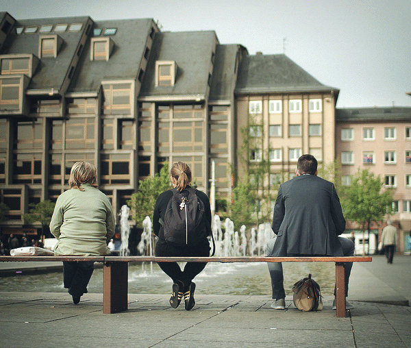
By positioning the image through the eyes of a youngster, I think the artist is revealing how temporary short-term gain is often reversed by it's long-term consequences. In other words, how newer generations lose out in these kinds of situations.
Wow... Didn't think this would get to the front page, but thanks. I was just messing around with different ideas.. /u/jpblah already gave you the link to the nebula one... Here is the other one:
https://www.behance.net/gallery/12984019/What-Space-Really-Looks-Like
and the uhh original wallpaper
/r/ImaginaryMindscapes
Vlado Krizan's Behance and deviantART gallery.
About this image, the artist says, "What if the British Empire didn't collapse after WW2 but spread to the whole world and beyond..?"
I like it because it conjures up feelings of ominous danger. At least to me. But then you see that couple in the far-left of the image, just sitting there, casually taking in the whole scene with no hint of alarm or care, suddenly the whole pic takes a different turn. It's analogous to how technology can, with familiarity, lead to a kind of shrugging acceptance rather than trepidation.
I'm working on new header art for this subreddit. It'll be multiple images instead of one. If you have any favourites that you've seen in this subreddit, please share those URLs or send me a PM.
Here's my entry this time around. This one I put overall more time into - a good 8-10 hours rather than my usual 3-4. Click on the image in the page to see it larger:
https://www.behance.net/gallery/22655531/Knights-Errand-Adventure