
What are
/r/photoshop's
favorite Products & Services?
From 3.5 billion Reddit comments
The most popular Products mentioned in /r/photoshop:


The most popular Services mentioned in /r/photoshop:
Photopea
GIMP
Pexels
Pixabay
Krita
Affinity Photo
Adobe Color CC
Creative Market
Unsplash
Freepik
Hugin
Blender
Pixlr
ImageMagick
Inkscape
The most popular Android Apps mentioned in /r/photoshop:

Snapseed

Adobe Photoshop Mix - Cut-out, Combine, Create
Adobe Photoshop Express:Photo Editor Collage Maker

Ruler
Pixl Preview

PhotoScan by Google Photos
Slit Scan Camera

Image 2 Wallpaper

Adobe Photoshop Fix

Photo Editor

PicsArt Photo Studio: Collage Maker & Pic Editor
The most popular reviews in /r/photoshop:
Some of the iPhone photos are legitimate-- thanks to the hard work of Peter Belanger. That said, these aren't the photos we're seeing in Apple Ads-- he just shot a MacWorld cover.
Overwhelmingly, the product images are 3D renders. This allows them for to achieve a perfect-- perhaps impossible-- lighting setup, where the blacks are truly black, a soft-box is filled with light entirely evenly, and microadjustments can be made easily.
This process has quickly gained popularity globally-- 80% of Ikea's Catalogue is just renders.
If you're seeking ways to make glossy objects look that good outside of a controlled setting, you're largely out of luck. Sure, the paintbrush tool can straighten out the edges in a reflection, but ultimately-- a camera is there to capture light. If you want to change the light, it's way easier to do that before you've taken the photo instead of after.
Irfanview. Small, takes no resources, works great on every Windows OS, displays virtually anything. Free. If you work with images, it will become your favorite tool. Trust me.
Yes you are violating the copyright. Even if you used a photo for reference, for instance you FREEHAND drew some fantasy image and used a photo of a bodybuilder as reference for the pose... if someone can compare your drawing and the source photo and reasonably say that yes you used that photo as regerence you are in violation of the copyright. So certainly tracing the image is a much more grievous violation. Would you ever get caught? Who knows. Even with reference you need to use it only to inform your 100% original drawing to be in the clear. I am not a lawyer but I did read https://www.amazon.com/Legal-Guide-Visual-Artist-Crawford/dp/1581157428 which is what I am paraphrasing here.
It's most likely a 3D render. Whenever such product pictures are too perfect its cgi. Quite popular among tech hardware and its not that much effort for the company since they have 3D designs anyway.
If you want to do something like that try Blender Blender
Looks to me like a linen texture. Either applied digitally with some kind of linen texture filter, or a scan of a print on linen textured paper.
https://clementinecreativedesign.com/create-linen-texture-photoshop/
Linen textured paper was popular back in the 1980s or so. You can buy it for your inkjet printer:
https://www.amazon.com/Pacific-Inkjet-Textured-Printer-8-5-x-11-inch/dp/B07MJT6G8Y
I have an iPhone, but Snapseed is made by google and it is very powerful in my opinion for a mobile app.
EDIT it is on android and iOS, the link goes to the google play store.
I used Vuescan from http://www.hamrick.com it works pretty well. Put your four pics on the scanner and it will detect four individual pictures and output to four separate files.
I would recommend making a bookmark folder of different truly Free stock photo sites. They are invaluable if you start doing professional projects and are just getting started. I would also add get a subscription to Death to Stock Photo. They email them to you weekly and are usually great.
Those are some elaborate, highly-stylized digital illustrations that were done mostly in Illustrator (I think) and then there are some photos that have been heavily manipulated, probably in Photoshop, and composited in.
Those processes are probably proprietary information that was developed by the artist.
I think if you're really interested in learning how to do this, you'd want to start by becoming a very advanced user of Illustrator and Photoshop. But the amazing creativity is something the artist was probably born with. I mean, I've been using Photoshop for most of my life and am technically extremely advanced. I couldn't even come close to creating something like that. There really aren't any filters or anything that could give you that look. These illustrations were developed bit by bit.
The artist is James White. He's Canadian. You could email him and ask him more about his process.
Hi, Photopea.com is the only non-Adobe software with a full PSD support. The UI is also very similar to PS.
It works in a browser and is completely free. You can open PSDs up to 300 MB in size.
You can do that in photoshop, but it takes a very artful touch to make it look decent. If you're turning a brick facade into stone, it is going to take a heck of a lot of work to make the edges and corners look right, and to re-create shadows from the roofline.
Probably the best choice is autocad or sketchup. That is what an architect would use for their renderings. There are a ton of software packages aimed at consumers that would be simpler to learn. I bet one or two of them has a professional version. I would check the ads in the trade magazines. I just googled it, apparently Masonry Design magazine exists. (I love trade rags, I work trade shows and I love to read the publications from other industries) There are a few articles in the latest issue about software for architects to do detailed, brick by brick layout, that's worth a look.
Amen! - It used to be super expensive, and given how much creation freedom you get when having the full package (Dont forget this includes motherfucken Typekit!) - Imagine you are a chef, and this is the price of renting your kitchen.
funny enough, this is actually an free illustrator resource that can be found online, the person who made that image literally downloaded the brushes and wrote something over the thumbnail...
here's the download link: https://www.freepik.com/free-vector/watercolor-background_1389689.htm#term=brushes&page=1&position=13
Photoshop 3D has sewer-grade functionality. Photoshop also has issues with the video editor; I've experienced something similar to this but it was due to nested smart objects not playing nice.
Considering all the bugs and the fact that 3D is being phased out of photoshop, you're much better off using After Effects. If you're not subbed to "All" Adobe Apps and don't wanna fork over the cash for Ae, then learning blender would be your best bet
"Jazz it up!" hah!
​
I tend to go here (or other font provider) https://fonts.google.com/ type in the name or text you want, then click 'apply to all fonts' and scroll away. Then download a few, install and try them. Always write out the names so you don't forget what you downloaded!
If you want something that doesn't involve a subscription, is super similar to Adobe Photoshop... I recommend... - Affinity Photo Costs $50 (one time payment)
If you want something that's free. I recommend... - GIMP
The free application Gimp opens .psd files without issues.
And Paint.net will also open those files once you install the plugin that can be found here.
I haven't had any luck with psd viewers despite having tried very many but your mileage may vary.
You might want to get a png of a person or just a person in general and lasso them out of there background then get a grunge or whatever texture and clipping mask that bitch on the person get a background that compliments the grunge you already clipped in the person and then put some flares around get the contrast and turn it up a bit and turn up the brightness a little. that should be just a general rendition of what your asking but for a more in depth and more stylish version get some particles and look up some ccs. I use rated designs I think he is really good. http://imgur.com/hnNGHoG Its not good but I made it just to demonstrate how easy that kinda thing is. But if you want that type of quality I would suggest working on your skill and watching videos and searching everything you need help on with some self learning if you can
https://www.mediafire.com/?bi8o2ko2wa623lq Thats the psd
IMAGE PSD FILE For that look I usually use gradient map or color balance to get to the base tone and then enhance hilight and shadow with a black and white layer set on softlight, in this example I used the fisrt two gradient map to reach de tone and value similar to that picture, then a curves layer to burn some hilight, the softlight layer and a hue and saturation layer set on colorize and soft light mode to wrap it up, hope to have been useful
A friend of mine who knew nothing about PS asked me the same thing the other day so I found this while googling around, he told me a few days later that they were exactly what he needed and was making great progress with "the beast", as he calls it.
You just have to be patient, the beginning is tough going and often times you will be pulling your hair out but after the initial hump it's a lot of fun learning new tricks and the myriad of ways to do the same thing. Best of luck.
search for Calibrize, its a free download that helps calibrate the colors on your monitor.
Also, had to correct you but PC resolution can go FAR higher than 1366x768, dependent upon your video card and monitor. I would strongly suggest you plug in a good external monitor into your laptop and do work that way. I have humiliated myself multiple times working from a laptop, then seeing the results on a real monitor later. Unless you're using a Dell laptop with RGB-led or RG-led, you're most likely seeing only about 1/2 of true color spectrum, and a contrast ratio that doesn't give you a whole lotta blacks.
Back to your question, yes the colors can be different from Mac to PC...even from Mac to Mac or PC to PC, hence with a good calibrated monitor, you know your colors will be accurate.
EDIT: Found it: http://www.calibrize.com/
Recreated in less then 5 minutes,
Fill background all dark(not black but black grey ish..faded black?),
New layer, fill it all white.
Cut out of that all white layer the top and bottom rectangle
Type your wanted text, use top and bottom text same color as your all white layer, and middle text the same as the background color.
download a grunge brush (http://www.creattor.com/brushes/distressed-grunge-brushes-pack-3491) make a new top layer and use one of those gruge brushes on that layer with the same color as your background color.
Stretch out the middle text a bit in hight
And done!
(example http://i.imgur.com/DVb3Zxt.png )
This way it is like a template and you can adjust all the text to what ever you want, enjoy
This type of noise is called Cell or Worley noise (using the euclidean distance metric).
One way to generate this type of noise is to use the Stones component in Filter Forge.
This site- timeanddate.com allows you to make a custom calendar and save it as a PDF which can then be brought into Photoshop or Illustrator to combine with your artwork.
DYSTOPIAN CITY
Modelling & Texturing Software: Blender 2.9
Signage Design: Illustrator CC
Compositing: Photoshop CC
www.artstation.com/artwork/mDJ211
To add to that, once you know how to do this (using Curves etc.), then know that there are also plugins and presets that have pre-made looks like this that can help you quickly get these kind of colors (at least as a starting point). Many photographers use VSCO presets in Lightroom I believe.
Also, the NIK collection is free.
Photoshop has no tool for creating photomosaics, but there is software out there that does it.
Last time someone asked these two were linked:
http://www.andreaplanet.com/andreamosaic/
http://www.mazaika.com/
(Have a look, I have not tested them).
There's only one Photoshop - the one made by Adobe (notwithstanding PS Elements and all the various mobile apps).
So your question should be "what is the best free image editing software i should use for my projects" instead. But even that is hard to answer without knowing what you want to do with it - compositing? digital painting? retouching? The list goes on, and your question is far too vague.
Having said all that there's /r/gimp which tries to do a little bit of everything, Krita is quite decent for digital painting and www.photopea.com for a toned down version of the real Photoshop that runs in a browser. These are all free. Affinity Photo is a very capable program on its own merits (one time payment of about $50 though). Take your pick.
Edit: forgot to mention Paint.Net (Windows only) and Pixlr X which, like photopea, also runs in a browser (but HTML5 as opposed to Flash). Both also free.
Affinity Photo is an excellent alternative. It's a one-time purchase of $50*USD* and can edit photoshop documents among other great features. It was updated recently and it has only been improved, I am slowly transitioning to it since I have such a large plugin and script library, some of which are not supported by Affinity Photo.
Most of the work in Photoshop is still done by the CPU, not the GPU. The GPU mainly improves the interface (smoother zoom, canvas rotation), provides 3D features, some advanced filters, and Perspective Warp.
Going by Passmark rankings, the range of i7 6700s hover around your old FX 8350, depending on clock speed. The i5 ranks lower, but shouldn't be too drastic considering you can back it up with more RAM. If you have other software (3D, video editing) that can take better advantage of the i7, go for that.
If cost is your main constraint, and Photoshop is your only big program, you may get more value out of another FX 8350.
Selective Color is your friend - choose white, add yellow.
Also a good way to get the lighting and highlights from a pic. Duplicate one of the Red, Green or Blue channels - preferably the one with the greatest contrast (usually Blue). Use Levels to bring the black up - and the White brighter. Use a brush to remove any bright points you don't want. Load the selection - fill with white or light yellow. Make layer Linear Dodge (Add) and mess with transparency. Most of the highlights on that helmet avoid the face - so you should be okay. Though you could add a couple.
Here's my take on it: http://i.imgur.com/y3deY.jpg
and here is the photoshop file
https://www.dropbox.com/s/icax2zb86kl2q7l/Prometheus%20kermit.psd
The Missing Manual does a slight better explanation, and they show you this little cheat sheet.
Does the Wacom you have use RS232 or ADB?
I doubt your Mac has a serial port and it definitely doesn't have ADB if it's from 2010.
http://www.macupdate.com/app/mac/14661/tabletmagic might make it work if the Wacom is serial and your Mac has the right port.
1: no, you edit full size RAW files, not small jpgs
2: find a local photoshop class and subscibe, make your employer pay if they want you to learn it
3: get a wacom tablet, they are a real help
4: there are macros (actions) but they are just for setup (for frequency separation for example), but it's up to you to do the work. What you might want to look at are tools like VSCO, or portraiture, they work with photoshop to help you edit... (also, check the nik collection https://www.google.com/nikcollection/
Mmm, I don't think he's doing any cutouts on those examples.
There's plenty of stock images of wildlife on black backgrounds: https://www.shutterstock.com/image-photo/tiger-looking-me-679942891
From there it's just a matter of toning and sharpening it to look like those photos.
Now, if you want to cut out something like this, first step is finding a good photo, cutting it out then actually redrawing the fur / whiskers using a good "Fur" or hair brush.
Normally what I do is cut it out best I can then grab a furry looking brush for my clone tool...then I clone the hair that I have and use the brush to add some back in to the picture.
If you want to take it a step further and make your photos look SUPER sharp like this you can either use the Camera Raw filter or my preferred method which is copying your entire image and pasting it as a layer on top of everything else. Go to Filter > Other > High Pass and set a high pass between 1 - 3 pixels. Click ok and then set that high pass layer to either Overlay or Softlight and tone down the opacity to get your desired sharpness.
My favorite small, fast image viewing and simple image editing program is IrfanView.
The 64-bit version is a 3.17 meg download, not even five megabytes, and it is lightning fast. Much simpler to work with than Photoshop, too.
To resize, load in the image you want, then click "image>resize/resample" and pick your size.
Try making that exact same think in a free design program like GIMP or Inkscape first.
You will then know how hard it is, even better... you will know if you even need to buy Photoshop.
I think you will find it is very difficult to get results that look professional. Has nothing to do with Photoshop. You do not sound like you have any graphic or print design skill or experience. If I were you, I would pay a professional to keep doing that work, and start the long road to learning graphic/print design.
This is a good resource to use: Complete Intro to Photoshop. If you'd prefer video there's Photoshop CS5 for Beginners. Both are good. check them out.
/r/PhotoshopTutorials
It will be very difficult to achieve a quality worth printing. You should look at buying a digital frame that can just loop the video for him. It could be really cool, there are some affordable options: https://www.amazon.com/Aluratek-Digital-Built-Calendar-ADPF08SF/dp/B00442VXCO/ref=sr\_1\_3?dchild=1&keywords=Digital+Picture+Frame&qid=1625506824&refinements=p\_36%3A1253504011&rnid=386442011&s=photo&sr=1-3
Logo Design Love is a nice easy read. It's about logo design (obviously) but it was my first design book and I enjoyed it.
Edit: I suggest a book over a tutorial because it might be new ways of thinking that you'll be introduced to rather than the more technical hard skills of the software.
Already been done, to the exact detail of your post, actually...
Also, I hope you're not just pasting that JPEG into your PSD? Vector that on your own. If you do, you'll have the transparency you'll need for the template. Look up tutorials on how to make business cards using crop marks, bleeds, and all that good stuff.
Then just send that to them, making sure they're aware of your transparency gig.
Are you on windows ? you might have to disable the display scaling on high DPI settings
i think it helps to think of the head inside a box. so a shoe box, which is not as deep as it is wide, flip it on its side. i couldn't find any pics so here's a thick book that will help illustrate what i mean http://www.keeleyhire.co.uk/images/items/full/5591.jpg
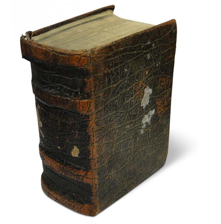
pop an ear on the front cover, pop an ear on the back cover. the nose, eyes and mouth goes on the book's spine. now, when you turn the box this way and that in your mind, you will hopefully get a more logical sense of how the head turns. i've done this sometimes, for head angles i couldn't really grok. instead i put a box on the character's neck and then sketch the head inside the box. that way it doesn't get away from me. basically, the way the banner pictures in r/artfundamentals shows. in fact, i this silent video https://www.patreon.com/posts/2451652 will get the message across, now that i've so amazingly set it up. r/artfundamentals is run by a concept artist and worth checking out. but i can't just promote that sub without mentioning r/digitalpainting which is cooler and run by incredibly good looking mods.
one thing to say is that when you sketch, just sketch line art. the image you linked is good, but it's a lot of time spent on just one head when you could have used that time to fill the entire canvas with head sketches.
because that's a big fat major part of it: practice practice practice. if it looks weird, analyze and draw the same thing again but correct the weirdness from last try. and if you get it right, draw it again to make sure it wasn't just a happy accident. no rest for the wicked.
Thank you! Oh i don't think i were anywhere close, i just used this stockphoto as a base, and then just improvised, no intention to actually make it look like her as a child just a gebneric child. However in the stockphoto there's a name of the uploader:
Victoria_Borodinova don't know if that's the name of the woman or if thats just the uploader. But again, there was no intention of making a realistic version of her but just a base to turn in to a child. Here's the stockphoto link https://pixabay.com/photos/no-make-up-without-makeup-natural-4375964/
Were you looking for something like this? http://www.caseywinson.com.au/images/PopCollage.jpg (a collage) or something like this: http://www.engadget.com/2004/10/19/how-to-make-your-own-photo-mosaics/ (a photo mosaic). The second one is done with the program and instructions in the link.
The first one is done manually... make a new large blank image, open the various photos you want in it. Go to one of those photos. Select the box marquee tool (M), at the top where there's a blank next to the word feather, put in a number like 10 or 20 or whatever gives you the results you like. Then ctrl+C to copy, go to your big blank image now, ctrl+V to paste. The blurred edges will be determined by that feather number you put in earlier. Smaller number = less blurred. Use the black arrow (V) to move the images around where you want, if you're dragging around one image and you prefer to drag around a different one you did earlier... with the arrow still selected as your tool, right click on the image you prefer and a list of layers will come up. Usually just selecting the layer at the top will choose that image and you can start dragging it around.
Also, instead of using the box marquee tool, you can use the lasso (L) and draw an outline around the part of the photo you want to copy and paste.
Tbh if you’re gonna use creative suite professionally, the entire suite is worth its weight in gold, if you’re just looking to do fairly basic stuff and aren’t really proficient yet, this would definitely cover beginner-intermediate work. https://pixlr.com/editor/
WIA kinda sucks. It is very limited.
If you want a decent free scanning program with a lot of features, I recommend you have a look at VueScan.
It would allow you to customize a lot of settings, and do things like setting it to auto-repeat the scanning progress immediately (so you can just stand next to the scanner swapping out pages every few seconds without having to click anything).
You should check out Substance Designer. It's my absolute favorite software for creating textures/materials/patterns. You can pick up a free trial or try out a student version (no limitations). It was so hard for me not to say "oh just go hop in Substance and create that" haha. Had to keep reminding myself it's a relatively new tool.
https://www.allegorithmic.com/products/substance-designer
Don't let the complexity shown in the video scare you away, it's super simple and quite fun tbh. I made this in less than 2 minutes just now!
Yeah, no, you can't do that.
Go to Shutterstock.com and maybe see if they have some good diagrams that will help you out. You have to purchase these images (They're maybe $10 each) but they're royalty free which means you can use them in most instances without getting into any legal troubles.
See if any of these will work for you: https://www.shutterstock.com/search?searchterm=anatomy+illustrations&search_source=base_search_form&language=en&page=1&sort=popular&image_type=illustration&safe=true
Seems like it has to be paper marbling with some digital effects.
FYI, the artist is selling the template.
https://graphicriver.net/item/detach-poster-flyer/19298058
Edit: Could also be oil brush work, e.g. https://www.shutterstock.com/image-photo/blue-purple-paint-brush-strokes-on-335367446
VSCO for Lightroom can achieve a similar look and is quite good.
Alternatively play with the individual curves colour channels with some selective saturation adjustments and you should get close to the effect. Sorry if that sounds vague but literally just open an image and have a play.
Well, to get the aesthetic of the first image, you just need to:
- find a good texture background (this will get you started: https://www.pexels.com/search/texture/)
- (optional, depending on how much you like the look of your texture as-is) layer it on top of whatever solid (or gradient, or whatever) background you want and then use a blending mode (the one to use kind of depends on the texture and background, but you can try starting with "Multiply"). You can also use adjustment layers on the texture layer if you want to tweak its look.
- Paint or place whatever graphic you like on top of this background.
From looking at the image, I'd guess that the original artist found an image of maybe old leather or Naugahyde, tweaked the contrast a bit and then painted over it with a brush and then set the blend mode to "Dissolve" to get that pixelated effect wherever the paint feathers off. I'm just speculating though, and I'm sure there are numerous ways to get that effect. For example, you could get a similar effect with a vector mask on a spray paint brush layer.
As for the aesthetic of the second image, you'll probably want to do something like:
- crush the levels
- turn the adjusted layer into a smart object (because doing things destructively is a horrible idea)
- add a noise filter - set it to "Gaussian" and "Monochromatic" if it isn't already there by default
- add a threshold adjustment layer
I'm sure someone more skilled with Photoshop than myself knows a better way of doing that, but this might get you what you want. Hope this helps!
https://www.pexels.com/ - this place has tons of large images that works quite well.
I've also noticed doing a search on Google for "Royalty Free Free Images" - notice the extra free, and the returns were decent ish. Pexels was how I found that. Might be new ones popping up from time to time.
Ahh, I found it so difficult to find a picture of a car that would work that I didn't realise that it was backwards! PT GUI is a Panorama Tools stitching program; hugin is an open source alternative, it takes the individual shots and stitches them together, but it usually leaves you with a lot of gaps to fill in photoshop.
Not to burst your bubble, but save for web does an average job at best for image compression. If you're on a Mac, I highly recommend image optim (http://imageoptim.com) and compress all your images through there before publishing them online.
Hmm, I don't use an all in one. I use FastStone Capture for the screen recording, then Adobe Premier for the editing. FastStone is a powerful little tool for 20 bucks though. http://www.faststone.org/FSCaptureDetail.htm
Use a camera?
Anyway, if not there is google image search but be aware of image quality/resolution and copyright. Learn how to use all the search options.
There are also many free stock photo websites. E.g. https://unsplash.com/ and http://www.gratisography.com/
Search some more and you can even find some RAW files...
The best selections are from paid sources naturally. Many stock websites like that.
Hi, there is always some compromise between intuitivity / simplicity and capability. You can not have both at the same time. So if you are looking for the simplest solution, you should stay with MS Paint.
Otherwise, you will have to learn new stuff, nothing is 100% intuitive. Personally, I am using Photopea. The UI is similar to Photoshop, but it can work with GIF, SVG and Gimp files (XCF). But it is always going to be "uncomfortable" at the beginning, because every program is more complex than MS Paint (I guess). It is good to read some documentation or watch tutorials, to learn faster.
Given your use case, I suggest you look at Affinity Photo:
https://affinity.serif.com/en-us/photo/
They also have an Illustrator alternative, Affinity Designer:
https://affinity.serif.com/en-us/designer/
I have not used Photo, but I use Designer. It's a very robust, full-featured application.
>Affinity Designer
This is incorrect. Affinity Designer is a vector drawing program replacement for Illustrator.
To replace Photoshop you must use Affinity Photo instead.
I recently purchased and use - at work, no less - Affinity Photo.
It handles psd and psb files directly to and from photoshop. You can save into psd format and it will be completely compatible.
It's a ground-up rewrite of PS, essentially, by a 3rd party Co. Pretty much anything you bring in is treated as their equivalent of a smart object, without having to first specify it as such.
It's also very cheap. And you buy it, not rent it by the month.
https://affinity.serif.com/en-us/photo/
While I was looking for the correct URL to paste here I also spotted it's currently on sale at 30% off. So U.S. $35.99. You can find tons of stuff on youtube if you doubt it can be any good for such a low price, but I've been more than happy with it and I would call myself a pro-level user (masks, overlays, replacements, etc.)
For those wondering about my fanboi suggestion to use their product. No, I don't work for them. Just a happy customer.
A little advice: you no longer buy Photoshop, but license it for $10 a month. If you're working on a Mac you might want to try Affinity Photo as it's a one time purchase. It's been winning a lot of awards and stuff. Not saying it's the best option, but is a viable option that will be a lot cheaper. I've only really assessed it from a retouching point of view, so I can't speak for it's design elements.
There is no such thing as a free Photoshop package, the one bundled with Lightroom is $10 a month.
It's a different story if you meant to say a free image editor - take a look at r/gimp, paint.net and pixlr online. And Kryta also (mostly for digital painting).
I haven't used it myself, but my brother uses Blender. I know that you can export your meshes into formats compatible with Photoshop. Its open source, and you pay by donation:
The best free image editor is Gimp.
Photoshop is 10$/month.
A cheaper alternative (just as powerful and similar UI) is Affinity Photo. I believe it's 40-50$ (buy once).
Ps: You really damaged the quality on that card by the way. Notice how much harder it is to read the text?
I would also recommend against the magnetic lasso tool (if you care at all about how it looks). There is effectively always a better tool. For example Quick Select Tool/Select & Mask. But it is situational. :)
I can't find what I used to use. It's free so I'll link it here when I find it. Until then, check these out. https://www.wfdownloader.xyz/blog/best-bulk-downloader-applications
Bulk Image Downloader is pretty great once you actually have a site chosen to download from. You can choose how deep you want to search in a page.
Here's The Basics of Photoshop in 25 minutes They use an older version, but the lessons still apply. As far as completing the task, you're kind of on your own there. Best advice: dive in and experiment.
In the end what you see on your monitor is limited by what your graphics card and monitor can display, which is likely 8 bits/channel. I'm told even 12 bits/channel requires special hardware and drivers (probably very expensive!) and there's nothing better than that. So you won't be able to see a change between 8 bits/channel and 16 bits/channel.
edit: Interesting read: http://superuser.com/questions/545563/what-are-the-advantages-of-10-bit-monitors
What I don't know is if printers can handle 16 bits or not. You may see banding in photoshop but not when it's printed. Give it a try.
If you want to work in 8 bits/channel, you'll need to use dithering and noise to create the appearance of smooth gradients as others have mentioned.
Have you checked what the font? You'll have to isolate some text and straiten it, but if it can't find the exact font it should at least give you something close.
How's this? http://i.imgur.com/98jGU.png
Here's the PSD: https://sites.google.com/site/redditstory/miami_feet.zip?attredirects=0&d=1
Basically I just cut the different sections of the image into different layers and applied styles. I did clean it up a bit because when you turn the background black you can see some artifacts around some of the items.
If you're gonna use the psd just get rid of the black background.
About the school point: from my experience, while school can be of help, 99% of the time no cares whether you went or not. The industry is all about your portfolio and experience.
And considering just how much you can learn through youtube videos or online courses, I may suggest taking some time and really working towards improving your abilities through tutorials and get a feel for doing mini-projects to see if you even like it.
And consider that while there can definitely be opportunities to flex your creativity, more often than not, you are your client's tool to pump out a piece. (manipulating that client to point them in the right direction with a design is a whole other skill that you develop so that things don't look like complete crap, though, haha.)
Also be aware, if you don't like deadlines, run away. It's all deadlines all the time.
I was lucky enough to grow up in my families graphic design company that I now run, getting a lot of experience in the field. Went to school for business. I can't draw either (my dad is the illustrator able to draw anything), which is a skill I'm working on - but I generally don't have an issue. Truthfully, it sometimes impedes me when it comes to certain logo designs, but that's about it.
In general, though, the toughest part in this business is business. Dealing with people. This would be the perfect job if clients didn't exist.
Edit: by the way, other then youtube, great place for some solid tutorials is Tutsplus.
Can you split it up into a couple different pdf files? Or better yet so each page is a separate pdf?
This site can supposedly convert pdf to jpgs. I'm sure there are others. Look are shareware.com and ZDnet.com for freeware that can do it as well.
or...i dont know...maybe get a current gen entry level tablet that would be good for lon_oh's level for about the price he/she is looking for ($80, close enough).
Wacom Intuos Small That would be a good place to start. It has enough functionality to do most things you will probably want to do with it and you can always upgrade to the pro version down line when you are ready. Currently $80 and is often at that price and sometimes lower if you find at a good time. Watch the video included on amazon to see what the different versions offer.
I use a background eraser app to remove the donkey head from it's background then save it
Then use the poster maker app to add the photo of your friend and then add the donkey head on top of that
https://play.google.com/store/apps/details?id=com.coolapps.postermaker
https://play.google.com/store/apps/details?id=com.handycloset.android.eraser
If you're using Windows, just configure the firewall to block incoming and outgoing connections for Photoshop.
Edit : Here is a thorough tutorial. http://www.howtogeek.com/112564/how-to-create-advanced-firewall-rules-in-the-windows-firewall/
Of course, I was on my phone earlier so I couldn't find decent links.
This tutorial should show you what to do on Windows: http://www.howtogeek.com/howto/16226/complete-guide-to-symbolic-links-symlinks-on-windows-or-linux/
I'm not sure how OS X handles Symlinks but I believe it should be similar to the linux instructions in that link.
Basically what you will do is create a preset folder on your HDD, put all the stuff in there and then insert a symbolic link to where adobe usually stores the preset folder.
You could use one of these programs to take video stills: http://www.makeuseof.com/tag/3-free-tools-to-capture-stills-from-video-files/ Then, you could use photoshop to pull your brother out of each still and put them on the one with the splash as the background.
Well I tried your advice, what do you think lol. Rough Draft
I personally don't like the blue tint the statue is giving off. Tried to change it in curves and color balance and didn't get the colors I was hoping for. Maybe I should try changing the mountains to fit the statue.
yup. that's one of the essential, but mostly unknown tools in Ps. There's also a pro version which is even better.
They are highly processed images. There's no simple technique to them. Some of them appear to be composites... the lighting in this doesn't match the sky <em>at all</em>, for example.
Well this reply is late, and you may already be too deep into the project... but this is my suggestion: if you plan on doing more 3D, and you need shapes that are a little more complicated than, say, a basic beer can... consider downloading blender.
I ended up doing it after being frustrated at the slowness and hassle of working with photoshop's 3D. It's VERY VERY slow compared to proper 3D programs, even if you know exactly what you need to do. It takes forever to render the simplest things.
In blender stuff like this is so easy, it's like 2 clicks (check out 25 seconds into this video) - https://www.youtube.com/watch?v=clO6M9fS1Ls&feature=youtu.be&t=25
Switching to blender made everything easier, even though the learning curve will seem steep at first. You can find a youtube tutorial for virtually anything.
I feel your pain man. I've been using PS for years, but only used illustrator a handful of times. Every time I'm forced to use it I feel so lost.
This is the only help I can offer. http://www.ehow.com/how_5924445_convert-psd-file-vector-art.html
For those specific images you link, I'd start by interpreting value as opacity.
Switch to Channels and CTRL-click the RGB channel to select based on value.
CTRL+J to lift the selection to a new layer and work from there depending on what you need to do.
5 minute example with not much attention paid to masking: https://www.dropbox.com/s/9nsw0rv3y0m0twu/j4afziQYOZ4gf.psd
Unless you're working in 4-bit colour the difference between adjacent bands of colour is going to be in the order of 1-bit here and there anyway so a random luminosity is usually going to be enough to bring the two together.
I understand what you're saying but noise maps aren't particularly practical in Photoshop, are resolution dependent and, dare I say it, a rather over-egged solution to a problem that rarely is a problem.
Here's a heavily posterised smooth gradient (dither turned off) with noise added to illustrate that dithering has indeed occurred.
https://www.dropbox.com/s/arhsvvb83adw6sc/dither%20from%20noise.png
Hey man, it's okay. What I do when I don't know how light behaves in a certain scenario is I google it. So if I was making the image you created I would google "glass bubble". If you look at this example you can begin to recreate something that looks reasonable realistic.
Then you can apply all the same effects through various techniques and tweek them until it looks right to your eye. Here's what I was able to come up with. Not perfect (definitely more color correction is needed) but more pleasing, as least to my eye.
I learned completely through messing around. Trying to duplicate an effect that is naturally occurring as closely as possible.
Lockdown has been difficult for everyone, but especially for those of us who need to vent our creative energies, therefore I've chosen to channel some of my ideas into composites. How convenient it would be if we could just teleport to places using a portal, or in this case an archway.
I'm an amateur editor and in the past I would struggle to create composites like this because of my inability to utilize photoshop to its fullest. After trying many editing softwares, I found that using Pixlr X the easiest for creating collages and composites. This edit took about an hour and a half to create.
Please leave some constructive criticism below, it would be greatly appreciated!
Also here's the link for the editing software :)
I don't have a clue what you mean with painting on a copied image... Are you talking about layers? Why does it have to be right click? What's wrong with a regular left-click painbrush?
But anyway, try https://www.photopea.com
and try being a little friendlier next time.. you're not a manager commanding something from the employees..
You may need to recreate it but it shouldn't be too hard. I think this video will help get the effect you want: https://youtu.be/p36nHaOFKe4
Just a note though: Photoshop is a "rastor" program. That means the image is made up of pixels and always has a chance of having a jagged edge to it. For truly smooth lines, you'll need a "vector" program like Adobe Illustrator or Inkscape (https://inkscape.org/).
If you're creating art from scratch you're probably best looking at Krita. It's very powerful.
As others have said, Gimp and Paint.net are probably your best bet for free photo editing.
I don't think so? There's this comment and this plugin, but I haven't tried either.
I'm not sure what you mean. Do you mean like posterization? Like vector art?
No. However, if it doesn't hurt your workflow too much, couldn't you put a solid color layer above the image and lower its opacity (to ~10-15%)? That should help the pen path pop without blocking too much of the image.
I don't get this behavior on my end. What layer is active when you click the brush tool? From what tool are you switching when this happens? Any tool? Are you using Windows, Mac, other? It could be user error. Hard to tell.
If you've got a budget, Kyle Webster's Mega Pack of Tool Presets has more than you'll ever need for $15. He updates it frequently, and has a few freebies as well. Otherwise, there's tons of free Brush Presets to be found on DA.
Better idea; use a scanner.
That will solve your distortion/angle/lighting/scale problems as it will scan it perfectly flat at the correct scale/size.
If you don't have a scanner, borrow one, or buy one. A basic A4 flatbed scanner (from e.g. Canon or Epson) will probably do a perfectly good job here - and they're dirt cheap.
Vuescan is great free scanner software (if you need it).
Quick extraction using threshold and shape trace in Illustrator.
TBH your best option is just to recreate it. Using a font that is similar I think this is if not similar possibly the correct font.
i think it all depends on their intended usage. If you're retouching for a fancy fashion magazine, you'll want to be meticulous and do everything by hand. If these images are not going to be viewed critically, then just use something like Portrait Pro.
In this specific case I'd just go there with Street View...
So if it's a sign in a location you know you could try that. You could try SmartDeblur, but it's unlikely to be "CSIable".
I would go with whatever you're more comfortable using. For me I use Powerpoint on my macOS because I'm faster with it than Keynote.
Also something to note: If you REALLY want to do it in Photoshop, consider just pulling inspiration from decks you see on that site and assembling your own.
For instance, this is a really nice, clean presentation: https://creativemarket.com/GoaShape/494082-NASH-Keynote-Presentation-GIFT/screenshots/#screenshot1
I'm not sure what type of product or business you're going for, but most decks these days are just clever layouts, typography and clean photos...easy to make, but hard to concept in your head when you're under the gun...still if you don't want to mess with Powerpoint or Keynote you can at least find some slide layouts you could recreate in Photoshop.
In the past when I have had to do this on windows I used a Power Toy which somehow still exists and is getting incorporated into Win10 Power Toys:
https://www.bricelam.net/ImageResizer/
Now I know this is not natively in PS but it was always reliable, quick and easy and you could do batches of pictures.
Not sure of Macs but hope this helps in some way.
I'm curious to hear some tips on this as well, but I'm afraid often you'll have to sacrifice either quality or file size. You could try services like https://tinyjpg.com/ to shave a bit of size off, but it won't perform miracles.
I guess it really depends on the type of image as well. The big blue gradient in your example is quite prone to having the noise/artifacts be noticeable very quickly. The more textured / contrasty parts of images won't be as much of a bother.
I'd like to see what other people have to say though, I'm just guesstimating here.