
What are
/r/Design's
favorite Products & Services?
From 3.5 billion Reddit comments
The most popular Products mentioned in /r/Design:


The most popular Services mentioned in /r/Design:
Dribbble
Behance
WhatTheFont
COLOURlovers
Kickstarter
Google Fonts
Adobe Color CC
Issuu
FFFFOUND!
Unsplash
Inkscape
Pixabay
Product Hunt
Figma
Blender
The most popular Android Apps mentioned in /r/Design:
Nova Launcher Prime

Click UI - Icon Pack

Video Editor Music,Cut,No Crop

Rippple - The Dribbble app

Mutiful. Volume with SMS.

Brain Games II

Iconic: Icon Maker+Logo Design

NFC Tools - Pro Edition

Adobe Capture CC
DailyArt - Your Daily Dose of Art

MAX VR
The most popular reviews in /r/Design:
This is a pretty direct rip off Alex Eiman's national parks series.
I'm all for using things other people have designed as inspiration, but showing off something that's a blatant copy isn't a good look.
Personally, flux has really changed my life. I look at computer screens all day and night for work and play and I used to get insane headaches after awhile. After introducing flux about 2 years ago, I've not had a screen-related headache since.
Maybe that's just me, but there is definitely a population where the blue light causes serious problems.
EDIT: Link to Flux's website and how to download: https://justgetflux.com/
$2000 being the result of competing Amazon bots, but never mind that, now i've got your attention...
Edit: And it looks like it's being re-released, welp, so much for your hard earned $277.
Some background. Every weekend I try to do a PPS, which stands for Personal Project Sunday. Essentially I try to use the PPS to try a new style or a new technique. This was the result.
​
Full project here: https://dribbble.com/shots/5703840-Work
> There's no way they're producing a ton of custom art for these things - it's gotta be a stock image.
This probably comes off as rude, and will get downvoted but; No thanks, I know you most likely aren't going to just rip my name out and use it as your own design, but I also don't want mine to become a template.
Now to be helpful:
Steal Like an Artist: 10 Things Nobody Told You About Being Creative
Draplin Design Co.: Pretty Much Everything
Don't Read This Book: Time Management for Creative People
1 Page at a Time: A Daily Creative Companion
Creative Confidence: Unleashing the Creative Potential Within Us All
Creative Workshop: 80 Challenges to Sharpen Your Design Skills
Finish This Book
How to Use Graphic Design to Sell Things, Explain Things, Make Things Look Better, Make People Laugh, Make People Cry, and (Every Once in a While) Change the World
Burn Your Portfolio: Stuff they don't teach you in design school, but should
Designing Brand Identity: An Essential Guide for the Whole Branding Team, 4th Edition
Not a copywriting rockstar myself, but I'm using an app that helps you to write more concise sentences.
It's free, so just copy your text in there and you are good to go http://www.hemingwayapp.com/
Affinity Designer is a worthy Illustrator replacement. Affinity also released Affinity Publisher, desktop publishing software like Indesign, which is currently free while in beta.
I really enjoyed the Netflix Original TV Show "Abstract - The Art of Design". It is not very in depth, but it is a smooth watching experience and gives a rather compact overview on how some famous designers tackle problems in their particular field.
I think Microsoft is still at a point where we should be patronizingly congratulating them for even creating this document. It's cute!
Maybe one day they can collectively figure out why this: http://windows.microsoft.com/en-us/windows-10/about
is both objectively and subjective worse than this: https://www.apple.com/osx/
Thank you for sharing your unused resources, but I'd like to ask you to create and display a license for those willing to use the work to protect everyone involved. The following link will make it really easy:
It's not a 'litmus test'. If the work is deemed transformative, there is precedence that that commercial work can be considered fair use. See Blanch vs Koons. The image was a re-interpretation of the original through an 8 bit lens, reflecting the relationship between the music and the original.
The image wasn't even the main commercial offering.
I would start with Don Norman's The Design of Everyday Things, which was actually originally titled The Psychology of Everyday Things.
This book was very formative for me as a designer.
Edit: I just bought another paperback copy. I had gifted my previous copy to a budding designer, and have missed it since. I think I'll give it another read!
Edit: Also, checkout Rudolf Arnheim's Art and Visual Perception. It's full of gold.
Followed Breno Bitencourt's tutorial since it was my first time trying this (https://www.behance.net/gallery/16579635/Low-Poly-Self-Portrait-Tutorial). Took around 6 hours start to finish with some experimenting/redo's at the beginning. All worked over just regular unedited photo (I wish I'd played with the colors a bit more, can always do that post though).
Terribly dated, the fonts seem like free generic versions that came with your ios, try looking through some of these as inspiration for cake companies with a more modern appearance.
Very interesting, visually striking! Reminds me a lot of the Spirits in the game Bastion. http://www.mobygames.com/images/shots/l/529850-bastion-windows-screenshot-this-is-distillery-a-place-which.jpg
You mean the Apple Computer who's design language is set by a Brit who never saw one of Dieter Rams' ideas that he didn't like? Or the NASA who's design language was set by Germans? Coke I'll give you.
Slight upgrade is to use one of these. What I used when I lived in dorms.
"As Little Design as Possible".
I think some people are missing the point about the specific change between these two Braun products, the first having been designed by one of the most influential product designers of the 20th Century.
It's a bit sad really, Braun were in such a good position to carry on the practices and values of Dieter Rams, and continue to be the aspirational brand it once was. It's a shame they've chosen to go after a different market, but business is business I suppose, and I'm sure there are other manufacturers making some stylish minimal shavers if we looked hard enough.
Made in Blender i always recommend the same Beginner Tutorial for that. But the program or technique is much less important than the understanding of light and composition for something like this. And that needs practice and experience. I highly recommend picking up photography for that. Thank you so much :)
Yes WhatTheFont and Identifont are two ones. They work okay. Also note the sidebar of this subreddit where it says "For font queries..."
These are done with a flatbed scanner. You have to print out the type in black/white, and as you scan the page, slowly move the paper to follow the scanner head. If you move the paper faster than the scanner head, you get the reversed effect like in that Phantom Love example. Here's a logo that I created using this technique.
Unique yes, unprofessional yes.
Please don't take this as negative, or a deterrent but I've been in the design field for about 5 years now and just want to share some friendly advice.
*I'd say this will do you more harm then good looking for a gig.
*You should focus your energies on making an appealing portfolio and a resume that compliments it. (You can go all out with color and presentation but as far as a resume is concerned these usually have to be printed black ink on white paper and demand legibility) Work always before resume, Some people might but I dont' care if you were a bum that took up photoshop in your spare time as long as you are good.
*the text in the middle right now needs a lot of work. It seems like you just chose a cool looking font and ran with it. There is no hierarchy though and the all caps makes it extremely difficult to read.
Here are some things I fffffound that you might want to use as jumping off points. The woodcut lettering might satisfy the gig poster look you have going. http://ffffound.com/image/4cd69366c8736007e61e8c614f3139a8257e1920
It' would be good for headers and callouts but you need something more legible for body copy.
*The colors are close to fairey's http://www.mediabistro.com/unbeige/files/original/vintage%20fairey.jpg
*buttons don't click anywhere if this is printed,and make sure your logos are up to date.
Any who, I could keep going but I think you should definitely revise this puppy with legibility and hierarchy in mind.
Cheers,
I just had my vacation days approved and felt inspired to do illustrate my vacation-feeling. I've also been meaning to try out some new methods for a while. Made in Illustrator in about 3h.
​
Here's the whiole project: https://dribbble.com/shots/6460868-Vacation
Honestly, I'd consider changing the words within the context completely. Unfortunately, at this point, those exact words have been dragged through the media discourse so much that it is now a joke and practically white noise to people. Those people who wish to defend him have already found justifications for those words in particular.
Have you considered other ways to frame the same message, so that people need to work to reprocess the message and its meaning? In the first place, that line is the most touted because it's the easiest to make jokes about and throw around for shock value, but it's the context of the quote that really made it so shocking.
Look over the transcript again and perhaps you could see other angles for the same message. There are a lot of powerful, much less regurgitated lines said within the conversation that may require a bit of cleverness to design the message well.
https://www.nytimes.com/2016/10/08/us/donald-trump-tape-transcript.html?_r=0
As it stands, I'm sorry to say it feels a bit stale and too on-the-nose. The design is basically just a big font statement of a tired sentence and then what looks like newspaper clippings on the bottom half. There is nothing about the design that is uniquely designed around the message itself. It's okay, but closer to a 'homemade protest poster' kind of way and not a 'designed professional message'.
https://dribbble.com/shots/2758917-Tripit-Summer-LP/attachments/561556
Those illustrations, specifically the van. Are they isometric vectors with some creative (mesh?) gradients? They are so well done they almost seem 3d rendered, but it does look like true isometric projection, which would be easier done in 2d.
Factoid - : an invented fact believed to be true because it appears in print. Source: https://www.merriam-webster.com/dictionary/factoid
Factoids are not facts but are commonly accepted as facts.
Sounds like you got it about right, according to this TED Talk, Barry Schwartz on The Paradox of Choice. Apparently, to be happiest with the outcome, we like to have some choice, but too much choice will actually decrease our satisfaction.
found where this post came from:
http://tutorialzine.com/2011/05/tweet-to-download-jquery/
looks like it doesn't even work properly as you can close the window & access the download.
I'm having a hard time finding screenshots of events of the olympics, unfortunately. But here's a quick example of that is how Skype does it. They've put out one of the most beautiful brand books I've seen:
See how they don't just leave things up to chance with their imagery? They will never hire someone who will say "why don't we mix things up and start using jagged vector elements with neon colors! that's what my taste dictates!" Nope, the brand has specifications which don't allow for that. Consistency in that regard helps connect with your audience and makes all of your materials feel like a complete and cohesive package.
>OK, let me explain. In this case, 30 degree angle can be created using CSC very easily.
OK, fair enough about the 30 degrees, but how is the stroke width of the C defined? In the VW, how are those stroke widths defined?
> https://www.behance.net/gallery/553179/Radon-Corporate-Brand-Identity
Unless I'm missing something, nowhere in that presentation does it give any explanation for how the logo can be created. It's just a bunch of arbitrarily placed circles and lines that could not possibly be described without measurements. Yes, the logo is created out of circles and lines, but that's it. There is no rhyme or reason to their placement, sizes, or lengths.
>If you are interested, I will find some time down the road to produce a follow up post on the construction of nike and McDonalds' logo.
I would love to see this. If you could show me a way to accurately recreate those two logos using only a straightedge, compass, and string, I would be genuinely impressed.
I don't have a list and I'm out of town so I unfortunately can't exactly make one at the moment. But I can tell you that some of my favorites have been Designing Design by Kenya Hara, Dear Data by Lupi and Posavec, and Aaron Draplin's Pretty Much Everything (I think this one is especially good for young designers). My books about specific designers have also made great reference materials.
Agree. On the static version it was upside down for the better readability. https://dribbble.com/shots/5614984-Walking-Bean
But in motion it supposed to be as you suggest. We missed that thing :D
NBC didn't come up with this poll, Daily Beast did. And the list is based on data from a Georgetown study. Both look at the risks and prospects of graduates depending on major.
These wallpapers are made from designer Meng To in Cinema 4D as part of his Design+Code tutorial.
Here’s a link to his Dribbble post. The post contains a link to a series of 70+ wallpapers free for personal use.
I do use motion 2, made everything too easy haha. Being able to put the same velocity on everything made it cohesive and quick, but i think it also might have made it a little stale.
And yes I do have a dribbble
> All photos published on Unsplash can be used for free. You can use them for commercial and noncommercial purposes. You do not need to ask permission from or provide credit to the photographer or Unsplash, although it is appreciated when possible.
Source: https://unsplash.com/license
And cross chopsticks in the centre at the red circle seems like anti-japan etc. I did some shabby change about it, hope you don't mind.;)
1.Imply the red circle as plate
2.Looks like a JP character'旦', which means sun rising
And proceeding to finish and complement sure be welcome.
In all honesty, I don't feel any are ready, but a combination could be great. I think one of the main issues is the mix of angular and round styles. To solve this, I think there are two options.
The first is to change the shape of the container, most likely to a circle. I would recommend using the background pattern from the first design, scaled up by 150%. You could achieve this by clipping the current hexagon layer to a circle of the right size once the hexagon has been enlarged. The problem with this is that, as previously mentioned, it'll start to look quite a lot like the Beats logo.
I feel like -- because of the logo's apparent recognisability -- this might be the better route to take, though. I think the b logo may need tweaking to begin with. All I suggest is the following: the circle at the top is duplicated; the new circle is then expanded by half of the b logo's thickness (Object > Path > Offset Path in Illustrator); and this shape is then subtracted from the main b-part of the logo. Before the subtraction, you may need to drag the top two points of the logo up, to make sure it would cut nicely. This would clean up the top of the main shape.The other option is to change the b logo more seriously, so that it fits with the hexagonal theme of the background shape. Some examples of what I mean can be found in this article. Although it might look good and less like the Beats logo, it would lose some recognisability.
It's you're choice, but overall I think they look pretty nice, and I really like the low poly pattern. Seeing as I'm a pessimist and terrible cynic, can I ask why you've used JPEGs to save the images? PNGs offer better quality, and for graphics the size is usually smaller too.
Edit: corrections
There's something like 130+ trackers on that site, Disconnect Me went nuts and I had to turn on NoScript to be able to read the page normally. After doing that it didn't give me any problems.
No, but seriously - Fuck that site
A little background on my product. The ZipSeam is a product that you use to tailor a baggy shirt in under 2 minutes. I was recently funded on kickstarter https://www.kickstarter.com/projects/zipseam/zipseam-instantly-tailor-your-clothes
I would like the logo to go on packaging as well as my shopify store.
I would love your feedback as I have no artistic background in me
Thanks,
SiDi
Agree completely. I'm not sure about some of the comments on here that say, "Oh yeah, this is another example, then show an actual building that successfully merges new and old.". But whatever.
It is worth mentioning that the OP does seem to show what was done early on in preservation (in the 80s)...keep the facade but build the building taller and "invisible" behind it. (Although the OP building looks way more recent...) Here's an early example of that type of preservation solution in Washington DC in the 80s. https://www.wikipedia.org/wiki/2000_Pennsylvania_Avenue
Preservationists (at least in the US) have since realized this is not good design for a preservation/addition to a historic building.
I like Simple Desktops. There's quite a variety of designs.
Unless you're talking about physical desktops… In that case, I recommend using an old wooden door with a piece of glass on top. You can get legs for it from IKEA.
Just because you aren't into anything new doesn't mean you're falling out of gaming. I haven't purchased a new title in quite a while since my existing games have such a great wealth of mod and post-launch DLC. There's been about 5 games in the last year I was very excited for but eventually passed up because they just didn't end up being what I wanted/what I had hoped they would be. If you're looking for more variety I'd recommend putzing around itch.io or GoG.com and picking up some $5 goody.
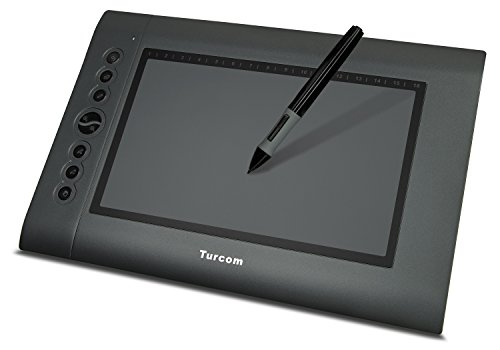
Huion on Amazon has good prices. I grabbed this for $60 on Prime Day, looks like it's still got a coupon offer making it around $66.
https://www.amazon.com/gp/product/B01FTE9HS2/ref=oh_aui_detailpage_o03_s00?ie=UTF8&psc=1
Mandatory reading: Design as Art.
Edit: Here's a nice little excerpt (there's loads you could take from the book, but here's one that came to mind given the use of veneer):
> 'Styling is a kind of industrial designing, and of all branches of design the most ephemeral and superficial. It does no more than give a veneer of fashion, a contemporary ‘look’, to any object whatever. The stylist works for the quick turnover, and takes his ideas from the fads of the day.'
According to Wolfram|alpha the EU has slightly less than a million <em>more</em> cars in use than the USA. So much cross-border driving occurs in the EU that European cars are required to show their country of registration (that's the blue rectangle on the left of the number plates).
It seems that type and their weight are the most fickle aspect of graphic design. In the early 90's bold type was king for logos and as of 2 years ago, we can't get thin enough. Dropping the type and those terrible stars leaves just a shape, which is usually more trend-proof. Dropping the type also makes the geometric language more serene and leaf-like.
Besides, just about every location will have "S T A R B U C K S C O F F E E" spelled out. The new logo might look a little light when viewed here out of context, but when applied it should be an elegant statement. I love how clean it looks on the cups:
http://www.smh.com.au/business/starbucks-stirs-ire-with-new-logo-20110106-19gtu.html
I was making stop-motion movies with an old cam-corder, featuring my Legos by the time I was eight years old, however I distinctly remember the Spiderman Cartoon Maker being my first exposure to the realm of thought that "Holy shit. I can make whatever I want to." Here's an example of what most videos turned out as.
Still ubiquitous, still usable! Icon sets contain so many dated representations. E.g. tube TV with antenna, bookmarks, floppy disks, rotary phones, et al.
There are designers out there liberating us from these obsolete icons, but it takes a while for broad acceptance. I haven't seen a phone icon alternative that would provide the same UX. But it's all relative.
Check out https://thenounproject.com.
Most font creation tools will require you to have each individual character saved as an SVG file out of Illustrator.
There are a number of free online tools that I have used, my favorite free option is called Glyphr Studio (http://glyphrstudio.com/)
For paid, I would recommend an app called Glyphs (https://glyphsapp.com/) which I believe is $300 for the license.
Just so you know, your redirect to Comcast (or any other provider-branded 404) is due to their tomfoolery with your DNS.
If you don't mind what's going on, ignore the rest of this, but if you don't like being forced onto a site you didn't want I suggest changing your DNS to something like Google's DNS or Verizon's (which range from 4.2.2.1 to 4.2.2.6).
There is a lot of mention of what dropbox is today, but the whole point of a rebrand is that it's trying to be something else, something broader, right? Dropbox Paper is about collaborating on papers together, it definately has a more emphasis on the creative aspect of collaboration and sharing files.
Study Andrew Loomis' Books, especially Figure Drawing for All It's Worth. These are really old books, but you can find them online here.
Look up the Famous Artist Course Series. Amazing illustration lessons by the true greats, unlike most modern books. Norman Rockwell being one teacher in the course among many others.
Also check out Jack Hamm's figure drawing book, the name escapes me at the moment.
I've been lucky enough to have a (mildly) successful career in illustration. I'll tell you that for me, what clicked most was visualizing the things you draw as solid forms. This is especially easy when seeing your subject in simple shapes. You should be able to "wrap your hands" around your drawings.
That's just my opinion though! My other opinion is that most if not all modern drawing/sketching books are pure crap.
To the inevitable person pointing out that CanIUseIt only lists it at 75%, that doesn't matter. Most of those browsers are mobile, you use FlexBox for those. Only IE 10/11 are no longer supported for Grid on devices where you will actually use CSS Grid.
If you do a google image search for coffee logo you can see that the stylized outline of a cup with steam rising from it has been done to death. As fracception pointed out it is difficult to see the letters in the cup design.
I also agree with fracception about the font. I do not like it either. To me it looks half way between comic sans and a neon sign.
If you stick with this type of design then I would take a bolder approach. Make the letters in the cup logo more recognizable. Make the colors stand out more; it's a little washed out and pastel looking. Maybe integrate the logo into the text or the text into the logo. The text and the logo don't look like they belong together at the minute. I would probably mock up about 10 designs and then throw them all back up here for critique.
Hi, giulianob. If you are using chrome you can use personlized web. Add a new condition and under 'Add CSS:' put this:
* { font-family:'gilldyslexic'; }
EDIT:
A lot of people are getting the idea that this is broken. The white background/ Times text is actually the theme. This is a blank slate theme that sets up the functionality of an index-based site. If you aren't so familar with this, check out http://www.indexhibit.org/, which this theme is based off of.
The Tumblindex theme comes with a decent amount of editing options to change font, colors, etc. But, it's not meant to veer too far from the initial format, unless you want to jump into the code yourself and move stuff around.
I've never been a fan of replacing a letter with an icon, I just read "la" "tern" in this case.
Keep sketching and see if there's a way you can incorporate the flame (or another way of showing lantern) within the letters without replacing a letter.
The Sony Cube and the Telefunken Ketty are just stunning. With minor tweaks they could sit in an electronics store today and people would assume they are the latest idock or something
Inkscape is a pretty decent alternative to Illustrator and it's the program that introduced me to vectors. It has a fairly large toolset although Illustrator has some more features that are extremely helpful.
Good for beginners though.
Yes to CSS3 and HTML5. Heads up that not all features of these are supported by all current browsers.
Start here:
While I appreciate the spirit of this list, it looks like it was written by a nine year old. Coffee? Really?
If you want a REALLY awesome book on developing, fostering and maintaining your true creative process you could do worse than starting here:> read: The War of Art It'll change your life if you apply the principles.
The left looks tacky and the one on the right looks lazy. I think your client is looking for something that shows depth and that is achieved with subtle shadows, think along the lines of [this as an example](https://www.behance.net/gallery/19725961/2008-(Original-Work). Notice the subtle gradients and mostly solid fills but with different tones for light n dark.
>"What GIMP is not: *GIMP is not MS Paint or Adobe Photoshop"
Indeed! GIMP isn't as good as Excel(R) either! Just the other day I typed in a formula and it turned it into a picture, WTF?!?!
Fun facts:
GIMP is available in over 50 languages.
GIMP is licensed under GPL2, which means that the end user can freely use, distribute, or modify it in any way that he sees fit. The end user can distribute his modifications under the conditions outlined in the terms of the license.
The mascot is named Wilber, If you dig around in the installation folders you'll find a Wilber Construction Kit.
There are hundreds of plug-ins for GIMP which are also free of charge.
GIMP is primarily developed by volunteers but only has 2 maintainers.
GIMP macros can be automated with any one of four scripting languages.
GTK+, a popular cross-platform widget kit, is a byproduct of the GIMP project.
GIMP started life as a student project at UC Berkeley.
The size of the user base is not known due to its free distribution. If the 2.4 million downloads (v2.6.11 since last October) from cnet alone is any indication, I would say that there are a heck of a lot GIMPsters out there. Do they care what some bloggers or r/design redditors think? Probably not :)
I think your stuff would be a lot better if you went more high contrast and started to experiment with contrasting colors. The work isn't bad but my eyes get lost in it due to how monotone it is. If you don't know what a color wheel is check this out:
http://paletton.com/#uid=1000u0kllllaFw0g0qFqFg0w0aF
Stuff like this is super helpful when you need to come up with color palettes but don't quite know what you're doing. When I plugged a green in from the green sig I got this:
http://paletton.com/#uid=72C0u0kn6Acd6PqiCHvs4vNv8pF
You could really make that pop with that palette.
vim is an amazing tool. however, it's not designed to be easy to learn. it's extremely easy to go from mind to text with vim once you know how to use it a little bit, but it's definitely not easy to start. if you're curious, I'd recommend using sublime text 2 with vintage mode enabled for a while so you can get used to some of vim's commands but still having the ones you're used to: http://www.sublimetext.com/docs/2/vintage.html
I love vim, and I strongly recommend it if you have the time to learn it and write enough text for it to be useful. I also strongly recommend remapping caps lock to escape, since caps lock isn't really very useful anymore (hasn't really been since typewriters).
:wq
I'm also in a midst of learning Japanese styled design!
I find Kenya Hara's books to be a good starting point:
Designing Design (I've yet to get my hands on this)
Ex formation
White (included inside Designing Design I think)
There's a book I recently borrowed called "New Super Identity: The New Era of Creative Branding" that has quite a number of Japanese branding examples amongst designers from other nationalities, which I think is worth checking out since they provide concise explanations for the concept and design outcome.
You should read some books:
Designing Interactions by Bill Moggridge
The Design of Everyday Things by Donald Norman
101 Things I learned in Architecture School by Mathew Fredrick
Process: 50 Product Designs from Concept to Manufacture by Jennifer Hudson
The Art of Innovation by Tom Kelley
How Designers Think: The Design Process Demystified by Bryan Lawson
... and many more..
It is not just about setting simple rules. It is about learning comprehensively what makes good design, and the power that designers can have to change the world.. There are rules such as usability, symmetry, economics, etc.. but all of that tends to be pretty common sense. You really gotta get into it, study design, read about new technologies, and experience as much of the world as you can. One good quote I hear often that is true is 'You can't design in a bubble.'.. So get out there, learn and make some shit. haha
Stay away from design, that's my suggestion. Here's why. You're asking two extremely different questions here: where can I go to expand my skills; how do I get motivated? If you just want to get inspired to do stuff, then here is a brief list of sites that have helped me: Abduzeedo; Brand New; Change the Thought; Fast Company Design; Design Work Life; Designboom; FFFFound; For Print Only; Graphic Exchange; Logo Design Love; Looks Like Good Design; Lovely Package; Motionographer; Notcot; The Sixteenth Division; The Dieline; Motionographer. Thats basically from my feeds. Then if you're up to it, then just go out and offer lots of pro bono work. I've actually lurked around the design subreddit to offer free designs here and there whenever I had time. Eventually you'll ask yourself, "what the fuck am I doing? I should be out doing ___". This will then help lead you into a more specific path and make you ask the right questions to achieve it.
Here's the major problem with your other question - motivation. You can't force it. You can't just turn it on because then it becomes a chore, rather than a passion. And if you aren't driven to do it, then you're only going to stress yourself out. So my suggestion, just give up design temporarily. Go work as a production person at a print shop. Try wedging yourself into a marketing department as the "graphics guy". When you give yourself the most mundane job ever, only then will you start to get angry. And anger will ignite action. You will become more clear and focused and soon the passion will come. Learning new skills and building up a portfolio won't really help you if you have no clue how to be truly inspired by what you want to do.
I would be interested to see what you eventually do in a few months. Please post again then.
If this is of interest to you guys, I highly recommend reading Dan Ariely's "Predictably Irrational."
Chock full of case studies about this very thing, along with tons of similar (and more interesting) studies.
You're welcome! Thank you for reading it. It was a labor of love, and it makes me happy to hear that it's helped someone.
I don't have plans to discuss typography, mainly because there are other excellent resources out there that I don't think I could improve upon. One is http://www.webtypography.net/ , and another is "The Non-Designer's Design Book." The latter can be found on amazon, and if you get an older edition (which works perfectly fine; it's not like the principles have changed in the last 10 years) you'll only need to pay a few bucks.
how was this done?
https://www.behance.net/gallery/20181309/ILUSTRACION-EDITORIAL i guess mangoes were made with combination of blend tool + widthscribe, but i have no idea how he drew apples and pinapples like that. this can't be done completely by hand, right?
I've only been able to make something similar by following this : http://www.newgrounds.com/bbs/topic/1169110
Didn't add any text, just resaved a BMP in Wordpad
EDIT: Got some more to work by adding text and fixing an aspect ratio problem in photoshop. Definitely would need some more experimentation to get a better looking result, I think.
Umm... kinda lose credibility when the design of the site itself is pedestrian AND its really just a link farm for zip files that contain .ai files.
Too difficult to have various filetypes and some affordance before clicking to download?: https://www.iconfinder.com/icons/329363/finger_gesture_hand_one_tap_icon#size=128
Was honestly expecting this to be made by the same person, but it's just an imitator. He gives credit to the original artist (Brandon Meier) for inspiration, but seriously, they use the same exact style and color scheme. Nothing original about it.
In Silicon Valley I can say that for Product Design, the norm for people's workflow is actually not Adobe Programs, but more lightweight programs like Sketch. Additionally, Adobe doesn't have competitive interaction programs so things like Principal have been used a lot. For Prototyping, I don't believe there's an Adobe equivalent; so InVision, Framer, Form and Origami are the main ones that people choose.
The few places that still use Adobe Programs are mainly big companies. I know at my place we want to switch over to Sketch but the program right now isn't reliable enough to handle our kind of assets. Also, we collaborate with a lot of teams, so it's not a a situation where we can just flip a switch.
One thing that does make me immensely happy is that these competitors have lit a fire under Adobe and are forcing them to improve rapidly. Adobe XD is a direct response towards people using Sketch and I've seen some cool new features in Illustrator which were grabbed from Affinity Designer
Sorry, I didn't mean for it to sound like that. I had no expectation of people doing any real work before being contracted. I'm new to this and just wanted to get some info that would help me choose a candidate.
I've now edited the offer from this (before):
> 1. Send me () a link to your best work along with a rough idea of what you’d like to do with the Readlang landing page by next Friday (22nd Jan 2016).
to this (after):
> 1. Send me () links(s) to your work which best demonstrates your ability to improve the Readlang landing page by next Friday (22nd Jan 2016).
To make it clear I'm not looking for spec work.
You need TextWrangler. Syntax highlighting, code folding, file explorer, and, my favorite feature, awesome find/replace/line finder/regex support. It's great and free.
Agree with ecnepsnai, except I would argue that theory (that dry site about generic color theory) is not important at first. Stick to imitating—this is the fastest path to growth in the beginning. Look at palette examples from ColourLovers and find designers you like on Dribbble. Imitate them.
Yes, eventually, you’ll hit a wall unless you understand what and why you’re doing it. That is theory, and will be invaluable one day. But if you try to hang your hat of theory upon your non-existent hat rack of experience, it’ll just fall to the floor. Have fun at first; learn as you feel the need to!
Mine would have to be the hip-hop magazine I comped for my magazine design class back in the day. Yeah, it's a lot of Gotham, but I was young and didn't know any better!
You have a ton to learn, but at least you want to. Kudos to you for putting your work up in front of everyone. Most guys get too comfortable.
Two books I want you to read ASAP are The Design of Everyday Things (PDF ok) and Grid Systems in Graphic Design (MUST be the real book).
Grid Systems in Graphic Design will give you a clear idea about placement of type. Pay special attention to margins. There are many examples of margins that are inconsistent and are too tight or too loose in your work. Eg the bottom of your avocado is too close to the bottom of the frame and creates a tense mood that isn't appropriate for a poster about something chill like avocados.
Another example are the pictures in your Chinatown tourism site. Even though you have used quite a lot of space the small margins between the images create a cramped impression.
In terms of typography, save the bold weights for things that should be bold. Remember that when everything is bold, nothing is. Grid Systems in Graphic Design again has a nice primer about typefaces that is still relevant now even though the book is quite old (pre-DTP).
> Below the images is a link to the site.
Make your links look like links and you won't need to tell people that.
I wish I did, but any good design book (think The Design of Everyday Things by Donald Norman) should mix in elements of how the human psyche interacts with good and bad design, so even if we don't have any currently, we have some books that can help fill this gap.
I am also interested in specific psych/soc application books as well though.
If you're asking only about the figures themselves, pencil. There's no way to "auto-generate" that kind of thing.
The best tutorial - and I'm perfectly serious about this - are Andrew Loomis' books, I suggest you start with Figure Drawing for All It's Worth. You basically have to become a decent figure illustrator.
Welcome to adulthood! Have a look around- it mostly sucks.
Just kidding. What I mean to say is, most everyone has felt like you feel now. "How am I suppose to make a decision right now that will affect the rest of my life?!?"
Don't sweat it too much. You can change your mind at any point until you die. If you feel inclined to pursue automotive design then by all means you should do it. I don't have an opinion either way on those colleges but I am sure you could do some google sleuthing and find some people on twitter or elsewhere who could give you some feed back.
As for drawing: You aren't good because you don't do it. Draw everyday and you will be amazed at how much better you are at conceptualizing your ideas on paper. Check out the book Drawing on the Right Side of the Brain. Most libraries have it and it is a good thing to go through to help you develop a little quicker.
As for programming: Coding and design go very well together and if you apply yourself to both practices you will most likely find yourself in a very well paid career.
I have to say that nothing showed me better how to get out of my own way when drawing than Betty Edwards' Drawing on the Right Side of the Brain. The main thing about drawing is losing pre-conceived symbolic language and simply learning to draw what you see. Everyone "knows" that an eye is an almond shape, but IRL, it isn't really shaped that way. Especially as the face moves in space, foreshortening, etc. distort the view. So learn to quiet the orderly, left side of the brain that tells you what something is, and just draw on the right side that sees it as a bunch of lines, planes, colors and values.
Nicolaides' The Natural Way to Draw was also useful in learning mark-making and loosening your marks through gesture drawing and quick studies. If you are studying design though, this seems to be a less important part of your studies. Typography, color theory, learning to represent as simply as possible should take precedence. I know many designers who cannot draw well to save their life.
Not to steal barryabrams' thunder, but instructables has quite a few articles on how to build a clock like this.
Depends on how quickly you want to learn and what the end goal is in terms of modelling. You have hard surface models, organic models, character modeling etc. Different 3D software and techniques are used for each outcome. It can also be very expensive depending on what you want to do with software/hardware. Typically you would be good to start with a free programme that has lots of documentation and user support, I would suggest Blender: https://www.blender.org/ . You can achieve good professional results and also export for printing.
If you want to get into Character models/busts/sculpture then 3D coat/Zbrush/mudbox are a good ideas. Making models is not easy so I would join up to some online forums where you can ask questions, watch a lot of videos and tutorials and practice everyday.
If you are looking to invest in hardware then I would always go for PC over MAC, you can get a lot more power for cheaper and if you are rendering it will be much faster running on a good GPU.
Good Luck
> It's like saying a pinch of cinnamon or a dash of salt in cooking. You can't quantify an exact amount
WHICH IS WHAT I THOUGHT, TOO, until I ordered measuring spoons and got dash, smidgen, and pinch spoons. As it turns out, a "dash" is 1/8 tsp and a "pinch" is half that. Nothing is sacred.
I’m anxious to hear mass opinions from the design industry, so thanks for prompting the discussion!
My initial reaction was that it’s “fine”, I don’t love it, and I don’t feel like it fits their current brand very well, but that’s what a rebrand is all about. It's definitely more modern techy.
But the more I look at it, the more I question whether or not it will age well. I agree with your statement about it looking like an app icon, and I’m just not sure if that’s fitting for a long-running American automobile manufacturer. I think the reason that auto company logos have such long life cycles is because it reinforces the ideals of stability and reliability, which, let’s face it, is what most of us want when we buy a vehicle.
There are some cues that remind me of a raised fist icon, or even like a backwards fist punch icon... but not enough to make me think it was intentional.
With a more muted (less drastic) gradient and a different ’g’, I think I would like it better.
It's visually attractive, but it isn't very usable, and creates performance issues for mobile devices. This will appeal to users of apps like Flipboard, but not those who like lists, displaying lots of information in a small space, limiting necessary bandwidth, or scanning headlines.
Probably not 100% what you are looking for, but ColorCop is extremely lightweight, can capture colors from anywhere in the screen, convert them to different rgb and hex representations, Invert or desaturate the color and is free.
It does not however do CMYK or other color space conversion.
It's a very simple site, so there's not much to comment on, but here are a few points...
- Compress your images better. You're using PNG-24 and honestly, its not appropriate for what you're doing. The page literally "peeled" down to my computer, and I noticed you have very heavy beasts on your page (that one image alone is 720kb). Use a 70-80 quality JPEG and you'll avoid any artifacting, plus it'll get those images down to around 150kb. Your page currently clocks in at 6.17Mb, which is utterly insane and unnecessary.
- State a fallback font in your CSS
- For images which are in PNG-24 and should be (ie: minecraft.png), run it through an image optimization program such as ImageOptim. Using that program, and without affecting any visual data at all, I dropped that 73kb file to 61kb. Same file, just all the shit taken out. Not a pixel difference in visual quality.
- Dood, seriously, wtf, spacer.gif? Use a margin.
- You're probably not coming at this from a markup perspective, but I would definitely cut back on all the <divs> and make this more a list. Float the elements, use margin.
- There's really no reason to use clear. Wrap your header in either <div id="header"> or a <header> (depending if you want to use HTML5 or not) and overflow: hidden it. You're using .clear a ton since your left and right floats in the header are not contained.
I feel, like many design websites do, this was a trend that dribbble went through but isn't really to big anymore, cause in point https://dribbble.com/shots only one example on the second page. My biggest problem with dribble is purely the lack and decent quality feedback.
Little did you know that Captcha actually serves a greater purpose than just security - those little blurbs you type in are actually helping to digitize historic texts. That is if reddit is using reCaptcha. Source