
What are
/r/comic_crits'
favorite Products & Services?
From 3.5 billion Reddit comments
The most popular Products mentioned in /r/comic_crits:


The most popular Services mentioned in /r/comic_crits:
Tapas
Tumblr
MediBang
Plotly
Krita
Gumroad
Emmet Re:view
Mozilla Add-ons
MasterClass
Pod Paradise
Inkscape
Photopea
Dribbble
Autodesk Tinkercad
ImageShack
The most popular reviews in /r/comic_crits:
My critique is not on your comic, but rather, your website.
You should consider making your header as thin as possible. Scrolling down to look at the entire next page every time is very cumbersome, and would be even worse for people with smaller screens than mine. It really distracts from the reading. If you can configure your theme to display the pages larger than they are, you should do that as well. If you're willing to fiddle with a different theme, there's a solid one called Simple Webcomic Theme, by GeoNeo. Boulder and Fleet does a great job with it by making their comic pages the first thing you see, whether you're reading left to right or top to bottom.
That said, I really enjoy your comic. I just now reached the most recent page and was incredibly disappointed that there wasn't any more. The characters are delightful, your palettes are lovely, and your paneling is fantastic. For once, I'm looking forward to Monday.
Damn, you guys have all been really helpful!
I have been worrying a lot about the art, but the overwhelming response seems to be that I should worry more about the pacing and the writing.
I've gone ahead and written up until where I see things ending.
I'll try my best to pace this out appropriately, but I also want to see if this storyline, and the ending, makes sense at all.
Any criticisms would be really helpful!
thank you!
(it has the two most recent comics at the beginning, beyond that is the text till the end!)
Wow, that was really thorough. Thanks for sharing, it was a great read and really inspirational for someone also working a 9-5 and trying to make art.
Looks like his Kickstarter has only a few hours left: https://www.kickstarter.com/projects/splurd/the-indies-a-comic-by-jeremy-kayes
It's looking pretty good. You seem to have crossed some threshold that I can't quite articulate which makes things look a lot more natural and visually interesting. I think another thing that would add a lot more visual interest is facial features/blemishes. Right now, everyone has a solid fill face without any features (freckles, moles, wrinkles, scars, etc.)
Scrolling through the cast page, there's also a pretty clear case of "anime face" going on. It looks like every character of each gender is built off the exact same mannequin. Check out something like this for more info (especially the skull shapes at the bottom of page 7): https://www.scribd.com/doc/93855686/Facial-Design.
The other thing, and I've probably mentioned this before, is that the "shattered mirror/spiderweb" panel effect is really distracting and draws attention away from the story and art to the paneling. It also creates a "panic/disaster" vibe which is fine for an action sequence, but doesn't make sense for a talking scene. Thirdly, it makes high-dialogue panels looks crowded, as if you'd cut up the panels just small enough to fit all the dialogue. Consider using larger splash pages/panels to show off the background, set a new scene, and/or show an interesting background.
I’ve been posting my new comic for only a couple weeks [link], and I’m unsure what to do for the thumbnails. Right now I just have them as the same repeating image, because I fear my usual thumbnail method (grab a good-looking panel from the update) would be good for an often visual gag comic like this one, since I worry it would be like putting the punchline in title.
My other plan was to potentially draw a specific ‘banner’ that I can cut up into the thumbnails, since they lie next to each other on the site. The downside to this is that tapas and webtoons display their comic episodes/thumbnails in opposite order, and the sites also require slightly different dimensions. Any advice/critique would be greatly appreciated.
Problems:
I go to the library every day to read comics. I use a different computer. This would fail because cookies are seat dependent.
I run into malware. I clear my cache and cookies. I now lose my place.
I switch from IE to Chrome. Cookies don't transfer.
Some ideas:
Pushing something like Firefox's Replace Bookmark. This thing is fantastic.
Add Server Side tracking using something like a username/pass combo or even simpler hashcode tracking that works like a URL shortener.
Do you have access to MySQL?
I don't get that :( is it supposed to be a sort of 'choose your own adventure' story? It reminds me of this game: http://www.notdoppler.com/aduckhasanadventure.php
Edit: now I think these are a few characters lives crossing with one another. But I think I am missing the bigger picture here.
>Having the dancing animation as your home page is a bold choice
The idea was to have something bold and eye catching. Not every latest panel can be a hero, but this way people get all the info they need right in front of them, and a big giant button that takes them to the start. My goal was to make it as crystal clear as possible what to do next.
> the cover page is difficult if not impossible to read
Is that because of the style of the text? Or is it a technical issue?
>(not sure what your web stats show).
You can check out my reader retention stats here.
This is just the last two weeks so it should include the most recent updates. Of all hits to the site, I get ~60% to click through to the cover page, and about 50% to click to page 1 of the comic. After that is falls to about 25% retention for the first chapter, and 15% for subsequent chapters. That 15% though seems to be stable, so those are baseline committed readers.
The thing is, I don't know if that drop-off is normal, better than average, or worse. My instinct is telling me that I'm doing okay, it's obvious that you can't capture 100% of all hits, but I also feel like I could do better if I had more data.
I've been trying to optimize the site to maximize reader retention, but it is difficult because I have no outside data on webcomic readership. I've asked a couple other webcomic makers if they wanted to share data, but they were tightlipped. So I decided to post here in hopes of starting a conversation about stats.
Thanks for taking the time to reply though. I get that people might not have a lot to say about this, but being able to talk out optimization with fresh eyes really helps!
Well. What I do with any CMS I'm interested in is to set up a local installation and fool around with it. Think about how I want to use it, see how well its defaults fit my needs, see how much tweaking I'm willing to do to make it work. I'm on a Mac, so I like to do this with MAMP, which nicely wraps up all the stuff lying underneath the CMS into a simple graphic interface. There's probably something similar if you're on Windows but I don't know if it's any good.
You could also do this on a live server but I like the security of being able to fuck up without any consequence.
So, if you're looking at "franchise" comics (as you call them) you're going to get franchise quality. Watchmen, V for Vendetta, and other Alan Moore work is generally considered the high-profile pinnacle of this type of work (in part because they are a reaction to franchise comics, rather than being part of them). SAGA's pretty good too.
However, just like there are arthouse films, there are also art/underground comics (or "comix" as they tend to call themselves). One of the best known is Alison Bechdel's Fun Home: A Family Tragicomic. She recently won the MacArthur "Genius" Award. (She is also the origin of the "Bechdel Test".) Maus by Art Spiegelman is another comic that is undoubtedly in the comix canon.
Personally, I'm fond of Michael DeForge and Ant Colony, though I don't know if I'd argue that it should be part of some canon or not. This is a pretty good list of "where to start" in comics that includes a mix of franchise and indie stuff: https://www.theguardian.com/books/2015/dec/17/omic-books-recommendations-graphic-novels.
Thoughts :
- Technically lacking. I am assuming english isn't your native language? If so, then why not write write in that first, and then translate the story to english later. If english is your native language, spend some time studying up on the fundamentals, start by reading The Elements of Style cover to cover.
- The ideas are scattered, and lack a strong narrative. From one sentence to the next, there is no building story or connection.
- Lack of detail. You spend a lot of time using very dramatic language but with little purpose or place. This type of writing is what we call "purple prose". It's reaching for depth, but comes off as trying too hard.
- Reader lacks connection to the characters or ideas. We have no POV in this world, or any idea of who, what, when, where, and why.
General thoughts :
What you have here is not a story, but rather a story fragment. A full story is made up of many fragments stitched together. The skill in writing is the presentation and joining of these fragments into a coherent narrative.
Go hang around /r/writing for awhile and practice the technical aspects of writing. While you do that, go imagine up a few dozen more story fragments and throw them into a big pile. Then use that to craft a full story out of your collection of fragments.
Reminds me of The War of Art, without the hyperbole that Pressfield employs (which I like actually).
The part that sticks out for me is the single minded focus. I remember seeing/reading an interview with an illustrator, I wish I could remember where it was from but he kept talking about how he was not a good enough artist (and he was incredible) to listen to music and draw. Another way I try and encourage myself to be single minded is to tell myself the 10 000 hours to mastery thing requires 10 000 hours of focus not 10 000 hours of doodling while the television is on. I don't know if that's true but you know..
Anyway, I love these reminders.
If you are doing it digitally, programs like Clip Studio Paint have curve rulers you use. If you are doing it physically, then I would invest in some French curves. You could also use circle templates. There is also this flexible ruler thing but I have never used one personally.
I can't see your image right now, but you should definitely take a look at Moebius's 18 tips for beginners.
The Adventure of an Exceptional Worm Joe, who had one idea about life
But life turned out to be completely different.
Obviously, Joe went on a journey to figure out the answers.
Well..
A kaleidoscope of funny and even dangerous things happened there.
And somehow, this experience has helped Joe to understand that everything was fine from the very start.
Finally, he realizes that everything he was looking for was always with him.
https://www.amazon.com/dp/B098BNPSV9
0.99 now
You should get the book, "Understanding Comics: The Invisible Art" and/or "Making Comics: Storytelling Secrets of Comics, Manga and Graphic Novels" by Scott McCloud.
These books will guide you on perfecting your art and understanding layouts, anatomy and more. It is truly a 'must have' for comic book artist.
Thanks! I'm serious, give me a pencil and paper and I can't make anything even remotely presentable haha. I did a lot of semi-competent pixel art and miniature sculpting though so I'm taking that approach. The very limited resolution is both to hide my incompetence and to be able to start and finish a page in one go. It does indeed look kinda like an etch-a-sketch, I can't unsee it now :D I don't mind if it gets popular or not, Webtoon is just a convenient place to upload and their format is what got me inspired to create my own thing in the first place (it's also on Tapas though https://tapas.io/series/Sons-of-Dust).
24 hour shift tomorrow, so expect a new episode :) Thank you for your input, means a lot.
I am working on the next short story, and want to know what worked and what didn't. I'm open to every kind of feedback.
Here's the link to my comics. (The one this character is from isn't out yet, I'm still working on it. Though there are some comics that contain an early version of him and some others that I recycled into my new project because of how much I liked him.) My current project I'm working on is called Drachenseele. I'll keep you posted when it's ready if that sounds good. :)
Enjoy!
Hey everyone, I've just finished with a major update to the guide "Taking a Comic From Start To Finish" and wanted to share with all of you.
​
Direct download link: https://gumroad.com/products/NQME
​
Recent updates include:
- How to make sales tabling at conventions
- Marketing tips and tricks
- Gaining a social media following for your books
- A huge update to the sections on how to print and ship your books
- How to acquire ISBNs and UPC numbers and barcodes for your books and which of the two you'll actually need
- A ton of various additions to pre-existing sections, as well as numerous images to go with the tips.
​
​
The guide is now sitting at a solid 174 pages and they're all yours for free!
I hope you find the guide useful and thanks for checking it out :)
That's something I'm just beginning to learn, I had no idea there were so many different types of pens, so really I appreciate your advice. I bought a cheap set to start practicing, but there little information on the pens in it:
https://smile.amazon.com/dp/B0007ZJ8RO
Are the round ones the crow quills you mentioned? I tried using them but I didn't like them too much, probably I was using them wrong. I'll try them again.
Been making this comic for about a year now, mostly as an excuse to learn how to draw. Got to halfway through the third chapter. Art's crappy in the beginning but it gets slightly, but distinctly less crappy over time. I'd love to hear any thoughts or crits on literally anything.
It's set in post-alien invasion future Earth and it's about extraterrestrial criminals, elder gods, altered states and weird food. Not always entirely serious.
it's here http://fleshkernel.cfw.me/
or maybe you prefer on mobile https://tapas.io/series/Flesh-Kernel
pic is just latest page.
This is an online version of photoshop. It will give you the most creative freedom. And you can learn a lot from youtube by following along and doing tutorials.
Keep it up!
I like the art style right off the bat. Kind of reminds me of Space Funeral.
I can't read it right this second but I'll come back tomorrow and give it a read.
Hi everyone ! ~~Anthony Fantano here~~ I'm Greytan ! I just started posting this prequel to my comic " Pat's Adventures " that I made 1 year and a half ago :
https://tapas.io/episode/1372813
You don't need to read what went before to understand the sequel YET. So if you don't want to read 132 pages, you can just start at this link =3
I'm looking for constructive criticism, so don't be afraid to be harsh ! Thank you in advance ! ^^
Hi guys!
My last comic is finally available in English.
It was originally published in Portuguese last year.
"Boxey was a famous and very controversial youtuber who died under mysterious circumstances. With a plot full of twists, this comic book discusses prejudice, freedom of speech, hate speech, sexism, intolerance and other topics. Who's to blame, in the end?"
You can read it in the link below.
https://tapas.io/episode/1354463
Sounds neat - I'd been honored if you took the time to review my comic 'Golden Years', it's a fantasy comic about a farmer who gets brought back to life by a god - but as an old woman. I'd love to hear critique on it from a new perspective.
​
Thank you for the critique. I know that Mouse Guard exists, but I've never read those. Do those comics change up the art style every story too? I draw and write and letter everything, my friends don't help me with any aspect of this comic, not that I wouldn't appreciate their help especially in coloring!
I haven't read Redwall or Mouse Guard but I know that my concept is similar to theirs.
I love all kinds of comics from European to super hero to newspaper strip. I wanted to try telling a story using lots of different styles of story telling and I thought it would be interesting and challenging. I'm having a lot of fun so far and I really appreciate the format that allows me to experiment.
Here's the first webcomic I ever made, Oi! Tales of Bardic Fury, a fantasy comic about bards in Ireland. it's also a completely different art style, but that's mainly because I was really in to anime, manga and disney when I made it.
Here are some more old cat comics I did, I have a 56 page sci fi cat comic called Purrvana (set in the same mewniverse as A Song of Mice and Fur here: https://tapas.io/episode/428224 but it's much more abstract and experimental than my newer work.
thank you! I appreciate your encouraging words, I really should put a pitch packet together just on general principle.
Yea I'd give you some feedback on your project, can swap emails in PM or whatev - I'm mostly an dedicated amateur, but Wild Frog is actually a more serious commercial ventures for me (i am selling high res versions: https://gumroad.com/davids ) I've ran small facebook marketing campaigns and posted my shit around - very low yield, i've given up for the moment on sales and focusing on audience building (like posting it here, leaking a low res version of it myself etc) - My current thinking is to try to spread it around and try to get a write up, if the traffic starts to increase, i'll put up the hard paywall or do a physical version, until then, i'm just giving the shit away.
- i've been making comics for awhile on a purely amateur level if you want to check out my older stuff i keep an archive online (NSFW 18+) http://www.comics-base.com/
THANK YOU ALL! for the reviews I really love it when people give me their point of view on my art Edit: okey so I took your guys recommendation and made changes on the style, if you`re still interested, here is a link: https://tapas.io/episode/787744
You're very welcome! You're the one who put in the hard work of starting your project and making the art and everything, I'm glad if I can help at all!
You could probably do both the bordered and borderless style at the same time, or at least start throwing some borderless in to experiment. It'd probably look really cool to have wide panels or even scenes that take up a whole page, with all the dogfights and open views I imagine you'll have. Big panels would be nice to show off all your detailing. Borderless would probably allow your water/sky to stretch or blend out for nice effect.
If you're worried about the boxes being dated, you could try peppering in some uncommon shapes and layouts, like parallelograms or trapezoids. Or several really tall rectangles next to each other, etc. Or stuff like bullets and air trails extending beyond the panel borders and into the gutter space.
Previewing your pages on different devices is a great idea. I'm sorry if it seemed like I was picking apart your speech bubbles--I just think the extra stuff made your pages feel cluttered. You could still incorporate radio transmission into the shape of your text boxes. (Some examples.)
Also, you're new at comic dialogue and it's hard to get everything across in less text. You'll get better!
Hey i like your comic style! Very clean!
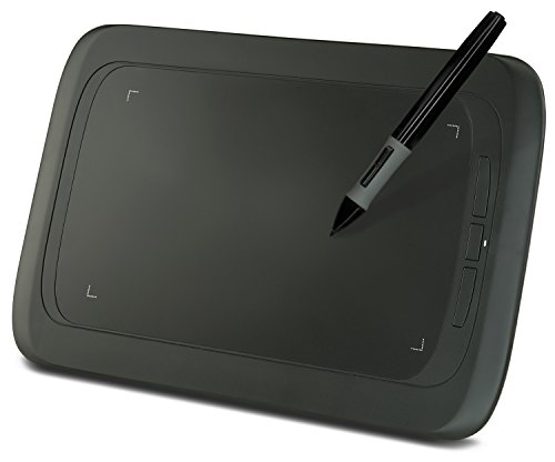
I think you might enjoy this community created program called Krita. It's like manga studio or photoshop. but free and specially made for and by artists. https://krita.org/download/krita-desktop/
You can use it with a wacom tablet intuetos pen and touch. Its real cheap and easy to use!
Cartoonist Kayfabe is my favorite by a long stretch. Jim Rugg and Ed Piskor talking shop. You can listen to it, but I'd recommend watching it. The Palmer's Picks clips from their Wizard flip-throughs are really great, as are the episodes where they dig into their collections, and discuss their various influences.
I'm confused.... you said monologue, but I see a dialogue between a clown and some small creature.
Is there more? I would read more, especially if both characters share some parallels, like feeling cursed in life, there could be something interesting to develop there. Also, I like the mini-comics above each character, that's a neat idea and could play off the actual dialogue in an interesting way, in fact it could be really interesting method for using an imperfect narrator, where the characters says one thing, but the images tell a slightly different story.
edit: original link didn't work
I love it. Very clean design. But you don't have breakpoints designed optimally for certain devices.
If you want to check yourself to look at how it looks on various phones, tablets, resolutions - http://re-view.emmet.io/
Re:view is a free chrome plugin. I'm not the author. I use it for development.
If you have to ask, you know the loading isn't ok ;) To be honest, it's awful. The rule of thumb is you have 2-3 seconds to grab a visitor before they leave your site, and your first panel takes 5+ seconds to load and the whole comic takes 15-20 seconds or more. Not to mention that it loads out-of-order.
Some basic advice:
You have hugely over-engineered your site. Looking at the source code there is NASA-level javascript code being used to load what should be a simple HTML page with a single image on it. Strip all that junk out and simplify everything to just what's necessary (i.e you do not need to monitor the browser's view window to dynamically load panels just-in-time).
Use caching tools to serve a static HTML page if there are no dynamic elements (comment feed, news feed, etc.)
Unless this is equally a web-design experiment as well as a comic experiment, consider switching to a tested framework such as Wordpress+webcomic.nu (Wordpress has caching tools built in).
Getting a little deeper into the weeds:
Use tools like Googel Page Speed to optimize your site.
Check your server settings and look for optimizations there. Consider using a CDN for image serving.
Really any one source won't do much because you want to find something that suits you. One book I did enjoy was more in line with a classic western style and helped get me started was "The Art of Comic Book Inking" by Gary Martin which was very good and taught me a lot. The next thing that really influenced me was reading the One Punch Man manga. The artist behind that is phenomenal and I spend the whole time drooling over his linework and blocking. I picked up a lot by studying that as well. But basically I would say check out this book and then find an artist that really speaks to your style and study how they do it. Really look closely at how they put down lines
Your spelling and grammar need a lot of work, especially around the website. Clear spelling and grammar allow the reader to understand what you are saying. You can have the best story in the world, but if no one can understand it you won't get far.
Working on your spelling will also help to create an air of professionalism. People are entrusting you with their finances when you ask them to buy your comic online. Proper spelling and grammar will help you seem dedicated, trustworthy and serious about your series and its readers.
The Elements of Style by Strunk and White are a nice and easy to read introduction to things you should or should not be doing grammatically. As you write, try to read the sentences out-loud to yourself as a narrator would. Make sure they still make sense and are easy to understand even when spoken out loud. Most desktop office software has spellcheck included, along with most web-browsers. Even if you can't get Word, there's a program called "Open Office" that you can download for free, and it works the same way. See if you can hire a friend to check over your writing for you after you have finished your own edits.
I don't intend to be overly harsh, but I don't want to be disrespectful by mincing words with you either-- the artwork is poorly executed and generic looking. It's not the worst art I've ever seen, but you could be doing a lot more. Anatomy, perspective, composition design, character design and paneling are all things that you need to work on, and it's great that you're getting experience by doing this comic. Just do as much reading as you can (go to the library in addition to looking up tuts online) and get as much practice as you can get. I think that doing something like life drawing would help you a lot with your action poses...Have you seen the different things on the sidebar?
You might want to check out Scott Robertson's How to Draw: Drawing and sketching objects and environments form your imagination. Tons of great excersizes and breaks down how perspective works really well. At least till you get to the cone of vision stuff.... I'm still trying to work that out haha.
Keep up the good work. Don't stop drawing :) And try to have fun with the learning ;)
♥ Ethan
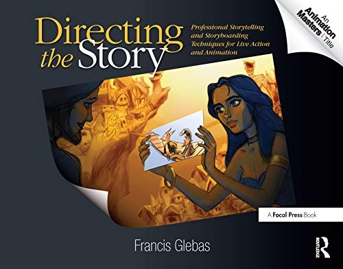
That sounds like a great goal. I am not a storyboard artist, so all I will say about your storyboards is that I am excited to see more! Here is a book I read recently by someone who worked for Disney, click here for that. And THIS is a good book too. Both of these books have a lot of pictoral examples and I found them very valuable, for comics or storyboards.
You can get 0.3 pencils off amazon! They're pricey for a writing pencil but fine for an art pencil. Pentel and other brands sell different lead weights that can also be bought off amazon, but I find the standard HB that comes with the pencil works for what you specified, but a 2H might smudge a little less
Glad to be useful. :)
If you're interested in Bone, you can find the complete collection in one volume, but it's a brick - over 1,300 pages.
https://www.amazon.com/Bone-Complete-Cartoon-Epic-One/dp/188896314X
I'm glad you liked it, MGarv! Here's the link to the Amazon page: http://www.amazon.com/The-Everlasting-Return-Graphic-Novel/dp/1927384060. The book's called The Everlasting Return, and in it Mr. Mildew does even more creepy stuff.
I saw a book of poses linked somewhere recently, but I can't find it now.
Edit: It was this one -- but I haven't actually read it myself.