
What are
/r/Maps'
favorite Products & Services?
From 3.5 billion Reddit comments
The most popular Products mentioned in /r/Maps:


![National Geographic Road Atlas 2022: Adventure Edition [United States, Canada, Mexico]](https://m.media-amazon.com/images/I/61JYN+sVvXL._SL500_.jpg)

The most popular Services mentioned in /r/Maps:
OpenStreetMap
Mapbox Studio
QGIS
CartoDB
Leaflet
Speedtest by Ookla
The True Size
TomTom Maps APIs
Old Maps Online
Worldcat
Google Maps
Google Earth
Vimeo
Ulož.to
DeepL Translator
The most popular Android Apps mentioned in /r/Maps:

Google My Maps

Citymapper - Transit Navigation

Avenza Maps

Countries Been
The most popular reviews in /r/Maps:
This is a map made by Ed Thomas for his alternate history timeline "Fight and Be Right." You can also find his book on Amazon.
https://www.deviantart.com/edthomasten/art/Asia-1940-140547642
https://www.amazon.com/Fight-Be-Right-Ed-Thomas-ebook/dp/B012JCCSAQ
Looks like the % change of population of each state between 1990-2000 (or, at least, an example map showing this). Found it on Google books here (sorry for the link format, I'm on my phone): https://books.google.com/books?id=BjdqAgAAQBAJ&pg=PA9&lpg=PA9&dq=new+York+state+5.5+vermont+8.2&source=bl&ots=1Eq61TlhU0&sig=DNLHsjb0eXAwrQVk1sKCVOIuhfA&hl=en&sa=X&ei=-Z-RVPTGE8mdgwSZ2YGYDg&ved=0CBEQ6AEwAw
Is that the one? EDIT: it's on page 9
My unit camped out near by to this place in Samara during the invasion in 2003. I was not in this place and wish I could tell you exactly what it is what I can say is that this is near a very ancient part of the country known as ancient Samara.
After consulting with Wikimapia:(http://wikimapia.org/#lang=en&lat=34.342603&lon=43.602864&z=18&m=b) I would have to say these are mounds suggesting a foundation for a domicile once existed in this place. Ancient? I have no idea.
Great find!
If you look in the history of the Pyongyang place node here: https://www.openstreetmap.org/node/32013127/history you can see it was vandalised setting it to that name by User:Crete Greece. It was then fixed the same day by User:Carnildo.
If you mouseover the day counts it gives you exact times. Broken at 00:24 fixed a few hours later at 08:34. So that was a fairly short turnaround on fixing the vandalism, but...
Sadly it seems OpenTopoMap took their snapshot during that time window (or I guess it made it into a daily planet dump), and now their rendering is showing the vandalism until next time they run an update. And it seems they must be on a fairly slow update cycle, so that's unfortunate.
I'll send a message to the OpenTopoMap folks and see if they have an easy way to run a new update.
I can recommend the Garmin eTrex 10. It's like $110, works great, and is very easy to operate.
Power it up, head to the starting point of the trail, check to make sure it has a lock, start recording, walk the trail, and stop recording. Repeat as much as you would like.
After you get home, connect it to your computer - it mounts as a drive via USB - and unload the track. You can then split out the individual trails, if you recorded more than one, and process them to remove spurious data (like a stray data point that is way out of line from its neighbors). There's a free app that works well for this: http://www.gpstrackeditor.com.
Then just import them in to Google Earth, or upload the track to Open Street Map (osm.org) and style it as a hiking trail if he wants to share them.
Try Route4Me Route Planner. It's available in your phones app store.
Edit: NVM, I think it's limit is also 10 destinations..
Edit: https://www.mapquest.com/routeplanner allows for up to 26 locations to be entered.
I recently bought this one and am very happy with it. It's about as detailed geographically as you could want as far as rivers, mountain ranges, bodies of water, etc.
It does have South Sudan. I'm not at home so I don't know how many of the non-UN countries it has, for example I don't know how it handles Western Sahara. In one of the Amazon images you'll get an idea though. It seems like all of the Jammu and Kashmir area has been given to Pakistan (I know little to nothing about the politics of this, only that it's disputed). Doesn't seem to mark out anything for Tibet. Also, at the very left edge it appears that there's nothing for Palestine.
For the price, it looks great (I love the style) and is very detailed. Only minor downside is that it is a bit glossy, but it's never bothered me.
Tree coverage should not ruin GPS too much. So get 3-4 gps traces of the paths and you should have a good average. The better the gps device (Garmin eTrax for example) the better the result.
Forget about Google Maps. You can not use Google Maps for any work-related stuff because their data is copyrighted.
OpenStreetMap is a free, open-source map that you can use as a background layer. Most buildings and statues in your area are already part of it. So you do not have to start from zero. There is a big community in the Netherlands that is probably happy to help you and can guide you in a way to get a good printable map but also a map that works online.
If you're willing to put in a little bit of work, Statistics Canada has pretty high-quality shapefiles for national and provincial boundaries. If you install QGIS (it's free), you'll be able to open them, customize the symbology, and export it to an image or PDF at a high quality.
You should be able to use QGIS.
I don't think you can rotate a layer in it, but you can rotate the labels (so flip labels 180, then flip the image I guess). Not sure if it supports that particular projection though
Yea, so far I am not impressed. Saw a story on Gizmodo this morning about some other major errors.
I use a little program called Offroad. You can use it in Windows 10 to easily download and view OpenStreetMap data offline. It's crude and simple, but it'll do what you want I think (and the map will be significantly smaller than 500gb).
https://sourceforge.net/p/offroadosm/wiki/Home/
Enjoy Tokyo!
I like the idea of travelling to remote areas (in theory at least). An idea I had a while back is to take make a pact with a few travelling companions... have a party perhaps... to select a random set of coordinates that all parties swear to visit. If you get ocean you'd just re-roll until hitting land. You'd also obviously have to establish certain house rules like 'no war zones'. For example when I just did this it ended up in the Libyan desert. I personally am not brave enough to embark on that one. Once you've established a destination, you can go see how much it would cost for travel, hotels, etc.
Some places would be REALLY challenging (expensive) to reach. As you'd imagine the coordinates often end up in Siberia, because Siberia is a great deal of the Earth's dry land. I've found that Central and Northern Siberia and northern Canada are almost impossible to reach, if you really wanted to reach your exact coordinate. Also obviously the flights to more remote areas are less frequent and ridiculously expensive, and possibly days long. One place I'm a little fascinated with is Kamchatka... however to get there it appears you have to go the long way.
This is all fantasy for me right now, but maybe someday... I think it would be fun. Although its just my luck we'd get Bakersfield or something.
Grad student in geography here.
What kind of data are you starting out with, if any? And what kind of map do you want to end up with? Are you looking to sketch out maps but not necessarily connect it to a specific dataset for really precise locating?
I use Illustrator a lot for static maps. You can find vector maps in AI format online to use as a basemap, then just color them in how you want, add in symbols, a legend, title, labels, whatever. Alternately, you could find a reference map you like and then draw over it.
If I'm using a data set with geospatial data, I'll put it in a geographic information system program (GIS) and design the map in there, which is also where to do any geospatial processing (example might be finding all the distances to a central point). Then once it looks okay in the GIS, I'll export it to Illustrator so I can refine how it looks. I use ArcGIS because my department gets it for free (software brainwashing!) but there's also QGIS if you want free / open source.
If you don't have a dataset with specific spatial information (for example if you have a list of countries and a value of some kind, and you just want to visualize the value for each country), a GIS might be a bit overkill. I've made quick maps from simple datasets using CartoDB, and it's pretty easy.
In the OSM world, the term 'edit' means you are actually changing the data. You just want to use the data in vector format and style it. Seems like a good opportunity to learn some GIS. QGIS is free, allows you to download OSM data with point and click, and you can do some of your styling in the software before bringing in to your graphics program.
If you only need this done for this one project, find a GIS person to get it in the format that you want. It's one of those things that would take no time for someone who has done it before and it'd save you the headache.
It is for sure not something standard to any map.
Do you know if this map comes with any sort of information aside? Maybe some info can be shed from the print version of the map.
I would venture the numbers relate to some way of dividing the city into sectors that would be familiar enough for the habitants to be intuitive, as the map of the city of Bucharest seems to suggest (there are numbered sectors identified within the city).
The outer round grey area might relate to Bucharest's ring road, also visible on the map.
That’s actually crazy because there are zero Carl’s jr.‘s in Michigan.
If you mean Hardee’s there’s like 10 in the whole state.
So no, wrong
Google Sheets has built-in support for their GeoChart visualization. That's probably your easiest option, if it covers the regions you need.
I'm living in Canada right now as of the moment, but I almost visit China every year because I have family living there.
Even if I was in China, I would still be on Reddit as VPNs are widely available. Most people who want to use Google or Facebook in China can with VPNs, like, for example, ExpressVPN.
That being said Xi is presumably not cool with Reddit but it is what it is.
Zoom in as closes as you can, then choose "Share Link" from the menu in the upper-right corner. It's not a great option, but that seems to be all there is. Off your phone, you could compile those links into a KMZ file, then import that file in Android Earth.
Edit: If you haven't seen it yet, My Maps might be a better tool for you.
Use a plexiglass-covered poster frame hanger. You can get them at WalMart for $5 or $10, depending on the size. It's basically a cardboard back that has a claw-clasp hanger stuck into it, with four friction-based plastic U-clamps along the four edges to hold a plexiglass cover on top of the cardboard.
You pop the four edges off, slip off the plexiglass cover, stick the poster on top of the cardboard, put the plexiglass back over it, and then slide the U-clamps back on. Hang when done.
The bonus is that it helps keep dust and dirt off the poster.
Amazon link for reference (but don't buy them on Amazon, though; they're generally overpriced there and will cost you as much to ship them as they are at WalMart): http://www.amazon.com/DAX-Coloredge-Poster-Plexiglas-N16024BT/dp/B001B0DCDA/
It come with this book on Amazon!
Here are the pre-2009 ones. The collection I have only goes up to 2007, I'm not sure if the other sets floating online are updated or not but if I find the newer ones I'll let you know.
Could you by any chance check the app CityMapper to see if it differs in any way from both of those routes? Its the app I use for walik/bike/public transport. Just curious
No idea when your copy was printed. The original was created in the 1720s or 1730s but you can buy renditions of it for fairly cheap.. So, unfortunately, chances are your copy isn't super unique or valuable.
Firstly Irish is a Gallic/Celtic derived language. Secondly there are multiple different contexts in which a different word for field would be used depending on said specific context and what it refers to in that sentence, there are approximately 30+ words in the Irish language (in the present-day) that can be used for field. (here's a book you can read https://www.amazon.co.uk/Thirty-Two-Words-Field-Manchan-Magan/dp/0717187977)
It doesn't include the many hundreds of potential regional dialectic differences and even more special reference words that were lost due to Anglicization, not Germanisation, of the Irish language and culture.
​
Get your facts right next time this awful data map that get's other basic stuff wrong.
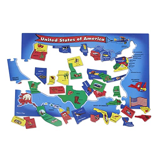
Maybe get an map puzzle of cities! like this https://www.amazon.com/Melissa-Doug-Floor-Puzzle-feet/dp/B000GKAU1I/ref=sr_1_2?keywords=Puzzle+Maps&qid=1656537372&sr=8-2 or something similar!
This link didn't work. This one did
No mountains, like at all, highest point is 171m above sea level, close proximity to the sea everywhere, nowhere it's more than 50km to the sea! The dominant wind direction is from the west, that's from the north sea which is pretty much always above freezing. It's not like it's never snowing or freezing, but on average there are maybe 2-3 weeks of snow cover scattered over the winter. It could be snowing one day but then it's melting 2 days later, then a couple of weeks later more snow...
We had snow for a couple of days around Christmas, but today it's 5°C!
Turkey has some pretty tall mountains and you have large parts of the country which are pretty far away from the sea, the average altitude of turkey is 1132m, Denmark is 31m! So location, altitude and inland are the things that affect temperatures a lot.
For comparison our summers hardly ever go much above 30°C, only a few days a year normally, something that I think is pretty common in Turkey.
Take a look at this map, https://openweathermap.org/weathermap
It's pretty obvious that places like Spain, France and Ireland are very much affected by the ocean currents, especially when you compare to US/Canada east coast but also the UK, Denmark and Norway, the Netherlands, Belgium and Germany to some extent.
Well, I've been thinking that with climate change, any coast is off limits and the west seems so as well. Then taking the typical hurricane path into thought, the back side of a the Appalachian Mountains would provide the best protection I think. I also prefer rural area over urban so the tip of VA is looking pretty nice atm. It will be a bit before I finally move because the next one I want to be my last one and build a little homestead on a plot.
Great job! Do you plan to add the data to some open geodata sources? For example, OpenStreetMap? As I see at the moment all NYC neighborhoods do not have geometry there - https://www.openstreetmap.org/node/158876393#map=12/40.6510/-73.8916
Hi there,
Unless you try your luck at antique stores for some vintage ones, maybe you should consider the good old foldable paper maps like these. They can be very large when fully unfolded. Sounds like a cheap option to me ! And you can still have it framed.
Might want to check OpenStreetMap. It not comprehensive, but does have some of the smaller islands named.
"England hides its fleet under the homeland Rock, the Great Dane Ireland in the back. King Oskar of Sweden is looking forward to Russia. France retreats courageously, while Spain indulges in sweet idleness. Belgium -- has spared him! Germany and Austria-Hungary are giving out good German blows to all sides. In Switzerland, good will prevails. Italy is faithful to the death -- the victor. Sicily is volcanic soil, but otherwise very ruby. Montenegro -- lousy gang, Serbia -- pig gang! The king of Durazzo, Albania, has abandoned his people. ...and Turkey are eating each other alive. Ferdinand of Bulgaria liked to eat too. Carolus of Rumania? Russia wants to devour the whole thing, but it won't succeed!"
Translated with www.DeepL.com/Translator (free version)
Have any questions. Ask away!
Register for the developer portal on developer.tomtom.com and use promo code DEVSTYLER for free credits to tinker with our Maps APIs. Feel free to ask our developer advocates any questions on the stream
How about TomTom Maps APIs? In your website and with a couple of lines you can add a map and a location marker. I'm sure the free tier would be enough for you. You can get an API Key there for free ( no credit card needed ).
Check the tutorials here : Map SDK for Web
In OsmAnd you can do it. Just click on the globe in the upper left and change from local names to russian. The cmap on www.openstreetmap.org it is always in local language as it is the best way for local mappers.
On desktop you can also use OpenMapTiles
Check out mapbox: https://www.mapbox.com/. They should have something with their editor. You can also customize maps. I'm a developer so I tend to just code this stuff up, but for non-programmer types there are a lot of options. You can also try Google Fusion Tables (has a map option), CartoDB and MapZen.
I'll take a stab at it.. just using google-fu:
a choropleth map that uses hexagonal binning.
sources:
I believe that in order to top the first map I posted an interactive tool should be used. So far, without using programming, I found:
I tried to create something but it seems I am useless; someone more experienced than me should have no problem (but the ones we know: a) there are a lot of neighbourhoods and b) they are not well defined) creating something clear enough to to be used.
What kind of style are you looking for, and what platform are you developing on? I'd highly recommend looking at MapBox: https://www.mapbox.com/showcase/. You can design your own styles or use their great satellite + base layers. It's free to get started so there's no cost until hundreds of people start using your app. And it plays great with map coordinates.
You could actually change the base data (as in the physical reference point), whether by writing a program to do it or actually manually changing it for each point (with a transit map I guess this could be possible).
With TileMill the workaround I know of would be using a PNG 'pattern' which has an embedded offset (see the last example in https://www.mapbox.com/tilemill/docs/guides/styling-lines/)
Ah, if you are digging through English resources you may find better results using "contour interval" instead. For your specific case, you may need to generate your own maps. A bit of time spent with QGIS and a few online tutorials may provide results if you don't have any luck elsewhere.
Take a look at leaflet.js. You could either go with custom markers (and just use a small black dot as marker) or try out one of the heatmap plugins.
have you tried using leaflet ?
edit: I read your post again, and it seems you are looking for some examples of innovative transit maps. This one mapping bus speeds in the Boston area comes to mind. Incidentally, that map was made using Leaflet API. Maybe not what you're looking for, but kinda neat anyway.
Sign up is no longer required for Google Earth Pro. Click here (http://earth.google.com/intl/en/download-earth-pro.html) to download Earth Pro, then sign in using your email address and the License Key GEPFREE.
There's also this one which I think does all of the calculation on your computer and doesn't send your password anywhere. It also has a link to its source code so if you're techy enough, you could run it yourself just to be safe.
No worries! It can be hard to get it right, I ran into the issue myself (I have good colour vision, but a few friends don't). Some purple or pink could be problematic, since it's a composite colour in RGB. But there's a lot of online resources on good palettes like this from Tableau and others and great apps for simulation like Sim Daltonism to help with the design :)
Agreed on the atlas option. I love any atlas really, but my personal preference is Rand McNally large scale spiral bound ones like this one: https://www.amazon.com/Rand-McNally-Large-Scale-Atlas/dp/052802244X/ref=sr_1_4?dchild=1&keywords=rand+mcnally+road+atlas&qid=1619488243&sr=8-4
I traveled all over the US after high school and before smartphones. For traveling, you want very detailed roads. I used an atlas. One map of the US can’t be as detailed as you want it. To use individual state folding maps is kind of cumbersome. The best option is an atlas. Now a days, they are fantastic back ups if the smartphone doesn’t work. Good thing to have in general. I love National Geographic maps. I’d probably get this one https://www.amazon.com/National-Geographic-Road-Atlas-Adventure/dp/0792289897.
We do some fancy-pants maps that are giant and expensive but we also have an offering currently only on Amazon and is an affordable, poster sized map of the world. Designed by our micro team in Seattle!
Amazon has 'em. I'm pretty sure I've also seen them at Metsker Maps in downtown Seattle.
GB Eye World Map Poster on Amazon.com - I bought this. Font size is small so you may find you need a pocket magnifying glass as well.
https://www.amazon.com/dp/B0013JR97Y/ref=cm_sw_r_sms_tai_zeDFDbWTBSKV6
Cavallini & Co. Celestial Chart Poster Wrapping Paper Sheet https://www.amazon.com/dp/1619926660/ref=cm_sw_r_cp_apa_i_iVKxCbZ4Q80K2
Pretty sure it's this one. I own it, too. Says wrapping paper sheet but it works like a light, textured poster
Thanks for the suggestion. I've actually seen this before and was tempted by it, but decided I wanted to go a different route and kind of create my own with pins on each city I've been to. It should be a fair bit cheaper as well and I think I'll start with Asia.
I grabbed this one;
Now I just need to grab a pin/cork board and some pins. Thinking about maybe running string through the pins to in different colors for each trip or something.
I have a world map that I bought at Walmart wayyy back. Looks great. Has all the large and fair sized cities on it and an old fashioned "weathered" colour to it. Very closely related to this one.
Link: Suck UK London Underground Map [Amazon.com]
Also, your site is cool, I just signed up for updates on my city.
Also also, I'm familiar with Strange Maps, and this book.
That was a cool slideshow. Did anyone see the pictures of the Swedish subway system that were on Reddit a month or two ago? Also, has anyone else checked this book out? I snagged a cheap used copy. It definitely focuses on the design aspect of the map, rather than tons of info about the subway, but it'll make any transit geek happy.
Feel free to try out the prototype and let us know what you think!
App Store: https://itunes.apple.com/us/app/locayton/id1298476762
Google Play: https://play.google.com/store/apps/details?id=com.locayton