
What are
/r/Calligraphy's
favorite Products & Services?
From 3.5 billion Reddit comments
The most popular Products mentioned in /r/Calligraphy:


The most popular Services mentioned in /r/Calligraphy:
IGTV
Google Photos
Internet Archive
Creative Market
Flickr
Inkscape
SkillShare
Behance
Barnes & Noble
Dribbble
Gumroad
Wikiquote
Imgur
Dictionary.com
HackADay
The most popular Android Apps mentioned in /r/Calligraphy:

The most popular reviews in /r/Calligraphy:
What brand is that ruler you used to draw the guidelines?
​
Edit: Thanks for the responses! I actually looked it up myself and found that the brand is called Alvin. Now I have another question though: I looked at the reviews and some said that the roller doesn't really roll well. Do you guys know some brands that have the smoothest rollers?
I can point you at this book Calligraphy flourishing: a new approach by Bill Hildebrandt. I am personally still pretty terrible at it so that's the best I got for ya haha. But it seems like you are off to a good start, I am sure if you work at it you can learn :)
I bought it at the Museum of the American Revolution in Pennsylvania (it was limited addition), and the brand is “AM”
Here is a link to it on amazon:
https://www.amazon.com/dp/B0041RZBRU/ref=cm_sw_r_cp_api_i_q7alCbP1YMGY6
Oh man, now I have to buy it. Another book purchase. Thanks a lot. (Just kidding, thanks for letting us know about it!)
Edit: for others who are unable to resist temptation, here’s the Amazon link.
So The Brain is obviously a stencil put on with a computer (notice the differences in the left and right ear line widths and how the right ear has a little bump in it at the top, they are the same.) I also want to point out that the shadow is definitely a Photoshop, but I suspect the whole thing is you taking a picture of a notebook and photo-shopping all of what we see on that notebook. So OP, give us another camera angle would ya, and prove me wrong? Otherwise I'm officially calling shenanigans on this post.
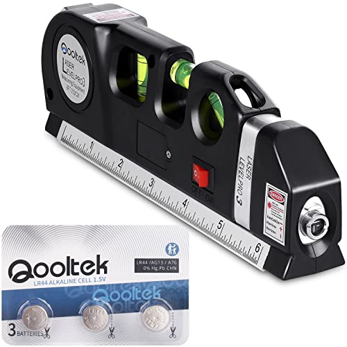
As someone else asked, here’s the laser I use :)
Qooltek Multipurpose Laser Level Laser Line 8 feet Measure Tape Ruler Adjusted Standard and Metric Rulers https://www.amazon.com/dp/B00PQ4PJYC/ref=cm_sw_r_cp_api_i_h4DgFb7TWD3K1
It’s just a $20 tabletop laser level I bought off Amazon! Just rest it on the table, super easy. I linked the one I have below but black and decker also makes one that’s popular
Qooltek Multipurpose Laser Level Laser Line 8 feet Measure Tape Ruler Adjusted Standard and Metric Rulers for hanging pictures https://www.amazon.com/dp/B00PQ4PJYC/ref=cm_sw_r_cp_api_glc_fabc_wn6-FbT1K9Q6R?_encoding=UTF8&psc=1
Thank you! This is the level I use, it’s only $15 on Amazon
Qooltek Multipurpose Laser Level Laser Line 8 feet Measure Tape Ruler Adjusted Standard and Metric Rulers https://www.amazon.com/dp/B00PQ4PJYC/ref=cm_sw_r_cp_api_i_h4DgFb7TWD3K1
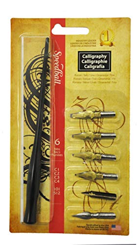
I can't say with 100% certainty, but a Speedball Broad Series C and a holder would serve you well.
https://www.amazon.com/Speedball-Calligraphy-C-Style-Lettering-Set/dp/B0007ZJ8QU
​
​
This is from a nomad journal, from trying it out it does work very well with a ‘pilot parallel pen’.
I already follow some of you! :) mine is @tashadeguzman
Edit: I usually post once a day (unless I'm busy). Just calligraphy practice and travel pics!
I already follow you btw. :p
Amazon :) just search lcd lightbox mine is like this one https://www.amazon.co.uk/Stone-TH-Drawing-Lighting-Animation/dp/B07N128B74/ref=mp_s_a_1_2_sspa?dchild=1&keywords=led+light+box&qid=1610918034&sprefix=lcd+light&sr=8-2-spons&psc=1&spLa=ZW5jcnlwdGVkUXVhbGlmaWVyPUExOU1PUDlFVTF...
Are you also trying to learn baybayin? Kudos, good luck.
Myself, I was trying to learn the textura quadrata ("diploma"-style stuff). But a well-rounded resource is The Calligrapher's Bible by David Harris. It covers both historical and modern styles, with a suggested ductus (or stroke order) for, like, a hundred hands. Amazon link below:
https://www.amazon.com/Calligraphers-Bible-Complete-Alphabets-Draw/dp/0764156152
I can recommend Sally Sanders' fairly new book Modern Calligraphy for Kids, which any beginning adult would also enjoy. She covers broad-edge pen, pointed pen, and pointed brush, so you could try it all. But more to the point, her list of tools is fun and up-to-date so easy to shop for.
did some digging:
http://www.kaligrafina.com/samsungtaba-spen-handlettering/
thats from the op, you can translate that page (sorta).
i believe he is using this app VVV called calligrapher.
he is also using the autodesk sketchbook app
https://play.google.com/store/apps/details?id=com.mark.calligraphy&hl=en
I'd have liked to use a semicolon, dash, or something to that effect, but that was the way that the quote was written in the source material I pulled it from. Albeit, not directly from the book, but from an excerpt on this page.
Also, I think you mean:
>"Your grammar sucks*,* but it's a pretty quote."
;)
edit: I forgot a period in my snarky quoted text. QQ
Those images were created with the website dreamscope. After messing around a bit with it today, I found that calligraphy pictures produced an interesting result. So I quickly wrote a few words and tried to apply a relevant effect to them. Unfortunately the quality is not really good, and I know my calligraphy isn't the best.
Anyway, let me know what you think about this, and don't hesitate to try it for yourself !
It’s just a $20 tabletop laser level I bought off Amazon! Just rest it on the table, super easy. I linked the one I have below but black and decker also makes one that’s popular
Qooltek Multipurpose Laser Level Laser Line 8 feet Measure Tape Ruler Adjusted Standard and Metric Rulers for hanging pictures https://www.amazon.com/dp/B00PQ4PJYC/ref=cm_sw_r_cp_api_glc_fabc_wn6-FbT1K9Q6R?_encoding=UTF8&psc=1
Well there are a few places you can start. You can do something with a broad pen like Italic, Gothic, Uncial, Foundational. You can do something with a pointed pen like Copperplate or Spencerian. There is a lot of modern stuff as well. The Modern Brush stuff has become pretty popular as well as other modern flat pen things. Its a big world, pick a direction and go :)
You might be interested in looking at this, The calligrapher's bible there are a lot of different examples in there.
I guess do you have some examples of some things you like and want to start with?
Looks like progress has been made from the last one you posted! This is awesome! If you are struggling some with the downstrokes, It can be extremely helpful to draw some vertical guidelines.
I am curious if you have seen
this book, Calligraphy flourishing: a new approach to an ancient art, Bill Hildebrandt there is a section in there about the cadels you might like.
This one, The Calligrapher's Bible has a bunch of different varieties of numbers.
Looking forward to seeing more from you :)
Nothing to do with calligraphy (just spider pictures)
WARNING SPIDER PICTURES, WARNING WARNING
Edit I made a calligraphy post for you Reddit. Featuring stormygrey circlejerk
I'm a lefty, and I've always liked calligraphy but struggled you know, with being a lefty. So I thought I'd give a right-to-left script a shot, and I like the aesthetic of some arabic & persian scripts.
So I started in the new year just teaching myself, based on internet research. Initially I used a flat paint brush.
Then I used the script examples I found here: omaruddincalligraphy.com (I also purchased his book, but only revived it yesterday), and posted some of my practice work on instagram. At this point I made my first few qalam (bamboo/reed pens).
Then some Jordanian guy messaged me over insta asking if I'd like him to teach me, and we communicate over facebook. I'll do up a few sheets of alphabet / letter pairing practice, send it off to him, and he lets me know where I'm making mistakes etc. It's pretty awesome.
Thanks. EJ was my inspiration when first starting on this road and has been ever since. I was and am still fascinated by his chapter on Roman caps. I would be pleased to see any material you have on the subject. https://archive.org/details/writingilluminat00johnuoft
When in doubt about prices on amazon check CamelCamelCamel, they have price histories on most products.
Right now, they're about as low as they have been in the past. I'm guessing it will start to go up as christmas approaches.
Thank you❤️🙏you can get the brush from here
To learn more about brushes in procreate you can go to Artist handbook and read about all the characteristics that are necessary to make a certain brush
https://procreate.art/handbook/5.1
Hope it helps 🙌🏾
There's no ductus written out, but it's mostly people copying other calligraphers and adding their flair to it. There was a skillshare class on it: http://www.skillshare.com/classes/design/Calligraphy-I-Writing-in-Classic-Modern-Script/581900124
Linking imgur is fine.
If you download Reddit Enchantment Suite - it has various things you can do with and one of the most useful ones is looking at images without clicking on them. Let me show you - http://i.imgur.com/39OXT54.png
Canson Mixed Media 98lb Holds really well, doesn't bleed even with multiple pass overs. The orange letters I went over about 3 times to get the rich color I wanted. Heres an amazon link: https://www.amazon.com/Canson-Mix-Media-Side-Wire/dp/B002NQ2K16/ref=sr_1_1?ie=UTF8&qid=1471747475&sr=8-1&keywords=canson+mixed+media
This is my favorite ink on Amazon.
Just fyi, Annie's book can be found for a very modest price used. Amazon
The leather pad advise is a solid one; I have been using a relatively cheap leather desk pad from Amazon which works really well for me.
Also, the other possible reason for nib catching is either the angle of the nib (in relation to the surface) is not low enough, or you're holding the pen at too steep of an angle. in my experience, these are far bigger factors than the nib itself.
It’s by far my favorite ink!
This is the laser:
Qooltek Multipurpose Laser Level Laser Line 8 feet Measure Tape Ruler Adjusted Standard and Metric Rulers https://www.amazon.com/dp/B00PQ4PJYC/ref=cm_sw_r_cp_api_i_h4DgFb7TWD3K1
Here's my attempt... last one I could do before I ran out of space on the page. A little messy, but I'm trying to get those square cutoff's looking neater. I Certainly feel like I'm improving, though!
I am having a lot of fun getting back into all this. I taught myself really basic calligraphy when I was in junior high school and haven't really done much with it since then, but after finding this subreddit (and /r/Handwriting), I wanted to make a conscious effort to improve my writing and get back into calligraphy. Just thought I'd share some of my results with the WotD.
You might like this book Calligraphy flourishing: a new approach to an ancient art, Bill Hildebrandt
That's weird, mine are made on a big ol regular lathe, they just take a bigger blank and then when it's done cut from the front and back where the grips are
here's one for $50 and I think it'll do. You can find bigger if that's too small.
Ahh I see what you mean. If I did the vertical line on the T instead of the diamond I could probably have put the midstroke spur there too and it would have been more uniform looking. I'll pocket that for later.
And I think you're completely right. I found the book on flourishing which talking about the big problem a lot of people have with smooth flourishes is they draw from their wrist as opposed to drawing from their shoulder which limits the range of motion. That's 100% me and something I've been trying to work on. (Actually idk if it would be a copywrite issue but if not it might be worth adding this book to the wiki or beginners guide as I could see it being a big help to people: https://photos.google.com/share/AF1QipPSA0hnPwIBO1ecFbntLQG5k3wqL4j89XKu_n1oJSQoOcyK7f7xRWiHIK3uClBqdw?key=TktWTEV3cTdReU4yMTRBTDQ1NDg5SV8xcGxOWjlB)
Cool. Well you might like this also The calligrapher's bible There is a little bit in there about roman stuff, might be more helpful. There is also some stuff about Roman in here as well The Art of Calligraphy - a practical guide, Marie Angel
Welcome! Study and practice :) There are a lot of good books out there for learning italic but we have a pdf of this one Italic Handwriting, Tom Gourdie
Cool, Have you seen this book? Calligraphy flourishing: a new approach to an ancient art, Bill Hildebrandt You might like it :)
These are a few pics from a pretty sweet book I have called Mastering Calligraphy I think this is the kinda of thing you are looking for. There are a lot of books out there with information like this including The Calligrapher's Bible It will teach you about the structure of the script. The parts that make up the letters, there are drills you can do to practice those parts and that will help you develop your skills.
Cool and I love gothic too :) well that Calligraphers Bible that was already recommenced to you is the first book I started with, I found it at the library and I still have the copies of some of it in a binder. This could be helpful for you as well, The art of calligraphy, David Harris. But the most important thing is that if you want to learn it takes time and patience and work. But there are a lot of people out there who are willing to help along the way.
I guess for clarification are you thinking about like Illuminated manuscripts stuff?
I went to my local art store. I found a pack of these small little containers. They were cheap and came with, I'm thinking, 8-10 containers. I'd suggest taking a look there
Have fun and hack your mind whenever you feel blocked. The ego is an avoidant liar, so get that fucker good! :)
Above all: have fun!
ps: the tag rude calligraphy on tumblr is absolutely refreshing, in case of insufficient funs.
I made this guideline generator when I first got into calligraphy. LaTeX works pretty well for this purpose, and you can use it online!
Functionalities:
- paper type, orientation, and margins (and everything else you can do with LaTeX, such as the forbidden f-word)
- nib width and proportions for any script
- adjustable slant and slant frequency
- adjustable line weight and style
How to use:
Open the document.
The options are mostly in the input section. Just enter the values you want according to the instructions.
Other than that, the page configuration part takes care of the paper you use, and you can change or delete the title before the \begin{tikzpicture} line.
There are many other things to fiddle with if you know LaTeX, but in that case you wouldn't need instructions.
Compile.
Limitations:
Nib ladders.
Short ascenders / descenders (like t and d).
Making it into a proper form (easier to navigate, but less customizability).
Those things are pretty easy to implement, but I decided against it for the sake of simplicity. If anyone wants them (or other functionalities), I can add it.
(Flaired this as reference, not sure if appropriate)
I feel I will be in the minority when I say I don't like it. It's ... too much. Reminds me of opals, it's just kind of gaudy. I also prefer pens with smaller diameters as opposed to 'fat' ones. The box is nice though.
Just my opinion. Anyone else?
Also, this probably belongs more on r/fountainpens, but I appreciated it.
Thank you for the insight :) Artrage isn't vector based, but it is extremely fun cause of all the combinations and different mediums/intruments you can try, and it's good at it.
Good luck in your journey. Don't you just love the wheel on wacom? :)
I am pleased to hear that because every calligrapher should have an in depth knowledge of Romans as they are the longest lasting style of lettering to retain their form and still be recognized and used today. The recognized model for Roman letterforms is the Trajan Column in Rome. Google it and look at the letterforms, their shapes, their spacing and the textures they form. David Harris doesn't give as good a basic tutorial as Scribblers look on the left hand side for Roman Capitals. I don't think it is a case of learning it first but rather in conjunction with because since the evolution of miniscules - Romans have been the majuscules. Good Romans seem so simple but are so complex and can be stunning (see Chris Haanes when done in its most very formal form but they can also be done in monoline or with any broad or pointed pen. A very good calligrapher told me years ago that an serious scribe should study Romans every 5 years so they will understand the letters. Let me know if you want any more info or examples.
Haha ... well it's not perfect—French has a lot more subtle (but definite) vowel pronunciations than English-speakers know how to deal with, I find.
The “mē” part is straight-forward enough.
There are very definitely two distinct “t” sounds in the word, because the second one forms the entire second syllable... But saying “hands” (or “tonns”) is actually wrong because the French don't pronounce the last letter in 90% of their words, so “mē TAN·tuh” is getting closer.
The hardest part is conveying the nasal sound of the vowel combination of “ei” that I represent with an "A" there ... There's really nothing like it in English; it's the same sound as “plein” in the common phrase, en plein air.
You kind of make this face when you pronounce it.
A helpful resource is jisho.org if you're uncertain how to practice a certain character. There's a section displaying stroke order under kanji details that also shows exactly how each stroke should fall in the four quadrants.
There are a handful of classes available on skillshare for pretty cheap and you wouldn't have to travel anywhere. Molly Jacques' Introduction to the Art of Modern Calligraphy looks appropriate, and I think her style matches what your wife is interested in. Her work on instagram is beautiful if you'd like to see more.
What kind of calligraphy are you interested in? Modern pointed pen is really popular at the moment - there are several classes available at Skillshare. Melissa Esplin's "I Still Love Calligraphy" online courses are also highly recommended.
And for anyone who cares, I started out with this SkillShare class from Molly Jacques. Obviously, no formal teaching nor writing style.
Pokras' early work is mostly cyrillic, if you scroll way down here : https://www.behance.net/pokras you'll find stuff like this : https://www.behance.net/gallery/6151471/Paradis-sur-Mesures-Streetart-calligraphy
It’s just a $20 tabletop laser level I bought off Amazon! Just rest it on the table, super easy. I linked the one I have below but black and decker also makes one that’s popular
Qooltek Multipurpose Laser Level Laser Line 8 feet Measure Tape Ruler Adjusted Standard and Metric Rulers for hanging pictures https://www.amazon.com/dp/B00PQ4PJYC/ref=cm_sw_r_cp_api_glc_fabc_wn6-FbT1K9Q6R?_encoding=UTF8&psc=1
So not an alternative, but I use Dinky Dips which are the perfect size to dip without making a mess. I also use these droppers to hold water/alcohol for cleaning/ink for easy refilling of the Dinky Dips.
My mess making has gone down significantly since getting these two things. Both of them are relatively inexpensive!
A resource I'd recommend for italic are the Lloyd Reynolds videos Episode two has been lost to the ravages of time, so don't go looking for it! Also his accompanying pamphlet/booklet thingy, which can be found fairly easily on amazon or from other booksellers.
Sheila Waters Foundation of Calligraphy is a fantastic book to learn from. It looks like it’s a bit pricey on Amazon. You may be able to get it cheaper on other stores.
This is a link on Amazon The World Encyclopedia of Calligraphy: The Ultimate Compendium on the Art of Fine Writing-History, Craft, Technique https://www.amazon.com/dp/1402733682/ref=cm_sw_r_cp_apa_i_AI04CbFC0FSCG
I personally got a copy at a local book store in my town.
I've been using the Parallels a bunch as well, just starting to get into the dip pen nibs more recently. The book is available on Amazon and other places online as well, I'd definitely recommend it; it gives a lot of information on both the fundamentals and the details of lots of scripts and variations.
Tombow brush pens are my favorite. These ones in the link (Amazon) are good because they are dual pens. One side hard tip the other soft tip.
https://www.amazon.com/Tombow-56167-Markers-10-Pack-Blendable/dp/B0044JIU2S
Edit: hard tip is easier for beginners, but you can totally decide which you like the best :)
This is stunning. You have inspired me to use this as my goal calligraphy. I'm reading Meditations and The Daily Stoic right now so this is extra poignant for me so honestly, thank you for posting this.
I can't tell if you're being sarcastic or not ...
I was given an old, battered copy of "The Non-Designer's Design Book" and I bought myself a copy of "Layout and Design for Calligraphers" which have both been really useful. What little else I know about design came from calligraphy classes where it was specifically taught. So, not much, is the answer, but those two books are a good start if you've got no other training.
All the time! I hate it! Somehow focusing on how the letters look disconnects the language part of my brain and I totally forget the words on and I can very easily misspell things. It really bums me out. I have to throw it out and start over. I can't stand misspellings!
I've noticed something else strange, too. I'm lucky in the sense that when I write something down, I remember it very well and I'll often use this to my advantage by copying out some text I want to remember, like The Art of War or the lyrics to a song. Sadly, it does not work if I try to do it in calligraphy. At one point I was going to try to make myself a very nice copy of The Art Of War with extra space in it for meditations, but I'm going to have to settle for my everyday handwriting because I just won't remember it otherwise.
Can't wait to see what you can do with them! I've been really enjoying this book: https://www.amazon.com/Cadels-How-Manual-Vivian-Mungall/dp/0578596695
I mention it because you obviously have the talent to do them, and it might give you some inspiration about more flourishes that you could add in!
I think you should change your guidelines as cawmanuscript said below. Actually, your proportions seem to be fine (2:1:2), but your angle is 80° and, as you point out here, it would be worth using the traditional 52°. You can just print lines on thick paper and it should work.
Next you must work on the component strokes that comprise the lowercase letters. This means the strokes that make o, v, u, n, and the ascender/descender (l and j). You should make them consistent, and having squared-off tops
The link isnt working but it may be this one. That IAMPETH guide I linked to has downloadable guide sheets Notice that they are grouped in 5's and the x height is where your lower case letters sit. The video I linked to will use this method as well.
Not the person who first replied, but here's an Amazon link to a set of the pilot parallel pens.
I can speak from personal experience that these are great pens to use for all kinds of calligraphy styles. I didn't buy mine from Amazon though, I went through Jet pens.
https://www.jetpens.com/Pilot-Parallel-Pen-Bundle-of-6-Nib-Sizes/pd/31443
I wasn't worried any fakes, there's no point in faking a pilot parallel, they're brain-dead easy to make. I just found a better deal on Jet pens.
I think you're supposed to just coat the nib with a brush but that never works for me, so I do this instead.
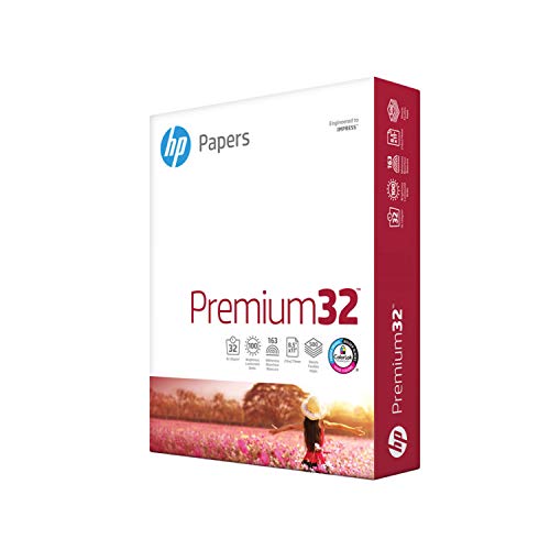
edit: ink is sumi, paper is HP Premium Choice Laser, nib is Mitchell ~~music~~scroll nib (not sure what size) that I half-mutilated.
I got started by learning Blackletter (Gothic) calligraphy from here, then progressed to other hands after purchasing The Calligrapher's Bible, which has 100 different hands in it (although not really, since it counts miniscules and majiscules as separate hands, so something such as italic would count as two hands - Italic uppercase and Italic lowercase - rather than just one).
I really like the Rhodia Reverse Book . Its not very big and I can flip it around to draw on all sides. I also read that Office Depot brand notebooks will be good but I didnt get to try them yet. Lettering Daily also had a recommendation for Canson paper on one of his videos on Youtube and I was planning on trying it next (when I stop being lazy and draw my own guidelines instead of blowing through $10 notebooks because they already have dots/grid).
I use marker layout paper for practice. Specifically, this is Borden & Riley #37 Marker Layout Bright White Translucent Bond Paper Pad, 14" x 17". Parallel ink isn't great but you can also pick up a fountain pen converter for your Parallels, the CON-50 and use whatever ink you'd like.
Personally, I wouldn't recommend this book. It is not well regarded in the greater calligraphy community. In my opinion, it is lacking four important points.
there is no commentary on how to look at your work, analyse it to see where you are going wrong and correct it. A lesson on "script analysis" would help a lot,
there is very little on layout, which is very important to move beyond just doing letter practice,
the stroke diagrams are too small to really see the small nuances between some strokes,
stating there are 100 complete alphabets is nonsense, there are scripts in the book and all he does is change one, two or three small things and calls it a new alphabet when in reality it is just a variation on the same script.
David Harris is a well thought of calligrapher and I have three of his books, two of which are decent however The Calligraphers Bible one is a fail.
The best all round calligraphy instruction and reference book available today is Sheila's Foundations of Calligraphy. It is the only calligraphy book which can take a calligrapher from beginner to professional in one volume. Of the over 100 calligraphy books in my library, this is one of five that I use on a weekly basis. Remember to buy it from John Neal at $35 than on Amazon where it is normally well over $100
Remember, the above is my personal opinion and others may differ.
For some reason, I can't upvote your comment, so I'll just pile on to say that the Pilot Parallel Pens are perfect for this kind of hand. https://www.amazon.com/Pilot-Parallel-Caligraphy-Assorted-Colors/dp/B08P3W2G5L/ref=sr_1_3?keywords=pilot+parallel+pens&qid=1656444375&sr=8-3
Line variation (vertical vs horizontal) is achieved by a stiff stub nib (including the Parallel) or by a flexible nib, which is more expensive and harder to master. You can look up flexible nibs on YouTube. They are really better for fancy cursive scripts.
By historical scripts, I presume you to mean the "Golden Thread" from Romans to contemporary. The two best calligraphy books aimed to children are "An Usborne Guide to Calligtaphy" , calligraphy by Susan Hufton and "Calligraphy for Kids" by Elenor Winters.
The three acknowledged best reference books for calligraphy from an historical aspect of script development are:
"Historical Scripts, from Classical Times to the Renaissance" Stan Knight
"A guide to Western Historical Scripts from Antiquity to 1600" Michelle Brown
"The Historical Source Book for Scribes" Michelle Brown and Patricia Lovett
Hope these suggestions help.
INOVART Calligraphy Underliners, 6-Sheets Per Package, 9"x12" https://www.amazon.com/dp/B005A0IXFY/ref=cm_sw_r_cp_api_i_6G6CHZW7W2CXH00YZ4SS
on Glamazon. The ones I use are transparent too. Check Johnnealbooks seller online: https://www.johnnealbooks.com
Calligrapher's Bible, as mentioned in the other comment.
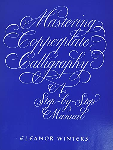
Mastering Copperplate if you want a book dedicated to Copperplate.
For Spencerian, this plus the workbooks: https://www.amazon.ca/Spencerian-Penmanship-Theory-Mott-Media/dp/088062082X/
That is no problem, you are looking at broad edge calligraphy. The cheapest place to get it is at John Neal as compared to Amazon. No problem with asking questions if you cant find the answers in the Beginners Guide or Wiki on the side.
Just consider using a dip pen or at least a Pilot Parallel pen rather than a fountain pen. The strokes will be much crisper or sharper. And use a larger size than smaller to learn.
Look up the Facebook group "Copperplate Script For All". TONS of information and support. On Youtube, look for videos, including those from Dr. Joseph Vitolo, who is a leading authority, and a down-to-earth instructor.
One of the best books to learn from is this: https://smile.amazon.com/Mastering-Copperplate-Calligraphy-Step-Step/dp/0486409511/ref=sr_1_1?crid=2AE668GZ9HME6&keywords=eleanor+winters+mastering+copperplate+calligraphy&qid=1648595321&sprefix=copperplate+elea%2Caps%2C142&sr=8-1
If you feel you want more intensive training, there are lots of good instructors giving online classes, including Kestrel Montez, Suzanne Cunningham and David Grimes.
Good luck in your pursuits - Calligraphy is a wonderful hobby, and can be a lucrative business!
If you want a refillable/fountain pen, the Noodler's Ahab is very well priced, and it can do both regular writing as well as thick/thin script to certain point. If you're looking for a dip pen, my fave is an oblique handle (easier as a right handed person) with a Speedball 101 Imperial nib, also known as a Hunts 101. But it's largely a matter of preference and different nibs suit us differently.
Nibs: https://www.amazon.com/Speedball-9401-101-Imperial-Pen-Silver/dp/B007QY9QEO
It looks like I used a cheapo bottle of Aladine that isn't really good for anything else. Also I think I may have just dipped the end in, since I wasn't sure whether or not it would clog the feed.
Maybe try thinking about it as a monogram? /r/Lettering has some nice monograms, also maybe illuminated manuscripts can give you some inspiration as well. Also there is /r/illuminatedmanuscript but it's not very active atm.
Not a pdf exactly but Calligraphy flourishing: a new approach to an ancient art, Bill Hildebrandt Bam
It looks like this, the "pen". I just put the nibs in there, but its not tight enough so they kind of fall out and are sort of loose in there.
http://tinypic.com/view.php?pic=2128vp5&s=8#.VIM4vzGG9HU
So sorry for using tinypic, imgur was not working here.
If they have kids/pets, those names are nice gifts, too! I went to Michaels and found some clearance picture frames and framed up the work.
Customize a nice journal with a writable cover (think Moleskine, Leuchtturm 1917)— their name, the year, an inspirational quote.
If they are desk dwelling folk, how about an acrylic name plate? Something like this, maybe?
Lots of friends-of-calligraphers are also interested in calligraphy — you could share the hobby! I’ve gifted my favorite introductory supplies with coupons for a couple lessons with me. If you’re not the teaching sort, maybe a month of Skillshare with some suggestions of where to start?
Wow—you are on fire today! I have yet to get my hands on a quill and this is a delicous teaser. For those interested in cutting the tip, there are some great schematic illustrations in Writing, Illuminating and Lettering that show how it's done, but since I haven't done it myself I can't speak for how useful they are. Also shows how the reservoir is made and fitted.
I'm curious about The Calligrapher's Handbook. Seems like it would be just my kind of book, are the editions by Heather Child and C. M. Lamb roughly the same?
I use normal dish soap to get the protective film off all my nibs. But I use a firm toothbrush and brush rigorously on both sides for 1-2 minutes each and then brush under running water a bit and then gently wipe dry with a paper towel.
I’ll usually do this with about 4-5 new nibs at once just so they are ready to go when I need them back doing that every single time I need a new nib. ;)
Also, I can’t recommend Sumi ink enough. It is fantastic, also the type of paper is very important as well.
This is the ink I use. Kaimei Sumi Ink 180 Ml (Basic Pack)
This is what I mean about the food grade stuff. It should work, I think. The link here shows a price of 5 Euros.
Are you in the U.S.? I got this powder on Amazon - it's very cheap. It is also carried by almost all online art supply stores. Mix a little with water and store it in a small bottle or jar. I used distilled water, and it has lasted for over two years. If you use tap water, you may have to discard it at some point, but it really is cheap. Mix it to about the consistency of maple syrup. Do NOT mix it directly into your ink. Add a few drops of the liquid to a small amount of your fountain pen ink, and it will not bleed. Good luck, and happy scribing!
As stated from above, I ordered it from www.etsy.com. Came from Hong Kong. Specifically from this seller. If you search "wax seals" or "wax stamps", there are many different options.
Usually I write about the pens I make here, but suddenly I realized I have something else to show off. I teach people Gothic and recently I decided to make a small digital workbook on Fraktur Gothic for the iPad. Basically all the letters, plus words practice and even a smallish composition exercise. It even has the brushes and the guidelines! So if you're into digital calligraphy and/or Gothic, this is the quality guide from a proper calligrapher.
Hey @colorsrun! I’ve a traditional copperplate font with flourishing options, that can be found here if you’re interested: https://creativemarket.com/leahdesign/4347331-Brachetto-Script-Font?u=leahdesign. If you’re open to using calligraphy fonts!
Thanks for your kind words. I also am always on the lookout for something to spark that little bit of inspiration. Even now, after all these years though, I can still return to what very quickly became my calligraphy Bible. Writing & illuminating & Lettering. https://archive.org/details/writingilluminat00johnuoft
I took a very good pointed pen Italic class in Birmingham a couple of years ago at The Community House, you should check them out. Here is their fall 2015 catalogue: http://issuu.com/leetch/docs/fall_2015_catalog_for_website Looks like they are offering a Foundational class and an intermediate Copperplate class.
Hollander's, in Ann Arbor, used to offer classes, but they've closed their studio, so I don't think that's still going on, unfortunately. But they might be able to recommend something if you give them a call?
I've had this happen because of oils from my hand getting on the paper. I bought these 2 finger gloves & they work great. OTraki 4 Pack Artist Gloves for Drawing Tablet Free Size Artist's Drawing Glove with Two Fingers for Graphics Pad Painting Good for Right Hand or Left Hand - 2.95 x 7.87 inch https://www.amazon.com/dp/B07RSQ8R1R/ref=cm_sw_r_cp_api_glt_fabc_A1ASM816TSJ5948NKH2T?_encoding=UTF8&psc=1
I do it a funny way. I use these , and refill the cartridges the pens came with. Mostly because I'm cheap and don't want to buy 4 converters.