
What are
/r/FurryArtSchool's
favorite Products & Services?
From 3.5 billion Reddit comments
The most popular Products mentioned in /r/FurryArtSchool:


The most popular Services mentioned in /r/FurryArtSchool:
Krita
Amino
Tumblr
Shutterstock
Inkscape
Scratch
DesignDoll
SketchBook
Internet Archive
IPFS
FileDropper.com
ShowMore
Procreate
DeviantArt
OBS Studio
The most popular reviews in /r/FurryArtSchool:
It's around $80-100 depending on where you go, it's not too high or low end and it has multi-touch which is great.
Learn to divorce yourself from the symbolic visual lexicon that we use and draw things as you see them, not how we interpret them. Try working through "Drawing on the Right Side of the Brain." Anybody who is new should give it a look because the most common reason people feel like they can't draw anything has little to do with their technical ability and more to do with their perception.
I'm new to art (and haven't posted anything yet) so take my advice with a grain of salt.
One thing is to make sure that each smooth line is done in one stroke. It's normal to draw the same line over and over until you get it right. Leave your fingers on Ctrl-z while drawing. Most programs have a "path" tool that can be used on longer lines. Your line endpoints could use some cleaning as well (just erase the tips that go too far)
High saturation colors (like the orange background, and cyan ears) should be used to draw the eye to the subject, and tell a story, and should be used sparingly. A plain white background would have been appropriate in this case if you didn't want to draw a kitchen.
If you're on MS Paint, I'd suggest switching to Gimp. If you're drawing with a mouse, and are down to learn something new, try vector graphics. Inkscape is a good one for that. (Both are free)
Tracing is good practice, but if you do it, remember two things:
- Don't post traced art without the original author's permission
- Try and figure out why the artist did what they did while you copy it: Question the shape of the line, the inclusion (or omission) of specific details, the chosen colors... Get into their head, otherwise you may as well just be doing drawing drills. (Do drawing drills, but also trace)
Heya!
You're proportions are looking decent, and the pose looks pretty natural. You're color choice is also working pretty well, so overall the piece reads well in the thumbnail and at a casual glance- which is big! You're doing well with the stuff that's gonna initially hook viewers.
The main thing that stands out as needing work is the anatomy. Here's a redline with a few notes. Areas like the chest, neck, and arms are just reading as a bit ill-defined. Learning some of the major muscle masses would make your work look a lot more refined, even if you keep it a bit toony and iconic. In a similar vein, certain forms (like the ribcage) ARE there, but the shape is off. The ribcage is roughly egg-shaped with the thin point at the top. You have it starting to taper too high, and tapering too small. You've also got a few spots like the upper arms where the shape isn't consistent- the character's left arm is way thicker than his right. Inconsistencies are a lot more likely to read as mistakes than either arm alone would be.
If you're looking for more detail on the subject (which I recommend, it's a detailed subject) I'd suggest checking out Figure Drawing for All It's Worth by Andrew Loomis as a good primer on constructive anatomy. It's a classic book on the topic, and it's in the public domain now, so it's free.
As I mentioned, I definitely think your art has some appeal, and I think it could be pretty solid after honing your forms a bit. Props for putting it out there for critique, and good luck shaping it up for commissions!
I think you're off to a good start.
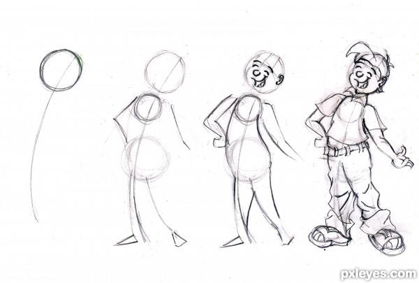
I would most work on drawing torsos and planning your drawings before you line them. Here is simple progression of drawing torsos that might help you: ~~~~
It seems you skipped the planning phase and went right into lining, which makes drawing much more difficult. If you want to draw toony, you start with a line of action, then make a head circle and two torso circles. Planning our your drawing first will improve you 10 fold.
Good luck!
Scalies gtfo. >V
Just kidding. Eastern dragons, don't see them very often. It's an interesting design. I don't know that I like the head that much. It lacks definition for me, like there's nothing that clearly says "this is a head" about the shape (if you ignore the eyes). Doing a quick search on eastern dragons yields many pictures of serpents with long, thin heads and shaggy manes. Also nose whiskers. The body shape looks interesting though.
Shading/highlight wise, you're consistent on the lighting's direction. There's a bit of practice needed though because the body looks like it kind of has hard edges at the transitions from light to normal to dark. Making the transition more gradual rather than brushing once along the area with a brush and calling it done, or even using the blend tool a bit, would add to the roundness of the body. Colour-wise I don't know that I would have gone with a blue for the highlights, but I guess it depends on how shiny the scales are supposed to be. It's not unbelievable, it's just not what I would have done. The typical thing to do would be to pick a lighter shade of the main green, maybe with less saturation, and toss that on as the highlight. But the blue works to break up the samey green all throughout, so I guess it works out well in that regard. That blue is also a complementary colour to the green, so good choice on that.
Cute :3
And for hands, why not use your own hands, or finding a posing program/tool to pose a hand and then try drawing it from different angles?
DesignDoll isn't bad for making custom poses, but it does not simulate skin/muscle/fat very well. If you use DesignDoll, I strongly recommend turning the skin-mesh off and going into art-view to view the torso, pelvic bone and the overall pose.
You can get DesignDoll here: http://terawell.net/terawell/?lang=en
As for hand-posing applications (specifically intended for hands, but may have other options) I know of some phone apps like Handy that could be helpful. It costs a few dollars, but it might be worth it.
There are also websites that take photos of common hand poses and store the pictures for people to practice with, like https://www.quickposes.com/gestures/timed (you can select hands to specifically practice drawing hand gestures) ^o.o^
Krita is another free/open source drawing program that's a bit better than GIMP. I still don't like it as much as Sai, but it might be worth checking out if you don't want to pay for a registration yet.
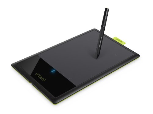
As an alternative to the Wacom brand, there is also the Huion H610 Pro, about 60 bucks on Amazon. My mate and I have one each, and so far they work well for us.
Yeah, Michael Hampton's book is very thorough and consistent and [basically] assumes no foreknowledge of figure drawing... although it is pretty intensive. Figure Drawing for All It's Worth by Andrew Loomis is considered a standard by lots of folks too.
Basically, any Figure drawing book will cover the fundamentals. Hampton's approach to figure drawing is entirely analytical, so it might be exactly what you're looking for.
/u/Ryuu_Girl linked a PDF of it earlier.
http://www.reddit.com/r/furry/comments/37ccti/reupload_safe_downloadable_google_doc_of_figure/
Change the pupils. Goat don't have circles but more of a... Now I don't know how to do proper English xD Squish the circle to an oval, not like cat eyes but in the length... Yeah.... Let's make this easier: https://www.ecosia.org/images?q=goat%20eyes
You need to develop a feel for how to create an image from lines and shading. It's more than just a suggestion or two can remedy, you have a long way to go.
There are some really great resources out there that you will have a lot easier time learning from than a furry-specific forum.
hey !! in terms of color palettes i often use http://colormind.io/ and lock a 1-3 colors in adn then let them randomize the rest until I find a palette i would enjoy working with. And then flesh it out from there.
Alternatively. I use http://www.colourpod.com/ too. for color platte ideas.
Photoshop was technically designed for photo editing and manipulation first.
Consider trying Krita (Free), or picking up a trial for Clip Studio Paint They have brush engines more intended for digital artists. Obviously Photoshop can get the job done if you know what you're doing, but I always found it's ability to blend on the fly with paint brushes to be limited.
Yeah there's a lot of hidden functionality, procreate has their own handbook btw and there are a lot of youtube tutorials if you ever need help. I'd say the most important things are shortcuts, layer management (reference and multiply), and brushes. Might also help to mix in a couple new things with each new drawing you do, the different brush options are pretty fun for example, I change it up a lot and eventually even developed favorites.
I bought it when I was using Windows with an email address I have lost. I now use Linux exclusively; Sai doesn't work in Wine :(
I could try Kirta though, I hear it's very much like Sai.
Ok yeah that would explain a lot ��. I would advise buying this. It’s a professional drawing trackpad that comes with 3 different softwares. Right now, you are being limited by the tools you have. Buying this would be a bit of a splurge, but I can’t say with confidence that you’re going to become much better with a mouse and mspaint.
While I think that drawabox teaches skills that are useful and vital to an artist, I think it very much puts the cart before the horse. It starts out dry, and then it keeps being dry for a long time, trying to get you to do lessons that are either boring or frustrating and messy, if you're not already competent at art.
I refer people to Drawing on the Right Side of the Brain. It's basically the "one weird trick your art teachers never taught you" book, and it covers the most basic skills for drawing from life, which will go literally miles towards improving your art skills.
After running through the book, you'll be able to draw in informal perspective and draw portraits, and learned about negative space, contour, shading, and how to get past your own brain to actually see exactly what's in front of you without adding or subtracting from the subject. Those are the most fundamental building blocks to a beginner artist, and what allow someone to go further into learning to draw. You'll be able to draw anything, as long as it's in front of you to reference.
After running through the book you can start on construction through resources like drawabox, where you take things you've seen before and arrange them in ways you've never seen them in. Doing it the other way around will only lead to heartache, since you literally won't be able to see what's wrong with your art.
Loomis's figure drawing for all it's worth is a very good reference for learning anatomy, though you'll need to take figure drawing courses to really start drawing believable figures.
Seconding the idea of going through an actual book. I was gonna recommend the Loomis one.
Link for convenience:
Two good starting points for tutorials and learning technique:
ctrl+paint starts off with drawing fundamentals and delves deeper into digital painting.
Loomis discusses the fundamentals in more depth, and goes into figure drawing and anatomy. (Check out Fun With a Pencil, and then Figure Drawing for All It's Worth.)
Heya!
So, first off, I did a redline.
In red, I doodled in the skeleton. The bone structure can be pretty important to at least keep in mind with larger characters like this, as the extra mass can make it easy for proportions to drift. You actually did a pretty good job with this- the arms are spread very realistically, and the pelvis and ribcage can be easily placed. The one spot that caught me as off was the knees, they're quite a bit lower in your drawing than they should be based on the skeleton. Another common error I see on larger characters is lengthening the spine between the hips and the ribcage to accommodate the belly, but you seem to have done a pretty good job avoiding that. So props there.
Regarding blocking and perspective, I did an edit in blue, and the green doodle on the bottom is my thought process. For organic forms in perspective like this, it helps to think of them as basic forms (sphere, cube, cone, cylinder, pyramid) that have been softened a bit. For example, the stomach and pecs can be well approximated by a cube, the legs are tapered cylinders. If you can learn to draw these basic shapes in perspective, you can get close to pretty much any organic form.
So yeah, I'd recommend digging up some tutorials on basic one point perspective, and working on fitting those shapes to your character. I know Loomis has some more detailed discussion of the figure in perspective in his Figure Drawing for All It's Worth, and I know there are a ton of perspective tutorials on the web, so I'd poke around a bit.
I'm super fond of Bridgman. Just, anything of his, particularly Constructive Anatomy. It helps students learn how to view human anatomy as masses and forms as opposed to flat shapes. How to Draw the Human Figure by Louise Gordon is another one of my go-tos. This one's more concerned with accurate anatomy and muscle placement, and is a great compliment to Bridgman, which is an incredibly dry read and can be difficult to tell what's going on in more anatomical drawings.
Betty Edwards' Drawing on the Right Side of the Brain is a good place for beginners to start, and she has a book on color theory (although I haven't had a chance to read it yet).
For those interested in comics, Making Comics by Scott McCloud is a great starting point. It discusses everything from tools to storytelling techniques, and even has a section for people interested in webcomics. His other books are also phenomenal.
Heya!
There's a lot that could be said about how to construct the form, and without seeing an attempt at a full body I wouldn't really know what info would be relevant and helpful. So two things that I'd suggest:
1: There are some great reference books out there on how to construct the human figure. One that I've heard excellent things about (and liked what I've seen when I skimmed) is Figure Drawing for All It's Worth by Andrew Loomis, which has recently entered the public domain and is thus legally free online. Skimming this for tidbits that looks helpful would probably be a good way to start, and reading it in more depth will give you a really solid theoretical foundation on figure drawing.
2: Just give it a shot! Even if it winds up looking horrible, that will give people a baseline to critique off of.
I'm liking the headshot, best of luck branching out into other things!
I bought mine in store but you can get it on Amazon and other book stores online!! Here's an Amazon link! I hope this helps you out, If you can't get it from this link then search up the book name on your browser and click on the shopping section!! https://www.amazon.co.uk/Draw-Manga-Furries-Anthropomorphic-illustrations/dp/4805316837/ref=mp_s_a_1_1?adgrpid=125705023596&gclid=CjwKCAiAnZCdBhBmEiwA8nDQxXLMvmxFEeVx1HKJZZE6PjiZpuPOHJFB0y1nGb4eqr3RCjf01_e5KBoCWvsQAvD_BwE&hvadid=5377615089...
It's expensive but there are specific displays that deal with color accuracy for art. They tend to be very expensive. This is an example of a monitor that is setup for artists:
https://www.amazon.com/ColorEdge-Management-Monitor-Warranty-CS2731-BK/dp/B07QHGD5QG/?tag=asol09-20
You will see a big difference between devices as they are not normally color calibrated due to brightness, contrast, and even sun settings for phones that will alter the colors. Laptops, even some of the higher end ones, don't have great color settings and contrasts so you will find a huge difference.
Here's some references !! http://keepursulafat.tumblr.com/post/89031181018/i-have-a-fat-character-i-want-to-draw-but-she-ends https://www.tumblr.com/search/fat+tutorial
Human bodies and anthro bodies are pretty much interchangeable, just apply what you learn from tutorials and reference photos to the body shape of the dragon anthro.
If you need to draw a fat feral creature, you're not in much luck. You'll have to search for fat lizards and work from there.
Goodluck !!
Random greyscale markers that I picked up in the art store. Tbh I would recommend investing in better markers where it doesn't bleed through the page but markers are made by azure™.
https://www.amazon.com/Royal-RM-904GRY-Marker-Grayscale-Colors/dp/B07BXLX4BG/ref=mp_s_a_1_3?crid=30DZDHZZ1AJNJ&keywords=azure+alcohol+markers&qid=1661566936&sprefix=azure™+alcohol+%2Caps%2C322&sr=8-3 Here's an amazon link for the product if you are wondering.
this sub is a wonderful start, ive found looking at RL animal references as well as i bought myself a drawing book drawing book
Oh yeah, I see that bit on the forehead. I'd bring the yellow a little farther into the orange really light. Another thing that helps a lot with blending is a clear blender pencil.
https://www.amazon.com/Prismacolor-962-Premier-Colorless-Blender/dp/B002X94T8U
Make sure you don't need to add anything after you use it though. It's almost impossible to add color on top of where you've used a clear blender.
If you don't have access to those, try twisting a paper towel together really tight until it looks like a crayon and then using it to blend the colors. It will smooth things out.
Do you have any examples of what your at looks like now?
Probably just sketch from stock references (or body positive instagrammers for more diversity) until you're happier with your intuition.
Yeah, keyframing + improv in the inbetweens as well as the little delay you're talking about are classical animation techniques, I think you're doing well! I can't really help you for CSP, it's not the best for animating, I know that there is an open source animation software similar to the one used by Ghibli themselves, named OpenToonz , but it might be a steep learning curve. Anyway, I happen to have a pdf of the animation bible "the animator's survival kit", it was very insightful to me, if you want it DM me :)
Here are two that i've done already in full res if anyone wanna see:
https://ipfs.io/ipfs/QmWkSFRgDHMzNGRFgYvsVCYsBR3Ne2s2VodVumEdvyVRxC?filename=backsack4.png
https://ipfs.io/ipfs/QmUkNcsXS2JiqMGsNAMp8L5vCdPVy8zoc8RsHFG32vBQYB?filename=zanbacksack4.png
I simplify my comic to make it simple to draw. Please check out my more detailed works here If you are worried about NSFW content, this is my favorite piece that I have done that is SFW
I am also only doing these little classes because I was personally asked to. I am a professional artist and make my living doing art. Please in the future do more research.
would it be possible for you to my boi Vincent? i don't really have any art if him with his fur pattern, other than the ref sheet image, but here's the link to his wip about page http://aminoapps.com/p/csviya
To expand upon your already placed guidelines, try separating the middle eye line into two to give a guide for the brow line and bottom of the eyes. Then for the snout you might draw a centered oval or square immediately under the bottom eye guide. After making the nose, connect the sides directly upwards to the brow guide. Another thing, any time your character's eyes seem too close or far apart, try using the "third eye" technique, ie. the distance of the eyes should be the about the length of another drawn eye.
An example.
For the past 8 sketch drawings, I've being combining my love of the front page with my amiable relationship with drawing and trying to draw whatever pops up on the front page! I just put on some electronic/ambient music and waste my night. Here's my Harold from /r/youdontsurf and a "gesture drawing" from /r/furry. I would have never drawn them if I didn't try drawing things from the front page, and I hope to learn a lot compared to doing only the old shitty headshots I used to do.
Maybe give that a try? If you're active on facebook or instagram or something that would be a good source too.
E: you can see the snipping tool in the second screenshot, that's how I get my images from the browser to Krita. It's a simple snip --> paste (ctrl+v).
> how do you find the motivation and want to just sit down and draw?
Some days I'm excited to draw, other days I don't want to do anything. Most days I actually don't have motivation to start things. So I do the 5 minute rule which is to draw something for 5 minutes. That often builds up my desire to keep going. However if I'm feeling really bad even after 5 minutes I stop because something is wrong with my body.
> when looking for references what and where do you look?
I started to save other people's artworks and images to get ideas and references to draw. For something like this I actually googled a royalty free image website of animals since I had no idea what to draw. This one just looked really cute and strong colors for me to work with.
Hi! glad you ask! There are many good options for you. From Photoshop (much older versions are free) to paint tool Sai, and one i found recently.
Plays like photoshop. Totally free. Tons of resources and growing daily!
I think you could’ve used this figure of Albedo as a reference (since you said the wings are inspired by her) Union Creative Overlord: Albedo 1:6 Scale Figure by So-Bin https://www.amazon.com/dp/B0831DW2F5/ref=cm_sw_r_cp_api_glt_fabc_Z9P320NYK74GADSD99ZF?_encoding=UTF8&psc=1
I'm going to go against the wisdom imparted by most of the others here and say you can use a mouse to do art, as many people prove on devArt. In fact, one of the easiest ways to do final pieces on a computer is to first draw with pencil and paper, scan, then use a pen tool in your art program of choice (GIMP for most law abiding and cheap individuals) to assign line paths to your drawing. When all the pen tooling around is done, you can do a single stroke action and voila, your whole piece is perfectly inked. Filling with colour is also just point and click shenanigans, and shading (if you just want to do simple cell shading) is simply lasso tool outlining certain areas and filling that area with a darker colour than the primary, or overlaying a transparent, dark blue on another layer. A tablet is not a requirement for digital art, but some form of analog to digital conversion process is highly recommended for it. The list is a short two items: A tablet (the commonly held belief) or a scanner (available in combo printers everywhere, or solo).
You can do art without either and using just a mouse, but it takes a lot longer to learn how to draw with a mouse. It's unintuitive when your normal instinct is to pick up a long, thin stick of some kind and drag it around on a surface to make markings that resemble a thing. I cannot recommend learning to draw with a mouse in a vacuum, but you can complete drawings very easily with them once they've been put from the real world into the computer somehow.
Removed. Rule 7. Traced art is not allowed on this sub. If you color a premade base, you must link the original artist in the comments.
Original piece- https://medibang.com/picture/p41809180634096210005926752/
Well let's address the elephant in the room immediately: mouse and keyboard is terrible tool to draw, and you'd better off sticking with traditional media if that's the only tools available to you right now.
Now, I'm not saying it's impossible, I know some people can create amazing things with mouse but they're exceptions rather than the rules.
So if you're still determined to create clean artwork with these limitations, I suggest you use vector-based drawing software instead. Keep in mind though that your workflow would be vastly different than regular drawing. The best free, easy-to-use vector drawing tool I can think of right now is https://boxy-svg.com which is browser-based so you don't even need to install anything.
The thing about drawing tablets is that there are many companies that make them, but only one that makes good ones that will always work - Wacom. It's an investment, and if you ever start doing commissions, it will pay for itself. I absolutely recommend this one for anyone beginning their journey into digital art. At $100 or so, it's more expensive than others, but basically, it's gotta be Wacom or not at all. It will last you years and be your best friend. As for software, the tablet comes with a couple of programs, but Paint tool SAI is a drawing program that a lot of furries like to use. I prefer openCanvas myself, but it's buggy and old and crashes a lot. Then of course, there's Photoshop, but it's expensive.
The one on the left is better but it still looks like a broken hand. I think you should be a little more conscious of how the joints and bones fit together in a bat wing to help you construct one. Check out this tutorial, and don't be afraid to look at photos of bat wings for reference!
You can think of bat wings as arms with elongated fingers. There will be a central mass at the apex of the wing where all the "fingers" meet.
The images you linked are sadly examples of where "automatic" or "global" cleanup is very hard to do. The first one is by far the most demanding one to clean up. The shading makes it so that just extracting the "lines" is near impossible, in addition, as the shading (the bits you want to keep) and the noise (smears and other bits you don't want) are the same colour and brightness there is next to nothing that could be done. You could use advanced algorithms to extract local brightness, but that would require a considerable amount of time-investment on your side, more so if you have little to no experience with programming/scripting.
The second image is a lot better; the lines are mostly clean and darker than the noise around them. If you could ink it, that would make the lines even darker and crisper, making them easier to extract. That is, if you want to have pixels to work with.
There is an alternative: vector. Import the images into a vector-program (InkScape is a great, free, open-source alternative) and draw curves on top of the image. The advantage with this method is that you get infinite resolution, but shading becomes less straight forward.
In general, when making anything, sketch first, then, depending on how rough it is, either redraw the sketch or start cleaning up. Either way, the paper the original sketch is on should NOT be the same piece you have your finished piece on. Simple tricks like tracing carefully over your sketch with a medium -> hard pencil then ink it and erase the pencil lines will greatly improve the perceived quality of a drawing. In addition, that will also make it much, much simpler to move the sketch to digital.
If you know your way around gimp, I could show you how I'd clean up that last piece, as that is a fairly ok piece to work with. PM me.
You don't have to pay a cent for quality, open-source software. Here's a few suggestions:
- GIMP
GIMP is a great Photoshop alternative on a budget. It's good at image manipulation.
- Krita
I am not as familiar with Krita but it's more drawing-focused and is probably up your alley.
Both programs work on Windows, macOS, and GNU-Linux.
Procreate isn’t on computers it’s an iPad thing, but there’s plenty of tutorials out there for ibis! So watch those! Lemme link you a cheap stylus that works across all touch tech.
I use this for my art on my iPad, and for taking notes for class on my iPad, I also use it on my phone sometimes and it works well!
there are some good ones for like 250 dollars like this one. It's 12 inches big so it won't take much space.
the tablet? if so here is a link https://www.amazon.com/HUION-Kamvas-Battery-Free-Sensitivity-Stand-13-3inch/dp/B083W88L5H
Reference pictures, apps that you can pose figures in to get a good personal/original pose. I recommend this app, it's the one I use on my Android phone/tablet
https://play.google.com/store/apps/details?id=com.madcat.easyposer
Here, here's the tablet I'm currently using: https://www.amazon.com/Wacom-Graphic-Drawing-Tablet-Beginners/dp/B07S1RR3FR/ref=mp_s_a_1_1?keywords=wacom+one+small&qid=1572247941&sr=8-1
Also yes, Krita is good, but stick to the basic brushes or else you will lost and/or daunted, advice from one beginner to another ;)
I don't think it's public domain like Loomis is, but here's the Amazon link.
I personally use an XP-Pen Deco 01 tablet, and it's been great for me. https://www.amazon.com/10x6-25-Graphics-Battery-Free-Shortcut-Pressure/dp/B077P6BQP7/ref=mp_s_a_1_3?ie=UTF8&qid=1545259428&sr=8-3&pi=AC_SX236_SY340_QL65&keywords=xp-pen+deco+01+drawing+tablet&dpPl=1&dpID=31nsYh1iSmL&ref...
An Atlas of Anatomy for Artists (Dover Anatomy for Artists) https://www.amazon.com/dp/0486202410/ref=cm_sw_r_cp_apa_rGB2Bb9G5VZ1B This was first, a little gross but important. With a proper understanding of anatomy you can start to form your own creatures and understand how others work.
Color and Light: A Guide for the Realist Painter (James Gurney Art) https://www.amazon.com/dp/0740797719/ref=cm_sw_r_cp_apa_SJB2Bb2KHP47J This one is great for understanding color and is really good if you're going to use traditional media.
Love the style and proportions are good as well. If you want to get better with different poses try changing the perspective. Make it from above him or below and learn how much fun it is to draw the same thing from different angles! You could also get one of these guys and draw positions that you move him into.
Id recommend some lessons over at /r/artfundamentals if even just for warming up. They are invaluable.
Secondly if you have never done still life or figure drawing I'd recommend doing those as well. They'll teach you about shapes and forms if nothing else.
Third, if you are able to spend some money on it I HIGHLY recommend the book "Drawing on the Right Side of the Brain" by Betty Edwards. The book isn't so much a learn to draw book as a how to go about drawing book. It gets a little fringe sciencey in some chapters but the lessons and exercises are still fantastic for someone new or coming back to sketching/drawing.
Lastly, studies are a great way to see how others drew out their characters. Find an image you like and try to reproduce it WITHOUT tracing it. Really think about what you are drawing and why you think the artist did it as they did.
Just my two cents, hope it helps!
Loomis is pretty advanced, especially "Figure Drawing for All It's Worth". It's definitely a great resource when you've got the basics down and want to dive into the details of muscles and bones, but you want to be pretty good at the basics of drawing what you see before doing it.
Definitely don't pressure yourself if something seems too confusing. If you try to force yourself to practice with an art book you don't understand, you'll just frustrate yourself (trust me, I learned this the hard way).
If you are willing to put some money down, you could learn a lot from Jack Hamm's 'How to Draw Animals' and 'Drawing the Head and Figure.' I picked them up for $10 each and having a physical copy really helped me.
I picked up that particular book (I assume it's this one ). And I agree, it's really, really dumbed down. If you just google "how to draw anthros" or "anthro line art" you'll find plenty of free blogs and the like with just as much information as the book. It's not that the book is bad, it's just not worth what I paid for it.
/u/jackiebird has some great suggestions, but I'd also like to add Drawing on the Right Side of the Brain by Betty Edwards. It's not specific to anthro drawing, but gives a LOT of good concepts to build a foundation. It focuses primarily on how to get into the proper mindset for drawing and it really helped me get started (even though I still have a lot of practice ahead). It's targeted specifically at beginners.
This looks just like the last thing you posted here. As mean as it sounds you need to work on the fundamentals, as it stands now there really isn't more we can say. Take an intro to art class and read up on art studies.
I highly recommend "Fun with a Pencil" by Andrew Loomis, you can find it here http://alexhays.com/loomis/ for free.
Well that mostly comes from practice, you do something enough (like sketching furries) and it becomes almost second nature to do it right on the first time.
You'll find the more you draw and the more you get used to your own style then you'll sketch a lot quicker and with a lot less lines. You don't need to actively try to draw with less lines, you'll just find yourself doing it after some time.
I know a lot of artists that paint and just draw a big blob as their first sketch and kinda chisel it down into a beautiful form and it leaves me so confused! But keep working and trying new things and your artwork will do wonders.
Also if you like drawing dragons then I'd recommend this book. I have a copy and when I wanted to draw some nice and unique dragons it really helped.
There's one thing I always recommend for this: Drawing for Fantasy Artists. I know it says fantasy, but it's helpful in general. It's what taught me how to do complex stuff like shading fur and bark, building scenes dramatically, or just doing outlines. That aside, you should start by copying lots of styles you like and learning to draw those, then you'll slowly start forming your own. It'll happen quite naturally. Best of luck!
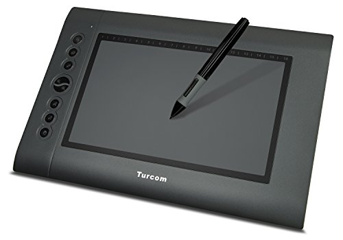
This is the version of a drawing tablet that I use
https://www.amazon.com/Turcom-TS-6610-Computer-Sensitive-Resolution/dp/B00A40GPM8
It's a bit cheaper than the lower models of Wacom tablets and a bit bigger I think. So far it works really well for me. The pen also uses a battery but I havent had to change it in over a year and I think it adds a nice weight to the stylus.
I'd suggest this tablet as a first tablet to someone if they don't want to completely go all out for a wacom tablet because it does work pretty well and has a larger drawing area than some of the smaller stuff.
Drawing tablets really aren't something to skimp on. You're going to get a postage stamp with 10 second delays which will make digital art a giant chore if you try and get the cheapest thing you can.
If you're just trying to practice art then spend $100 getting a kit of prismacolor colored pencils, quality drawing pencils, erasers, and sketchbook. You'll get all the same practice.
If you're doing this to make money and take commissions, you're going to want to just wait a while and save your money and drop $230 or so on a used Wacom Intuos.
I just invested in a Cintiq myself but its really not necessary if you're just starting out. I've been drawing for around 12 years and I have plenty of pencil to paper experience! Started out digitally about 5 years ago and you could honestly start with a Wacom Bamboo for $60 to $80 http://www.amazon.com/Wacom-Bamboo-Splash-Tablet-CTL471/dp/B0089VGPII I've seen some good mouse drawing work but it is MUCCCHHHH easier and probably better to use a tablet.
I can't say I've gotten hand fatigue issues before. But I do know that the others are right. Having a death grip on your pencil is bad, and probably why you have problems. An early solution I learned from someone to combat this is buy some thicker leads (like 1mm leads or 2mm maybe) and draw with those naked. You'll quickly come to appreciate how tightly you should hold your pencil, as pressing too hard will find you quickly working with broken stubs between your thumb and index finger if you continue to death grip. It's kiiiind of a dick move to yourself, but effective. When you stop breaking those thick leads while drawing, you'll instinctively know how to hold a proper pencil lightly enough to do your work without hand cramps.
I prefer a different method myself, change your grip. Instead of the typical writing grip where you claw your pencil right up to the tip, do either an overhand approach (thumb and index finger near the tip, the rest of your fingers holding up the back of the pencil) or a more distant "chopsticks" approach where you rest the pencil between the tips of your index and middle finger, and hold it against those finger tips with your thumb up near the mid/high end of the pencil.
As /u/cheetahmags/ suggested in point 1 as well, your drawing utensil might also be the wrong size for you. It's entirely possible that you're using a pencil/pen/stylus that is too small for your hand. I know if I'm working on the last stub of a wooden pencil it'll bother me how little I have to grip (I have big hands, so that "last stub" is usually half a pencil). It's equally possible it's too big, and I've seen people try to do meaningful work with one of those 8 in 1 pens that's as thick as your thumb. It works, but is it comfortable?
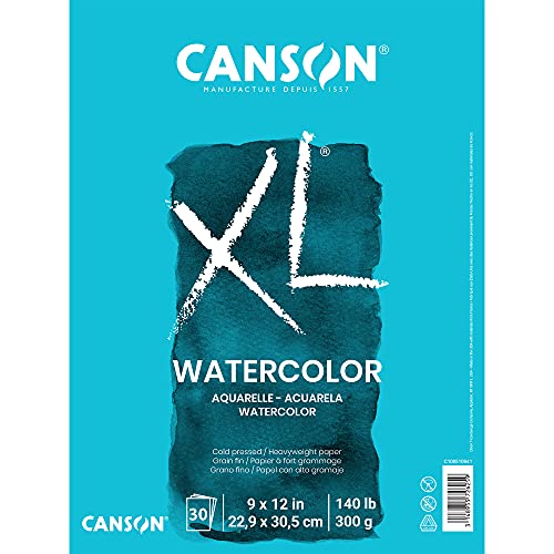
1) Watercolor paper is very easy to find, unless you're nowhere near an art store. But you can easily get some online. This is a 30 page pad of 9x12 cold press (I'm actually considering buying one now that I see this...) and is a good deal considering the amount/brand.
2) Depends on what kind of paper, and what brand. 5x8 is a small sketchbook (I'm assuming 100 pages), but what kind of paper will change that price. The one I get from the same brand in that size is usually listed around 9-10 bucks in stores, 11 is on the high end but not unheard of. This one I linked is /sketch/ paper, so it's a lighter and less durable paper, so if you got actual drawing paper, chances are $11 is typical. Sketchbooks aren't cheap, but I can't tell you if you got overpriced without knowing more.
3) What kind of qualities are you wondering about (what's the context). Honestly, I could go about an hour into each thing that's been listed up here (with some exceptions, like dry media since I only really use pencils). Are you talking paper qualities, drawing qualities...something else?