
What are
/r/GraphicDesign's
favorite Products & Services?
From 3.5 billion Reddit comments
The most popular Products mentioned in /r/GraphicDesign:


The most popular Services mentioned in /r/GraphicDesign:
Behance
Dribbble
Inkscape
SkillShare
Creative Market
Dropbox
Adobe Color CC
TutsPlus (Tuts+)
FontLab Studio
Issuu
Krita
COLOURlovers
Codecademy
Google Drive
Gumroad
The most popular Android Apps mentioned in /r/GraphicDesign:

The most popular reviews in /r/GraphicDesign:
You're looking for Halftone Line effects. There are lots of specialty plug-ins and so on that produce very good results. PS has its own versions, of course.
Try Filter>Sketch>Halftone Pattern, set Pattern Type to Line
or you could try the Mode>Bitmap method described here:
http://www.howtogeek.com/113914/how-to-make-line-tone-art-like-on-money-with-photoshop-and-no-filters/
First of all, we all start somewhere. Don't feel too beaten down because of what others are saying or thinking.
I think this process might help you get faster at designing sites:
- Decide how many pages you need and what style you want the site to be
- Get all text and images you need for the home page
- Find other websites for inpiration. Pick 3 you really like and mix them together for your site (behance is great for inspiration)
- Once the home page is good (including all content, images, navigation and footer) then create a basic template for the other pages
- Add the rest of the content to those pages and save your work (hopefully you will have been doing this all the time!)
Two more things. Remember this list of suggestions is very basic. The work being put into a website can be 10000x more times than you will put in, so keep that in mind. Also, remember you need to know all PS, AI and ID as a graphic designer, in order to impress your boss and colleges. Share your work online and ask for genuine help from other people. If people say it sucks find out why.
Yes, drop the paint if you grabbed it from Google images. As someone currently learning copyright law, the legal ramifications of something as simple as ripping off an image from google images can be pretty significant, especially with something like a logo. If you like the idea and want to keep it, try to recreate it yourself. While you likely won't get in trouble, better to learn good practice now so you don't get in shit down the road.
Drop everything you are doing with the fonts. The drop shadow is confusing my brain, and the typography itself isn't that terrific either. If you are going for 'fun' fonts, try looking for some interesting free fonts that fit the style you are aiming for. This is a good start.
Finally, if this is going to be a logo, there are tons of things you are going to have to consider. Will it work at extremely large or extremely small sizes? I'm already seeing problems with scalability because your logo is a raster image, so if you blow it up on a billboard it is going to look very low quality, as opposed to if it were a vector it would have no problems. Also, a logo should be able to function well in black and white, with or without text in a variety of contexts. It's a nice graphic, but not a very effective logo.
Learn Adobe Illustrator and Indesign for specific projects. For example, being a graphic designer means making everything from print to web and since you only have photoshop, then you only really have the web part down. Learning Illustrator could really help you out when you are designing logos or posters for company identification. You could design in photoshop, but that program uses pixels which means you can't stretch things out without losing quality. Illustrator works by using vectors and you could stretch your designs out without having to lose quality. There are many other things involving the programs its not all about learning how to draw and design logos. There's color theory, typography, training your eye and learning how people react to designs is essential to becoming a great designer.
I highly suggest going to college and taking courses on that, but if you can't then read up on the principles of typography as well as designing elements. /r/typography is a great subreddit and Thinking with Type is also a great book to read. Becoming a graphic design with only a high school education can be really really difficult since you'll be up against people who went to college and received feedback in order to establish their own designing style as well as learning everything needed to get started. Which is why I recommend attending college, but nonetheless I wish you the best of luck!
fontlab. you have to buy it or acquire by other means. there's some tutorials on how to use it on youtube. it's got a little bit of a learning curve but it's not too hard
Oh my god, you guys are thirsty as hell.
OP, an answer:
Search portfolio websites: https://dribbble.com/designers, etc
Search your location in Google + designer, like "Chicago Web Designer Portfolio" or "Chicago logo design" you'll get hits of those kind of designers around your area.
Ask connections you know about people who have designed for them. That is a great way to get a "Good" designer, someone who can be vouched for, not a random dude on the internet. But, mind you, there's some great dudes on the internet.
You have a long way to go. I'd advise looking at good work constantly. Try redoing that camera again looking at some images from https://dribbble.com/search?q=camera When you first start out it's ok to copy others work as practice. Replicating good work will help you improve.
What software do you use?
If it sounds like something you might like, I would think about starting to learn some programming NOW, while you're still young and have (presumably) more free time. There is nothing I like more than taking a design and putting moving, working parts behind it. Whether its games, websites, apps etc, you will have a lot of options as far as creativity goes. Plus, it is a good way to get a well paying career.
As far as classes for this type of thing, I recommend CodeAcademy. It's free and easy to get into.
PS - Cheers for even asking this question. When I was 14, I had no idea what I wanted to do, and I am still not sure. When you have your life's goals laid out in front of you, it's much easier to achieve them. Ok, I'll stop sounding like your fucking guidance counselor.
What size will this thumbnail live on youtube? Will it be that big?
I think for no formal graphic design experience this is decent though some things that could make this better would be to lose the outerglow behind the hands holding the pistols. It might seem like a nice way to make them pop but it's not very appeasing. Try to find another way to make it pop if you think it blends in with the background too much like lighting the background with dodge or just brushing white behind the pistols ever so slightly.
I think the main thing I think that this could use to make it better is a better color palette. That mint green triangle at the top, the lime-ish yellow and the white don't jive together too great. You can try these sites and find a nice combination that doesn't clash so hard.
Keep up the designing.
"Work for Money, Design for Love" and "Logo Design Love" both by David Airey. If she doesn't have them already, then these are awesome for any graphic designer looking to work as a freelancer or start their own business.
What you have here is a fancy emblem. It looks nice as it's own illustration, but I wouldn't consider it a logo, and to be honest, it doesn't really say anything about what it's supposed to represent. Just looking at it, I get no sense that it's for a gaming channel. It's too busy, and there's too much detail in the texture and effects to be re-scaled without distortion. I'm not saying the layout is bad, because it does look nice. You could use this as a splash illustration when introducing the channel, but the logo standing on its own should be much more simple and represent the idea of the channel better.
Here'sa brief article with tips for designing a good logo. Don't be afraid to do a little research on logo design through Google too. Also, don't forget to consider how the logo will be used; print and/or web and its scale. Definitely try to make it in a vector based program like Illustrator.
Coursera has periodic courses on programming you just need to look for them when they're up. They're free to sign up for, and it's essentially a free online course through a college. A Python course is coming up that will be taught through the University of Michigan. I signed up for it myself just to better myself with more programming knowledge.
You're looking at page layouts, so try searching for that instead, maybe some beespoke catalogues and things like that. Maybe some book design too. Some examples from Behance.
I tend to look at cooking books for this stuff beause they look nice, and need to find a good balance between presenting images, bullet points, etc.
Completely overused - but it works well in this context for sure! Here's a nice lobster alternative in case you're looking for one in the future.
https://www.behance.net/gallery/24882765/Hamster-Script-%28Free-Font%29
Not much to breakdown really. Hood was done on it's own layer just like it should of been done. The design actually isn't all that great to be honest. I barely noticed it was herbalife, no call to action, the text wrapping around the wheel well is bad practice and not a very good design. My eye doesn't really go anywhere.
So I guess my next question is. Why do you consider this a good vehicle wrap?
and just so you know, im not really talking out of my ass either as I do these for a living
I think you could take your salary you had from your agency, and use that as a good base. You can also check out the median salary for your industry and field to see if you're actually "worth more".
Shave off the last three zeros to get an hourly rate. Because a freelancer has expenses that an employee does not have and because you're responsible for your own taxes, I'd recommend increasing your hourly rate.
I like to have a range instead of a hard number. For the low end of the range, I'd multiply it by 2. For the high end, I'd multiply it by 2.5 :)
Then you just multiply the low end by the number of estimated hours. Do the same with the high range.
Hope that makes sense.
So for example check these out https://www.behance.net/search?content=projects&sort=appreciations&time=week&search=personal%20branding
What is the difference between personal branding at uni and personal branding outside uni? The objective of the first should naturally flow into the second, right?
Try creativemarket.com - search for food mockups. Here are two I found pretty easily, and there are some others as well: https://creativemarket.com/itembridge/3861-Food-Box-Vol.2-Mock-up-Template or https://creativemarket.com/itembridge/3862-Food-Box-Vol.3-Mock-up-Template
They have all kinds of resources and most all of it is pretty reasonably priced, I've used some stationary mockups from there and they turned out really nice.
If they're agreeing to utilize Material design, they can't not use shadows. I mean, I know the guidelines don't HAVE to be followed but if the director doesn't want to use shadows and keeps throwing the term "Material Design" around then it's going to make things confusing. The whole point is to feel like you're looking at paper/material stacked on a table and things on tables cast shadows. But I regress.
Semantics aside, I suggest you just engage them! Ask how they think you guys could convey depth in a way that is just as versatile, stackable and subtle to the user as shadows. Make sure they understand how shadows affect implied and anticipated functionality for the user. They should already have something in mind, but I'd give 'em a few hours to either find or come up with alternatives. If they come back with something that seems to work and is technically reasonable (stability, support, speed, consistency, size, etc) then I'd give it a shot. If it constricts the user experience, limits scalability, is technically expensive or the reasoning points to simply being stuck in 2013 then ...well, they had their chance man.
You can portray depth without shadows. The depth portrayed in Material design is vertical; looking down at the materials on a table. If I'm not allowed to use shadows, I'm left with horizontal depth which can be conveyed with size, color adjustments, opacity, position and/or blur. Here's an example.
I have design elements and styles that I don't like. I think all designers do. But again, your director shouldn't suggest not using something without an equal or more compelling alternative.
If you're new to vector graphics, get Inkscape (free download from https://inkscape.org/ ) and go through the tutorials in the Help menu to get an idea how things work in vector graphics. Illustrator may be the standard, but Inkscape is quite accessible and I felt the tutorials gave a really good foundation for the concepts.
One of the routes to go would be to trace your design using a vector app like Adobe Illustrator. If you dont have that, you can also use a free vector app like Inkscape. https://inkscape.org/en/ Check out the tutorials and video area on the website to learn the program.
There's a program that professional (and regular) gamers use to stream their games which also has a great recording feature. It's a completely free open source program called Open Broadcaster and you can find it at their website - https://obsproject.com/
Keep in mind it's mainly for streaming, but the recording feature works flawlessly and doesn't hog lots of your computer's processing power.
Check out Tuts+ (https://tutsplus.com/tutorials/). It's been a little bit since I've checked them out, and it looks like they aren't doing any new tutorials, but you can check out the older ones which are pretty helpful
Besides that, I would just get into the programs and go wild. You won't break anything. Check out some design magazines too, like How or Print, for inspiration.
Try Treehouse. It cost $25 a month, but they have a month long free trial. You can learn at your own pace with videos that have corresponding project files. The great thing about Tree House is you can start with learning HTML/CSS and move on to other programming languages (i.e Javascript, Ruby on rails, iOS, Android, and Swift).
I highly recommend you check out webflow https://webflow.com/ or macaw http://macaw.co/ I've only used Webflow but they're both pretty similar. They're great tools if you want to make something quick and aren't really into programming.
I feel like there is some confilct between the background and the popsicle. Try making the white glow around it yellow or orange, really POP it out of the tropical plants. Also, watch the blue on textured type, it's getting difficult to read, maybe make it bold or another pull color, like the purple or green.
Also, watch the heirarchy of the logo, the popsicle, and the headline, they seem fairly close in relation to each other, REALLY push one of them, and then take the other two back.
^Sent ^from ^Reditr
Ellen Lupton - Thinking with Type
this is a fun one too - one side of the book is the ten commandments of typography, very biblical - the other side breaks all those rules.
Hello, From a software tutorial point of view, Vimeo is great - http://vimeo.com/categories/education/tutorials, and it is free. If you are willing to pay a subscription fee, Lynda.com is excellent.
Regarding tutorials for poster design, magazine layout, typography, branding, etc, I would recommend you bury yourself in some good books. To name a few: Grid Systems by Kimberly Elam, Typographic Systems by Kimberly Elam, Thinking with Type by Ellen Lupton, Making and Breaking the Grid by Timothy Samara.
Source: BA Graphic Arts undergrad
There are a lot of variables to consider when pricing projects. How long you expect the project to go on for, your local market, your experience, and the clients budget/size to name a big few. Along with those considerations, the project itself is going to influence the price. A business card is not going to be priced the same as a website.
I realize that doesn't answer your question directly, but it may give you a starting point. Keep in mind that you should never, ever sell yourself short, even if you are new to the business and are trying to pull in clients. Sure, give them a price break if you think the project will be used in a portfolio or they ask you to do something you haven't done before. Chalk it up as a "learning discount" for yourself. However, do not cheapen your work by cheapening your prices, or you'll regret it later when your previous clients expect cheap work that is of higher quality, and those clients telling their friends they "know a guy who does cheap work". It never pans in the favor of the designer.
Another great resource is going to be design books specific to pricing. Here are a few that I found helpful when I started out:
Logo Design Love
Business and Legal Forms for Graphic Designers
How to be a Graphic Designer Without Losing Your Soul
Graphic Artist's Guild Handbook of Pricing and Ethical Guidelines
The Designer's Guide To Marketing And Pricing
The Graphic Designer's Guide to Pricing, Estimating, and Budgeting
I'm going to be leaving my office soon, but if you'd like to ask anything else, let me know. Reply or PM is fine, would be glad to help out.
Web design /development is always evolving, so for that reason following blogs/designers will often give you the most relevant and up to date info on best practices etc. but nothing beats books for a good foundation. Thinking With Type, Designing Brand Identity, and Meggs History of Graphic Design would a good place to start.
To answer your question:
www.trydesignlab.com, but it's still in private beta.
www.hackdesign.org
http://psd.tutsplus.com/articles/inspiration/teach-yourself-graphic-design-a-self-study-course-outline/
We're an online company that does custom orders of vinyl decals. Postcard size is perfect, and we are happy to do one-offs. Just click on the "Request Custom Order" on the left to start a custom order conversation. https://www.etsy.com/shop/SewardStreetStudios
Because of the resolution or because the background graphic wont print well?
I'm not sure why imgur did that to my jpg, but here is a dropbox pdf of the design now. This includes both bleed and trim, so the fringed edge wont be seen on the final product.
Your willingness to help others out is awesome.
There are some amazing free web dev. sites out there that are just plain amazing that might have a solid jump on starting from scratch. Plus plug directly into Javascript, PhP, Advanced CSS3 and HTML5 etc.
http://www.codecademy.com and https://generalassemb.ly/education/web-design-circuit are amazing. After kicking off there about 8 months ago, I was able to pick up more advanced stuff and really start cranking out solid freelance to put towards with my design portfolio for that next job.
That's more 90s and I hope that never comes back in style.
I was thinking more along the lines of these for print design: https://www.behance.net/gallery/23105939/Retrowave https://www.behance.net/gallery/23813155/20-Years-of-Photoshop
And, I only say that because the style has been showcased quite a bit and there's a lot of experimentation with getting it right while not be abusive with it.
Yes, the others are right to tell you that you're going about this the wrong way. I'm here with a suggestion on how to do it the right way.
What I suggest is getting a Pantone Swatch Book. They can quickly become essential to any designer's toolbox.
To use the book, you go through the swatches until you find one close to the color you're looking to replicate. Then compare all of the similar swatches in the book to your color until you find one that looks just right. Note the number on this swatch.
Now open the corresponding Swatch Book in your design program (Photoshop & Illustrator have them built in) and find your Pantone number. Boom. Done. The color in your design will now match your desired color. You may want to convert it to CMYK depending on your printing method but that's easy enough.
You can even use the color picker in the program to find the RGB or HEX values of that swatch...so you can use it in video or web projects as well.
Fair warning: the books can be a bit pricey for what amounts to a bunch of printed colors—but just know they are printed with the highest detail possible for the most accurate results and that kind of printing precision costs money.
https://www.amazon.com/dp/1590653289/ref=cm_sw_r_awd_-Aefub17F6J32
However, you can likely find a used one on eBay for much less. Beware though. Books that were not cared for properly (left out in light or heat, cut up, etc.) may have faded/damaged swatches and not function properly. Pay attention to the description, photos, and seller's history and you'll be fine.
http://ebay.com/sch/Color-Guides-Pantone-/46730/i.html?isRefine=true
Hope this helps. Good luck!
I don't see anything obvious thats wrong, however I ran the file through my distiller program and it should work fine for you. https://drive.google.com/file/d/0BzDdkxcF3EUdLU1XWEZYdEUzOFU/edit?usp=sharing
I always run outside ads through this when Im building a newspaper or a magazine. It takes away ghosted stuff and goofy artifacts and usually makes ads fine to print.
Do you use distiller at all? I could share some pdf settings with you if you do
It was originally meant as an 8.5" x 11" poster printout. I linked a smaller file, but here's a bigger file for those with bigger monitors.
P.S. I've always considered myself a terrible designer so any tips or shortcuts or whatever would be awesome! :)
You can totally create material for imaginary companies. Just call it a concept.
For real companies, just call it a "Rebranding Concept". Example.
For imaginary companies, call it a "Brand concept". Example 2.
A good start would be to brand yourself! Give yourself a logo, mock up some business cards and stationary and maybe even a website design. None of it even has to be implemented in real life, it just makes for a nice portfolio piece.
I dislike the font, too close to semi-artsy fonts like papyrus. A clean, sans-serif like you used herewould look much better. I really dislike having the title text (person's name) in italics. Also, the purple is very purple. Making the colors a bit less saturated and a bit darker should make it look more professional.
Browsing your other work, I like almost everything else you've created except this resume template. :p
This sounds very appealing to me. I'm currently working on launching my own clothing company, and would love to take part in this venture. I have a number of designs already complete that I can show you over PM if you like, and would love to get to work creating some more.
Here's a link to my portfolio, which although hasn been updated to contain many clothing designs, will allow you to see a bit of my work:
Can I suggest you to use my software: PixaFlux.
It is a non-destructive image editing application that uses a node graph instead of layers. You can use nodes to add images to your project and compose them in many different ways, and at the end you can have one or more resize nodes that change the size to whatever you need.
The software is mature, and I am really interested in finding beta testers. If you are interested and decide to work with PixaFlux I can create some examples and tutorials about how you can use it in your workflow. I can also develop new nodes and tools if you need them!
Thanks!
Black, yellow, tan, white, peasoup, neonish blue, dark lavender.......Not colors I would use together and there are a lot of them. Then you add a rainbow on the other page.
I would kill the peasoup and the lavender. Change the yellow to the blue perhaps. Idk, Id have to play with it a bit.
Well, like you said, I'd suggest finding someone who has done this before. But, if you have absolutely no budget at all, start keeping a folder of things you like. Study them. Try to copy them. And then take the things you like and make them yours. The following sites can be good for inspiration...
Love your stuff. And, I like beer. This was very nice to see from you: https://dribbble.com/shots/1110920-Beer-Infographic/attachments/140475
If you go to the advanced options in GIMP, you can change the resolution. I don't think it can do any good for your current poster, but it is possible to remake it in 300ppi. Though, you may get a pop up about the image size, and if that happens, I don't know how it'll go for you. I recommend a vector program.
A thread about Vector Programs: http://www.reddit.com/r/GraphicDesign/comments/364ncd/what_is_a_goodcheap_vector_drawing_software/
Inkscape Link: https://inkscape.org/en/
I also recommend skillshare, courses are short, easy to follow, and made by people sharing their own experience. http://www.skillshare.com/classes/design/iOS-Design-I-Getting-Started-with-UX/264159994 http://www.skillshare.com/classes/design/Design-Beautiful-Apps-iOS-App-Design-UX/771498797
I haven't personally taken it, but you can tell from the projects and what people haver written that it must be good.
If you are serious about learning better techniques for illustration I would have thought this would be invaluable.
Checkout this guys project for example, it's a nice illustration at first, but once completed it has a bit of heart about it.
> There's a lot more too if you google html5 tutorials or beginner css or something like that.
cut and paste 'html5 tutorials or beginner css'
first to pop up --> HTML5 & CSS3 Fundamentals
reviewing now!
No problem! Sucks to find out AFTER you graduate, eh? At least you'll always have the option to go back if you decide to.
As far as online tutorials, there are a couple big players popular for them (keep in mind that Adobe themselves have some good videos on their products):
Otherwise, just simply googling "{programName} tutorials" and you'll find a wealth of information provided for free.
I can very quickly recommend that in Illustrator and Photoshop that you learn/master the pen tool. EXTREMELY useful and versatile. Beyond that, general design principles you could pick up online or even in books if you like that route.
Awesome, you're waaaay further along then I was at your age. Keep it up. The more experience you get, the easier it will be to diversify your designs. I think you're headed in the right direction.
The main thing I notice is that most of your logos seem to follow a basic formula: big text in the center, with smaller text centered underneath. Try breaking the grid a bit. Work with diagonals or unconventional placements. Experiment with different spacing between lines of text (or try using only one line of text sometimes). In one word: Exaggerate. It may help to take a look at some gestalt principals to spice up your designs. I found this to be a helpful resource as I was working on these issues (and of, course, I still am).
Well you're right, this is a pdf converted into a png so I could upload it. The text you see in "Summary" has the justified text with changed values (given to me by my tutor in 1st year, it makes all text look perfect minus a few haha).
But thanks for that, its always good to get inside the head of someone who hires us!
Here's my behance profile if you're interested, there isn't a lot of work - I'm in the process of adding a few more. https://www.behance.net/AaronDarkDesign
There's Time Sink, which I did not use beyond the trial, but I don't remember why... http://manytricks.com/timesink/
Edit: I forgot to ask about OS. That's a Mac app, which I'm assuming you use due to Safari...
Magazine Subscription: I can recommend 'Computer Arts'. They got worldwide shipping and publish special issues on specific topics once in a while (you get one magazine a month).
Books: 'Logo Design Love' is a good one. Although it is pretty specific the described workflows helped me a lot.
I just got a job in UI design a few months ago, and it's hard to find stuff. I asked one of my professors and he said the most important thing was to keep the basic design principles in mind. I suggest you focus on your grid and typography, and the graphics will come more naturally. Sketching things out usually helps me.
David Kadavy's book Design for Hackers is really helpful - he looks at design from a reverse-engineering perspectives while reviewing design basics. I'm going to use it to create a basic guide to design principles for the computer science students I work with soon.
We're similar, in a way. I embarked on the same mission as you nearly a year ago. I graduated with an English degree in 2005 and couldn't really figure out what to do with it. I had a pretty good background in art from various classes, including photography. I started making posters and a website for my husband's band and got really into it.
So I decided to get a "degree" so to speak, without getting a degree. Thinking with Type is was set me off. I learned typography and html/css on a pretty basic level, got a 19.95 photo editing program, Pixelmator (which is fucking amazing, btw).
Sketch, even if you think you can't, do it. Draw your letters by hand. just try, it'll help you in the long run. Get some graph paper, it'll help.
To be valuable and make logos mean something, you need to learn a vector program, like Illustrator or CorelDraw. Start in PS and then move into AI.
After a year, I didn't even have to go to school, I got a job as a graphic designer in a sign shop because I could do a little of everything they would normally hire 3 different people to do. (marketing, graphic design, web design).
tl;dr - do it for a year, if you still love it, go to school or get a job, but LEARN ILLUSTRATOR!
Want to get better at typography? Start making type. Even if you suck at it and don't stick with it, learning the rules of how type is constructed will help you get better at using it. I'd recommend ordering a copy of Designing Type by Karen Cheng.
And of course, the bible, if you haven't read it
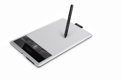
Should I go with the older model? http://www.amazon.com/gp/product/B005HGBEZ2/ref=pd_lpo_sbs_dp_ss_2?pf_rd_p=1944687622&pf_rd_s=lpo-top-stripe-1&pf_rd_t=201&pf_rd_i=B00EQW6M2S&pf_rd_m=ATVPDKIKX0DER&pf_rd_r=0JJ5HXRRNNA4W4R78B22
Or the newest? http://www.amazon.com/Wacom-Intuos-Medium-Tablet-CTH680/dp/B00EN27UC2/ref=dp_ob_title_ce
If you have used them both, would you say it's worth the extra cash?
I graduated uni last year, from my experience they are looking to see base skills so maybe some sketching, drawing, painting and maybe some stuff done on the likes of Illustrator or Photoshop if you know how to use them. Make sure its really well laid out and neat. If you are stuck for inspiration if you want to do a few Graphics project answer some briefs on /r/freedesign or designcrowd.com. Make sure you can talk about your work and the concept behind it in relation to your target audience.
Bonus tip for the interview, for one of my interviews I was asked about my thoughts of my favourite campaigns, what graphic designers I look up to and how I created certain pieces of my work. Don't worry that you haven't done any published work, chances are a lot of other people haven't, but it will look good for them to see your thought process by doing a couple projects and seeing your skills.
Bonus, this is a great portfolio building book, I bought it for a friend of mine when we did Graphic Design on the mainland UK. All the best for your interview!
The paid version of Add Watermark on the Google Play Store will let you do both functions (free version only lets you do text watermarks).
https://play.google.com/store/apps/details?id=com.androidvilla.addwatermark