
What are
/r/reviewmyshopify's
favorite Products & Services?
From 3.5 billion Reddit comments
The most popular Products mentioned in /r/reviewmyshopify:


The most popular Services mentioned in /r/reviewmyshopify:
PageSpeed Insights
Burst
GTmetrix
Unsplash
Adobe Color CC
COLOURlovers
Loom
Pixlr
unDraw
Paletton
Uploadcare
Colormind
Olark
Product Hunt
Calendly
The most popular Android Apps mentioned in /r/reviewmyshopify:
The most popular reviews in /r/reviewmyshopify:
I can't find it again.. there's a list on PH of ethical shopper apps/plugins. I remember the pitch video was a young woman talking through the rankings and metrics of their plugin..
this is awesome, i love the concept and examples.
​
however, the check out isn't working for me, i get a 500 Internal Error, see this screenshot: https://www.screencast.com/t/SIVsN4uWtPg
I've checked on a few different examples, just a heads up.
The only thing I can think of on top of my head now that's helpful is pagespeed by Google. It only focuses on optimization for speed, but not things like branding and design.
More words would be good lol. Google likes them, and potential customers might see your company as more credible. A call to action at the bottom of the homepage would help. I almost didnt notice your little menu bar, and thought you just had the four products. If I wasn't reviewing your store, I honestly would have probably left at that point. Something like "show all" at the bottom, and even a header like "Top Products" or "best sellers" instead of "featured collection" would be much more interesting to a buyer. Also my OCD self notices that there is not a full row on the homepage. Row 1: 3 products, row 2: 1 product. It's these little things that make your store look more professional, and prompt people to enter their credit card info.
I recently found this website: https://www.iconfinder.com/ To find cool graphics for your store. For yours, maybe a section on the homepage talking about your commitment to quality, returns and guarantees, and maybe something about cool electronics lol
I recently went nuts with the icons on my website, maybe it will give you some ideas: https://www.epiphanymealprep.com/pages/about-us The icons kicked it up like 10 notches from the stock photos I had before. Good luck to you and have fun!
Hi Mkrayowski - I knocked the images together using an Adobe package, the sources images were from Burst: https://burst.shopify.com/?utm_content=free_photos - you can get to it through the Shopify admin from any image picker which you haven't selected an image yet - HTH, RP
The only way to make it better would be to copy the blueprint of successful websites. Here are some question to ask yourself - i've answered them for you.
Who is my competitor ? www.superherostuff.com
Are they successful ? https://www.similarweb.com/website/superherostuff.com#referrals
How do i copy their website ? Create a blueprint of the entire website, find a theme that is similar, and start adding content (trust badges, apps, and pages)
So a few quick points:
The brooklyn theme is cruel when it comes to conversions.
But for you to get no add to carts means that you are targeting the wrong people on facebook.
- Font too small
- Install Mega Menu so you can get a dropdown menu
New Suggested Format:
- Slider with great elephant image
- "Doing our part section"
- a sampling of products grid (like 12).
Facebook:
You have the makings of a good facebook page. The content that you are posting really impacts me and resonates with the audience. Keep it up!
For this site, people care less about spending and more about helping the elephants, which is why you should replace/remove $100 shipping on the top banner with something like "10% of all sales are going to Save the Elephants," (the goodwill effect)
Make sure that its the first thing they see when they come in on the site, mention it on the slider and throughout the site. Create a page about the organization and use that as the "learn more link" if you decide to go with the top banner/slider idea change.
Last note: you need a colour scheme.
You're site is not very memorable. One of the easiest ways to make it memorable is to introduce color.
I'd guess it's a mixture of a few things:
- 1000 really isn't that much, a little surprising no one even added to cart but not unreasonable because...
- PU leather is not really sought after, anyone that really cares about their leather products is going to want genuine leather. Your in that tough spot of positioning yourself as a luxury company but without a really luxury product.
- Anyone who googles your product to find out more about it will likely see it for sale other places like Amazon for half the price and choose them over you
You can also get a popup lightbox like this one on Amazon to at least better light the shoes.
Also, what is with the Accessories section? None of those items have anything to do with shoes.
Site looks great but I'll probably buy mine from here
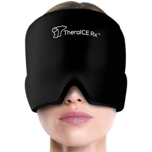
Although you're headed in the right direction, it just depends. If this product does exactly what it is intended to do then there won't be any issues, and I'm guessing it does because the product is selling well on Amazon, but it has questionable 1 star and 2 star reviews
https://www.amazon.com/TheraICE-Rx-Headache-Comfortable-Stretchable/dp/B082WN9NJL
So if anything the OP can go into detail about how does the headache relief hat actually works based on the technology that is implemented with the hat but even so I still wouldn't sell this product health products are tricky because if it makes the problem worse, the customer would consider suing. That's whats so tricky about health claims
I suggest you remove your policy page link in the top nav as it’s a distraction.
Get a real email with your domain name. It will make you look more legit.
You gave a policy page, yet your site is actually missing the most important policy pages you can have and those are your privacy policy and your terms of service. There is a reason why every reputable e-commerce store on the planet has them, it’s because they know these documents are more for the owner than the customer and that they are the front line defence against law suits.
Also, as a customer, I won’t shop a store that cannot be bothered to implement them because it tells me that as a store owner you probably haven’t giving any thought to my rights or protecting my privacy.
Lastly, I recommend reading the book E-commerce Evolved as it explains a lot of the mistakes people make and what to do about them.
https://www.amazon.com/Ecommerce-Evolved-Essential-Playbook-Successful-ebook/dp/B0711FK99L
Hi, I just went through your store. The products are good. I have some suggestions for you to make it more enticing for your visitors. Before spending your money on FB ads and Instagram ads you need to make sure your store is ready to capture and engage them. If not then you may end up losing all your money. What I want to say is you need to focus on customer engagement and retention before investing in ads. Add features like advanced email marketing, loyalty rewards, reviews + Q&A, web push notifications, workflow automation, smart pop-ups, announcement bar, chatbot, product recommendations, actionable analytics all integrated with each other and powered with Artificial intelligence. Try Aitrillion. For all the must-have features. Instead of using different apps go for all in one app. It will not only optimize your speed but will also keep your data safe. It is easy to manage. You can take a free demo, to book it click here.
Good to know. 2 orders from those visits sound great. Don't go making lots of changes on our suggestions and end up swinging from one side to the other tho, or else you will miss on what is working.
Those pics you added are not the type of faces I had in mind, but if it works it works. I was thinking of something less aggressive or influencery, maybe something ethereal, even just human shapes and shilouhettes, not actual people with a lot of personality. I would use those pics at the bottom.
But again, dont take me for any kind of expert. I was just thinking something like this:
https://www.pexels.com/photo/woman-wearing-diamond-ring-3474504/
Good luck, and glad to hear you got some sales.
The yellow banner and buttons make it hard to read the white text's. I'd suggest changing the text to black so it stands out more or darken the yellow so the white letters are easier to read.
Fix up that logo as well, remove the white background and make it a .png with a transparent background. You can use Pixlr.com to delete the background with the cut out tool and the magic cut out button.
Maybe add more in the about us section and make it a full page instead of a small blurb in the bottom, who you are why you started the site kinda thing. doesn't even need be real but people respond to a story with a face more then just a faceless website when its small.
I would add a little more to the FAQ also, maybe check out what competitors have on their and go off that as well.
Hi u/ankits
What a great store. Quick fact: the mobile version of your website has a low-performance score (30/100), the main reason is showing "Remove unused JavaScript" (you can find more info here)
Get a social media influencer to promote your artwork. This would be a good way to get high traffic to your store.
Also, you can try using product badges to quickly grab users' attention on top-selling, on sale, and low in stock artwork. Try using ModeMagic, they have some really cool graphic stickers for free! Maybe there can also be a section called 'Coming Soon' to keep your customers' on their knees :)
I hope this helps!
What a great store. Quick fact: the mobile version of your website has a low-performance score (30/100), the main reason is showing "Remove unused JavaScript" (you can find more info here)
Also, you can try using product badges to quickly grab users' attention on top-selling, on sale, and low in stock artwork. Try using ModeMagic, they have some really cool graphic stickers for free! Maybe there can also be a section called 'Coming Soon' to keep your customers' on their knees :)
The website is suuuper impressive! Just a quick note I figured you should know, it does take a little while to load up, I'm not sure if it's just me, but I've tried refreshing a couple of times and it does take a little while. I typically use the google website analyzer here and see where I could improve. I've used this to sell myself to stores and companies in order to revamp their websites in my young days hahaha. Cheers mate, looks great!
- PS saw a comment where u said to focus on mobile optimization; the tool gives you some help with that too :) Best of luck!
I wouldn't necessarily say you have to pay for a theme, but the current layout you have set up isn't that great.
I would suggest looking into maybe moving your slideshow above the collections on the homepage. Make sure the images you're using are all the same size prior to uploading them. The slideshow is super jumpy because the images are all different sizes. For a free site maybe check out this one if you need to resize any images: https://pixlr.com/
I haven't checked this out much, but Shopify has this site for images you can look into: https://burst.shopify.com/
The logo advice is solid. It kind of looks like you just took a stock image and placed it there. Make sure there's no background as you can see the white of the background for the image and it's different compared to the background of the site so it stands out oddly.
I might suggest reaching out to Shopify support to see if they can provide you with a little bit of css to make the subscribe button under the slideshow centered. That's way off for some reason.
In the footer can you remove the first heading, Latest news perhaps? It just goes to a 404 page.
Just a few things I noticed right off the bat. Good luck!
Looks good! Great vibe and overall theme.
Agreed to the other comment, didn't like the push notification box. Personally, I never wanted get "alerts" from some website. A better option would be using an add on for email opt-in, which is an absolutely must for any eCommerce website. Always try to grow your list, nurturing and some will eventually convert to customers.
Another I noticed is that scrolling is a little glitchy, not a great experience.Should be something easy to fix.
Finally, may I ask how would you draw traffic to your new store?
Great work!
Although you need to work on speed on your website - https://developers.google.com/speed/pagespeed/insights/?url=https%3A%2F%2Fmosh.deals%2Fproducts%2Ffor-iphone-11-pro-max-xs-x-xr-case-slide-armor-wallet-card-slots-holder-cover-for-iphone-7-8-6-6s-plus-5-5s-tpu-shockproof-shell&tab=desktop
Hi there,
It is a very great strategy supporting social purposes. Customer love shopping from these brands. Congratulations :)
Offering free shipping is always a great idea.
You can also create a pop-up to collect the email address of your visitors and give them a discount coupon for this. After building your list you will have the chance to always notify them with your email newsletter and in other words you will have a great "customer database".
I wasn't able to find any information regarding the Privacy Policy which feels little unsafe to shop form your website.
Also the thing that caught my eye on your product page is that you have the review section without any reviews. I would recommend to add this section after getting some reviews or to instantly add them if they are available.
You have a pleasing overall website score but there are still some point that you need to optimize.
Here is your full report.
We recently had the chance to analyze all the tips that eCommerce stores need to optimize to boost their conversions.
Get your super-guide from here.
Good luck with your eCommerce journey :)
Hi there,
I had a look through your store and I have to say that it looks pretty cool.
I would like to mention, don't know if it's only happening to me, I saw the same pop-up many times which bothered me and to be honest harmed my experience and I wanted to exit your website.
I wasn't able to find any information about the Privacy Policy. This not seems very safe in the stage of sharing my personal information with your online store.
Also I would suggest differentiating your products. They look very similar to me. You can gather the same ones in one product page and just add the colour options.
The overall score of your website is not pleasing. You must improve it as soon as possible.
Here is your full report.
Your loading speed is very high and this is the main reason for your users to abandon your website. This rate in approximately 65% on desktop and 90% on mobile. Users won't wait for your page to be fully loaded.
Personalized shopping experiences are proved to increase the online sales.
Image yourself stepping into a physical store and looking for something to buy. The salesperson of this store after looking at your for some secs instantly knows your shopping taste and what you want to buy. It sounds great right? There is no doubt that everyone would like to be treated like this. We call this personalization when it comes to online shopping.
Have you ever tried Perzonalization?
Good luck :)
Hi there,
Congratulations for your entrepreneurship.
I would like to mention some point regarding your store, but please do not be offended.
As you would also know, there are many online stores selling posters and the most common problem of every Shopify store is having traffic but no sales.
You need to mention very clearly why you are different than your competitors.
This article will for sure light your way.
Have you ever checked the overall performance of you website? Your loading speed needs to be optimized instantly. The industry average is 4 secs. Here your full report.
Also, Black Friday is approaching. Use this shopping festival to your advantage. Offer discount codes to your visitors, send them gift guides or include a little present in their orders.
Check your traffic sources and look carefully through the demographics of your visitors. You may need to expand your shipping to many other countries.
And something last, why don't you design posters of Joker? As you would also know, he is very trending these days.
Good luck :)
Hi there,
The first thing that catches my eye, is that your categories at the front page are very confusing. You need to organize them better.
You must do everything to get reviews from your customers. Having the review option without any is not looking well.
You don't have an About Us page to explain your mission clearly and why people should buy your product.
The loading speed of your website is very bad and need to be improved instantly. The average speed is 4 secs. Of course there are some major point too.
Here is your full report.
Good luck!
Hi Nizam,
The first thing that catches my eye, is that you don't have an About Us page to explain your mission clearly and why people should buy your product. As you can imagine this is a very common product which can be found across many shops physically. So you have to clear your products quality and why it is different from your competitors.
Studies say that you need to have at least 15 products on your store in order to give a reason for your visitor to stay, so try to add a few more products before starting to promote your store.
Check this article with the best products to sell!
Also you can add product reviews to your product pages, as social proof is very important during the sales process and impacts directly the decision of the buyer.
Although your store's score is quite pleasant, there are some points that could be improved.
Here is your full report!
Good luck!
Hello Miguel,
Congratulations, your store looks amazing and the designs very appealing.
I would suggest to add customer reviews on your product pages. This could help many customers decide faster and of course will boost your conversions.
You can also build up a page with fashion suggestions or maybe include some blog posts regarding styling.
You page's overall score is quite good but there are some thing that could be improved to improve it even more. Here is your full report!
Oh, have your tried Perzonalization?
Good Luck
Hey there,
I reviewed your store and I have to say that your front page needs to be optimized as it doesn't look much appealing.
As you have many competitors online, you need to make it clear what differentiates your brand from the competition.
Although the overall score of your website is quite good, there are still some points that need to be optimized.
Here is your full report.
All stock, is not a good option to display your products. You may use all of our products or something similar instead.
Studies say that you need to have at least 15 products on your store in order to give a reason for your visitor to stay, so try to add a few more products before starting to promote your store.
Check out this article of Perzonalization. It will help you a lot!
Good luck!
Hi there,
There is no doubt that there are many online sunglass retailers.
Please don't be offend but your website's theme looks little bit old fashioned, this may affect the shopping experience of your visitors.
Here, is a great article of Perzonalization which can help you to optimize your store.
When it comes to your page's speed I need to say that there are many things need to be optimized.
Your loading speed is 7,7secs. This a high number when it's compared with the industry's average which is 4secs.
Here is your full report.
Have the article on one tab and start optimizing as soon as possible.
Also, maybe Google remarketing will be helpful to instantly notify your visitors and bring them back to your website.
Good luck.
Hi there,
The first thing that catches my eye, is that you don't have an About Us page to explain your mission clearly and why people should buy your product.
As you can imagine this is a very common product which can be found across many shops physically. So you have to clear your products quality and why it is different from your competitors.
As for Google Ads, you can try remarketing ads to target people who have already visited your website.
And I believe that your price is little high. You may think of lowering i of offer instant discounts to your visitors, which could be a great idea to convert.
Also here, is the full analysis of your page. There are some points that need to be improved. Although your overall score is pleasing, have a look to have an idea.
Cheers
Hi there,
Hope you are great. Your store looks pretty cool but I would like to mention some points.
The product description on you product pages are just structured on the right side (I am talking for desktop) Is there any theme restriction?
Your story is well tailored, but what is the point that differentiates your store in the competition?
I wasn't able to find any information regarding the privacy policy, which feel un-safe during the purchasing process.
Here is a full analysis of your online store. Your store's loading speed is great as there are some improvements to be made regarding your fonts and JavaScript.
Good Luck:)
Hello,
The first think that I have noticed on your website is that you do not have any privacy policy sections which makes it un-secure for online purchases.
Also, the material of the product is not included on your website. Remember that a great amount of visitors look for it before making the purchase.
One tip for you accessories page: You can add a pop-up asking for the emails of your visitors.
You may say something like, "Subscribe to be informed when our products are available online".
Your page's overall score needs to be improved.
Here is your full report.
Good luck :)
Hi there,
Congratulations, your store look quite cute :)
I would like to mention some points that could be improved for better conversion!
The first thing that I have noticed is that About the Product and the other information are just on the right side of the page. Is there any theme restriction?
Also, you need to structure the Quick Links section on your footer better. It looks a little complicated like this. Maybe dots or number can help you.
Your product photography looks good.
Studies say that you need to have at least 15 products on your store in order to give a reason for your visitor to stay, so try to add a few more products before starting to promote your store.
The loading speed of your website is great but there are some point that need to be improved.
Here is your full report.
Wish you the best of luck and please do not hesitate to ask any questions :)
Hi there,
Your products look really cool :)
The first question that comes to my mind is regarding your target audience. Are your products unisex? If yes you have to mention this.
Also the sizes are in inches. Check and analyze your traffic from Analytics to have an idea about your audience. Maybe your main audience is outside of the US. In this case you have also to include cm for the measurement. Most of the visitors won't spend time on converting these dimensions.
Unfortunately your site's overall score needs to be improved. Your page speed is around 11 secs which is very high. The average waiting time of customers is around 4 secs.
Here is your full report.
As you are a Shopify merchant, you may also like to try the personalization plugin of Perzonalization. Microsoft's partner company with an ability to boost your recommendations sales up to 15% monthly.
Here you go.
Good luck :)
Hi there,
I have to say that your products look really cool to me :)
I totally agree with journey2dropship's comment.
Product reviews or fetching your IG account with your website and posting picture of your orders or your real life customers can have a positive impact on your sales. These must demonstrate the quality of your products.
Also, I wasn't able to find any Privacy Policy on your website.
Remember that every visitor with an intent to buy any products from your online store would like to be sure that their personal information are in safe with your website. This is a main topic missed from many online retailers.
Although your website has a good overall score there are still some point that need to be optimized.
Here is your full report.
Wish you the best of luck :)
Hi there,
Hope you are doing well!
The first thing I have to ask is about your target audience? Are you sure that you are target the right people?
Animated social media post have a greater engagements. As you are an illustrator and designer, you may like to create a GIF for example displaying kids wearing your products and as a result becoming stylish. Then boost this post as much as you can. Be sure to have the green light on the audience bar.
Here is page speed report of your website. I believe that including the video on your homepage affects the speed and as a results it leads to low conversions.
I hope you find my comment useful.
Please answer for additional questions.
Good luck :)
Hello Luca,
Congrats on starting your online business.
The first thing that I have noticed, is the problem that i had on subscribing! Wasn't able to subscribe to your email list.
The product pages links are not available on the product images displayed on your homepage. Adding a link there would be a great idea.
I wasn't able to find any information about the international shipping. Maybe your main traffic is outside of the US and customers are worried about how you ship worldwide.
I checked your store's Page speed and it seems that the webstore is not performing well.
You should optimize your product images for a higher loading speed. You can get your full report from here.
Good luck :)
Hello Mahen;
Waow, your designs are really awesome! I watched the movie Padmaavat, yesterday (and loved it!) and your question arrived just at the perfect time ;)
Getting inspired by raniperola's comment, I checked your store's Page speed and it seems that the webstore is not performing well on mobile. Please find the report here.
Considering the fact that many people use their smart phones to browse through online stores, the page speed on mobile will matter a lot. Right now your store get 27 rating out of 100 meaning that a crucial improvement is necessary. You may consider working with a coder to fix this issue.
One other point is about shipping rates. On your product pages, you announce that you ship worldwide but when I click on the 'any queries' link, it gets me to an error page (404 - page not found). Your visitors would want to understand how much they will pay for shipping and if you are shipping to their locations. You may want to consider adding some information about shipping and make that information visible across the whole site.
With a few edits and updates, I believe your webstore will totally nail it!
Good luck!
Ilke
Hi It's really slow to load on my mobile I like the design and the menu is cool (I'm on mobile only) Also once loaded it's very responsive, the color selector is great and the experience is very smooth Maybe the reviews could be higher in the page What do you use as a shopping cart/paiement ?
Some tips for the loading time https://developers.google.com/speed/pagespeed/insights/?url=https%3A%2F%2Fwww.envirotee.co.uk%2F&tab=mobile
I like the photos and products, they look very professional But the layout and design are not so good, not clear
Also your site is very slow.. https://developers.google.com/speed/pagespeed/insights/?url=https://trendysoulboutique.com/&tab=mobile
Here're your Pagespeed results.
​
Honestly, I don't think you do a lot beyond optimizing your images (which Shopify already serves as webp images as of yesterday) and maybe reduce your font's weight. That said, if you aren't significantly relying on search traffic, trying to optimize Shopify (or any other store builder) to please Google is a fools errand.
Make more contrast between slider and category images directly beneath it, maybe by including a border inside the images or changing the text style.
If possible change the order of your homepage stack to be
- November featured product
- featured collection
- additional collections
You're not giving me that color feel of tactical equipment, it feels very desaturated of color. Try to come up with a color scheme that can stir up the imagery better:
http://www.colourlovers.com/palettes/search?query=military http://www.colourlovers.com/palettes/search?query=camo
Get a Logo made to match the essence of what users should expect from you.
Great store, products, and photography. Really good start. Not loving the "CURRENT DESIGNS" call to action on the homepage though. Current designs? Are all your designs not current? I would put something else here. Even "NEW ARRIVALS" would work better. Link to a specific collection, versus linking to all your products (if I wanted to go here, I would've just made a selection directly in the navigation). Also your product images are loading slooowly - you might need to resize these. After make sure to test your loading times using a site like https://gtmetrix.com/. I would change 'Sales' to just 'Sale'. Oh, and don't forget to add a favicon! Good luck :) Love your clothing.
More important than focusing on your current web presentation, I think, is focusing on your value proposition to people finding your website. Mostly that there really isn't a value proposition. Why would I give you ~$40 for brandless sunglasses when I can give Amazon $12 for similar pairs?
Your shipping takes 2-6 weeks, and Amazon's takes 2 days if I'm a Prime member. I still get them sooner even if I'm not a Prime member. Your return policy also sucks and makes your overall website look like a scam since it talks about "perishable" goods not being eligible for returns despite you only selling sunglasses. On top of all that, most people are familiar with how smooth Amazon's return process is and they don't want to risk arguing with you about a return should they need to exercise their right. You also want me to pay for my own return shipping costs. Not unfair but Amazon has no problem eating that cost for me so again, why would I ever buy from you instead?
You're going to burn money and time if you think changing your copy, theme, SEO, etc. will magically fix your business. Short of trying to establish a new sunglass brand and using influencers and other creative types of brand marketing or carrying actually branded sunglasses and offering something places like Sunglass Hut don't, you're going to have a rough time making this venture work.
You may write this comment off as me being a hater or not "believing in the hustle" or some silly shit like that but I figured I'd throw it out anyway. Hope it helps even a hair. Best of luck.
Found most of your items on amazon for 1/3 of the price with 2 day shipping.
Anself 4pcs Men Shaving Set, Badger Hair Brush, Shaving Razor Holder Stand, Soap Bowl, Shaving Soap https://www.amazon.com/dp/B01HETW85E/ref=cm_sw_r_cp_api_rJLFzbH6KRA8B
I don't think I am the perfect buyer for this. I would only buy this on amazon. I think your market is older people who have heard of NordVPN and can be scared easily into it, or younger people that are too busy to bother.
It can be a good product for them. It would help a lot if you could post logos of the VPN options available, but that's not always available I understand.
I would brand this with my own logo and name. I know it's not easy but if you talk to the supplier and see how many orders you have to make before they can brand it with your own label. That way you can brand the website and maybe photoshop the product immediately and add a small disclaimer at the cart page: "Due to varying demand the product may or may not arrive with our branding...". A little sketchy but that could make things easier. Or maybe that's a big no no, do not take me for any kind of expert, especially in copyright, legal, or branding issues. Just throwing ideas out there.
But since you have a generic domain name you can probably add more router options, it is also a mismatch that the name of the store is plural and there is only one product. You could run both stores, you clearly have the skills to see how a successful store looks like, it just needs some tweaking. And maybe it works already and whatever improvements are only gonna be gravy on the top, a couple conversion percentage points higher or something. GL.
MSQ eye makeup brushes 12pcs please check out this.
Hey u/outsprung, I found a mobile app that might interest you.
Facebook Local is a fine alternative for finding out what’s happening nearby. Beyond just restaurants and other local businesses, the app lets you browse through nearby events and of course invite your Facebook friends. Keep it in mind next time you’re figuring out what to do on the weekend.
^I'm ^just ^a ^bot, ^bleep, ^bloop. ^Don't ^want ^to ^see ^these ^suggestions? ^Feel ^free ^to ^block ^me, ^I ^don't ^have ^feelings ^and ^won't ^be ^offended.
Products are missing descriptive content. You're listing the qualities but none of those are speaking to the customer like this one, for example. Just a couple of lines of content can create a brand association which can be the difference between a customer who remembers you and a bounced visitor who does not.
My gut reaction is, "OK... What is this?". Even after clicking around a bit I don't have a firm grasp on what it is your store is there for. You're selling power products but there doesn't seem to be a theme or reason for me to return.
One resource that may help you is a book called, "Don't Make Me Think". It's about how a website should be designed in such a way that someone who visits the site knows within 1-2 seconds EXACTLY what the site is about and why they should shop there.
Here's a link to the book on Amazon:
Don't Make Me Think, Revisited: A Common Sense Approach to Web Usability (3rd Edition) (Voices That Matter) https://www.amazon.com/dp/0321965515/ref=cm_sw_r_cp_apa_LACMybNX1991M