
What are
/r/fakealbumcovers'
favorite Products & Services?
From 3.5 billion Reddit comments
The most popular Products mentioned in /r/fakealbumcovers:


The most popular Services mentioned in /r/fakealbumcovers:
Wikiquote
Unsplash
Pexels
Pixabay
Google Fonts
This Person Does Not Exist
Freepik
Creative Market
Wikiwand
Artbreeder
GIMP
Pixlr
Rate Your Music
Shutterstock
Font Squirrel
The most popular Android Apps mentioned in /r/fakealbumcovers:

The most popular reviews in /r/fakealbumcovers:
They're Out's first album is heavily inspired by the dark and gritty tones of bands like Queens of the Stone Age but adds its own surreal flairs reminiscent of Strawberry Fields Forever. From start to finish, the album brings a moody and angry tone that feels almost spiritually inspired - summoning head-banging riffs from the dark below. It's a wild ride for sure and certainly not for everyone; but when it succeeds, it's an experience like no other.
Album art is from "Gloaming" by Keaton Henson. The art is inverted on the album cover.
Wonder what the album would sound like? Here's what I thought: Reptiles by Them Crooked Vultures.
this is the exact one I bought but theres plenty of others on and off Amazon if you look up "silicone cat lamp" or just cat lamp/light lol, they've got ones with different faces and phone connection features but I just wanted the basic one :D
The Investors' debut album, "Over Budget", remains a classic to this day. Perhaps its distinct, at times louder and more upbeat sound that contrasts with their newer albums' toned down, more melancholic one plays a role to this. Perhaps it was the time it was released. It is still a joy to listen to, nevertheless.
***
Photo by <strong>Collis</strong> from <strong>Pexels</strong>
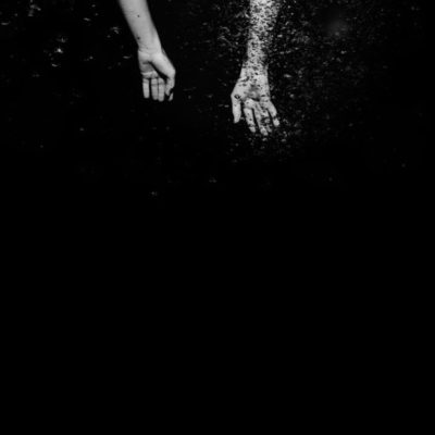
My second attempt at this stuff. Really liked the photo a lot, something about the blue caught my eye so I tried to frame the text in white like her face and leave the middle blue. Title game was weak but I couldn't think of anything.
Model is Stephanie Obasi
Photographer is Oye Diran
Obviously credits go to these wonderful individuals.
Thanks! So this effect is called pixel sorting. You can do it in Gimp, Photoshop, After Effects etc and probably on some websites too. But this image was made using Natron which is a free and open source software (FOSS) as I wanted to test whether one can do editing in a composition based software or not.
Hahahaha. If this is you actually expressing your lack of Photoshop, I'd recommend using Pixlr's editor. It's online and it's quite powerful. I probably sound like an ad or something but I use it a lot, both the editor and the express version and I love it.
Thanks! I really admire the art that Hipgnosis created. It holds the imagination without sacrificing a sense of humor. I recommend the book Vinyl . Album . Cover . Art by Aubrey Powell (one of the two founders) that contains every cover they designed. It’s fascinating, IMO.
Well, i did everything on my phone, of course it would be better and faster to do it in a computer and photoshop but anyway... basically i did everything manually (adding the black stripes, erasing some parts of it, coloring the background, etc) i used this app here: https://play.google.com/store/apps/details?id=com.iudesk.android.photo.editor
So, after i added the black stripes, i changed the temperature of the image to more warm colors (yellowish tones), then i used an effect called "color splash(brush)" in the app, so i could select the colors that i wanted to see manually, That's basically it.
Thanks! I went with a random Wikipedia page for that name and forced myself to use the whole title, but I agree with you.
I just noted that both The Last Target and Last Target are existing bands by the way ��
Image sources:
Pool: Jay Wennington on Unsplash
City: Yeshi Kangrang on Unsplash
I know, I know, it's more of the same and I haven't taken into account the advice from the critique thread. Next time, I promise!
Sherridan P. Grincely - Pleasant Afternoons
Image source: Juliandra Durkin on Unsplash
Late 60s/early 70s folk rock, like Crosby, Stills & Nash
I made the image on my phone using Fractview (idk if it's on the Apple store). It rendered for like 30 minutes because my phone is slow lol.
Fonts used: Berthold Akzidenz Grotesk (w/ a lot of keming), Times New Roman MT Std, Helvetica LT Std.
Hey guys,
New here, wasn't sure exactly what link flair to put here. I love working with photoshop, fonts, and pictures so expect to see me more around these parts.
Noticed there seemed to be a lack of foreign artists on this sub, so I'm starting to experiment with multicultural album art!
Title: 就是我 / Only Me (Single, 2016 Remaster)
Artist: Jacklyn
Genre: Mandopop
Country of Origin: Taiwan
Year: 1989
Image: Riki Ramdani via Unsplash
I used Illustrator & Photoshop. If I'm looking for a more vintage look I'll throw it into VinylizeMe (it's a phone app that can take a photo and give it a vintage jazz feel). If your looking for images unsplash is great resource though. Just a side note, your font choice and how you place it can really make or break a design. I can usually tell a hand made cover pretty fast by how they use fonts.
Original Art
Created in Blender with post-processing in Photoshop.
Fonts used: Universal Serif / Crimson Text
"Chemist" text handwritten on cars stock in black Sharpie Magnum, scanned, and processed in Photoshop.
Image sources:
pexels.com
unsplash.com
I edited the goat myself, you can find the edited version without the text on my Instagram: https://www.instagram.com/totema_art/
Here's the original pic of the goat: https://unsplash.com/photos/sDBOWET5wDU
Never had real training. I was part of Newgrounds back when it was relevant and played around with Flash. After that, it was Photoshop and Gimp to make my MySpace page prettier than yours.
Now I just make fake album covers because I like playing with fonts. :-/
I pretty much use Paint.Net exclusively now unless I'm forced to use Photoshop if there isn't a plug-in to do what I want. I find it's a lot more intuitive and less frustrating than PS.
I use Blender which is a free and open sources software. This is the graphics card that my laptop uses and it works really well for me. But you don't need a heavy duty computer for it (although it certainly helps). There are 2 types of render engines that are in it and one of them renders almost instantly unless you go crazy with it but the other render engine is much slower and intensive but the lighting is much better. You can still make the less intensive engine have good lighting though. Here's one where I used that super quick renderer
Recorded in 8-track tape and using Leslie speakers (inspired by the sound of Soundgarden's <em>Black Hole Sun</em>), Antidote is a psychodelic record like no other. Abstract landscapes, found sounds and short poems all meet in the 12 tracks that make this record one of the most awaited this year.
Genres: psychodelic rock, indie, synthpop, art rock.
Release date: Friday, October 19th (digital only), Sunday, October 21st (on vinyl and CD).
I made the image on my phone using Fractview (idk if it's on the Apple store). It rendered for like 30 minutes because my phone is slow lol.
Fonts used: Berthold Akzidenz Grotesk (w/ a lot of keming), Times New Roman MT Std, Helvetica LT Std.
I don't know, unfortunately, I just used a random app I found on Google Play :/
Edit: this is the app. The font is the first one on the second page. Would not recommend using the app, though. When I saw my post on my laptop later on, I realized what a huge dip image quality had taken.
I saw this artwork and couldn't think of anything more fitting than making it for 'The 1975'.
Band Name: https://en.wikipedia.org/wiki/HomeSeer
Album Title: https://en.wikiquote.org/wiki/Bleach_(manga)
I used several different pictures that I had in my design folder. Threw them into GIMP, did some contrast tweaks and cut out some overlaps, and layered them together with different blend types.
Band name font is ISL_Jupiter and album titile font is Voyager Grotesque Bold.
Source image:
https://commons.wikimedia.org/wiki/File:Pied-winged_swallow_(Hirundo_leucosoma).jpg
.jpg)
"Pied-winged swallow (Hirundo leucosoma).jpg"
by Charles J Sharp
CC BY-SA 4.0, from Wikimedia Commons
The Shaggs were three sisters who were forced by their father to make a record, despite having no training in music or instruments whatsoever. My Pal Foot Foot is about the sisters' lost, twice-amputated cat Foot Foot, who ran away one day and was never found (although the song ends with Foot Foot coming home).
This song is from The Shaggs' only album, <em>Philosophy of the World</em>. It is the strangest album I've ever listened to, yet it's one of my favorites.
The May cover draws on memento mori images. I used vintage inspired borders and fonts to reinforce the retro look of the cover. For the face I made the eyes white and did a vintage filter to get the image to the tone I was looking for. If you want to see a more detailed look you can check it out here
The original image can be found here
Unfortunately I don't have the link to the original image as I made this one a while back
Band name: https://en.wikipedia.org/wiki/Sirisena_cabinet
Album name: https://en.wikiquote.org/wiki/April_22
As for the picture, I cheated a bit and just made small changes to an image I'd saved a while ago that I'd been wanting to use for an album
The font used was Ostrich Sans Inline. And for a elementary school art project you did a strangely great job. Could definitely pass for a album cover even without the words!
The May '17 cover draws on the tradition of skulls in Metal covers but takes it in a more light hearted direction. You don't think of humor and Metal together and that's what inspired me to do this cover with a bearded skull. The use of a vintage book cover and the Día de Muertos inspired skull gives it a more traditional gothic feel that allows the beard to to seem that more out of place.
"Heavy Rotation" is a monthly playlist, I created on Spotify. It's a collection of new releases, in Heavy Metal & Hard Rock, I'm enjoying. It's also a wonderful excuse to create a new cover design each month.
Original skull vector created by Ajipebriana - Freepik.com
This one is not formulaic. Band name and album title are fictitious, made up by me. I'm not sure how to flair this image or if it's necessary in this case.
The artwork consists of some simple photoshopping made with an image from this page (the 11th one) with the character from this image added to it.
Well, yeah. Pexels is a copyrightless image database so technically using this image doesn't hurt any artist. Besides, I feel like I edited it sufficiently to make it stand out enough from the original. I don't get how you could consider this unoriginal because I used an image I found on the internet. Does Banksy get shit for using stencils he makes from pictures he finds on the internet? Not at all, because the end result is something entirely different.
Photo taken from here
Inspired by Lonely Little Lovely by The Maine
This is an online photoshop-type app that seems to have all the basics.
When making a fake album cover, the key is to make it a square image (imo), so you can create a new image and instantly make the size square (500x500 or something). Starting with a square canvas will make it easier to visualize the layout instead of cropping it later!
Accidentally closed the image while uploading the picture. From the "Last 7 Days" Flickr.
Cheated the random system a bit, I clicked random page multiple times and chose the part of a quote I liked the most.
Artist name
Album name
The image is my own, it's an edit of a picture I took in Austria.
Picture: My own. It's been forever since I've tried making something in the Assembly App.
Wikipedia article on Davie Kirkwood
Lost the image link, but got it from Flickr's last 7 days.
ABOUT: I've been wanting a "The Best Yet (Part 2)" for a couple years now so this is my version of it that's design-inspired by the first album. This is a mild redesign of what I created earlier this year.
SONGS: When it comes to the songs, I tried to pick out some singles from each main album release since Hello Hurricane and then split it up into two albums with the first one being a little more rock than the second. These aren't final songs (I mostly stuck to singles) but added a couple of "Bonus" songs from EP's at the end.
DESIGN: My goal was to have the red line be a theme across front (like the original) and keep everything black and white. I also added the new logos/fonts/etc. I thought about calling it "More of the Best" but didn't like the name haha. I just went with instead "(2)". In addition, instead of just turning the saturation to zero I also boosted the contrast which I personally think looks great. It might not be the best cover image of the band, but I personally like it. 🙂 The font for the title isn't the exact same as the original (I don't know what it is), but I picked one similar and mildly annoying is the fact that the parenthesis are a different font than everything else. The image on the back was originally the band on a white background but I thought it looked a tad boring by itself so found a stock image of a brick wall and placed it behind them. The CD I continued the red rectangle/line on and wanted to keep it looking minimalistic.
Put it together in photoshop. I've been wanting a "The Best Yet (Part 2)" for a couple years now so this is my version of it that's design-inspired by the first album. https://www.amazon.com/Best-Yet-Switchfoot/dp/B001KF6MQA
Posted this in /Art and someone suggested it would look cool as an album cover, so here it is :)
After lessons learnt: I did not take the portrait photo used, it was taken by the talented @kalvisuals and can be found here . I of course did the editing.
This is the Weekly Cover Contest Thread for 14/July/2019 through 21/July/2019.
PLEASE ATTACH EVERY COMMENT THAT'S NOT A SUBMISSION DIRECTLY TO THIS COMMENT
The rules are simple: create a clever cover with the given image.
- The given image may require cropping. Non-square submissions will be removed.
- As always, submissions should be replies to this thread containing a direct link to the image.
- The winner is decided by popular vote and gets featured on the sidebar + is awarded a unique flair.
If you don't know any band names / album titles, check out r/bandnames. Extra textures / criticism / advice / freebies can be found on the r/fakealbumcovers discord!
High-res source for this week's prompt
Check out the artist here!
Good luck!
Photo by Rob Curran
​
Track Listing:
- Noise Machines
- Gradient
- Bottle-Episode Week
- Not Art, Not Yet
- Sea of Variables
- I Want to Fast Forward
- Would You Even Notice the Change?
- Long Way Home
- Another 4-Way Stop
- Stimulation Failure
- Adjectives, Adjectives!
- Noise Machines pt. 2 (Static Machines)
- Somewhere Down the Line
Here's a higher res version that you should be able to download now. Larger
I'm really having fun doing this!!! Definitely an all female indie band, maybe they do some covers of old funk?
Name - https://en.wikipedia.org/wiki/Women_in_Panama
Title - https://en.wikiquote.org/wiki/Advance_Wars
Pic is from the front page, cheated there, but I thought it was cool.
Background photo: by John Fowler on Unsplash
[Request](/r/fakealbumcovers/comments/as29cq/can_some_make_this_interesting_love_the_photo_but/)
I supplied a cutout in the request thread, in case you want to use it.
Tornado photo by Nikolas Noonan, via Unsplash.
IMAGE SOURCES
Man - Daniel Horvath on Unsplash
Cowboy and herd - Mahir Uysal on Unsplash
Posted a couple days ago and reposted after fixing a couple things I wasn't satisfied with.
It’s not really a parody more as it is an emulation. Trying to evoke the style of the virtual self artwork. Photo by Jonas Off on Unsplash Crystal taken from Virtual Self art.
You know, I'm definitely not a virgin when it comes to extreme metal a la grindcore. However, that is quite a ummm... thing that I now have knowledge of. This album (split actually) art is dope as fuck tho.
Band: https://en.wikipedia.org/wiki/Clear_Creek_%28Harris_County,_Texas%29
Album: https://en.wikiquote.org/wiki/Dr._Seuss'_How_the_Grinch_Stole_Christmas!_%28TV_special%29
Picture: Lost the link to it.
Forgot where I got the album art from, since it was something that was sitting in my computer for a while. Whoops.
I googled it and it appeared as 2019, but now I checked wikipedia and it seems it premiered last year but only got a wide release in theaters now. Anyway, probably won't come to Brazil so I'll just have to wait for the blu-ray
Title font is Whicker (Bonus), band name is Wild Fire.
Unfortunately they're both paid, I think I got them for free after buying one of the Affinity programs. Though you can find similar ones on fontsquirrel like Misproject, just search for "display" fonts!
Immediately after seeing the photo I wanted to create something retrofuturistic out of it. I'm still not entirely sure about the names though :D
---
Hazard is Androids' new album, inspired by late '80s electronica. The constant use of synths may put off non-fans of the band, but will grow on you after the third song, Conflicted. The warm sound of the carefully placed cello is a nice touch and definitely something that we are not used to hear in any Androids album.
Hazard is a great achievement for the band, and probably their best album yet.
Photo by <strong>Jonaorle</strong> from <strong>Pexels</strong>
Ain't too good, but I am just starting to play with some things in Photoshop instead of GIMP.
Original photo by Will Truettner
And space picture is by Francesco Ungaro
Image by Sarah Richter from Pixabay
Hello!
I was training some new technique on Photoshop and liked the end result. The original photo wasn't from Reddit, but a stock file from here.
Thanks =)
Did this yesterday. I took the original image by Bogdan Glisik which you can find here and converted it to an oil painting, did a Double Light effect and added the 80's grid floor.
Image by Paul Gilmore. I got the artist and album name from the formula (Wikipedia tells me Mupparru is a village in India), but the Flicker Gods did not favor me so I ditched the formula and went for Unsplash instead.
Used the Random Album Cover Formula with a bit of a tweak - used an image from Unsplash.
Photo by ian dooley on Unsplash
My second attempt at this stuff. Really liked the photo a lot, something about the blue caught my eye so I tried to frame the text in white like her face and leave the middle blue. Title game was weak but I couldn't think of anything.
Original Art
Blender + Photoshop
Fonts: Universal Serif / Crimson Text
"Chemist" text scan of my handwriting --- marker on cardstock.
A Discord server I mod sometimes has contests to see who can make the best combined album cover. The covers were made with websites that use neural networks to merge images. We used https://deepart.io/ and https://dreamscopeapp.com/. The former has a watermark, but is a lot faster (Dreamscope can take several hours). I think they're really cool and it's fascinating how the AI interprets the images and combines them.
did you do this with thispersondoesnotexist.com?
I love it! I just posted 2 album covers made with stuff styleGAN2 (same thing that site uses) generated on my computer
those images were all found on this website, where an ai creates human faces. if you mess with it for long enough you end up getting some warped and interesting images.
https://thispersondoesnotexist.com/
I don't know the specifics, but each refresh of the page give a unique 1024x1024 image of a face generated on the spot by a AI, (I assume a neural network).
I know right? And I just chose one that didn't work out as well, the others generated ones are more successful and even weirder https://thispersondoesnotexist.com/
For those who follow or just notice my work, I've some awesome news! I've been busy doing real album covers!!!! As a designer is a dream come true for me. Ok back to this cover for this piece, I took the original vector graphics Flower vector created by freepik - www.freepik.com and turned them into sewn patches. Though the weathered vinyl look is overused at times it felt right for this piece.
The May '17 cover draws on the tradition of skulls in Metal covers but takes it in a more light hearted direction. You don't think of humor and Metal together and that's what inspired me to do this cover with a bearded skull. The use of a vintage book cover and the Día de Muertos inspired skull gives it a more traditional gothic feel that allows the beard to to seem that more out of place.
"Heavy Rotation" is a monthly playlist, I created on Spotify. It's a collection of new releases, in Heavy Metal & Hard Rock, I'm enjoying. It's also a wonderful excuse to create a new cover design each month. (The playlist is embedded below)
Original skull vector created by Ajipebriana - Freepik.com
Photo by <strong>Mustafa ezz</strong> from <strong>Pexels</strong>
Photo by <strong>Riya Kumari</strong> from <strong>Pexels</strong>
I wasn't sure which one looked better so I also made a version without the retrolux
Photo credits to Torsten Dettlaff on Pexels
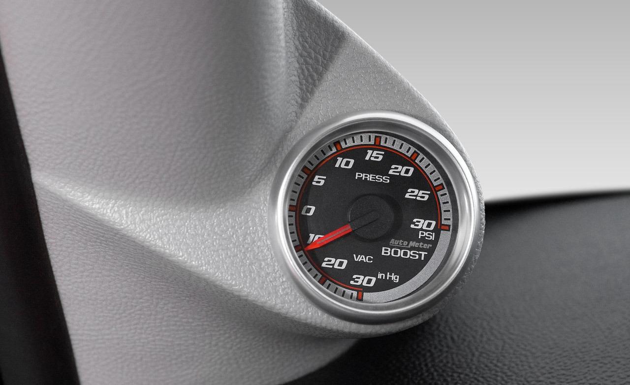
Source Images:
Wristwatch
Boost gauge
This is just a cleaned up and upscaled version of something generated by Artbreeder. Here's the original image, and here's the "artist."
Hi!
This is the source of the image.
I choose Meta as the flair because it was found elsewhere online, and I don't know how to categorize it. What would be the best flair for it?
Thanks =)
Thank you for posting to /r/fakealbumcovers. Your post was removed as it appears to be a real album cover
If you believe your post was removed in error and wish to have it reviewed, reply to this comment.
Thank you for posting to /r/fakealbumcovers. Your post was removed as it appears to be a real album cover
If you believe your post was removed in error and wish to have it reviewed, reply to this comment.