
What are
/r/conceptart's
favorite Products & Services?
From 3.5 billion Reddit comments
The most popular Products mentioned in /r/conceptart:


The most popular Services mentioned in /r/conceptart:
Gumroad
ArtStation
Linktree
Tumblr
Behance
Krita
Kotaku
Stitcher Radio
Vimeo
GIMP
Kickstarter
SketchBook
Clip Studio Paint
Eagle
Artbreeder
The most popular reviews in /r/conceptart:
Hey osterlay,
I dont have anything recorded in terms of process steps for this. Octane is a 3D rendering package. I used it in conjunction with 3D models and textures I created. I create a straightforward base and render out a scene with some lighting information and then paint ontop of it.
Knowledge of 3D is industry standard at this point and is used everyday. Its faster, more efficient and produces the best results for great design work.
The best way to learn a very similar process is to take a look at Eytan Zana's gumroad tutorials
Character Design I did recently, Inspired by European clothing.
I really enjoyed carving our her expression and personality. Coming up with her clothing was a fun challenge as well! :-)
my socials:
If you want to look into using 3D in your pieces (Which I highly suggest as its practically industry standard at this point) there are tonnes of places to learn now. I recommend learn squared or any gumroad from Maciej Kuciara, Eytan Zana or Jama Jurabaev.
I learnt how to use Octane from Julien Gauthier's gumroad. Highly recommended!
Get a Gnomen account and watch every video and practice everything they teach.
Find professional artists you admire and do master copies of their work (you can't claim these as yours, but it will help you learn how they approach their work and techniques).
Be able to emulate a style- buy ART OF books and how-to books (The Skillfull Huntsman, Darksiders II, Surf’s Up: The Art and Making Of A True Story, The Art Of Robots, Figure Drawing for All It's Worth by Andrew Loomis, Bridgman's Complete Guide to Drawing From Life, Color and Light: A Guide for the Realist Painter, Imaginative Realism: How to Paint What Doesn't Exist, any other book that really snags your interest or imagination) and try to make art that fits into that world.
Show your work- an concept artist who can come up with 30 usable and unique designs at once in the early sketch phase is just as valuable as one who can render a whole scene in full color. Shoe some of your design process, roughs, etc so we can see how versatile you are.
Be aware that character art is the hardest to get work in. Props and vehicles have the most need. Environments get get you good work, too. Pick one of these to really master before dabbling in others too much. Your portfolio should have a clear direction and focus.
Looks like an attempt to confuse and then get enough following to sell ad space. I'd rather go back the kickstarter being developed by industry professionals, it will have a much more thought out system and support network. https://www.kickstarter.com/projects/kirillchepizhko/next-generation-website-for-cg-artists
I usually substitute it in place of the initial painting phase. I'll create a basic sketch/thumbnail (This can be lines, black and white compositional thumbs, or colour sketch) then I'll move onto a 3D program to work out the scene in 3D space and make sure it works correctly. (Especially if its a game focused scene it needs to be able to be navigated well.)
I'll export the model and start setting up the scene in Octane. With my materials assigned and lighting blocked out I can then go ahead and start applying paint in photoshop and just noodle it out until you get to an adequate point.
Eytan Zana's gumroad houses a very close workflow progression
I'd recommend these tutorials from Alex Ruiz on Gumroad. It's the same course as CGMA's Fundamentals of Architecture. Marciej Kuciara's Intro to Environment Painting course on Learn Squared also covers some architecture (mostly perspective) basics.
There's a Krenz tutorial called "How to rotate stuff in perspective" which you can pick up in his gumroad shop It lays down easy to follow techniques for rotating objects in perspective with a focus on drawing from the imagination. You'll get much faster/more accurate results learning the theory and practicing applying it than you would through observation and studies on their own.
No worries, I love to procrastinate.
I don't have much in the way of tutorial/process stuff, but I do have the 3d base that I started with. If you've seen John Sweeney's Set Design Gumroad, my workflow/process was very similar. Except I didn't really use any photos for props by themselves (still not quite confident enough in my ability to blend them properly), I mainly used them with various blending modes for texture over the props that were already in the 3d.
I'd also recommend watching Shaddy's free youtube series. But I'm guessing that you already have, since you brought his name up.
Not really, I had already done enough research for a previous character illustration, so I was quite familiar with the theme I was going for. I only googled a few specific things I was interested in along the way, like the fur leggings, which are based on the ones Otzi wore.
On a side note, if you wanted a book with lots of reference for historical stuff, you can pick up Military History. I've personally wanted to get it for a while, but it was always overpriced here.
Thanks! I study often "morpho" books from michel lauricella. Its a French artist who did some very good books on anatomy and figure drawing. Heres an amazon link, even if they are in French you just study the drawings and traits.
Beside that just practice, study everything you can and try to browse Artstation as much to get inspiration, its also very important to study materials surfaces and how the reflections works. when you dont feel drawing look up for references. And never start anything to draw without references, try to get irl/photos références and other artists works as style ref. (if you have a pc, install "lighshot" to take screenshots and use PureRef, they are wonderful to work with)
And again yes, spend as much time as you can gathering references, even for the smallest rock.
DYSTOPIAN CITY
Modelling & Texturing Software: Blender 2.9
Signage Design: Illustrator CC
Compositing: Photoshop CC
www.artstation.com/artwork/mDJ211
Hey guys!
For more information and portfolio:
IG: www.instagram.com/Saraiva_art
www.artstation.com/saraivaa
Or DM me for quotes :)
Loved designing their clothes and concepts! high fashion in a desert wasteland~
my social media for those interested :-)
http://sjruk.deviantart.com/gallery/ https://vimeo.com/stevenrichards
Environmental stuff is all I dabble in, stay away from my last page, i've uploaded everything from my very first try using a tablet -> now
Game Google play:
https://play.google.com/store/apps/details?id=com.monolithmind.Insilentium&hl=en_AU&gl=US
Let the blizzard of epic card battle spin you in Insilentium - one of the best online tcg and ccg games ever.
Build your deck, challenge other players all over the world and become one of the legends!
Combine different races to make your deck really unique, manage your game strategy and tactics to conquer the battlefields of Insilentium!
Original core gameplay and combination of CCG and TCG genre games makes the Insilentium really unique - and it’s available for free! Would you dare try something totally new in a deck building game? Do you prefer storyline or epic PvP duel battle?
In-game features:
original core gameplay with 3 lanes battlefield
immersive game lore for true fantasy lovers
unique art style
original characters, each one with its own storyline
...
www.artstation.com/artwork/Poe6lB
I make landscape story every month in my patreon too
if you like it you can support me here every month to have more high-res landscape story every month: patreon.com/Ruanmingren
EDIT: Stitcher & iTunes links.
iTunes: https://itunes.apple.com/us/podcast/episode-024-emmanuel-shiu/id832866123?i=317435108&mt=2
Stitcher: http://www.stitcher.com/podcast/devxp/episode/35058913?autoplay=true
I agree with this. A lot of the "sketchiness" is in this is from the nice line quality and the confidence from the artist. They don't seem to using any special brushes, other than having their opacity and width set to pen pressure. But I would strongly recommend looking at Kyle Webster's brushes if you want to play with more traditional-media looks.
i'd mostly just suggest sketching a very rought skeleton of this animal and connecting the wing bones to the shoulders some sketches, but you should also look up their anatomy and skeletons
Also, if you're going to spend lots of time with this creature, you should think about how it would land and take off again. Avian birds use their legs to kick off from the gound/tree branches to get some momentum and fly once they're in the air. Water birds need to build up a momentum on the water surface before they can take off into the air, much like airplanes. (a video of ducks taking off)
The tail of this Atranoch could be used for a kick off, or it would glide across the ground like a snake, building up momentum to slowly take off (like ducks), so you wouldnt have to worry about legs.
I'm not trying to yuk your yum here, but these poses and outfits are just absurd. Like, is it so hard or unpleasant to draw women without their asses out and with reasonable clothes on? What even is that outfit on the right? So my first piece of feedback is that over-the-top sexualizing female characters is a fading thing, and you might want to start practicing drawing women that aren't intended to be adolescent male eye candy.
​
My second piece of feedback is maybe more technical. The nipple covers on the right will fall off immediately because they're outside the belt, so there's nothing holding the fabric in tension. Heaven help her if she rounds her shoulders forward, her tits will instantly flop out. Thigh holster - like the one on the left - cause the handle to lay fairly flat against the thigh (with a small gap so you can slide your fingers around the grip. Having the handle stick out like you have here makes it awkward to grab and remove, and liable to catch on things, and impossible to hide. (reference material here)
Try the book "Botanical Line Drawing" and improve your botanical line drawing skills.
Disclaimer: I'm student of Mahe Zehra. Author of this book.
From the perspective of Passive Income, where you want to sit and relax after putting one time efforts, I would suggest a game only. As for an App to work, you will need to be very much active to do the backend processing and management to support the utility of the application. That makes the business model of mobile App to be an ACTIVE way of making money!
For me, I created a game with the name called SardaarJi (here is the link) back in 2015. I put in a lot of efforts and then updated it back in the year 2018 again. The amount of work and efforts those I put in were like few months of coding, designing and then publishing. The game got more than 100,000 downloads during its first year.
After all this, it fetched me 3000 to 4000$ and till now it gives me like 50$ to 100$ every month though I don't update it any more or work on it. If I put some more efforts, then it can be great as it is still fetching me like 10 to 30 install everyday. 50 to 100 would not be a very high figure but the point here is it is an PASSIVE source of income.
So CONCLUSION, definitely a GAME!
So I think the previous commenters were right in telling you to use softer lines. When you keep line art in a piece you have to be rather conscientious about your line weight and where you place lines. Lines are a representation of light value.
If you’re not trying to make a character scowl it’s best not to put lines between the eye brows unless they have a prominent wrinkle there. Perhaps if it’s a slight wrinkle a lighter line would do or it could be softly painted in.
Under the nose suffers from the line weight as well it makes it appear like it may be a scar. This philtrum May have been better demarcated with paint or lighter lines.
Your drawing is extremely symmetrical giving it a stiff appearance. Almost like you drew one half and then folded it down the middle to make a carbon copy. This is especially apparent in the bridge of the nose. Average people have slight asymmetry in their face. Little imperfections make a portrait piece great vs good.
Lastly the bone structure is slightly askew. The character being an elf this may be intentional but I would strongly advise more anatomical practice. The orbital vaults in the skull typically don’t extend that far down into the maxilla. The collar bones are also askew and extremely symmetrical.
I think you’d benefit greatly from studying more anatomy, there are TONS of online resources but if you want something tangible this is a good book for like half the price I got it for ��
Anatomy for the Artist https://www.amazon.com/dp/078948045X/ref=cm_sw_r_cp_api_i_W26hDbCFHD828
All in all it’s a good render. The color is where it shines the most. Just keep drawing and you’ll get better and better �� Keep up the good work
Feel free to DM me if you want to talk about it.
Nobody commented for days. Well, I can say good form on the turnaround concept. We could give this to a 3D guy right now and they could get the mesh started at least. For that part the anatomy looks good.
However, your 3/4 pose has a lot of anatomy issues; the left side arm and both hands are not quite right. The left side leg doesn't look like its connecting with the ground. Right now it's reading mostly as a sharp peg leg he's leaning on. The head is off center from the chest (again, to the left).
I would highly recommend you flip your work horizontally to see these issues. We get blind to them as we work. I would also recommend you pick up this analytical anatomy book and go through all the lessons to generally get a better foundation.
Hope that helps, good luck and keep drawing!
Check out Shot by Shot, it's an older book but I learned a lot back in '05, when I got into storyboards, from this book. The Star Wars art-of books, Jurassic Park, etc are great.
Well, my 2 cents is that you should just greatly focus on improving your painting skills. People tend to use photobashing as a way of creating a shortcut from painting things they can't paint, which is also seen here by looking at your other paintings. To get a more realistc feel you really need to be able to paint all that shit yourself.
While the photobashing might somewhat seem pleasing to someone who doesn't work in the field, people who work in the field can easily see what is bashed and what is painted when your skill gap versus the photo is so huge. AKA. while shit might look good or okay to regular people, the people you actually want to impress won't be impressed until you close that said gap.
In all (or most) your paintings you have really low saturated colors and especially on your paintings of human there's a really bad sense of 3d space. To work on this I'd suggest you to get books this: like http://www.amazon.com/How-Draw-sketching-environments-imagination/dp/1933492732/ref=la_B0034O5O32_1_1?s=books&ie=UTF8&qid=1409486251&sr=1-1 It would be a great idea to improve your line drawing skills, since it's the hardest way of expressing 3-dimensional space. This would vaguely help you paint more realistical humans and environments when you kind of need to understand the volume of the object 100% to get a realistical impression of the object via line drawing.
Well, this is my 2 cents. Don't take this too harshly, I'm just trying to help :^)
Keep up drawing!
Here's a good book for some conceptart drawing stuff.
This thread is fine, but try to include a little background and what exactly you want feedback on when you post for crit next time :)
Try pushing more toward cools in your shadows, rather than just using a desaturated/muddier shade of the hue you're already using. Likewise, warm up the highlights a bit, epsecially on his face- those pale purple highlights feel unrealistic and very odd there especially.
Cast shadows-especially (base don your lighting) where the arm closes to us would cast on his leg/torso, isn't coming across properly- I think it's too weak and indistinct compared to the cast shadow on the background.
Brush strokes seem on par, so it's just color theory and lighting at this point. If you don't already, pick up a copy of James Gurney's "color and Light" to guide you through some of these more complex color theory ideas.
Overall design is fine. I like that you're exploring textures and patterns. He feels base din a semblance of reality I believe. Nothing too wrong with the anatomy. Just wish there were some more small things to help guide us through his story a bit more (jewelry? tattoos? hidden letters? inkstained fingers? opium tins? severed heads? etc).
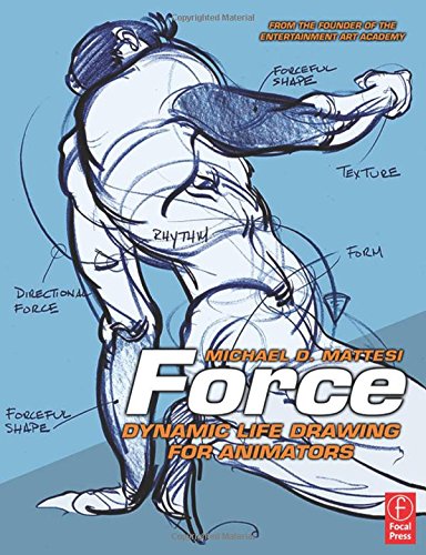
Mike Mattesei's Force{ Life Drawing and [Force: Animal Drawing'(http://www.amazon.com/Force-Drawing-locomotion-concepts-animators/dp/0240814355/ref=pd_sim_14_1?ie=UTF8&refRID=1QSBM06M98HZ89RA0RFQ) are spectacular.
My favorite book is "Force" by Mike Mattesei, and the techniques can definitely help you lose the "stiffness" a lot of early artists suffer from in their figures.