
What are
/r/DigitalPainting's
favorite Products & Services?
From 3.5 billion Reddit comments
The most popular Products mentioned in /r/DigitalPainting:


The most popular Services mentioned in /r/DigitalPainting:
Gumroad
Krita
Behance
Pexels
ArtStation
Creative Market
Procreate
SketchBook
AbeBooks
DeviantArt
Pixabay
Inkscape
GIMP
WikiArt
MediBang Paint
The most popular Android Apps mentioned in /r/DigitalPainting:

Infinite Painter

SketchBook - draw and paint

ArtFlow: Paint Draw Sketchbook

MediBang Paint - Make Art !

Free music for YouTube: Stream
The most popular reviews in /r/DigitalPainting:
Thank you! For the textures, I used brushes from Ahmed Aldoori and Aaron Griffin.
Ahmed Aldoori: "Dots" and "Dust Scratches"
Aaron Griffin: "Sampled Brush 7 1" (on "Dissolve" mode) and "goro_stroke" (as smudge tool)
Even bigfoot gotta bathe. Protip: check the size of your canvas vs the reference image BEFORE you paint.
Besides the aspect ratio thing, I struggled with the texture on the water. I don't like leaning too hard on the fill gradient tool because it feels like cheating, but picking the colors one by one is super hard. Also, I completely whiffed on the values in the water at the bottom, which is much darker in the photo.
From https://www.pexels.com/photo/person-on-beach-during-golden-hour-783725/
when you try painting in a loose style, what paintings do you have open to the side? because if you don't have anything to reference in terms of style, you will end up painting photographs. i like Sargent, here's one of his portraits http://www.wikiart.org/en/john-singer-sargent/portrait-of-edith-french?utm_source=returned&utm_medium=referral&utm_campaign=referral#close for example. he doesn't hide his brush strokes. he's got a brush with a fairly hard edge and that's what he uses.
the chromatic aberration - a photo effect - doesn't add anything to your painting if you are going for a painterly style. it enhances the photorealistic style.
I've done a lot of sunsets and oceans lately, so I specifically chose a picture with neither of those things. I obviously struggled with the tiles above the door, which was mainly a time issue. Likewise for the somewhat melty mailbox and the stuff on the ground.
From https://www.pexels.com/photo/white-stone-house-with-blue-shutters-on-sunny-day-4947014/
make the hairline a little fuzzy. digital brushes tend to make hair look like helmets and to negate that you want to make the hairline blend a tad with the forehead. example https://www.deviantart.com/wojtekfus/art/Vibrate-408998672
and that's it. the hair is just there to frame the face. digital artists often think they have to put highlights and show each hair, and as a result they often overdo it. they don't look at the old masters and understand that hair should be sensed, not looked at. just show the form of the hair and leave it. communicate with the viewer, let them fill in the missing information for themselves.
A lot of beginners will hear the advice, "don't paint on a white background." Frankly, it's good advice, since beginners have a tendency not to be as bold with their value ranges. That said, it's not a hard and fast rule.
I've been playing around a lot lately with the approach I used for the first 50 seconds of this video (27 minutes in real time) - all of that sketching and rough rendering of light/shadow was done using a single brush with a single colour setting. The brush itself was pulled from one of the famous Kyle T Webster's natural media brushes - which I haven't used long enough to recommend, but many others do - but really the interesting thing about it was just that it's got color jitter on, and I set my foreground to a very saturated red, and my background to a very saturated blue.
The result was pretty neat - if I paint lightly, I get a faded red, if I use a middling pressure, it comes out with a kind of muddy mauve, and if I press hard I get a very bold and vivid blue. The dynamism to it led to a lot of happy accidents, and its semi-unpredictability was rather refreshing. Once I got more control over it though, it had the benefit of giving me a range of tones without worrying about switching colours back and forth.
Color and Light, by James Gurney. buy it (on abebooks, used and cheap) read it, sleep with it next to you, make the love to it but avoid sticky pa- well, forget that last part. fantastic book on colour and light that everyone should have in their libraries and/or beds. http://www.abebooks.com/servlet/SearchResults?an=james+gurney&sts=t&tn=color+and+light it's like $14.
and i also suggest checking out Iste Brak's youtube channel https://www.youtube.com/user/Istebrak/videos especially her critique sessions. loads of different tips and suggestions on different subjects. i only found her channel yesterday, but what i saw was very interesting.
I've used Photoshop and Clip Studio Paint so far, they're both pretty good. The latter one lacks some of the options Photoshop has (color adjustments/filters mainly) but it's definitely cheaper, and it's on sale right now.
here's one i did just a day or so ago. it's similar to yours in the sense that it's a dark environment and there's a gargantuan creature approaching. notice the value separation between the two dudes and the snake. it doesn't make it any less scary and menacing (in fact it kinda enhances the menace because you can't see the whole snake, you have to imagine it, so now i'm in your head making you think of huge scary snakes) https://ienkub.deviantart.com/art/What-noise-699011105
here's one by james zapata, where you have the foreground horde of soldiers, middleground giant and background angel. all separated and the angel and giant are still very visible, it's an easy painting to read https://www.deviantart.com/art/Caida-683197268
You can consider using OBS (Open Broadcaster Software)
It's used for live streaming, but it also works really well for recording. Available on windows, mac and linux. Plus it's free. Just make sure you set the recording options to the proper format such as mp4 instead of flv.
Thanks! Check out Shaddy's Youtube channel and watch the digital painting videos.
I also put some studies like these free for download with brushes I used on my gumroad! I plan on putting some more recent ones on there soon
Had this image saved forever. Glad I finally got around to it. I struggled with the textures in the clouds and particularly in the sand.
From https://www.pexels.com/photo/woman-standing-near-white-and-green-ship-by-the-seashore-2035883/
even though they have a style, the artist has learned the fundamental rules and so can break them. i would recommend looking at anatomy & proportion tutorials to get an understanding of the human form. then you can look to break it into whatever style you want. as to software do you have photoshop / illustrator ? if not i'd recommend - https://krita.org/en/homepage/ - easy to use, but just as good as photoshop.
Nice rendering on the clouds! Don't you think this piece could be incredibly eye-catching if you colored the clouds in cool colors? Blues and purples will really compliment the orange mountains nicely.
I think you will do great things and a good brush pack goes a long way. You can get James Paick's brushes on his gumroad page here . They're in the 'Free: Level Up! Session 34' package, which is as the title suggests, free. It might not show up on the first page, but if you scroll down and let the next set load, you should see it as the very last one. he stores them as tool presets, so you'll have to import them and use them from Photoshop's 'tool preset' palette, which some people may not be accustomed to.
Inscape 0.91 was just released, and claims to have performance enhancements. https://inkscape.org/en/news/2015/01/30/inkscape-version-091-is-released/
edit: also see http://wiki.inkscape.org/wiki/index.php/Release_notes/0.91#Rendering_and_performance
even if you choose a complementary harmony, i think it's totes fine to use nearby colours as long as they tend towards gray and are not dominating. so i wouldn't use red/green and then a pure orange. i'd use a very muted grayish orange.
i've never thought of these diagrams as anything but guidelines. the colours each diagram point to are just the main colours, but you have to be allowed to use whatever colour you want to tell the story within the painting.
Mucha's Lefevre Utile http://www.wikiart.org/en/alphonse-mucha/lefevre-utile-1903?utm_source=returned&utm_medium=referral&utm_campaign=referral#supersized-artistPaintings-227666 the main colours are red and green, but you've got gold and orange and some blue to kind of transition between the two main colours.
when you paint a human, you HAVE to use some kind of orange for skin. so that's one colour locked already. that means that, if i use a strict complementary harmony, everything else in the painting has to be some kind of blue.
but Mucha didn't think so. he knew he had to paint skin, but the flesh tone is not one of the primary colours in Lefevre Utile. the flesh tone, along with the golden dress, and the flowers in her hair, are secondary.
it's also worth noticing that Mucha didn't use a Split Complementary Harmony here, that would have meant a lot of purple/orange/green. but there's no purple in Lefevre.
so no, you don't have to use only two colours.
Drawing on the Right Side of the Brain is a good book to start with. There are some basic exercises that will get you started. I would also suggest that you send everyday trying to draw what you see. Do blind countours (look at something do not look at the paper while you draw) to develop hand eye coordination.I teach drawing for a living at the college level and I am positive that if you have the work ethic then you can learn. I would be glad to give you pointers if you send me images.
i can't find anything on morguefile or unsplash that says you can not use their images for free. https://unsplash.com/license
selling images that you found on this site and traced is not illegal. personally, i'd be too ashamed to call myself an artist if i did, though. that is, however, a discussion about ethics and creativity and not what you asked.
A lot of people, beginners especially, are always worried about brushes. I know, i used to be an avid brush hunter! After seeing people making amazing artwork with base photoshop brushes, i was just..stunned. So don't worry about not having the right brushes for the job - even fiddle around with it and make your own! You learn a lot about brush mechanics that way.
But since we're on the topic. I'm going to step up and say to avoid all the silly brushes that were made from stock photos and instead focus on finding good brushes that were meant to mimic real life media.
<strong>https://www.deviantart.com/art/the-loish-brushset-477640124</strong> - something like these would be a good start, just read up a little! And hey, good luck!
I use some of the free ones from here; https://gumroad.com/grzegorzrutkowski
And the default ones and some I made myself! One thing I've learned is that it can actually be hindering to have a large library of brushes. I reccomend experimenting and trimming down as you go. There should be lots of info out there on modifying and creating your own brushes out there.
Hope that helps good luck with your art!
The step by step process can be found here.
This was to practice a new perspective (tipped up side view), as well as try and design something that looks like it can be from a certain manufacturer. This was partly inspired by the F12 Berlinetta, as I wanted to create a GT car that could seat 4 in comfort.
These are great! Reminds me a lot of Frank Hong's thumbnail work. He did a few videos a while ago that show his process if anyone's interested. He puts a lot of stuff up for free on Gumroad too.
Yeah sure, I use Dave Rapoza's brushes and tacnique, well I start out with either line art or value, I start adding color pretty early on with a soft light layer. From then on I usually dont touch the color picker because if I wanna make the color or contrast more intense I would use a layer adjustment. And the rest is just rendering.
This gumroad tutorial by Dave Rapoza has his brushes included and you see alot of the techniques that I use.
Hope it helps.
Definitely not my best work, but I think I at least got it in the ballpark. I really think Heavypaint works a lot better on a big desktop monitor than on an iPad or Android tablet.
Really struggled with perspective here. Had to go back and paint over multiple parts to get things to mostly line up.
From https://www.pexels.com/photo/photo-of-a-rustic-concrete-building-6988826/
Honestly, the brush set doesn't really matter- the technique does. However, if you want a brush set recommendation, this is one of my favorite sets. I recommend building up your own brush set rather than using someone else's premade set, though.
If you're just getting started, I recommend Paint Tool Sai. It's cheap and super easy to use. Photoshop is what you use when you are really serious and want to do professional work, and it is very daunting if you've never used it before.
Krita is free and a good place to start. It's pretty powerful!
I use Corel Painter and have for the past 8 years or so. It's pretty reasonably priced and I love the traditional media simulation. You can look back in my post history to see examples of my work, if you're curious.
Good luck! I'd play around in some free programs first to kinda get a feel for it before you drop more money, but that is just my opinion. :)
I've been doing a lot of pixel art work the last few weeks for a new project, trying to get back into the style. I love this series by Nina Geometrieva and did a small 8bit version for practice.
I'd be happy to elaborate. So... I have two recommendations for types of gloves: the SUPER cheap do it yourself ($2) -- and the reasonably cheap ($8-$13).
The super cheap are literally just a pair of cotton gloves that you can buy from almost any pharmacy. You simply cut off the thumb, index, and middle finger like this: https://imgur.com/a/GDSDN - I like these best for Wacom tablets because... they work! Unfortunately, even though the area is covered, touchscreens may still pick knuckles up.
For touchscreen devices like the Microsoft Surface, Wacom Cintiq, etc. I like the cheap gloves. You can find them on Amazon. Here's one example: https://www.amazon.com/Huion-Artist-Glove-Drawing-Tablet/dp/B00VTHAS00/ref=sr_1_3?ie=UTF8&qid=1515366743&sr=8-3&keywords=drawing+glove
If you go on Amazon, search for "drawing gloves," "artist gloves," or "anti-fouling gloves." I'm sure you'll find something accommodating.
Palm rejection is a must for a tablet. I know that Artflow has it, but it's not comaptible with all devices, so you would have to check first. I'm sure there are other apps tho!
What helped me bridge the gap was the book, "Drawing on the Right Side of the Brain". Absolutely amazing book. It covers the basics and how to view things with an artists eye. Now I see everything I look at as pieces and shapes rather than so much gestalt like I used to.
I disagree about the ear, it's a little high up, but it is taught that the top of the ear lines up with the brow line and the bottom of the ear is closer to the nose than the mouth.
I also disagree with the lips, your paint over makes it look like they are looking directly at us and not at the angle they should be.
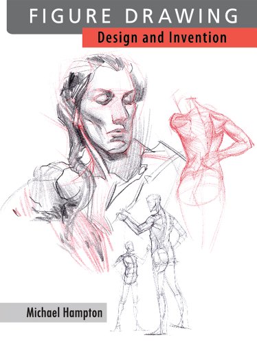
I suggest looking at Drawing the Head and Hands by Loomis, it's a great book for everyone.
Yeah, except two of the plushes the rest are real ones!! . That was the funniest part of all
If you're starting out go cheap to dip your toe in.
For software, Krita is absoloutely amazing and 100% free (although if you really like it consider donating). There's plenty of tutorials on youtube you could use to learn it and don't fall down the brush rabbit hole. A lot of artists sell brushes which are sometimes over 100 and most of which are crappy ones they've found for free and renamed.
For hardware, I recommend starting small with like the GAOMON which is currently on sale (20 euro) and will get you started with understanding pen usage and pressure.
You do not need to spend a lot of money to get started, just get the basics and when you're at a level to move forward then consider upgrading.
Best of luck OP!
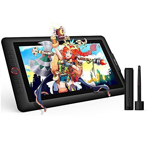
I have one you might like. It’s about sixty dollars above your price range but it’s a really good tablet so I’d say it’s worth it. It’s the Drawing Tablet with Screen XP-PEN Artist 15.6 pro Computer Graphics Tablet 120% sRGB with Battery-Free Stylus Full-Laminated Technology, 15.6 inch Pen Display with 8 Shortcut Keys & Red Dial
Sorry that was a lot but hopefully the link works. If not, i found it on Amazon.
If you have prescription glasses, some places will offer that blue-light filter coating for a small fee. Otherwise, you could look into f.lux, which is the same idea but you can at least turn it on/off for colour-sensitive work. I used to get headaches and fatigued before installing f.lux. Helps a lot with sleep as well.
I have this exact size iPad, I was scared it was going to be too small but it's fantastic!
I can do the same type of art I do on PC on the iPad in Procreate! It's more responsive than a Cintiq 13 I used to have in the past.
I agree with having to buy a proper stand to draw at an angle to avoid back/neck pain. My favorite is the Nulaxy laptop stand! But there are so many different ones to choose as well. I've seen cases that even act like stands.
https://www.amazon.com/Nulaxy-Ergonomic-Adjustable-Computer-Compatible/dp/B077B9W343?th=1
Dude I feel blessed to give you this ...these guys are the absolute best ;
Gurney did Dinotopia books and a TV series on dinosaurs
and Loomis was a famous 50's/ 60's illustrator
Check out the Huion Kamvas 13.
This one is on sale at least in the US. I’m not sure where you are so your price might be different.
Limited-time deal: HUION 2020 Kamvas 13 Drawing Monitor 13.3 inch Pen Display & Graphic Tablet Screen Full-Laminated Tilt Function 8192 Battery-Free Stylus, Come with Glove, Adjustable Stand, 20 Pen Nibs - Black https://www.amazon.com/dp/B087JL5LXP/ref=cm_sw_r_cp_api_i_dl_QHDHFD9NB123VMYX2BZR?_encoding=UTF8&psc=1
I scored my Huion 16 inch pen display for $280 plus an extra discount Amazon tacked on in checkout. My total was $265 I think. That was a few years ago and still going strong.
Invest in a Huion tablet. I got a basic one for my son for $50 with warranty. I've done work with a mouse and it's a nightmare. HUION H420 USB Graphics Drawing Tablet Board Kit https://www.amazon.com/dp/B00TB0TTAC/ref=cm_sw_r_apan_glt_i_6V1E8YENSWT6GWJ36KH6?_encoding=UTF8&psc=1
What do you mean by "like this"? With a traditional feel to it? I don't believe there are any specific tutorials. If you were talking about how to approach a digital portrait, you do that the same way as you would traditionally. Unless you are into blending modes which I am not for the most part.
If you are looking just for good tutorials that can help you with portraits (and not only) I would focus on Schoolism - Essentials of realism, teaches values and a traditional approach to painting, and <strong><em>Foundation patreon - Basic head construction</em></strong> to learn the planes of the face. Then you can check Art of Wei on YouTube for the facial features. Or Proko if it suits you better.
i finally made a tutorial yay!. If interested you can check it out here:
https://gumroad.com/products/XNkG XD
​
#have no idea how to use reddit.
Really love your paintings. It looks like you did the background after the figures? Because the backside of your swordsman/woman is not matching the world perspective.
I made these notes on my phone, they're messy but I trust they get the point across: Drawn on top: Perspective Note The left shoulder would be much lower. The other parts of the body will follow these prospective lines, elbows hips, knees, etc.
Also, moving the figures closer together horizontally would make the image stronger. Keep the depth, but less background separating them.Drawn on top: More Notes. I love your color palette and clouds look great. Thanks for sharing.
During the process of completing this painting, I struggled with pushing the values to a point where the contrast feels more natural.
Brushes used: https://creativemarket.com/sadielewski/3589145-Sargents-Oils-–-Procreate-Brushes
Thank you so much!
This is the picture I was taking as reference, trees are dark against a clear foggy background. I don't know if it could be done the other way around, or I didn't understand you, sorry.
I used to use a lot of layers, but in this one I tried to use as few as possible. In this case I used a sketch one and a painting one, but I know I should have used at least a separate one for the sky.
That brush does that, but I think it's intentional, like when watercolour runs from where you put it (sorry, idk how to explain in English). I downloaded a new bundle of brushes for watercolours, might try them later.
Again, thank you so much! :D
I took a month off from pen tablets to practice on paper with pencil, pen, and markers. I dusted off the Wacom recently and did a quick 2 hour sketch, and I feel as though my lines have become a lot more fluid. Also, I'm able to work more quickly.
Not sure it really looks like a Mercedes but let's just assume it does.
Yeah, it's definitely missing character. More life like colours and textures.
I will look into blemishes, corrosion and perhaps the plates wielded/riveted together. That's a good idea, it will make it look more authentic.
Also, this is a Wall from my novel "Delirium" so whats happening there by those sewage tubes is very relevant to one of the chapters. The illustration will be placed just before that chapter, and if the viewer is watchful enough, this illustration would feed their curiosity. Or so at least I hope.
The age of the wall is quite young. Present time is 2074 and the wall was built in 2025.
Yep, I will post revisions :)
https://www.amazon.com/Monoprice-6-25-inch-Graphic-Drawing-Tablet/dp/B00H4LAF9O/ref=mp_s_a_1_3?crid=1SEPTYLG4C3X8&keywords=monoprice+tablet&qid=1641213355&sprefix=monoprice+ta%2Caps%2C110&sr=8-3 this is one I’ve personally used for years when I drew on pc. Works fine but from what I remember the driver installation was rather tricky and I had to download a different one. Huion also has a variety of tablets under 50 bucks.
I have doubts you’ll find a screen tablet for that cheap but plenty of screenless options, which I don’t find to be a super difficult transition. Much better than going without!
Sorry that happened to her and it’s a really nice gesture to use your own gift card! Hope you can find something!
he also has a website, but it's not that well organized. there are however loads of photos to illustrate the theories, and the Lincoln bust might pass for a cartoony character. and the book is $13.85 on abebooks.com http://www.abebooks.com/servlet/SearchResults?an=james+gurney&sts=t&tn=color+and+light because abe rules, amazon drools.
try to think of contrasting colours instead of light/dark. it's kind of tricky, but look at the blue moon in your image. there's an orange square overlapping it. warm and cool. that's all you need. at first it's going to feel weird painting without dipping into the deep black pool - and the deep blacks are still there for when you really need them - because we're used to looking at photo references. keep in mind that photos are photos. they are compressed and filtered by the camera even before there's any post production done to them.
two desperately underrated sources on colour theory is Marco Bucci on youtube - he's a fricken master but his posts are infrequent, years apart, so no one bothers to subscribe to his channel. their loss, i say! his short videos has taught me more about colour theory than all the other youtubers put together https://www.youtube.com/user/marcobucci/videos
the other source is underrated because he doesn't have a youtube channel. i'm talking about James Gurney. legendary. he's got a book you can buy cheap called Color and Light. get a used copy if you don't want to spend money on a new. i got mine from abebooks.com but he's on amazon as well. a lot of people skip this book because it's a damn book and who reads on paper these days? but his book is so good it took up a permanent position in my bed - IN MY BED! - for two years. and i'm a healthy adult male, i could have had all kinds of other stuff in my bed. here it is on abebooks http://www.abebooks.com/servlet/SearchResults?an=james+gurney&sts=t&tn=color+and+light
for anatomy i say Andrew Loomis. yes, there are lots of people on youtube teaching anatomy, but they are all repeating what Loomis wrote. go directly for the source.
https://gumroad.com/l/NTydE the brushes that comes with this are pretty lovely. i can't help but use them all the time.
the shaddy safadi series https://www.youtube.com/watch?v=umpmbbcAzgU&list=PL0SSy7vUJ6ExSzVbhaliZ6S8242dJtKDm is also very popular.
It's actually a combination of several brushes with some painting and erasing away to get those kind of edges. Then I would lock that to a layer mask to add shadows/variation in colours.
You can find my brushes in some of the studies I put up here for download
If you direct me to a certain part in the painting i'd most likely be able to tell you the exact brush.
The main brush packs that I use and inspiration comes from John J. Park and Mathias Zamęcki i'd highly recommend Johns content which is worth the price and as bonus comes with his tool preset.
As for the sharp edges i usually roughly paint and then lasso it into the correct shape and smudge the outline to calm the edges down.
^Spent ^maybe ^3 ^minutes ^on ^the ^trees ^which ^are ^strictly ^polygonal ^lasso ^tool.
Sure here is the link! Thanks for noticing the style I try to achieve! That was the ultimate compliment.
It’s a canvas brush that’s part of this set. https://creativemarket.com/sadielewski/3589145-Sargents-Oils-%E2%80%93-Procreate-Brushes?u=crsimonsen
Full disclosure that’s my promotional link. Not sure if that frowned upon here but it is the brush set that I use almost exclusively on all of my paintings.
Really struggled with the foreground, but at least the mid and far mountains turned out OK and the values are mostly right overall. If anyone knows how to simplify that explosion of detail and texture in the grass and rocks, that would be helpful. 🙂
From https://www.pexels.com/photo/brown-wooden-fence-beside-mountain-568258/
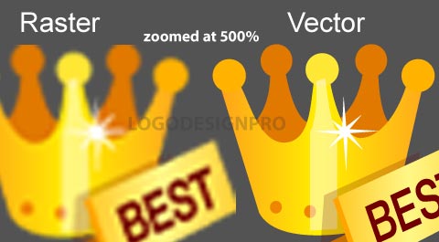
Illustrator produces vector graphics. Vector graphics can be resized to any size you need--big or small--without breaking down.
Inkscape is also produces vector graphics, and it is free.
Photoshop produces raster graphics. Raster graphics can't be resized without breaking down.
Here's a picture that shows you what happens when resizing vectors as opposed to rasters.
Hi there :)
If you don't need Corel Painter for some specific reason, and you don't plan to use it professionally right away, than I would suggest you to go with something free, like Krita. It is really a capable graphics software, able to give you professional level results.
https://krita.org/en/
And it also works offline.
I don't know much about PSE 12, but a free program, that I can recommend for beginners and professional painters is Krita. It's dedicated to digital painting.
For clarification, I've been digitally painting for a while. But had never tried using existing photos as textures and painting over them to blend them. Not necessarily a matte painting, but also not a full 'painting painting'.
Fun style. Story behind it is fun too, but this is my first post to this subreddit so wouldnt mind just the suggestions etc.
Story is here!
http://shop.3dtotal.com/digital-painting-techniques-volume-1.html is the only one i can recommend, but not because i've read it but because my teacher has. it's a lot more than $20 though. i'm going to predict that all the books you are recommended are more than $20. Color and light, by James Gurney is the only art book i've read. http://www.abebooks.com/servlet/SearchResults?an=james+gurney&sts=t&tn=color+and+light but it's a really good one. also cheap on abebooks.
chris oatley's academy is cheap if you look at the monthly cost, i think it's like 10$ or something. the videos on gumroad are cheap too, like 5$. even paying a liiitttle bit is more motivating than getting it for free. https://gumroad.com/eytanzana i've got the two cheapest videos. one of them includes a clever plugin and you get his brushes and stuff. for 12$ that's not bad.
zapata's videos are 8$ for both https://gumroad.com/jameszapata and that light, colour and mood video, i bought it 18 months ago and it taught me techniques i haven't stopped using since then. that's pretty neat 5$ investment.
thank you! but i'm not so intersted in the colorful side art software like that. what i'm referring too was very "sketch" driven.
^^^it was literally a program just like this, practically identical. thank you for your reply!!
I really like the colours, but if you struggle I find pinterest and https://color.adobe.com/create adobe colour help a lot.
I honestly love everything about this and the only critique I can give you is that his weapons and lamp need shading. It just looks flat since there's no obvious indication that it's going backwards.
So first off, me and my friend started this collab thing where she writes a little prompt and I draw it as a warmup (sometimes longer). This one was particularly interesting to do. I'd recently watched the free cgma workshop on environments for animation and I've been engrossed in drawing/painting this stuff. I absolutely love this guy's work! So I'd been emulating it before as well but I was more jokingly doing it. I really enjoyed doing this!
The two aspects I focused here was a) colour and b) texture! I never knew how much I ignored texture in my paintings. I'm floored by the difference. I'm going to now try to add texture where possible. Use references! I'll be the first to admit that I've never been really good at using references because most of the time they're a pain to find and an even bigger pain to actually use because you can't look at them all at the same time. Thankfully with a little bit of searching I found a WONDERFUL program that allows me to do just that! I'm still weak using references, but when I do- the difference is clear.
I'd love any critique/ comments you guys have!
The workshop if anyone wants to see it,
http://www.cgmwonline.com/nicolas-weiss-free-workshop.html
and the software for references viewing,
It was a photo I found on the internet. Here is my DA. Thanks for the support. DA is such a huge community but I don't seem to reach out to people. I barely get 20 views in every post.
I also have an Artstation.
original @ https://www.pexels.com/photo/body-of-water-between-green-leaf-trees-709552/ -- people keep saying I have a style, a teacher said it was impressionist, but I'm not so sure. Had fun anyway.
Can also try medibang. Think all their system requirements are fairly close though. Compare your system specs with their minimum and recommended requirements... maybe there's something you can consider upgrading in your laptop, like RAM, if funds are available
I have a Galaxy note Pro 12.2 and a Huion tablet for PC.
I was like your wife at first hating not 'drawing on top of' the image, but I forced myself to use the tablet for a while and once it 'clicked' for me I no longer have any problems with it, in fact I kind of prefer the tablet now because my hands don't 'get in the way' of the image.. I use both, it just depends on which software I need to use for which project, and whether or not I am in front of my PC.
The Note Pro I didn't like at first, because there was a noticeable input lag between drawing and the line showing up on the screen. However once I installed LineageOS on it, it's working perfectly. If the Galaxy Tab you are using is newer, it may not have this problem, mine was made in 2014. (Usually the Samsung tablets with S-Pen are called "Notes" and the ones without are called "Tabs" so make sure the one you are getting does in fact have an S-Pen.)
If you do go the Android tablet route, I suggest Autodesk Sketchbook.
soft values or not, i've had a look at your gallery and one thing i have noticed is the inconsistency in colour variation. you sometimes, like for this piece, paint skin in a monochrome way that... makes it look lifeless. there's no variation in chroma, just value. it's something that usually happens when the artist only samples colours from a photo, the sampler only picks up the chroma of one pixel and misses all the other variations, but i don't know how you work. it would be interesting to see you incorporate the colour bands of the face - examples below - into this painting. very subtle application of the colours, red, yellow and blue, can make a huge difference. i've included the examples because i can't tell if you know about them or not.
https://i.pinimg.com/originals/e9/8d/54/e98d542f2ea6c167984f63a935fdb31e.jpg
https://www.sketchbook.com/blog/wp-content/uploads/2016/05/brow.jpg
In the CDbox there's the product key that lets you download the bundle.
you might also like to try sketchbook
there are 2 versions (Free / Registered and Purchased)
the registered version has more features than the free and the full version lets you have more layers guides, rulers and so on.
MyPaint is free.
Sketchbook has a free version and a cheap subscription version @ 2.99 a month and 24.99 a year. If you are running Windows 8 or 10 you can try the Modern App version through the Windows App Store for free.
Sure! The effect comes from two things, brushes and an overlay texture layer. If you go check out Mikhasus brushes you will find both the brushes and the canvas textures.
You may! I come from oil painting, so I try to find the closest thing I can. These were done with Mikhasus brushes along with some of the default Procreate brushes.
Thanks, sure!
Blocking in, background, big shapes: Nikko Rull (Procreate default, found under "Painting")
Fur and trees: Old brush (Procreate default, also "Painting")
Rendering skin, fur, details: Sharp render from Jingsketch (awesome free set)
Cliff texture and snow effects: Rad (Procreate default, found under "Retro") and Flicks (default, found under "Spraypaints")
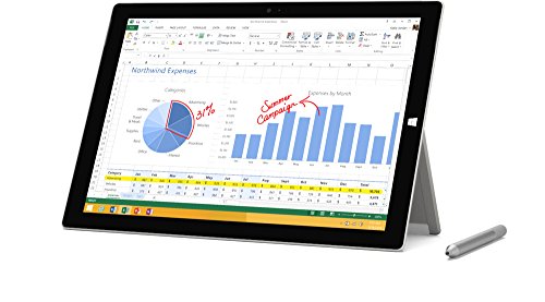
Was considering Surface Pro (2017) but couldn't justify it at $1500 for doing digital drawing and painting as just starting out. And iPad Pro's are one step closer in more realistic drawing experience.
Tried out the new iPad 9.7" (2018) for a week nice entry works with pencil and can get into it cheapest being $329 or $429 with another $99 for the Pencil.
It's pretty proficient as a drawing and note-taking and there are some powerful apps like #1 being Procreate for artists and only $10. Another is Autodesk Sketchbook,Paper53,etc.. many capable programs for drawing and painting.
Tho the new iPad is the cheapest it does have some limitations. Screen is lesser than the iPad Pro 10.5" or 12.9" which have better laminated screens with true tone. Less pencil lag and come with twice the ram for handling heavier workloads.
I took mine back and upgraded to the 10.5" as wanted to be as mobile as possible. If I was going to be in one place doing the majority of my drawing and art. Then would have gone with bigger 12.9" Pro model. As will give the best drawing experience with bigger canvas. But a bit clunky and bigger size not as easy portable as the 10.5".
The cheapest model new (2018) is still quite capable starting out in digital arts. But if cost isn't a factor than would consider the 10.5 or 12.9 Pro models as more capable and future-proof as your skills require more complex drawings,paintings,etc..
.
Also, make sure to look up the computer minimal requirements you would need to run Photoshop. Don't want to buy the program to find out your computer isn't strong enough to run that and a few other programs at the same time.
PS, look into the program I mentioned Affinity Photo, here . It came out for Windows now, so if that's what you have you can run it. Just another option if money is a issue but don't want to lose quality.
Hmmm... Have you checked the https://krita.org/en/download/krita-desktop/ website? IIRC they charge a small fee on some online stores (like the Windows App Store, for example), but it can usually be downloaded for free from the Krita website. That's where I get it. If your laptop runs Windows, MacOSX or Linux, you should be able to download it for free!
Krita is an excellent piece of software and it is free, I would suggest trying it out before spending any money on something you don't need. Don't let the 'free' price tag put you off, it is a full program designed for painting.
Try free the ones first, Krita is an excellent painting program, GIMP is also very good but more like a full on image manipulation program. These are both complete fully functioning pieces of software that can and do surpass expensive proprietary software.
Other than that try the demo's of anything you are even thinking of paying for.
Thanks! It's a craig mullins brush set. That man's work is so amazing.
The original link is down but you can get it here: https://www.wetransfer.com/downloads/7ad6ce96e160d1d08302d54d0d1b3bfb20150111234752/344192ac2f254042fe75f94f232a104720150111234752/133ffc
Yeah. Thanks. I'm going for tighter edges next time.
Currently, my style refs are Daroz and Kr0npr1nz.
http://daroz.deviantart.com/art/She-501607233 https://www.patreon.com/creation?hid=1430991
Thank you for your CC! I can't really take much credit for the colours, I started out with a palette from Colourlovers. But I did blend them together. And wow, I feel honoured that you'd like this as your background. If you are going to use it, maybe you should try this. It might look a little bit better!
I bought this one. It works pretty well. https://www.amazon.com/dp/B07N36J5FC?psc=1&ref=ppx_yo2_dt_b_product_details
Are you looking for a pen tablet (no screen) or pen display (with screen)?
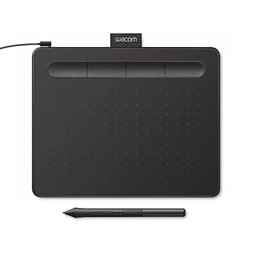
One by Wacom is a newer $60 pen tablet and is even compatible with Chromebook: https://www.amazon.com/Wacom-Graphic-Drawing-Tablet-Beginners/dp/B07S1RR3FR
If you're looking for a pen display, it's usually a minimum of $200. I recommend looking at Huion tablets for this: https://www.amazon.com/HUION-12-Laminated-Graphics-Battery-Free/dp/B08P1MB6FB
Also keep in mind that you'll likely have to pay for whatever software you're looking at, but there are plenty of free programs like GIMP.
Hmm, I'm surprised they are that cheap now (ones with screens) but it appears they can be bought...
https://www.amazon.com/dp/B07VTKYH9D
Not a recommendation, I've never used a one (except Samsung tablet with s-pen).
Have you tried Wacom’s art pen? Twirling the pen rotates the digital brush. Love it when using rakes and tapered brush shapes.
Wacom Art Pen (KP701E2) https://www.amazon.com/dp/B003ICXCXE/ref=cm_sw_r_cp_api_glc_fabc_FNS2FbZAKB038
You're right, the combo is expensive. I just meant an iPad that is compatible with Apple Pencil.
Look up info on which iPad's are compatible, but definitely I know the iPad Pros are compatible.
The pencil and iPad are a very good combo. Pretty much as good as Photoshop and a tablet. It's portable too.
I still recommend using Photoshop with a tablet like this though; Photoshop is a bit more versatile than ProCreate. But both are great.
When you post later be sure to include the drawing with the post too so we can help you better.
The head is too big for the body. The neck is too long. The eyes are not parallel to the face. The lips are parallel to the eyes.
Get a set of proportional dividers. Work on getting your outline right before adding detail.
Hey there, why haven't I found this?? It's definitely more affordable, about $50 short and I'm talking bout its 21.5 inch version. Did you get it from Amazon as well?
What type of art are you aiming for? Theirs plenty of tutorials on youtube that can show you concept art, speed painting, work flow etc. Check out Sinix, Ahmed Aldoori, EverydayJames and Walid Feghali if you want to do concept art. Ctrl-paint is another channel that nearly everyone recommends to learn photoshop. Books on the subject tend to skim over a lot of stuff I purchased Beginner's Guide to Digital Painting in Photoshop by Aleksander, Nykolai and It was pretty useless except for the process photos because I had learned more in depth online.
I use a Veikk 1560. It's 16 inches and with a stylus with an eraser/battery free and programmable buttons I'd say it's a good deal for $350 https://www.amazon.com/VEIKK-Drawing-Graphics-Shortcut-ScrollDial/dp/B07DJ9NGNV
thanks brother for giving best possible advice
what would you say about Huion Inspiroy H950P (https://www.amazon.com/dp/B079HHZ63W/)
or the
Huion KAMVAS Pro 13 GT-133 (https://www.amazon.com/dp/B07BGZ81N3)
Have had great experience with the Huions. They're just as good or better than Wacoms (have had those too) but cost less. Planning to give this one as a gift for Christmas - https://smile.amazon.com/Pro-Display-Graphics-Pressure-Shortcut/dp/B0749M1TBX/ref=sr_1_4_acs_ac_4?s=pc&ie=UTF8&qid=1543956957&sr=1-4-acs&keywords=drawing+tablet
My fav is the xp-pen 22e, straightforward setup, and no complaints in performance. As another user mentioned the larger size creates a reach at certain angles so I set mine up on a 3rd party drawing tray turned upside down heres the link I setup a secondary keypad along with the cabling underneath in the tray compartment so I have extra hotkeys and no clutter.
I only mean this as constructive criticism and not to hurt your feelings, but: everything. I think you should take a step back from color and painting, and worry more about sketching and strengthening your foundations.
You can still do this digitally, and I'm by no means telling you to stop painting! However, foundations (especially in your case: edges, lines, values, and form) are absolutely the to improving.
Edit: I realize I didn't really give much advice in my post so I wanted to come back and actually give you something useful to work with. :P
Start smaller - much smaller. It looks like you're working from the image of another artist, which is a great challenge, but you're putting the cart before the horse. I'm not sure what your visual skills are like right now, but I'm a strong advocate of Betty Edward's Drawing on the Right Side of the Brain. The skills you'll learn from that book are invaluable and expose you to a wide range of techniques and theory that will really help you hit the ground running.
I'd also suggest not getting caught up on one image. There is a lot of improvement to be made, and the best thing you can do as a young artist is to be done when you're done and move on to the next piece. I still get caught up looking at completed work and drive myself crazy wondering what I could have done differently. The truth is that experience comes from mileage, and you've just got to make that journey.
Yeah that's kind of what Andrew Loomis is talking about in his Fun with a Pencil book I think, I've been following along on Drawabox for a little bit but I'm still at the part 1 lesson still where you rotate the boxes. I guess I thought since I was already doing the 3d stuff maybe I would have some idea but its actually really hard... I tried to do a turn around sheet of a cartoon character and just trying to drawn them in a 3/4 view made my head hurt.
I even have one of those cheap wooden manikin things but you can't really put it in any normal looking poses. Hopefully some of these books and other things will help too.