
What is Reddit's opinion of
Wikimedia Commons?
From 3.5 billion Reddit comments
➔ Wikimedia Commons website
By popularity on Reddit, this Service is:
100 reviews of this app found across Reddit:
Hah, weird to see this here. This is the GIF I made a few years ago by taking the existing one in French and changing the text into English. Here's the original French one :)
That picture is amazing and much better than the one used on Wikipedia right now. Care to give it to Wikimedia Commons? See https://commons.wikimedia.org/wiki/File:Cornea_transplant.jpg for the currently widely used picture.
Hey look, it's 116 photos from Apollo 11.
And here's 23 more pages of photos from Apollo 11, a good portion of them taken on the moon.
They are using this comic in this article, hahahhaha
https://en.wikipedia.org/wiki/China%E2%80%93Pakistan_relations
Edit: So it like it is not relevant to have article in en-wiki, but it they choose to have some related files:
https://commons.wikimedia.org/wiki/Category:Polandball_comics
Hello! The transfer of Crimea was not unique, there are several other examples:
1) Gomel' uezd was tranferred from Russian SFSR to Belarussan SSR in 1926. You can compare this map from 1926 with modern map, which shows that at that time Gomel' was part of Russia.
2) In 1944, after the deportation of some North Caucasian peoples, southern part of Chechnya was transferred from Russian SFSR to Georgian SSR. In 1957, after North Caucasians were allowed to return, this desicion was reverted. You can compare these two maps: https://commons.wikimedia.org/wiki/File:Gruzinskaja_SSR_(1944-1955).jpg?uselang=en and 1957-1991
.jpg?uselang=en)
3) There was territory exchange between Kazakh and Uzbek SSR's in 1950s, unfortunately I cannot find good map for that.
Kind of. It's the result of a half sphere being projected on a flat, rectangular area. All images have this effect, but it's less noticeable with smaller sections. Most camera software also tries to account for it as much as possible.
This image (src) for example, would more or less look like this if it were projected around your point of view.
I really like that some "main towns" of the map became really small village now...
For example Semur-en-Brionnais (south of Duché de Bourgogne: green in the middle-right) is now a 600 habitants village with a cool church and a cool castle...
Thank you, you are right, I even found it on Wikipedia. The source I have used for those two countries must have been wrong.
I have updated the map: http://imgur.com/3z3KmaR Also on Wikimedia.
I visited your country few years ago and really enjoyed Borš! Thank you very much again for correction!
If you have a birds eye view of the map with a free licence, please upload it yourself. Wikipedia is produced by volunteers, and at the moment no such image is available.
Here's a link to the Commons page where you can select the resolution you want: https://commons.wikimedia.org/wiki/File:AncientMars.jpg
Guess they missed this warning when hotlinking:
>Some browsers may have trouble displaying this image at full resolution: This image has a large number of pixels and may either not load properly or cause your browser to freeze.
Oh come on. They took the picture straight off of Wikipedia Commons despite their claim that >Inothernewz.com was able to snap a picture of the JS Kurama during its salvage efforts
They're not even trying.
Largest available scan with some context for the lines. Of all of these proposed extensions, only the Braintree Branch was actually built as intended. If you're curious why a line was or wasn't built (or why the route was chosen) I can probably answer.
Actually CookedBird has the right one. From FP:
> Merkel presented to Xi a 1735 map of China made by prolific French cartographer Jean-Baptiste Bourguignon d'Anville and printed by a German publishing house.
Also, this article seems to refer to the wrong map reported in Chinese media:
> A map published in many Chinese-language media reports about Merkel's gift-giving shows the Chinese empire at its territorial zenith, including Tibet, Xinjiang, Mongolia, and large swaths of Siberia. [This larger map](https://commons.wikimedia.org/wiki/File:China_and_Japan,_John_Nicaragua_Dower_(1844\).jpg) was the handiwork of British mapmaker John Dower, published in 1844 by Henry Teesdale & Co. in London, and was certainly not the gift from Merkel to Xi.
The picture is rectangular because back in the film days, the chunk of film that gets exposed to light was rectangular. These days, the imaging sensor that absorbs the light going into the camera is rectangular.
https://commons.wikimedia.org/wiki/File:Dslr_sensor_comparison.jpg
US, Canada and Europe are often lumped together. Huntington in his Clash of Civilizations did that.
Latin America is close to Europe culturally, but isn't lumped with it because it's mostly non-white.
Yeah, here are the 2012 results for the Communist Party.
It's a fairly complex split, though, not necessarily mainly about economic or social systems, but also largely about national questions. The Communist Party appeals to actual communists, but also appeals to a kind of "Soviet nationalism", people who like the idea of a broader Soviet people and culture, who would form one of the world's two superpowers. It also draws votes of people who are just looking to vote against the Ukrainian nationalists.
The blue stands for the UK, loyalists and British nationalists. The white and black symbol stand for peace. The green stands for Ireland, republicans and Irish nationalists. I know there are thousands of proposals and this isn't the best one. I'd thought I'd try anyways.
EDIT: Thanks to many suggestions I'll make a redesign when I get back from school.
EDIT 2: New and better flag proposal. The hand and hexagon come from Wikipedian Palomca. The red cross is Saint Patrick's Saltire and represents the de facto flag of Northern Ireland. The yellow is a color in the Ulster flag. Blue is a traditional Irish color and one of the national colors of the United Kingdom. The hexagon is for the 6 counties that make up Northern Ireland. The hand is also seen on the Ulster flag.
UPDATE: I made a slight mistake in the setup - the layering for the sun/venus and mercury layers should be swapped. See the correct version here (this will be kept current): https://commons.wikimedia.org/wiki/File:Gearing_Relationships_of_the_Antikythera_Mechanism.svg
The Antikythera Mechanism is the world's first known mechanical computer, used by ancient Greeks to predict the path of planets in the sky, the dates of eclipses, lunar phases, and several religious calendars. It was made over 2000 years ago, and nothing rivaling its complexity has been found for the next thousand years.
As a final class project in a CAD class this past semester, I recreated it! You can see my video of it in action here: http://www.youtube.com/watch?v=jqQihicwRlU
However, I had to collate data from several different papers, and there was no one good overview of how everything fit together, making it a bit of a headache to figure out. So, I drew this companion infographic to help me during the project. And now, to fill the gap in knowledge, I took an hour to clean it up and am putting it on the web. Yay!
Let me know if you have any questions, I learned quite a bit throughout the project and am happy to answer any!
UPDATE2: I wrote up a description of the project, you can read it here; http://theshamblog.com/2014/01/05/presenting-the-antikythera-mechanism/
https://commons.wikimedia.org/wiki/File:Wir_stehen_nicht_allein.png
> "We do not stand alone". Nazi propaganda poster from 1936. The woman is holding a baby and the man is holding a shield inscribed with the title of Nazi Germany's 1933 Law for the Prevention of Hereditarily Diseased Offspring (their compulsory sterilization law). The couple is in front of a map of Germany, surrounded by the flags of nations which had enacted (to the left) or were considering (bottom and to the right) similar legislation.
The logo on the dial says Raketa in script. Ракета
EDIT: I thought that the default reddit font would do standard stuff to italics; generally, italics look like script, kind of. Anyways, that т should look kind of like a miniscule m
Pohjana on Wikimedia Commons:issa oleva tiedosto, joka on vektorisoitu vaakunakomitean vuonna 1936 ehdottaman suuren valtakunnanvaakunan pohjalta. En viitsinyt käydä värejä korjailemaan, vaikka itsellänikin kävi mielessä tuo sama ajatus.
Mikäs siinä latinassa on vialla?
This is the light railway in the northwest New Territories, Hong Kong, intersecting the West Rail Line at Tin Shui Wai station.
The US is the only first world country where sexual relationships between first cousins is "frowned upon". In the rest of the world it's not as big a deal. Even in the US the situation is improving.
She's not objecting. Both of you obviously enjoy it. Keep us updated.
Here's a rather more cute (baby) one: https://upload.wikimedia.org/wikipedia/commons/9/9e/Newbaby.jpg
More pictures here:
https://en.wikipedia.org/wiki/Opossum
and here: https://commons.wikimedia.org/wiki/Category:Didelphis_virginiana
(the proper name of course is opossum).
Kelantan is one of the states of Malaysia (Malaya at the time this flag was used).
Larger SVG: https://commons.wikimedia.org/wiki/File:Flag_of_Kelantan_(1912_-_1923).svg
.svg)
From Wikipedia article:
> Between 1912 and 1923, Kelantan adopted a significantly different flag design, which encompasses a white flag with a blue border enveloping the top, fly, and hoist of the flag, and Jawi scriptures stylised as a feline. The tip of the tail is interpreted as "Kerajaan Kelantan" (denoting the Kelantanese government), while the main body of the animal-based scripture contains two passages from the Qur'an, an excerpt of the 13th ayat of the 61st surah, the Al-Saf:
> Petolongan dari Allah dan Kemenangan yang dekat. Dan sampaikanlah berita gembira ini kepada orang-orang yang beiman. (Help from Allah and a speedy victory. So give the glad tidings to the believers.)
Just make sure you follow the licensing requirements for the image you choose. For example, you may be required to give a credit. Read the image description page for the image to see what its licensing requirements are. See Commons: Reusing content outside Wikimedia for more information.
That doesn't look quite similar... Though this picture has something in common with what we've seen in the episode.
I realized after turning in my project proposal that this was going way overboard on the assignment, but on the plus side I have something impressive to show employers now.
Turn on the annotations for information. You might have to hit pause in some places to read it all.
Also, I'm mostly happy with it, but I can't for the life of me figure out why Solidworks glitches out and makes parts disappear while animating the explosion. Anyone know why? I think my laptop just doesn't have enough juice.
UPDATE: I made an infographic of how all the gears fit together! And uploaded it to Wikipedia: https://commons.wikimedia.org/wiki/File:Gearing_Relationships_of_the_Antikythera_Mechanism.svg
UPDATE2: I wrote up a description of the project, read it here: http://theshamblog.com/2014/01/05/presenting-the-antikythera-mechanism/
UPDATE3: You can download the CAD models! You'll need Solidworks. http://theshamblog.com/2014/01/05/cad-files-for-the-antikythera-mechanism/
I'm sorry, but if they were hit by a 54 ft tsunami, they would be utterly screwed. This plant is right on the ocean, with no sea wall!
So they have some waterproofing, and batteries are stored above ground level. That's good. But where are the diesel generators? Would they and the batteries survive a 54 ft wall of water that has no impediment from the sea? They would have to all be on the top floor of an intact building. The site was not designed with this in mind.
Edit- downvoters, I would rather get replies as to why you disagree.
Yeah. It's a derivative of a cc badge, which is why it's CC-BY-SA. It was still silly to modify a badge instead of making a new one, given the ironic licensing. If you make one from scratch, maybe you could upload it to wikimedia commons?
edit: okay, here's a CC0 badge, available under CC0.
Creative Commons has downloads including public domain badges, but I can't seem to find an exception to the overall CC-BY licensing, so I think they've overlooked this issue as well :/
True. Although the cross of the Wehrmacht in WW2 looked a bit different. They used the "Balkenkreuz": https://commons.wikimedia.org/wiki/File:Balkenkreuz.svg
The cross of the Bundeswehr is more similar to the classic version used until 1935, which is a so called "Tatzenkreuz" or "Cross patté": https://en.wikipedia.org/wiki/Cross_patt%C3%A9e
Uh, this guy looks like he's off to a rave. They're not that brightly coloured:
(Image licensed under Creative Commons. Source: https://commons.wikimedia.org/wiki/File:Starling_2.jpg )
The character isn't really being rendered because the article uses an SVG file. Here's what it looks like at a reasonable resolution: https://commons.wikimedia.org/wiki/File:Bi%C3%A1ng.svg
That probably means that either there isn't a standard glyph for it or that most fonts don't support it.
>Green doesn't have the best connotations
Green has quite mixed connotations. It can also mean safety, permission, or acceptance. As a software project, I think these are the most relevant, unlike sickness or nature.
I... don't understand why you'd respond this way.
Malaria exists in sub-Saharan Africa to a greater extent than it does anywhere else on Earth. https://commons.wikimedia.org/wiki/File:Malaria_world_map_-_DALY_-_WHO2002.svg
Actually, in terms of political consciousness, Scotland shares a great deal with the north of England. If you take a look at proportional maps of recent elections, you can see that the political divide in th UK doesn't span the Scotland England border, but rather exists between the urban and rural, UK wide, exemplified in the results from the Scottish Borders constituencies. Also seen is greater Conservative support in the south of England, which is well documented in terms of the enlish north-south divide. Exceptions to tory ruled rural areas exists in both the highlands and north of England.
In fact, as of the 2007 Local council elections (I haven't checked this year's results), the Conservatives held absolutely no council seats in Manchester, Liverpool, Newcastle or Sheffield; the metropolitan areas of which have a greater combined population than Scotland.
The political divisions in this country stem from the economic histories of the the areas either side of the chasm, and these economic histories are shared across the Scotish/English border. The north/south divide is observed as running from the Severn to the Humber to a far, far greater extent than was ever observed from Bowness to Berwick.
I love this one, the first ever image of Mars taken from close up (in this case by Mariner 4).
The image was beamed back to Earth as a string of numbers corresponding to shades of gray, but the processing power at the time was so limited that Dick Grumm at JPL got impatient. He took the strips of numbers and pasted them to the wall, got some art crayons, guesstimated shades of yellow and brown, and coloured in the strips like some interplanetary paint-by-number.
This is the result, a large area in the vicinity of the Phlegra Montes. You can see Dick Grumm's initials ((RLG) in the lower right of it.
On most regions of Spain that difference in pronunciation is lost, that's called yeísmo, and means that LL and Y are pronunced the same, as a Y in English.
This is how I pronounce LL, but that's basically because in catalan the difference is very clear and there are very few words with a Y.
Hey I made that ugly first image!
Always interesting to see these things turn up. Guess you were reading about sine?
Nice fractalization method too.
Feel free to be as blunt as you'd like. Considering I'm the ignoramus, I was hoping you could clear up some confusion for me.
1) Re: Taiping Rebellion. Considering that is one of the events enshrined in the Monument to the People's Heroes, can you tell me which side the Chinese support?
2) Re: Boxer Rebellion aka Eight Nation Invasion. The US Army was fighting with the imperialists or anti-imperialists? Here's a painting of the US flag flying in Beijing if you need a hint. https://commons.wikimedia.org/wiki/File:Siege_of_Peking,_Boxer_Rebellion.jpg
3) Re: "The USA was the main factor in preventing Japanese total domination of China." Well, I do wonder what Chiang Kai Shek would say about that. Or even Joseph Stilwell. Aw, hell with that, do Americans even believe that?
4) Re: "The USA was also instrumental in rehabilitating China in the 1970's when it was on its knees" Um yah, sure.
I guess I could bring up things like Douglas MacArthur wanting to drop 50 nukes on China, or America's foreign policy of containing China (and correspondingly Xi's call for a new model in relations), the Chinese Exclusion Act, or the US bombing the Chinese Embassy in Belgrade, or the spy plane off the coast of Hainan, or the NSA hacking China.
That's not a bad headstart if you wanted to look any of them up. Oh but what would I know... I'm just an ignoramus about.... hmm what did they used to call the PRC again? Oh that's right, I'm just an ignoramus about Communist China.
High? In terms of what? Annual intake? Population coverage? Area coverage? Allowable concentration? Redness?
Edit: The scale appears here and it represents proportion of population. The source of the info is the British Fluoridation Society and in particular, their publication, One in a Million: the facts about water fluoridation
% that goes on trucks, rail and ships is pretty similar.
https://commons.wikimedia.org/wiki/File:G%C3%BCtertransport_D_1997bis2010.png
Not only is the shell itself bigger than a tank, but the cartridge plus propellant is 3 times as big! https://commons.wikimedia.org/wiki/File:Dora_Kartusche_und_Geschoss.jpg
Searching "royalty free" is always going to find the pay to license sites. Try searching instead for public domain (government images - say if he took a picture with the president) or creative commons licensed images. If you use creative commons licensed images, you'll have to pay attention to the specific license but that shouldn't be a problem for a student short. Flickr has a creative commons search, Google Images might, and Wikimedia Commons is all CC or public domain content.
Here is one such CC licensed image from Wikimedia.
Source and attribution is on its Wikimedia Commons page: https://commons.wikimedia.org/wiki/File:OrcusandPlutoRotatingFrame.gif
Neptune is the white dot to the lower right of center.
Pluto's orbit is shown in grey. Orcus, a dwarf planet very much like Pluto, is in red.
Uranus is blue, Saturn is yellow, and Jupiter is red.
For a convergent series, you can graph the partial sums and find the asymptote, which is just a horizontal line that they approach. The y-intercept of the line is called the sum of the series.
Now, the series 1 + 2 + 3 + 4 + ⋯ is divergent, but you can do pretty much the same thing! After smoothing out the partial sums, they approach an asymptote which is a parabola, whose y-intercept is the "regularized sum" of the series. The y-intercept is −1/12, as shown in the diagrams.
So to answer your question, it's precisely because the numbers on the stair-step curve are positive that when you extrapolate them back to x=0, you get a negative number. The diagram that shows this most clearly is https://commons.wikimedia.org/wiki/File:Sum1234Asymptote.svg.
I wish I knew too! The original poster was made in the 1930s. This is all I could find about it. But, I'll keep looking!.
To the contrary! There are plenty of areas that need improvement. If you're interested, take a look over in the Stub categories category. A stub is a short article that needs to be expanded. Wikipedia currently has decent breadth, but many articles lack depth. Interested in coffee? Looks like the coffee articles could use some work. More into photograph than writing? Pop over to Wikimedia Commons and start uploading! There's plenty to do, you just need to know where to look.
There are quite a few churches in Assisi if I remember, so you could be talking about a different one, but your comment did remind me of a little church where I went to Mass one time when I was there. I think it was this one:
https://commons.wikimedia.org/wiki/Category:Santo_Stefano_%28Assisi%29
>être composé à 24% de poissons, mais les poissons sont eux-mêmes
Tu ne fais qu'empirer ton cas, fais preuve d'un peu d'humidité face à l'immensité de l'univers.
It's easy to miss in the list format, but definitely check out the full-size annotations in the Bruegel painting.
Well, like splorkchop said, the stramp thing really only goes down to some little restaurant thing which acts as an alternative to the main cafeteria. There's a second, regular set of stairs on the other (north) side of that restaurant, but that's in an awkward spot unless you live in MSV (one of the dorm complexes) and are coming from that direction.
But hey, the building is pretty, at least.
It is WWI, it's from 1917, it also says "subscribe to the war loan" This is the artist's wiki page.
I love them all. My parents had a fawn boxer earlier sorta like this but without the tail (died when he was 10), and I grew up with him. The great thing about the breed is their personalities. No lack of them either in the current one (the cuddly one) or the previous one. Still, great dogs to have around kids.
Yes, sanitäre Normprüfkörper (sanitary standard testing bodies, also called Normschiss [standard poop]) are very important and have to be manufactured according to DIN 1385 or DIN EN 997 in Germany. Every toilet in Germany has to be certified according to these standards to ensure a perfect sanitary experience.
Here is a picture of a set of sanitary standard testing bodies according to DIN 1385 positioned in standard arrangement in a testing receptacle (i.e. toilet). For a standard-compliant flush congestion test, these standard testing bodies have to be accompanied by exactly 12 sheets of individually ripped 4-ply toilet paper.
Info is here. BTW if you see a hotlinked image from Wikipedia or Wikimedia commons you can take the basename of the URL which will be something like File:Circle_radians.gif and Circle_radians should be the image title. Plug that title into the search box (on wikipedia or commons) and you should find the image description page w/ author and source information.
The user who made the images has a gallery on Wikipedia here with plenty of other images. All of them are PD or CC-BY-SA.
Testimony of Zdziś (Zdzisław Szeliski) of the ex-Nationalist Military Organization (NOW)'s Gustaw Battalion of the AK. https://commons.wikimedia.org/wiki/Category:Gustaw_Battalion
Gustaw historical society: http://gustaw-harnas.pl/
Most probably about 300-350 people were killed. Some say 500.
I can do this one!
Cascade School was built in 1894 and lent its name to the surrounding area.
Cascade originally covered a much larger area than it does today. Here's the best map I can find, though I swear I've come across historical maps that show it covering less area than that. Since the Great Depression the neighborhood went on a very long downward spiral until recently when it has started to revive as "the eastern part of SLU".
Currently it's generally accepted to be the region surrounded by Fairview, Denny Way, I-5, and the Mercer Street Interchange.
It's really massive, but it's not the end of it. Here is even higher resolution of the painting.
Vad är det för flagga? Är det någon som har kolorerat Sveriges flagga (unionsflaggan) med fel färger? Det måste ju ha gjorts i utlandet i sådana fall.
Via. H/T to /u/hallmarkthrow's excellent submission, which is how I found this.
also our doughnuts usually don't have holes in them: https://commons.wikimedia.org/wiki/File:Beignet_good_for_mouth.jpg and htey're most likely filled with jam/chocolate/apple sauce (we still have holed doughnuts but nothing as fancy as what you can find on the other side of the pond)
themoreyouknow.jpg
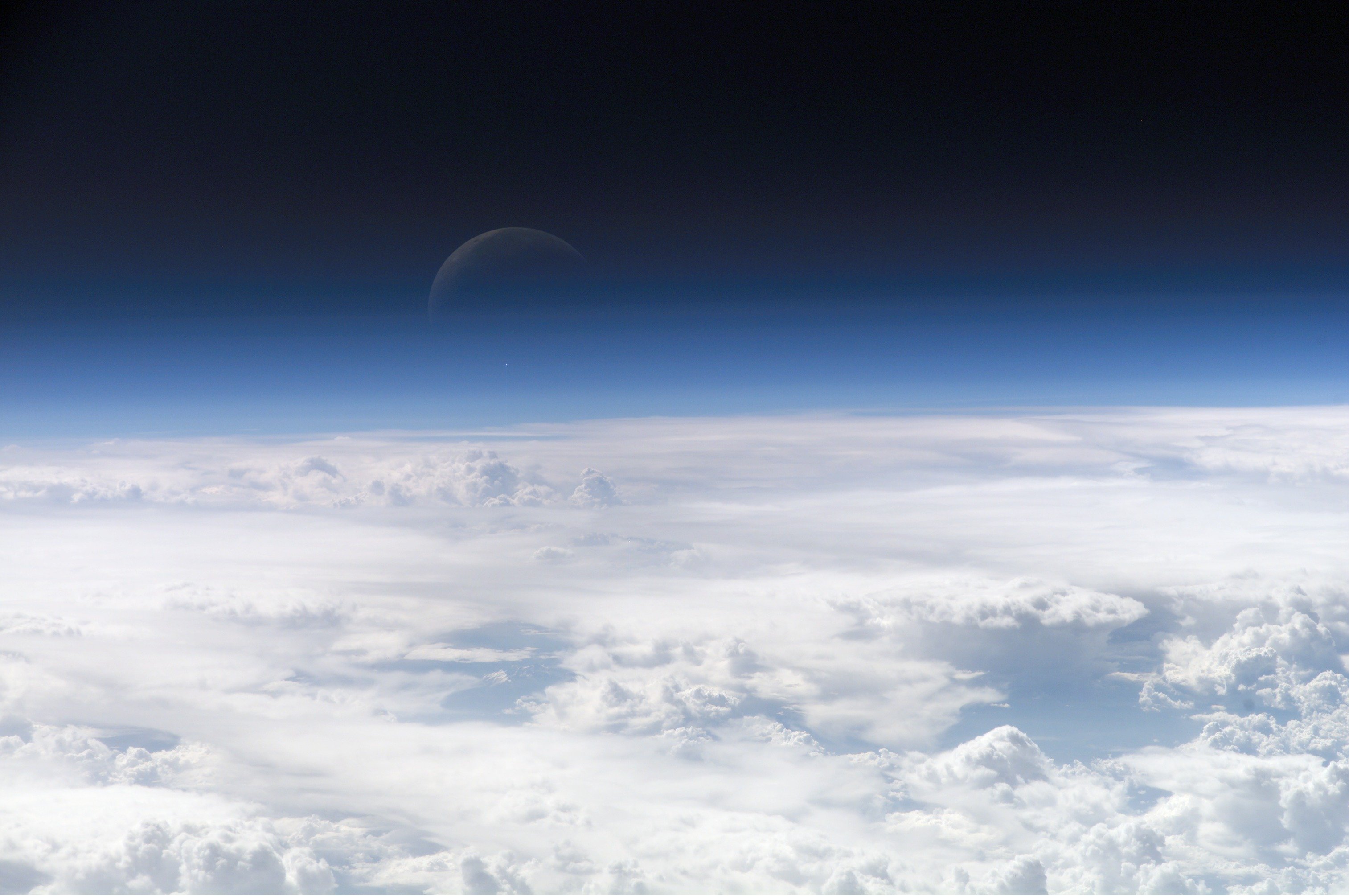
>A day night cycle?
This would have a pretty big effect on society. Because the moon is in a synchronous orbit with the Earth, a lunar "day" lasts about a month. If the sunrise is on the first of the month, high noon is about a week later, sunset is a week after that, and then you have about 2 weeks of darkness.
People would have to adapt artificial schedules to keep themselves functional, much like people living near Earth's poles do. I'm not sure if two weeks of darkness per month is enough to create an onset of seasonal affective disorder.
The level of nighttime darkness between a "new moon" and a "full moon" would vary more dramatically than what you're used to. This is because the earth would occupy a much greater angle of view in the nighttime sky than the moon does from our current perspective. The apparent size would be like this.
Pic taken in 2010 on a commercial flight landing in San Jose.
As my browser tries to load this image, it encounters errors. The resolution is higher than my screen in the first place. So alternative methods for viewing are the page on Wikimedia commons:
https://commons.wikimedia.org/wiki/File:1_fenghuang_ancient_town_hunan_china_2.jpg
Or a reduced size image. They do this resizing automatically and it's very nice. You can put in your own resolution width in the URL and it will give you what you ask for.
Here's Wikipedia's map (the one from the article that martin234 linked to).
Here's a similar map from ILGA.
When I'm feeling fancy, I get a piece of fabric for a background, use clay to mount and position the stone, and then setup some lights. Here's an example. It works best with a tripod, and for close-ups you should check if your camera has a macro mode.
Most of the time though, I just take the stone out into direct sunlight for the picture. I recommend trying a few different angles to get a feel for what works the best.
I'll put this one up in the race for the title 'Earliest combat footage'. As you can see on the page the date of the video is disputed: "Cinema became practical in 1895, how is possible a moving footage of a naval battle in 1894?" But when you look here you'll find some 'videos of the 1880s' (no 'combat footage' though).
The source for the video on the Wikimedia Commons page: http://www2.open.ed.jp/real/15655/01.mp2 Which seems to be affiliated to some form of japanese educational platform ('open.ed.jp').
If you are refering to the center of the image and not just empty space, from the source:
>This central core, seen in the upper left portion of the image, is about 25,000 light years away and is thought to harbor a supermassive black hole. The reddening of the stars here and along the Galactic Plane is due to scattering by the dust; it is the same process by which the sun appears to redden as it sets. The densest fields of dust still show up in this mosaic. Also evident are several nebulae to the lower right, including the Cat's Paw Nebula. The 2MASS analysis software has identified and measured the properties of almost 10 million stars in this spectacular field alone.
I do not have these pictures but there are all these locations that I would love to somehow utilize. I think it is better to make up my mind about the engine/mechanics, then implement it using whichever place (my appartment or something) and then make the actual game.
I don't think they would be special to recreate in 3D but they just have something about them... :)
As example - one of them is abandoned submarine demagnetizing station, how cool is that? :) (I believe demagnetizing of submarines would make a front page with TIL :)
If I would have some solid engine idea I could make it in Patarei Vangla (Battery prison)
The charge happened during the Battle of Wörth during the Franco-Prussian War. About 700 French Cuirassiers charged into Morsbronn where they were trapped and annihilated by Prussian close range fire.
The Battle of Lützen in 1632 was on of the decisive battles of the Thirty Years War. The Protestants won the battle but the death of the Swedish king Gustavus Adolphus was a significant loss. It resulted in Sweden losing its dominant role in the war.
These were definitely posters, although I was intrigued to see if they was also a playing card size produced, as I had never seen any in that form.
Google and I can find no evidence that they were ever published in a small format. The wiki page for them shows that they are used on a lot of pages on wikipedia, but none of them mention a small size, and the UNT link I posted upthread has no mention of them also being cards. Same with the Library of Congress.
Screw-on adapter fisheye lenses are usually... bad optically. If you want the bulging, super-wide-angle fisheye look with decent optics, you'll be getting something like this.
Autofocus is not critical for something with as wide a field of view as those lenses; in fact, the field of view can be wide enough that the autofocus mechanism may choose something to focus on other than what you want it to. So spending all of the money required to get the Sony-made lens might not be necessary.
On Wikipedia: https://commons.wikimedia.org/wiki/File:F-105_hit_by_SA-2_over_Vietnam.jpg
> A U.S. Air Force Republic F-105D Thunderchief trailing smoke just after interception by an SA-2 missile. The SA-2 did not actually hit an aircraft — the fuse automatically went off when it neared the target, throwing deadly fragments over a wide area.
When you mix water and ethanol you are making a solution.
- Ethanol: BP=78° C FP=-110°C
- Water: BP=100°C FP=0°C
Now then (even ignoring any ions) the properties of the solution are quite complex and one can't assume they can be simply combined where a 50% solution has properties halfway between the two substances. What you need to use are something called phase diagrams which are for the most part experimentally derived. Here is an example of one for solid-liquid equilibrium for (ethanol & water) link. From it you can see that at a freezer temp of say -20°C you will freeze anything with less than 30% ethanol.
Because of how similar (and therefore soluble) ethanol and water are, it is difficult to cause them to separate by freezing (freeze distillation) where a water abundant layer freezes and a ethanol abundant layer stays liquid.
Ethanol and water can be more easily separated by distillation by boiling (with the initial vapour collected being a higher concentration of alcohol) but you reach a point where the yields varying only temperature become very small and you need to perform more complex processes to get a higher concentration which generally aren't worth it.
https://en.wikipedia.org/wiki/Phase_diagram#Binary_phase_diagrams
Just did a little reading, it's hemolymph, which is what some arthropods have instead of blood. It can contain hemocyanin, which turns it blueish-green, but doesn't need to.
My special example is the ladybird bug, which bleeds yellow while autohaemorrhaging or when killed. Pic Unfortunately none of the articles I read explained which chemical is responsible for the yellow color.
Just going by what I've seen on this wikipedia article. They were just for special games, though.
There are pictures of the early Olympic teams when it was just an England team representing the whole, wearing white with a Union Flag as a crest.
Also, not that it matters, but just for accuracy, Persians only make up about 60% of Iran. Here is a map of the ethnic groups and it doesn't include other non-regional groups like Afghan refugees who make up around 1 million people. There are Arab populations in the south of Iran, but they are a marginal group in Iranian society.
I see you've contributed one to Wikipedia / Commons. Very cool. Would love to see more up there.
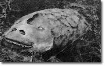
Dunkleosteus terelli, a 10-meter long armored fish from hell (and also the Devonian period). It had armored eyeballs, what the hell was going on that it needed armored eyeballs?
A LED matrix like this could be used as a sensor, because LEDs work like photodiodes when biased in reverse. I also think they respond the most to the colours they emit, so an RGB LED matrix might be usable as a colour sensor.
No idea how they got maps this accurate back then, or how the typeface looks so perfect. But I do know that this is this is exactly the same map that Lincoln looked at. The map even appears in this 1864 painting, visible leaning against a wall in the lower right-hand corner of the room.
The buds look like you got a beech. Just wait until the leaves show, then it should be easy as pie. The soil doesn't look to great imo :/.
/edit: Fagus sylvetica?
As a somewhat different take on the idea of women helping the Greek resistance, carrying guns rather than supplies, here is a photo I like published by the ELAS resistance movement.
Where do you live? What things outside photography are you interested in?
For me, I live in a historic area and I enjoy taking photos of historic buildings. Each September Wikipedia has a contest in which they solicit photos of buildings on the National Register of Historic Places. I've participated for a couple years (and added some other stuff, too).
My interest in local history has also led me to photograph gravestones for Find a Grave. Which is not particularly creative, but it gets me out there.
By the way, both those "hobbies" lend themselves well to point and shoots. You don't need to have a high-end DSLR for a photography hobby.
That's a valid point. I did a quick summation based on this map. It's arguably a rough estimate, but nevertheless: ca. 20M pro Russia, ca. 25M pro West, Crimea ca. 2M. Still about half and certainly enough to start a civil war. One should also take into consideration that the industry is based in the East.
To get started with macro photography, a cheap way with very reasonable quality is to use the 50mm that you already own together with a reversing ring. I don't think I can explain it better than the Wikipedia article:
> Ordinary lenses can be used for macro photography by using a "reversing ring." This ring attaches to the filter thread on the front of a lens and makes it possible to attach the lens in reverse. Excellent quality results up to 4x life-size magnification are possible. For cameras with all-electronic communications between the lens and the camera body specialty reversing rings are available which preserve these communications. When used with extension tubes or bellows, a highly versatile, true macro (greater than life size) system can be assembled. Since non-macro lenses are optimized for small reproduction ratios, reversing the lens allows it to be used for reciprocally high ratios.
This is a picture that I took with a 50mm f/1.8 AF-D and a reversing ring. This is another one. The disadvantage is that you'll have to go fully manual (both exposure and focus), but I've never considered that a deal breaker. Also, you'll have to be pretty close to the subject (a few centimetres) and you can only focus by varying the distance to the subject, or by using extension tubes.
That's because your shoelaces are actually being tied into a reef (or granny) knot.
There are three states that your shoelace can end up in:
- Keeping the tied up like a bow state.
- Unworking itself until the second part of the knot unties itself.
- Working itself until the knot is properly formed.
> If there are thermal vents and ice on Europa, at some point in between is a zone with "comfortable" conditions. ...I find it highly plausible that in some regions of Europa conditions exist that are very similar to terrestrial oceans.
People seem to forget how different Europa is from Earth. The presence of H^2 O means nothing on its own. Environment dictates how substances behave. Surface ice on Europa is akin to our planet's silicate crust which floats on the mantle and -- while it's possible there's an ocean beneath the Europan surface -- it's also very possible Europa's crust sits atop a flowing viscus semi-solid mantle (like ours but made of what would be salty water if on Earth).
You're onto something there, other Boccherini-themed ones might be "La Orquesta del Infante Don Luis" or simply "Musica Notturna".
By the way, I've heard you talk abou Goya before and I wonder if you know painting. The man standing at the front of the right group is assumed to be Boccherini. The three other men are supossed to be the rest of Boccherini's String Quartet, including violinist Filippo Manfredi on the far right of the painting. Manfredi was a close friend of Boccehrini that followed him from their native Lucca all over Europe, and eventually to Arenas. Around that time, Manfredi left Don Luis's orchestra to come back to Lucca to play in the royal orchestra, only to die soon after. This was painted a few years after Manfred's death and also after Don Luis's court left Arenas. Considering that, the painting and Manfredi's appearance on it are very intriguing and slightly creepy.
Edit: I thought I was PMing you... oh well.
There are lots of pages and databses like this but all the ones I've seen are generally unhelpful as they come from a strong bias. I think this graphic gives a good general outline of the larger and more distinct families: https://commons.wikimedia.org/wiki/File:Christianity_Branches.svg