
What is Reddit's opinion of
The Noun Project?
From 3.5 billion Reddit comments
➔ The Noun Project website
By popularity on Reddit, this Service is:
100 reviews of this app found across Reddit:
I just found the noun project a couple weeks ago. It's a site dedicated to free icons.
It's useful for creating flowcharts, diagrams, and art. It's helped make some of my work look more professional!
In our current campaign, I am playing a half-orc cleric (nature domain). All of my skills are pretty solid with the exception of CHA, where I rolled a 4. To roleplay this abysmal charisma, I play my character as being barely literate in Common, but fluent in orcish. This mostly manifests in not being able to use big words and an inability to understand sarcasm.
In our last session, our party was passing through a town, so while we were restocking I decided to browse the local bookstore. I asked the shopkeeper if he had a copy of "Hooked on Common," a popular book series that teaches the fundamentals of Common. The bookkeeper glanced at me over the rim of his glasses with an amused smirk and directed me to the children's section of the store.
This is what I imagine my character found.
The font on the right is Olde Thorass, based on the Forgotten Realm's "Common Thorass" from the 2nd edition rulebooks, and can be downloaded here.
The dragon was created by Alexis Winward, and can be downloaded here.
The black represents the dark, questionable nature of sweatshops, the drop (created by Dilon Choudhury, available under Creative Commons) represents the literal sweat of the workers and the red represents suffering. The gold represents the prioritisation of profit above all over human costs.
Thank you! What you're saying makes sense, but I really don't have anything else to put in that space and thought it did well in tying the card together. I also imagined players rifling through cards to choose their spells, and the classes may come in handy in that case.
Shoutout to the artists at The Noun Project for the great icons!
Maybe 1 million+ icons adds for a little too much variety
EDIT: My favorite one so far. I present to you: BUTT MAN!
It'll just elevate the piece and give your brand more clout. Especially since assets like this are meant to be shared.
If you don't have someone to make custom icons, check out the Noun Project. You can pay the creator for use or credit them in a tiny footnote.
A whole lot *) of monochrome icons can be found at The Noun Project, most of them are CC-BY-SA, but having a file in the docs around that tells about the source isn't a problem. Also, I use them (with C++/Qt projects) directly in their SVG form, so I can keep the SA also inside the SVG files.
*) probably more than 100000 !
The Noun Project is my goto for simple svg icons. Unlike the hyperbolic statement in OP's title, Noun Project literally is the largest collection of icons. Basically anything you can think of will be on there with dozens of versions to pick from. Almost all of them are free with attribution, and almost everything has a public domain version as well which is free with no strings attached. If you want to pay monthly for unlimited use without needing to attribute the icon creators it's cheap and they have an easy to use desktop app for copy pasting into any application that supports graphics (try it out for free).
Ask yourself where the anxiety comes from.
- Do you feel like you aren't capable of doing the design? Not qualified?
- Do you not like doing design, perhaps it's boring or not interesting?
For #1 - take a logical approach to it, which is natural for a backend engineer like yourself. I suspect you don't like the visual design aspect, since it's not seen as founded in logic (instead creativity). Great news though! It really is a logical approach. Find inspiration, put things that inspire you in a bookmark folder, and create something unique from all the good things you like from each. Dribbble.com is great for this, so is The Noun Project. Art in the past few centuries is really building on top of what others have done and adding something to it.
For #2 - If you dislike design work enough, consider finding someone to partner with. Otherwise try to find a way to efficiently get through the design process. Stimulants like Adderall or caffeine are great for doing things you can't focus on. Drugs all suck in their own way, so also consider looking up focus techniques and try hard to practice them. Make sure you are recording what is working and what isn't in your own personal feedback cycle.
Happy holidays my friend!
WTF?!
I got kicked out of there for wearing a shirt with something similar to this on it.
I’d hope they were at least in the water park portion?
While we're at it, let's also add a Jewish fella with a yamaka, a solider with a helmet, a nerd with a fedora, cat in the hat, and green eggs with ham.
Or, we can just insert whatever image we want -- regardless of whether it's part of the Unicode Emoji standard or not -- into any digital medium of communication by linking to it. This is the internet, NEVER underestimate the power of the link and know that it's always available to help you express yourself -- you don't have to use a squirt gun because Apple took the hand gun out, link to an M16 if that's what you want!
Yes, I think more chat apps should support inline embedded images so this is easier and flows the same way a message with Emojis would. Maybe they can limit it to double the height of a character, otherwise only show it on expand. Yes, this will use more bandwidth, but this is becoming less and less of a problem, especially for vector art.
Finally, third party apps are available that can help you do this without even opening your browser.
tl;dr: Stop whining and use the link. It's super effective.
Still ubiquitous, still usable! Icon sets contain so many dated representations. E.g. tube TV with antenna, bookmarks, floppy disks, rotary phones, et al.
There are designers out there liberating us from these obsolete icons, but it takes a while for broad acceptance. I haven't seen a phone icon alternative that would provide the same UX. But it's all relative.
Check out https://thenounproject.com.
Correct the pricings are listed here https://thenounproject.com/accounts/pricing/
royalty-free is not necessarily free like open-source isn't necessarily free. A example in case of open source is the NASA license (NOSA) model where the software is open but not free
Actually, I wouldn't recommend spending a dime on a logo if we are talking new startup here.
There's not a single startup in the history of the internet that has failed because of its logo.
And remember Google and Coca Cola - they managed with a free logo.
Here's what to do instead.
For the mobile app icon go to TheNounProject and grab an icon. Put it in a circle or other shape and add some effect in Illustrator.
For the text grab some fancy professional font. There's plenty of them if you google "free professional fonts".
To make your life easier, Squarespace created http://www.squarespace.com/logo/ which basically takes the whole NounProject database and lets you generate a logo with their icons and a nice typeface.
I'm myself a designer and I never spend more than a couple hours on a logo, and tbh even 2 hours is hella of a lot of time for a logo for a startup.
You could go for a minimalistic approach, there’s a website called noun project that will let you download tons of icons that you can use to represent a sci-fi setting.
It would look less realistic and more like blue prints, giving a unique look to what you run.
I'm assuming you're talking about prototypes, because the answer if you're at the point of publishing is, you hire an artist.
That said:
For actual art, I would suggest looking around for free-to-use clip art or similar sources. Google Image Search actually has filters to allow you to filter on things like the type of art you want (e.g. photos, line drawings, etc), as well as copyright terms, which can help if you're worried about distribution rights for PnPs and the like. And, if you find art you like in a search, you can then go to the site it came from and oftentimes you'll find sites that specialize in clip art for free use.
You can also look at places like The Noun Project. They specialize in icons, and you can make very functional components with them even if they're not necessarily amazing looking.
For actual component layout, I frequently suggest Scribus. There's a bit of a learning curve, but it is free. You can also just mock up components using something as simple as MS Word or Google Documents.
In that case, I think you can simplify it a bit and just use symbols for rotating clockwise and counter-clockwise. Using icons is cleaner graphic design and will save you some real estate on the cards/whatever reference sheet is used.
Edit: Here are some good rotate icons from The Noun Project.
This is awesome - I didn't realize the origins of so many foods & drinks could be firmly pinpointed in California.
A bunch of icons to indicate food, (non-alcoholic vs alcoholic) drink, etc... would make this visual really appealing to look at. The Noun Project often has good icons representing things, if you haven't heard of it. And you can generally use any of them as long as you provide attribution like in the corner or something (or you can pay for the icons and support the artists, but it's not necessary).
Not at all necessary to give them icons. I just figured it'd be neat to skim the coastline and see little drink icons alongside the names of the drinks, or whatever.
I personally use Photoshop/Illustrator for designing cards along with The Noun Project/Flat Icon for icons.
After that, I use spreadsheets (Google Sheets) and Cardmaker from BGG. It's a kickass program, the developer is super responsive, and it's free! With spreadsheets and Cardmaker you can generate cards quickly for printing.
First off, this is a REALLY cool, simple idea and it works flawlessly and quickly, so UX-wise, you're off to a great start.
First, when the file is ready for download, the bright green button screams for you to click it, but you can't unless you select a format. Whay about having the button greyed out until you select a format (in a bright green dropdown until a format is selected, then once it is, the download button goes green.)
Secondly, why can't I get an HD version of the file even if it's available?
Lastly, the icons for no audio and no video don't work clearly. Maybe something like this for no audio and something like this for no video?
This is a great idea, and I'm sure this will be useful. Did you make all these yourself?
I recently worked on making logos for a couple open source projects I maintain. My approach for one of them was to start with an open source font and some CC-licensed icons from Noun Project, then paid a small fee to use without attribution (about $3) and made some modifications in Inkscape. They turned out okay, but I'm definitely no graphic designer, and most other developers aren't either. There are lots of other mature projects out there that don't have a logo that would benefit from having one.
https://commons.m.wikimedia.org/wiki/Main_Page
Those are good places to start for most simple illustrations and icons!
Everything on Noun Project is free if you credit the creator appropriately (read their terms, some don't really care.) Vecteezy makes you pick through "premium" artwork to see the free stuff so just keep an eye out for the "free" tag while you search. Wikimedia is usually just a last-ditch effort (they're great for flags and maps though!)
I hope you find what you need!
Love your opener! Also great insight into your creative process. Thanks for that. Glad I’m not the only one using thesaurus to brainstorm. I find myself also looking up words on the nounproject in addition to giphy to get inspiration for symbols and icons for words.
Tweak List:
Lock screen: * jellyfish
Home screen:
- aiir status bar
- HS13
- Clean home screen
- Colorbadges
- dotto+
- HSwidgets
- Mune for HSwidgets
No available theme - icons from here
I was going to write a flippant comment about using absolutely anything (and link to this list of nouns). But thought that could actually be a neat idea, and one that could differentiate your game a bit.
Each pickup could be a completely different object (maybe with a theme, or maybe completely random). You could find images from asset packs, or somewhere like the noun project. Instead of just giving you points, you'd fill up this huge collection/scrapbook/dictionary of points in the form of random things. It'd give you a reason to go back and look for pickups, and be a great way to make 100%ing the game more fun.
Or you could just use bananas.
Have you looked at The Noun Project? The site focuses mostly on icons, but some of the icons are pretty detailed and would be great for a project.
They’re free to use under Creative Commons, so as long as you are not using the images for commercial works.
:) Yeah, in the web development world, it is called the hamburger menu/icon. Also wikipedia. The 3 vertical dots - ⋮ (vertical ellipsis) is jokingly called the kebab menu/icon.
Ik had ook zoiets als voorbeeld gepakt en dan zelf in Illustrator iets gemaakt wat bij mij past. Iconen downloaden bij The Noun Project om het grafisch strak en gelijk te maken. Ik heb bijvoorbeeld ronde vector art gezocht voor LinkedIn logo/mail/telefoon en mijn foto heb ik dan ook rond gemaakt zodat het allemaal met elkaar verbonden is. Overigens ligt het heel erg aan de branche of je een foto moet toevoegen. Mijn cv is bijvoorbeeld ook in het Engels ivm de internationale branche.
Persoonlijk heb ik een beetje kleur eraan toegevoegd in de vorm van "headers" om eruit te springen als je tussen een stapel uitgeprinte cv's ligt die alleen wat zwarte letters gebruiken. En ben niet bang om bold en italic te gebruiken om je cv leesbaarder te maken.
Volgorde die ik heb aangehouden: Naam + info / 2 woorden die mij als professional beschrijven + "strong interest in ..vakgebied.." / Education (want nog bezig met scriptie dus dit is mijn huidige bezigheid) / werk ervaring direct gerelateerd met de studie zoals stage + praktijkgerichte minor / werkervaring retail / Skills - software + talen.
Had altijd 1 A4 maar dat paste er nu niet meer op, belangrijkste werkervaring + opleiding staat op het eerste blad.
Hi, Game dev here. I'm guessing you're using Unity to make this game because the 'base' over which the ball is spawned at the start looks like one of the default UI sprites :P
I'd suggest a total graphics overhaul. The gears look great but give the game some juice. Obstacles of different shapes and sizes would be great. Maybe, add colors.
The grey background looks a bit bland. If you're going for the minimal style, consider changing it to white or very light grey.
Add in a light screen shake when the ball hits the line, probably make the ball squish a bit. You can also use the particle system for hit effects.
Tweak the line renderer material you're using and try different line styles. You can probably have multiple line styles as unlockables.
And yes, do change the font.
Cheers and good luck with the game!
Edit: Head over to https://thenounproject.com if you need any icons/UI button sprites. Huge collection for no price.
Edit 2: Here's a great talk that might help you with the graphics and effects and stuff: https://www.youtube.com/watch?v=Fy0aCDmgnxg
As a designer, there are a few things that bug me about it.
Firstly there is a little kink in the green waves between the S and the H that I can't stop noticing.
Secondly, what's up with the green waves and the globe? I mean, what do they have to do with Mishref?
Thirdly, I don't know what the file requirements for submitting a geofilter, tho I'd still consider working in vectors because right now it looks very pixelated.
My tip would be to find something unique about mishref and somehow incorporate that into your design, don't overwhelm it with styles and colors. There a lot of helpful resources online you could use to make a color palette and perhaps use some iconography.
I wish you all the best and hope you're not discouraged from creating more stuff.
About 2 years ago there was a similar post, and someone recommended Thenounproject
It's a website were you can find over 3 million stock icon. Free of use.
The cool thing about this website is that it has an icon for everything, even specific things. I needed an icon to represent an industrial programmable logical controller or PLC. At first I didn't believe that it would have some icons for it as not many people knows what a PLC is. I was amazed when I found 4-5 icons representing a PLC.
I think you're fine as long as your using that other portfolio as a starting point and adapting it for your own needs. I can't imagine that these are exactly the same, and that you want to differentiate yourself with color scheme, typography etc. At the end of the day, this is about your work. Content is what's important here.
As part of this customization, I'd recommend going for more unique icons rather than emoji. Check out https://thenounproject.com for a huge selection, where you can find something that matches the tone you want.
I get that emoji are now thoroughly integrated into our language, but they're very much for informal communications. Your portfolio should be polished unless the hiring managers you're targeting are specifically for a younger generation than my GenX self.
Conceito interessante, mas os grafismos para o Parque da Cidade e para os bairros são vectores gratuitos que foram buscar à net, mais precisamente ao thenounproject.com. Sei porque já utilizei exactamente os mesmos vectores no trabalho.
Oh wow I just posted another comment similar to this. My suggestion would just be to have a "first track" icon like this: https://thenounproject.com/search/?q=first+track&i=182653 next to the rewind button on the bar that you already have. I can live with joining the video as it's live because I can just cover the top half while I rewind to the top :)
the noun project is a great place for icons, if you didn't already know of it.
You can edit their color in figma as well. Just gotta included the author in your alt attribute.
I looked at r/symbology that was suggested. Looks fun but it seems to be "what is this symbol" and I think OP wants to know "what should the symbol for x be?" which I love and would join. Right now when I want a symbol for something I put related words into google and choose "Images" and then scroll through them-- not always satisfactory and not deep enough. I have also gone to a reddit for people interested in the topic and asked them.
I would propose a further refinement to the question--"what should the metaphor for x be?" I think the word metaphor captures a deeper level of thinking.
OP might also enjoy the Noun Project if he doesn't already know it. https://thenounproject.com/ oh, is there a subreddit for icons? that might do unless it means literal religious paintings vs representations.
Keep me in the loop!
Well, what you posted is not a typical aqua vitae symbol, this is. It probably goes back to the late classical era around the 1st century, but aqua vitae wasn't in widespread use until the middle ages when more people were capable of distillation:
https://www.diffordsguide.com/encyclopedia/407/bws/the-life-and-times-of-aqua-vitae
The symbol you posted is related to aqua vitae, but more general like "liquid" and also more of a process. It's a neptune symbol with 5 circles, 3 on the tips of the trident and 2 inside. One guess at its meaning might be more like "seawater distilled 5 times" or "water distilled and chilled repeatedly" like "take water distill, chill, distill, chill, distill". There are many different dialects of alchemical symbols, so more context would help but aqua vitae is more often an open triangle with 3 circles not a trident.
Right, got you. Short answer is no easy way other than what you said: trace the shapes to “fix” what should be the paths! It can be luck of the draw when downloading icons from the net. Why people outline the artwork like that I don’t know! There’s a fantastic site I use called https://thenounproject.com but again some are outlined. Sorry no good answer!
My go-tos when working on projects:
- Unsplash for stock photos (no attribution required, pretty good content)
- Noun project for icons (free tier requires attribution, but I use this site so much I pay for Pro so I can use the icons without credit)
The thing I'm having trouble with these days is finding stock video content to use as accents on pages...
I found links in your comment that were not hyperlinked:
I did the honors for you.
^delete ^| ^information ^| ^<3
I'm not a tattoo anything but some thoughts:
- Fremen don't have a logo. I don't think blue on blue eyes represent them either considering that's a sign of spice addition. I think the most iconic thing about the Fremen that best represents Dune is the crysknife. I suggest using this image: https://thenounproject.com/search/?q=dagger&i=819851
- mild spoiler: Dune and Leto II are connected >!through the worms!< so I suggest a that design
My suggestion is take something like this which is an image of the worm looking right at you, then have either 3 crysknives back to back to back in the center of the mouth (one for Stilgar, Duncan, and Leto II) or have their initials on each side.
The Dune font is: Orthodox Herbertarian
Thanks!
For in-app icons (like buttons) I usually just stick to what's included with SF Symbols and that almost always suits my needs.
The actual app icon was purchased at The Noun Project and I just touched it up until I was happy with it
If you're looking for a huge selection of unique icons The Noun Project is a great source. They are royalty-free (not open source), but that's normally what you need for client projects.
Looks good! Cool product... I might eventually be a customer.
Some things I would improve off the bat:
- The greens and browns tend to leave little contrast, so they're hard to see when they're overlapping. I'd recommend only using white on top of either of those colors.
- Same for the main banner - I'd made the text bigger and make it white. It's an awesome message and sets the tone... make it bold.
- The section right below the main banner is really crowded with text. Try to break this up and make it more manageable. A good strategy is break it into rows with an image and text, alternating (so, Row 1 = image, text, Row 2 = text, image, Row 3 = image, text, etc.). Think about putting some icons in here, instead (use TheNounProject.com for this).
- In your review carousel, put images as the backgrounds!
- Arrow at the bottom of the home page doesn't scroll up for me. Social logos at the bottom highlight in a neon blue that doesn't match anything, too.
- Instead of having Products dropdown at the top, why not just have two links: Hammock and Hammock Accessories? That dropdown is an unneeded step. You don't really need the Shop button in the top right corner, either, since it goes to the same place.
- On the product page, why is the header so large and so different from the home page. Consistency! Make it all seamless.
Otherwise, coming along really well! I love the logo, concept, and product - keep trucking.
>brandmark
https://thenounproject.com/term/robot-face/178985/
​
It's a CC-BY icon. There *might* be a missing attribution line, which should be fixed, but if you think brandmark owns that icon, you're wrong.
Type will help round it out. I think the major issue (and why it might be confused as an icon) is in its simplistic style is looks like widely used icon for overlap, popout, layer (example). I think it also being black and white makes the quick icon connection in my mind.
At the end of the day the definition between icon and logo can get blurred and it really comes down to context so in the context of this sub I wouldn't immediate say that's an icon.
As others have already pointed out, the idea sounds clever and convenient. One thing you should elaborate on your webpage could be data privacy which is a major factor here in Europe. I can't see any mentioning of it and storing my personal files and programs in the cloud should be reaffirmed with enough protective measures.
Another thing I caught from scrolling through the page were the icons just before the footer. They look extra bolded (a lot of black area) which makes them feel less elegant or consistent with the rest of the fonts. You might want to have a look at fontawesome or https://thenounproject.com for some sleeker icons.
One last tip: Your Facebook link (leading to a non existent page) in the far downright corner is not really eye catching. Maybe move it over to the left side above your mail address so contact details and further information can be reached in one place.
The small configurator where you click through your configuration is a nice plus. Although I highly doubt my Xbox Controller - macOS - TV combination to be highly intuitive.
Also:
https://thenounproject.com/ (License)
TL;DR: Per-icon license (most are CC-BY 3.0, some public domain), or buy/subscribe to use forever & commercially.
With the correct movement, that could be the BSL sign for 'linguistics' but i'm not sure how appropriate that is to your cause, unless you were mentioning how BSL is a language with it's own grammar, in which case that might be right. My personal choices would perhaps be this one or this one, but I suppose it depends on what you're trying to convey. Hope that helps.
Well I'll be honest, I'm not a graphic designer. I just like lurking this sub.
But I didn't see car when I first looked and still don't even looking for it. Is it supposed to be head on or a side view of a car?
I'm guessing side. If so, maybe get the lines to make more a car shape? Like a longer slope on the right, then come almost straight down on the back (left). Not sure how to make the wheels more wheel-like though.
Again, not a graphic designer so feel free to ignore my recommendations. Just saying, as an outside observer, I don't see a car.
Not sure, but I found this. If you hover over the "CC" icon, it says the license is Creative Commons, so you can use it for commercial work, as long as you credit the creator.
a few I found:
hotel for bed, WC or toilet for bathroom, water-pump for faucet, shower for shower. You can add icons to it, I think that would get more use than creating your own set from scratch.
https://thenounproject.com/ is much more extensive, I don't know if node-red supports it though.
The noun project are plenty of icons that are usually under CC-BY license.
Then use the Launcher Icon Generator that others mentioned in this thread.
Make sure to attribute the author as needed by the license.
I'd say it's definitely not, especially if there's awesome commissioned art it'll undermine. If you really need to fill that space maybe see if you can do something with vector elements (from https://thenounproject.com/ for example) or typographic elements.
The Noun Project is a great site! All the icons are licensed under Creative Commons and require attribution, so you can use them for free wherever you want. Alternatively you can buy a royalty-free license (~$2 per icon) which doesn't require attribution and you can use the icon forever.
There's a cool site I use for any sort of "whats the typical icon for..." type queries - the noun project. In this case, it corroborates the </> suggestions!
Start with removing the circles from around the icons. They don't help the icons in any way. You are creating a lot of tangents (example: battery almost touches the circle but doesn't) and causing you icons to feel very confined.
I would work on refining the icons themselves. I think you can add more detail to them since they will be on a large outdoor billboard. Work on refining weights and balance. Example: The white lines breaking up the box are so heavy they compete with the actual box form itself.
Here are a few links that might help:
Easy steps to better icons
The Noun Project - Reference how other people are handling the same icons.
Heh heh heh. So there's a neat little site called https://thenounproject.com/ where all these black-and-white symbols have been collected. What I did was grab some of those, then create some custom HTML tags in the homebrewery. So for instance you can do <h1> or <b> or <div>, you can also just define your own with css, and Html 5 I think, and luckily the Homebrewery supports it. So I do something like this:
> <style> earthEl { background-image: url(LINK TO YOUR IMAGEg); background-size: 14px 14px; background-repeat: no-repeat; display:inline-block; width:14px; height:14px; vertical-align: text-top; color: transparent; } </style>
at the top of my page, and then later on I can just type "<earthEl></earthEl>" and it will stick the little icon there. Basically it's kind of like a <span> with a background image and a set size it takes up.
Data source: https://en.wikipedia.org/wiki/Democratic_Party_presidential_primaries,_2016
Hillary & Bernie graphics: https://thenounproject.com/
Visualization: Excel
Pretty self explanatory. I was a bit surprised that Bernie over performed in terms of final delegate share versus final vote share. In other words, he ended up with 44% of the votes, and received 46% of the delegates. Hillary was the opposite (56% of the votes, but 54% of the delegates).
My first question would be where do you plan on using this...logo? Is this eventually going to be a watermark on your imagery, is it for your business cards, or for just a website?
Regardless - it's very cumbersome. The whole thing feels jumbled, from the three tone camera lens, the floating button, and the "somewhat professional" text randomly next to it. I would recommend looking into other possibilities for your logo shape. The current one doesn't make much sense, and does not scale well. I would remove the "somewhat professional" text. Maybe check out the Noun Project for some other ideas? Or Dribbble is always a great place to check out for inspiration.
I use Photoshop CC and Sketch for designing icons. I also subscribe to Noun Project for $10/month (alternatively you can use their icons for free as long as you give credit to the creator).
My SO set me up with a file in photoshop so I can make them pretty quickly. Basically he made the shield and banner and put them under the same hue/saturation adjuster, and then put a text box over the banner.
When I want to make one I go to The Noun Project and find an icon I like that represents that particular badge. Icons on the noun project can almost all be used for free if you attribute them (hence the attribution list at the bottom of the page), or you can use them without attribution if you pay. I just paste it it onto the empty spot in the middle of the shield, slide the hue/saturation until I'm happy, change the text, and I'm done! It takes me about 30 seconds. I'm pretty sure he'd be willing to share the .psd (the template file) if people are interested (though I'd have to ask him).
Hey mate, I've just been updating the flair for Game of Bands as well, and yesterday I found this website: The Noun Project. It's pretty impressive. Icons are either public domain or creative commons; for the latter you can either buy them or just attribute them.
Here's a search result page for "Record"
I've just been resizing them and altering the colour in GIMP.
Well, you're not alone. The sad part is, that a lot of the times, people clutter up their slides just so it seems like they put more work into them.
A few pointers to get you started:
Design your basic template separately, including the logo or whatever backgroud you'd like to use, and save as pdf and import as an image.
Dark background, light text. Always works better. Especially when the presentation is being projected onto a wall/screen.
Use no more than two fonts, and phrases instead of sentences.
Don't use a fancy transition unless it's required. More often than not, it isn't. If you must use a transition, make it uniform through the slides.
Frame and align your visuals. Think of how you'd like to paste your posters to your bedroom wall. Now apply to slide.
Refer to good presentations online, see why they work, and try to emulate. Often you will see that what they have in common is that each slide works as a stand-alone visual. Don't be afraid to have more slides, unless under regulation.
Don't number your slides (unless under regulation).
And the most useful, don't use horrid clip art. Here's a GREAT alternative: https://thenounproject.com/
There's lots, lots more, of course. But this should start you out.
Here's a tip: use more graphic assets that don't look stock.
I struggled with this during the past few times I designed my business, but it goes a long way. The other problem is the font-logo. Do yourself a favour and buy a $1.99 icon from https://thenounproject.com so you can have an actual logo instead of "SpareSpaces" in regular font.
Edit: the Google material design icons are great for a lot of purposes. But I think you'd want something more unique for your logo.
They do have a lot of icon packs where they're all made by the same person in the same style, or a hard to find or interesting theme pack made up of stuff from lots of people (like Women in Tech.
Or if you find an icon you like you can view the creators profile for more similar stuff or pay them outright to make custom icons.
I myself use it for quick one-offs, or to get a public domain vector shape to incorporate into my own design. But sometimes they don't have what I had in mind so I just make it myself and then upload it as public domain.
Nothing comes to mind. I tend to search Noun Project for inspiration. You see quite quickly if there is a common theme. Searching “blog” shows, not really, but something that represents “writing” like a document or pencil/pen is the common approach: https://thenounproject.com/search/icons/?q=Blog
Try GIMP or Illustrator, vector files are scalable and try to use only vector symbol, If you need some symbol or icon, try in Wikipedia (for SVG files) and Noun Project for icon in SVG format.
Hi ! You can find millions of icon in this website : noun project You can download them or you can just saved the icon you want in your favorites and copy/past the link of the image in notion. With free account you just have black icon but you can have in any color you want if you agreed to pay (sorry for my English 😅)
It depends on if you think investing the time to become a designer is worthwhile. There are three ways you can approach this problem: 1. The Fast Way - Collaborate with someone who’s primary skill is UI/UX design. 2. The Slow Way - Simplify the UI until you are able to code something elegant and self explanatory. Black boxes with white outlines, and self explanatory icons purchased from https://thenounproject.com/ will take you a long way. Avoid using text wherever possible. Be minimalist with anything outside your area of strength, and invest your time in your strengths. 3. The “I’m building skills, not a game” way - Watch YouTube videos, Udemy courses, and pour over the documentation for the game engine you are using. In this case you are more likely to become an entry level designer than ever finish a game.
These are placeholders. They would take about 2 days to implement.
Icons look like basic stock from something like the Noun Project.
I've used thenounproject.com to find some really awesome icons. There's a free and paid version. Since I do a lot of design work I pay the $40/year for it and it's totally worthwhile!
OMG like hell I'd use this without attribution. Have you heard of "the nouns project".
This seems like a massive level up I'm a backend data engineer. Only 1 year into my job but I'm pinning this to see about giving you a frequency use list to hone your skill on for multiple levels. I've been wanting to do it myself for an age because pictograms can be used universally language agnostic and I want to start several projects that way.
https://thenounproject.com/
You should create a patreon. I'm fairly well off myself and will no doubt have plenty of "pro-bono" passion projects. But none would be this steady/structured such that I can reliably put out the content daily and I think it's perfectly fine to upgrade that from free to monetised via donation.
The icons are a bit too detailed. You have to test them at small sizes.
The lootbug love one could do without the arrows and the dwarf.
The radar doesn’t look like a radar, it looks like a target. I recommend using [https://thenounproject.com] to look up icons and symbols for any word, I use it often for inspiration. Here’re some radars https://thenounproject.com/search/?q=Radar
<strong>Colinas de Chino</strong>
Flag for the city of Chino Hills, Chino Hills itself is represented by the hill-like designs as seen in the flag, they are colored Evergreen and Woodland Green, representing its Chaparral and Woodland nature.
Below the hills is a band of blue, the shade of which is found in their seal, it represents their historically swampy nature and also doubles as an estimation for their elevation with the hills starting at about 262 pixels from the bottom.
The symbol above the hills represents a curl or "chino" and is colored after the palette of the Chino Hills Huskies.
To top it off, we finish with a background color of California Sky to represent their Californian identity.
(curl design based from https://thenounproject.com/term/curl/1801239/)
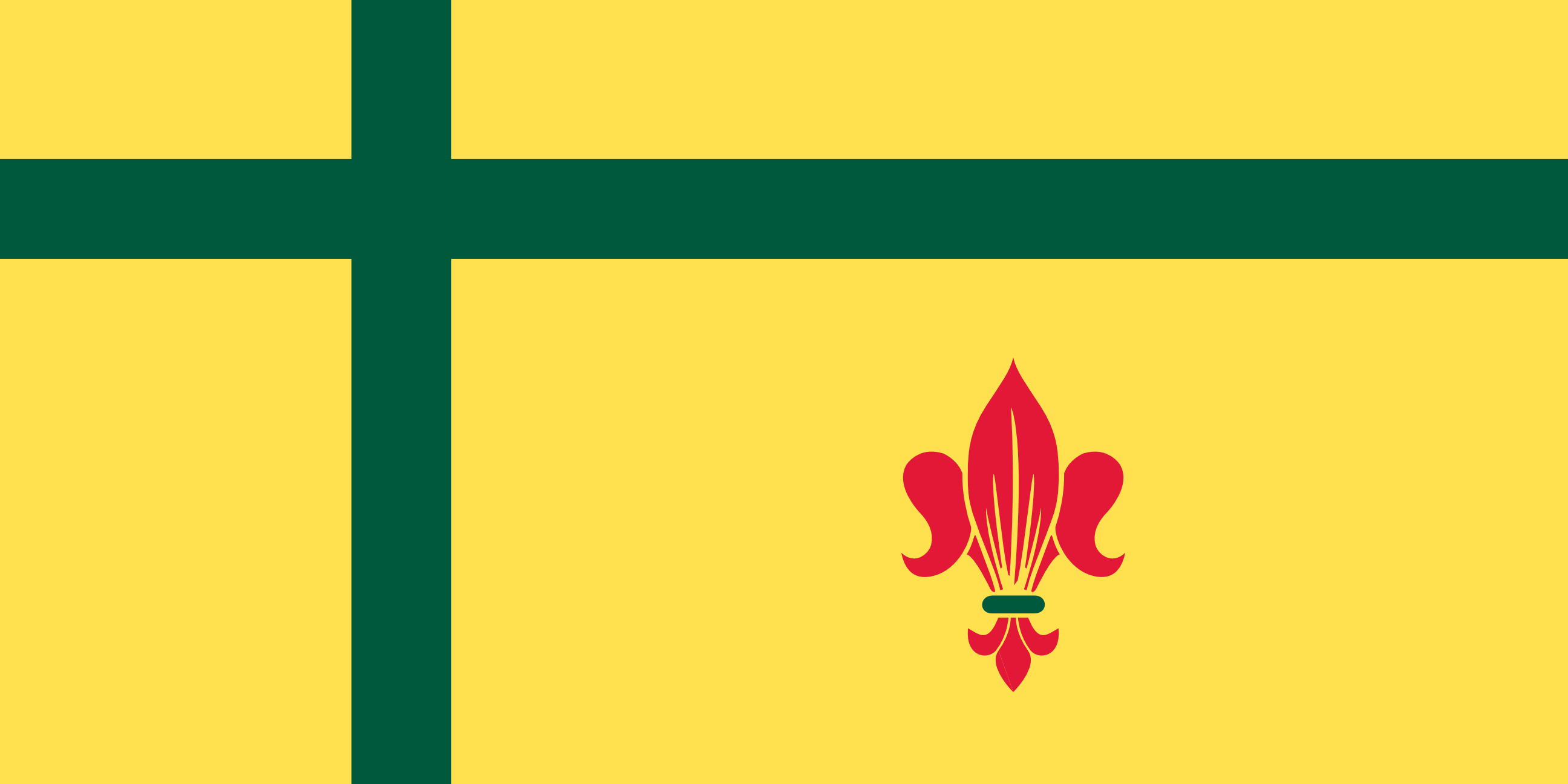
Hello! Another redesign for one of the Canadian provinces/territories, Saskatchewan is up next.
I really felt in this scenario that a fresh design was needed, as I wasn't quite sure how to create a unique flag with either the traditional wheat or red lily symbols. Bison is one of the many animals commonly associated with the prairies, and while researching for this project I came across this incredible svg from the Noun Project by Jinhwan Kim, so it was meant to be :).
For this alternate flag, I've taken a more artistic license in order to invoke imagery rather than symbolism or meaning. I tried (and failed) to remake either the milky way horizon or aurora borealis in lieu of the shooting stars, so if anyone knows of a successful svg implementation of either that might work let me know!
Final note: the best design for wheat that can be found on any flag, IMO, can be found on the fransaskois (Saskatchewan francophone community) flag, wonderfully incorporated into the fleur-de-lis.
Hello /r/graphic_design, I am a computer engineer and a PhD student who is trying to shift into game design and development. I have no prior training in design, so I came to this sub to get some feedback!
The type of games I will be publishing fall into the hyper-casual category so they will be small games with short playtime sessions. I settled both on the name and the logo after many iterations. To be exact, I created 76 different logos and if anyone would like to see different iterations and give more feedback, the rest of them can be found here.
I am using the drawSvg package in Python to create the SVG logos. I have browsed many icon websites (mainly thenounproject) with a couple of keywords in order to draw inspiration from other creators. Thus, some iterations are close replicas of some of the icons I've stumbled onto, but the final logo is my own creation. Nevertheless, the “everything is a remix” principle applies :).
I wanted to have the word OKI (as a way of saying OK) and the moon in the logo. Later, I decided that a moon would be repetitive in the design where a nice O is already present. So I tried to turn the O into a planet with a little moon orbiting around it. Since the message I am trying to convey is positive, I added a little smile on the planet and finalized the design.
The base colors are #ffffff background with #000000 lines/text over it. The second one with a pink color is just another iteration. The pink (#ff91af) is called Baker-Miller Pink which is a pink tone which “has been observed to reduce hostile, violent or aggressive behavior”. This also aligns well with the values I support.
Any feedback would be greatly appreciated. Please destroy my logo design :), thanks!
Personally, I'm cutting my own parts for various prototypes and small one off projects where a client sends dimensions/art which I draft up in CAD. I don't know anyone else with a laser cutter.
Lasers cutting software typically supports vector and raster files. The Noun Project has a lot of both. It's a great place to find icons which typically are laser friendly, though I've found the vector files sometimes have duplicate lines causing the laser to run the same path twice.
I'm not aware of any resources like Thingiverse for vector files. I'd suggest learning how to use the vector trace tool in Inkscape if you want to start making things with a laser from existing works.
You can get pretty creative with free icons at places like https://thenounproject.com/
Once you learn the basics of inkscape its easy to modify them a bit. They're all free too under a creative commons license provided that you provide an attribution to the original creator.
That being said, the logo could use a better icon indeed. Show more of the conflict in the second one, quick search gave me this which would work perfectly if simplified some more.
Oh, goodness, I don’t know how to summarily answer some of those questions in a great way, except that The Noun Project is a website, yes: https://thenounproject.com
I would just see what fonts vibe here for you someplace like this and look at their designers’ descriptions and intents when designing them. Try to interpret ideas like humanistic type, legibility, how webfonts allow for greater consistency between say websites and PDF forms (digital or printed), how different typefaces/sizes/weights/colors allow for information hierarchy so a job app or form is more usable, etc. You can learn so much about design by experiencing the world through a design-focused lens, and through context. I don’t think I could ever teach as well as the world itself teaches.
And attribution is like, I designed this kitty silhouette line art, and in my license along with it, you can use it if you attribute it to me at the bottom of the page/flyer/email/tv screen/whatever. If you ever aren’t sure what is meant by copyright, license, trademark, Creative Commons, attribution requirements, giving credit, etc, you can always Google or ask the person to clarify.
The only thing I can suggest, is looking at the design a little bit more. I believe taking a more minimal turn would be more attractive to the eye. Surely, aesthetic is more of a personal thing, but this is only my opinion.
You can check this site: https://thenounproject.com/
For transparent png.
Make sure to find a cute colour pallete as well. This site can help: https://coolors.co/
Also make sure to get inspiration of many platforms to see what is out there. My go to is Pinterest, Instagram (I know cliche,lol).
Wish you the best! I am not a pro on diagrams but I hope these tips can help you! Keep it up.
The widgets was maked with a Chinese app: this one.
It have a lot of options and is completely free: the problem is that the app is in Chinese. The icons are from: The Noun Project.
The wallpaper is from a Twitter artist, she's account is @Wolframico.
I only really needed these as a student so I'm not much help as a paying professional - for silhouettes I generally did a quick Google or check Pinterest. For small graphics and icons, I love thenounproject. Really nice content but would be hard to make content on for sure!
Great! I think there are a few things to dissect here.
- arabic developer community
Ok cool, I dig the rounded termination points with sharp edge in your bracket now. This feels in line with an abstraction of Arabic script to me. I wonder if you can abstract it to feel more Arabic somehow? What would the bracket symbol look like to match this font?
- somewhere to go and get help
What you have here doesn't really communicate a community or help right off the bat. How can you show this without having to write all that? Maybe the name of your community can help with this RE stackoverflow
- circle represents this community
The circle may represent community but it sure doesn't show it. Try not to be so symbolic that non-designers won't just see a circle. Also, don't feel like it's necessary to justify that. Nothing wrong with it just being part of an eye, but if you want to show community, there are ways to actually show it.
- the whole shape looks like an eye looking to the right.
I didn't see this until you mentioned it, actually feels a lot like a mouth eating. I think you can really push this direction of the eye with the bracket though. I like this idea and really gets at my second point of feedback too!
Mir ist das immer peinlich. Ich kann Mittwochs keinen gezeichneten Frosch beisteuern, auch wenn ich gerne würde. Es geht einfach nicht. Ich habe weder die Vorstellungskraft fürs Zeichnen, noch die richtige Hand-Augen-Koordination. Ich bau dir ein Screendesign für eine Website in 4 Stunden und setze sie in 12 Stunden um, wenn der Content da ist, aber ich bekomm einen Frosch nicht besser gezeichnet als ein 3-Jähriger.
Aber ok, dafür gibts ja die Experten, an die man das outsourcen kann. Illustratoren, Künstler & Co. KG. Gute Menschen, die dann evtl. an einer Website scheitern. Yin und Yang.
Ich find es nur lustig dass die Erwartungshaltung immer automatisch da ist, dass Grafikdesigner & Mediengestalter zeichnen können. Ich hab jetzt keine Studien, aber wenn man sich in Agenturen umblickt landet man da bestimmt bei einer 50% Quote, wenn nicht höher.
Bestünde mildes Interesse an grafischen Frosch-Eskapaden? Das war nur ein Quick & Dirty Test um meinen Post zu bebildern.
Shoutout an @Bernd Lakenbrink bei nounproject für den Zentral-Frosch. Bin zwar Premium-Kunde bei dem Verein und brauch keine Namensnennung, aber der Name klingt so als könnte er auch hier abhängen.
i really love your custom stamp. the imagery reminds me of the treasures you can find on thenounproject.com - i may just have to make my own stamp too!
i've written a couple notes to my mail carrier and left them on top my mailbox, and she writes back! but they were purely functional - asking if i could set up my own outbox since i don't have that at my apartment - so i kinda want to just leave her a random hello now!
prior to this mail carrier, i had someone else during the summer when there was a lot of advocacy for the usps going on. i wrote her a long thank you note on a nice postcard, left out snacks and a la croix, but it was never touched, even the card which i left out for days. :(
Anything that isn't mostly description is good. I loathe description-heavy fiction, be it fanworks or published. My eyes glaze over because there is 0% chance I'm going to picture exactly what the author is desperate for me to envision. I realized at one point in Reliquary that I wasn't picturing a tunnel or river or scuba gear or the motion of swimming, I was picturing literally a classic style, static, stick figure icon.
This is my 2nd ever project and I am having so much fun! It helps when we have such an awesome community.
I freehanded the leaves but the giraffe itself I copied the outline from Rfourtytwo’s Giraffe icon and added colour.
[C] Worked for me: Acquire some sort of thick black marker, e.g., sharpie. Draw something simple on the inside of your forearm. I drew something vaguely shaped like this. Hopefully, when one of you looks at it, you'll remember the others.
If anyone asks, say "it's a reminder to do something, but has to work offline" or some such.
quick comment: i suppose i had better not making any of these huh...
also, jet icon taken from thenounproject, by Nhor
and, good thing i found a better way of making wood textures for this one
If you willing to pay the noun project is great for all sorts of icons. You can change colours, get icons and mix them together and they’ll all .png. Might be some free ones too but I’m not too sure https://thenounproject.com
lmao I use the shit out of this as an ESL teacher and it is a lifesaver, BUT I would warn others to maybe not hastily search for images to show a non-English student/ parent without checking ahead of time... I searched “vaccine” in front of a dad once and some of the top results were just random butts getting shots in the cheek lololol he didn’t really know what to do with that
No worries! Glad my advice helps.
Yeah, 3D Functionality would be insanely difficult - I'm not really sure how SketchFab or Marmoset even do it, to be honest. But it would SERIOUSLY give you a leg up on the market if you could figure it out. In-Browser 3D is only going to become more powerful in the next few years.
But this system is a great idea outside of that. Your planned iteration sounds great. Tools like this are very useful if pulled off right -- like, for example, the Noun Project which has a selection of icons that you can use.
Definitely focus on demonstrating how powerful and easy the tool is. I'd even recommend a Motion Graphics video showing how easy it is to customize and export to sites like Canva.
Weirdly enough I looked it and thought it looked like Barcelona.
Reverse image search says it has a lot in common with this icon (either a direct adaptation or they're both based on the same map): https://thenounproject.com/term/streets/248845/
The creator is from Barcelona, so it seems like too much of a coincidence!
If so, I'd guess somewhere in the old town/El Raval-ish. That horizontal road that runs across with the kink in it is quite distinctive I think, as are the smaller roads that meet in a point in the centre and peter out. Into a park maybe?
What's the context? That might help...
I found links in your comment that were not hyperlinked:
I did the honors for you.
^delete ^| ^information ^| ^<3
Maybe https://thenounproject.com/ could be a place to look? At the very least, you could probably pick out and pay for individual icons that you want, instead of buying a whole set which might not contain your exact picks.
Icons are by me but I sourced the logos from The Noun Project and Google so I don't have rights to them or anything like that. I just made them for personal use. The only original icon is the Among Us one. Feel free to use my set!
Edit: And if you're looking for a more official white icon pack, check out this website! Support the professionals!