
What is Reddit's opinion of
pxleyes?
From 3.5 billion Reddit comments
➔ pxleyes website
By popularity on Reddit, this Service is:
100 reviews of this app found across Reddit:
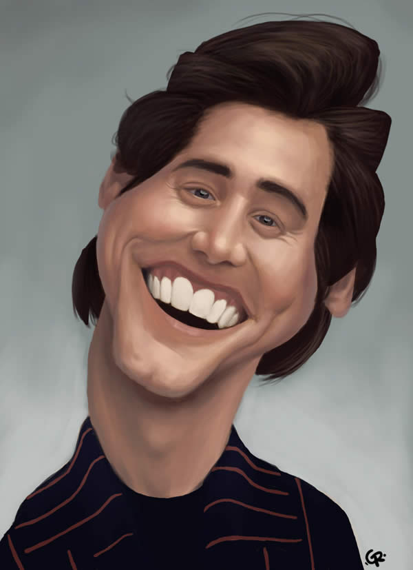
I personally think they are shit and aren't even caricatures. Like someone already mentioned, a caricature is supposed to have some of your most distinct features drawn in an exaggerated fashion ala
http://www.pxleyes.com/blog/wp-content/uploads/celebrity-caricatures/1.jpg
http://machoarts.com/wp-content/uploads/2012/08/Sylvester+Stallone+Caricature.jpg
Those look like cheap, amateur drawings.
it seems to me that his impersonations are more-so caricatures of these people than true-to-life impressions.
He does them well in my opinion.
His impressions are good in the same way that this drawing of Jim carry is good.
http://www.pxleyes.com/blog/wp-content/uploads/celebrity-caricatures/1.jpg
Not quite.
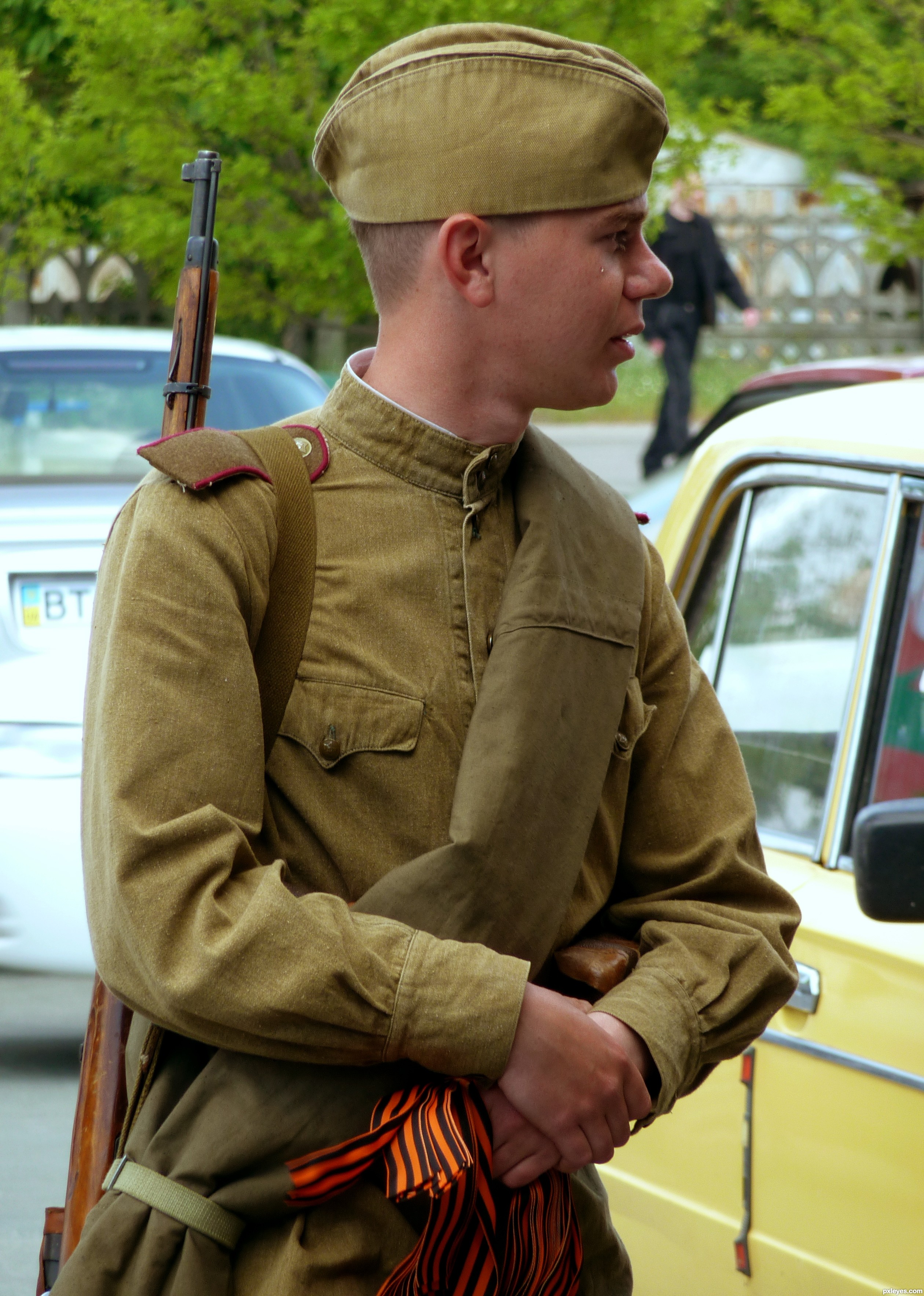
RAF pilot's uniform. Note the low brim and the two buttons in the front.
Red Army WW2 era uniform cap. Note the high brim.
The dude in the photo is Soviet. It's the most logical conclusion to start with, I mean, what are the odds that an RAF POW ends up in a POW camp for Red Army soldiers and happens to be captured in a super-iconic photograph?
behind the scenes video made by ~~the~~ <em>a</em> photographer, Von Wong
edit: sorry got that wrong - actual photographer, Tom Lacoste and interview with him
Take a look at entry 8 in this photoshop contest. http://www.pxleyes.com/blog/2010/08/pxleyes-top-50-pictures-from-the-photoshop-contests-of-july-2010/
>Contest goal:Many of us have seen chops of cars into miniature versions (as done so brilliantly by Solkee). The aim of this contest is to apply the same concept to an animal. As examples, you may choose to make a two legged dog or shorten a sausage dog. Make the chops as realistic as possible so it looks like this is the way the animal was born. Author: SOLARIS, created for: compact animals photoshop contest
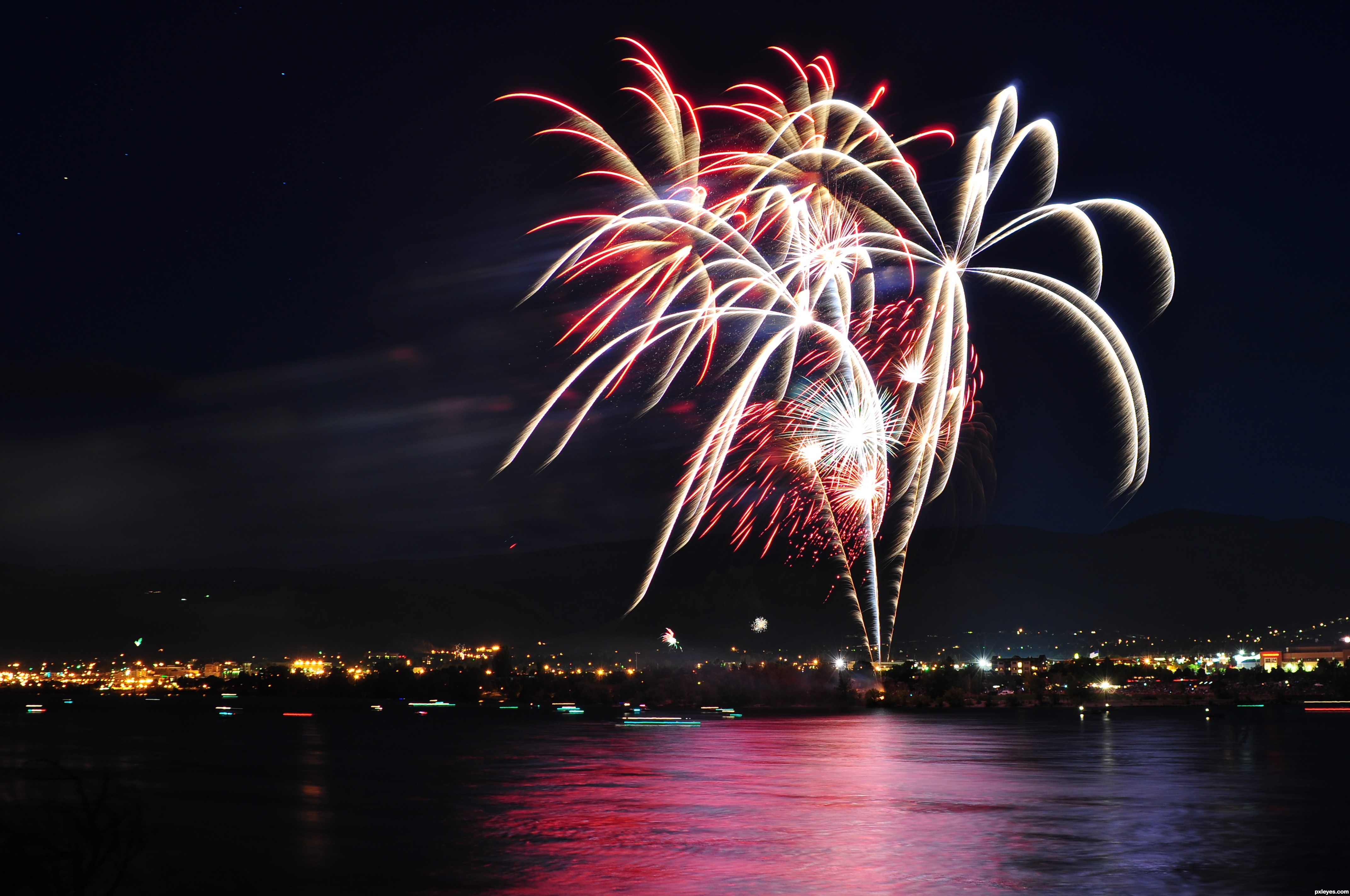
The fireworks themselves are too clear for that.
Why would you think it's a long exposure instead of just a cloud of smoke formed on a still night from a ton of previous fireworks?
Though this was probably shot at 15 pictures a second, making timing kind of easy.
edit This is what a long exposure of fireworks looks like.
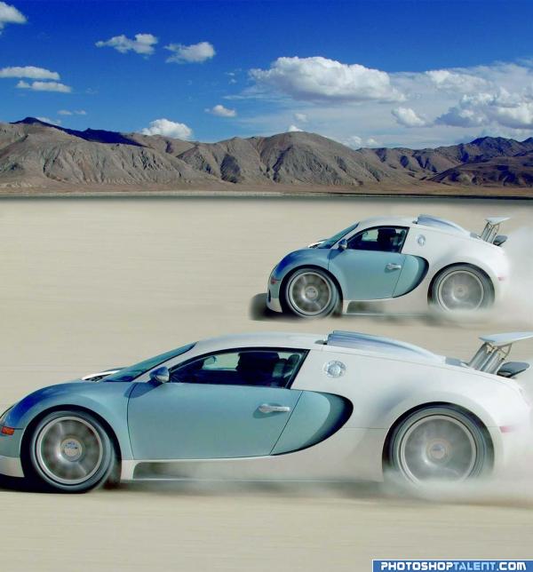
oh my god that car is hideous....
looks like they took a ferrari and did that "minicar" thing that people do: http://www.pxleyes.com/images/contests/Making%20Mini%20Cars%20practice/fullsize/Making%20Mini%20Cars%20practice_4a503baf38450.jpg
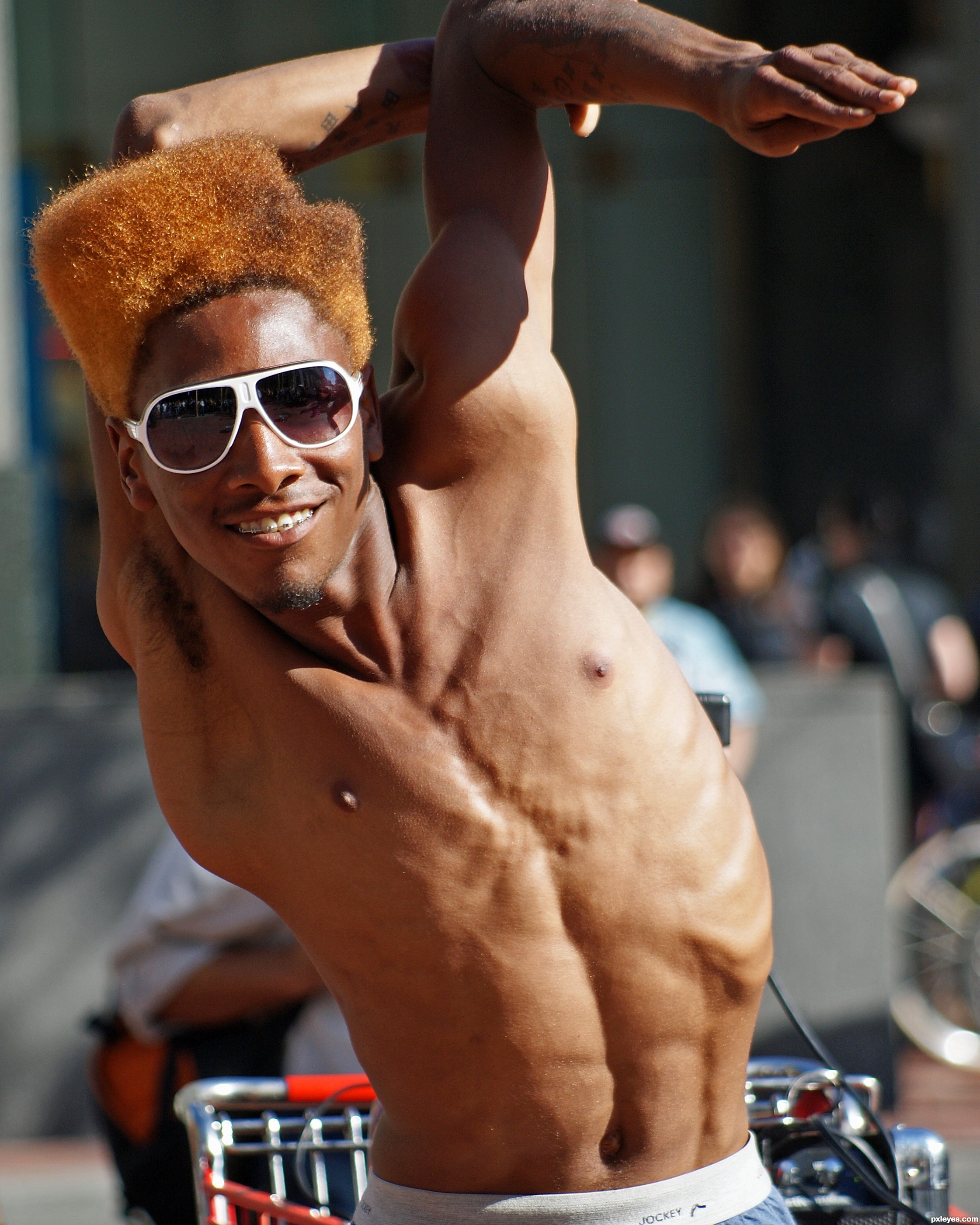
This is an argument I see in the art world a lot with people learning anatomy. There are many positions that are 100% POSSIBLE. But they still look unnatural.
Yes, a person with lose tendons can flip their arms around in wacky ways. But it still looks unnatural to 95% of the population as they don't see that kind of thing on a daily basis. There's essentially a limit to how much you can exaggerate.
When a single mother spends more time talking about her kids than her. Yes, I get they're important - they should be - but this isn't OkBabysitter.
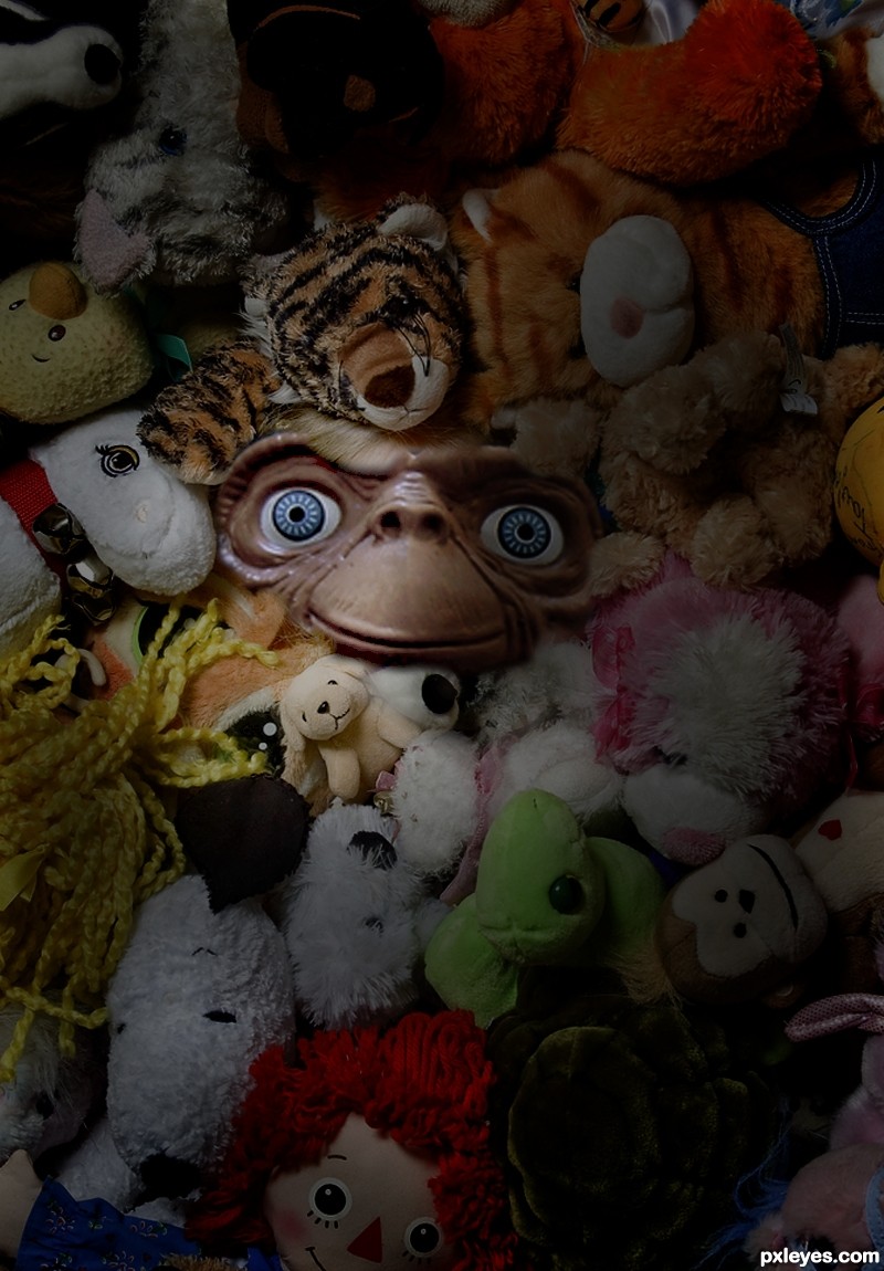
I'm especially nope-ing out of there if she has pictures where most of the photo is her kids, and her face is buried in there like E.T. peeking through a pile of stuffed animals.
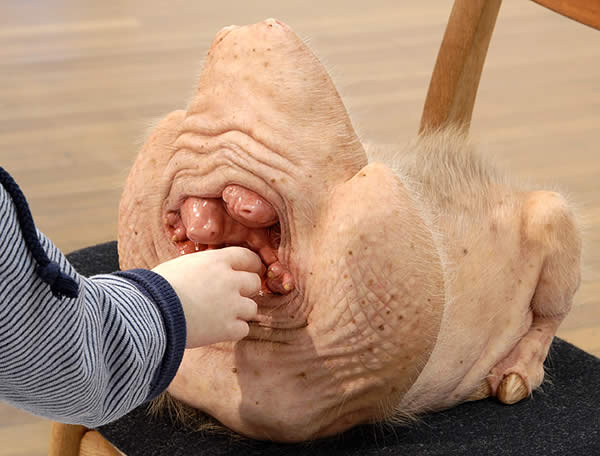
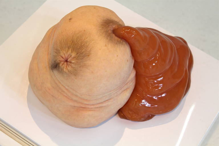
it is a tail, not a not a micropenis, promise. Here is another angle
Artist is Patricia Piccinini, btw, who you might recognize form her horrifying woman-dog sculpture or... whatever the fuck this is.
That is Lucien Petit-Breton, first person to win back to back Tours in 1907 and 1908.
Found the pic here
King of the Sea - created by Hct3400
Not really a mythological creature or something like that. Just a photoshop combining multiple pictures (check the sources below).
This would add cost and reduce the functionality of the lens. First, consider that all lenses must start as axisymmetric parts (round). So cutting them down to rectangular shapes would be additional labor.
Second, zoom lenses typically use rotating glass, so for zoom lenses, there would only be one "correct" orientation where the lens aligns with the sensor.
And lastly, for most lens/focus/sensor combinations, the edges of the lens image is outside of the sensor, because there are artifacts introduced by the edges - chromatic aberrations, drop off, softening, etc. Sometimes it's desired to include these effects (like a vignetted shot). However, in most cases, these effects are unwanted, so trimming down the lens so as to have it fit perfectly on the sensor would just make bad pictures.
The biggest things to aid in making lenses smaller is to give up zoom functionality, resulting in a fixed lens, or use a smaller aperture, resulting in deeper depth of field and poor low-light abilities.
Who's a bigger shithead? Rachael Bunyan for writing this or op for sharing it? (Assuming op isn't Rachael Bunyan)
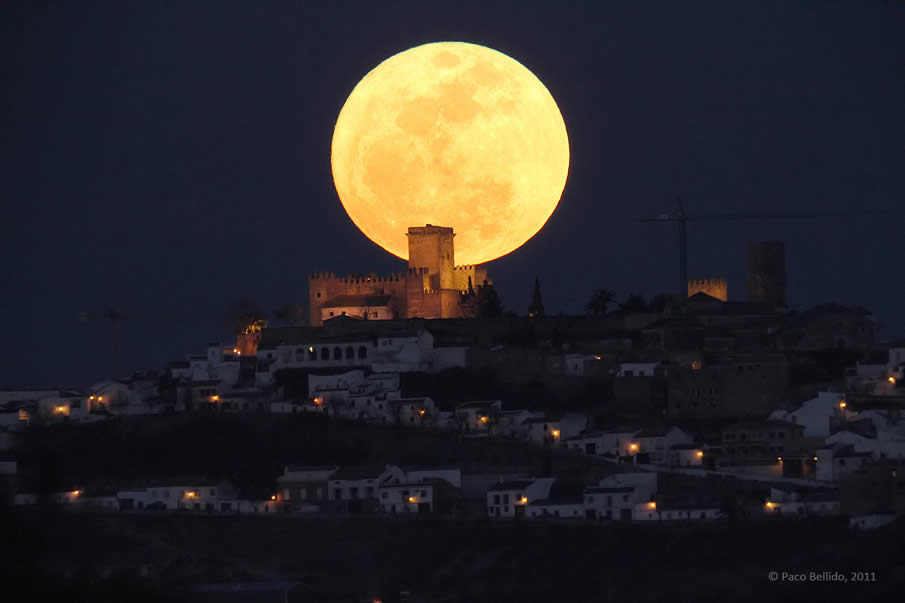
It's not even photoshop, it's just use of telephoto lens that make the background appear proportionately larger. Same reason why the moon looks so damn big in some photographs.
Don't feel bad about this effort at all - you nailed the one thing that so many HDR photos fuck up: so many people use a regular eraser tool to mask out the different layers, and highlighted photo elements tend to have a 'halo' around them. Your transitions between layers are sharp and exactly where they should be.
I have never painted an under water scene before but I guess you could look at light rays? Look at the examples on this page for further inspiration:
http://www.pxleyes.com/blog/2012/04/underwater-digital-paintings/
My only other recomendation would be to look at surface lighting. As in reflections etc. off of the surface of the water.
Once you've got the lighting sorted I think you've got a really solid piece with only minor detailing etc. left to do.
Every country has their oddities. I'm sure someone can compile an album of all the crazy stuff we do in the states. Here's a breathtaking album I found of all the beauty Russia has to offer. In particular I love this photo! http://www.pxleyes.com/blog/wp-content/uploads/russia/4.jpg
Specifically it originally comes from this website which runs photoshop contests.
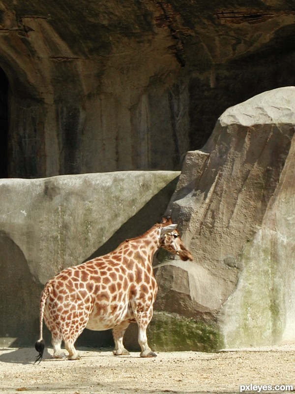
Also here is a video of an adult dwarf giraffe they have normal proportions, they're just smaller.
Taken from here:
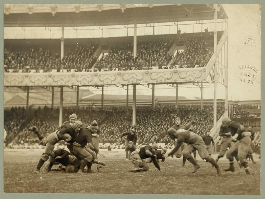
http://www.pxleyes.com/blog/2011/07/121-professional-vintage-sport-photos-taken-before-1925/
via r/history here:
http://www.reddit.com/r/history/comments/jx3vc/vintage_sport_photos_prior_to_1925/
See also the 1915 Army/Navy game here:
http://www.pxleyes.com/blog/wp-content/uploads/vintage-sports/19488v.jpg
and now that I see the watermark, it was also posted at Shorpy at one point.
> He will never get this. This will be claimed as religion and cartoons.
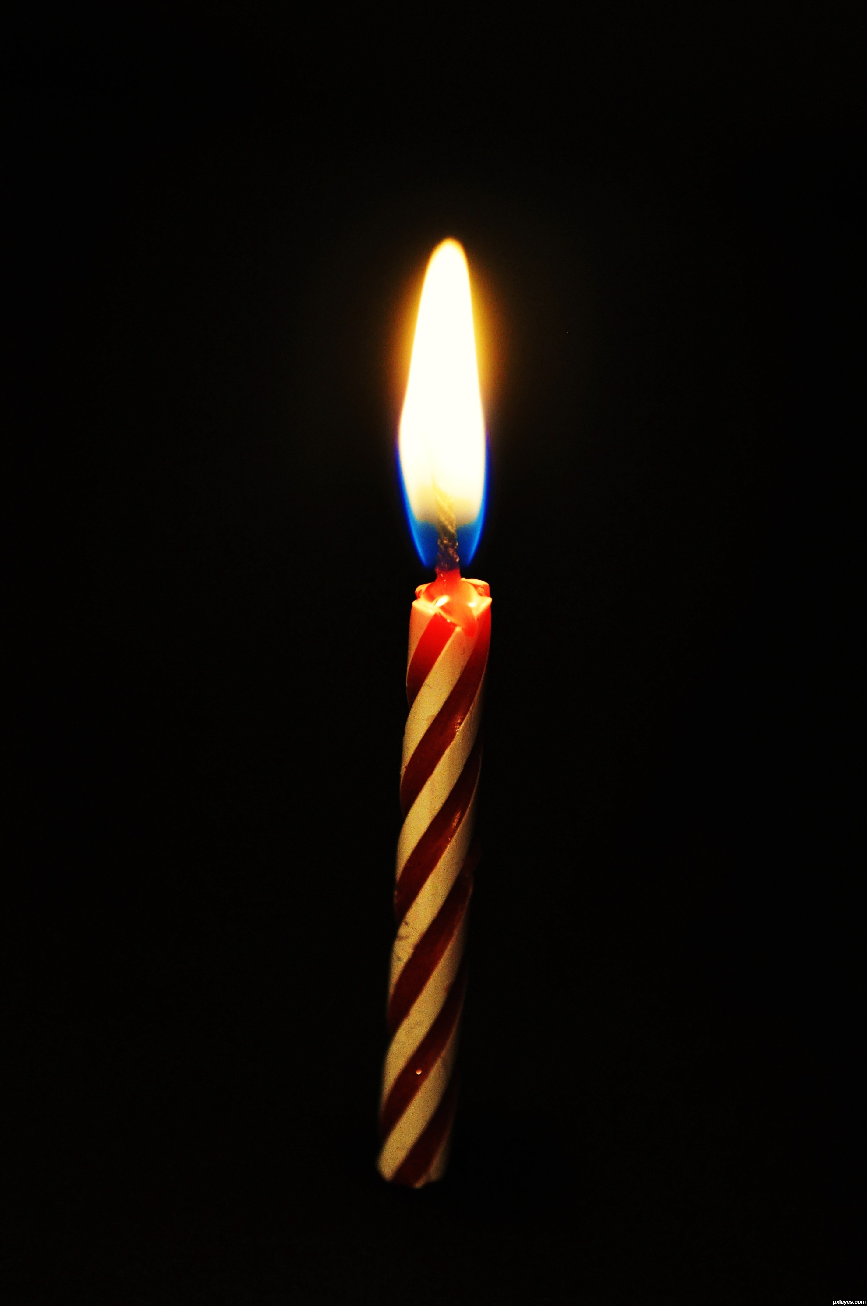
The difference between temperature and heat is quite easy to test, anyone can do it easily for themselves. Here is a preactical experiment: I suggest getting a large saucepan, put say 8 litres of cold water in the saucepan, and then try to boil the water using the quite hot flame of a single birthday candle.
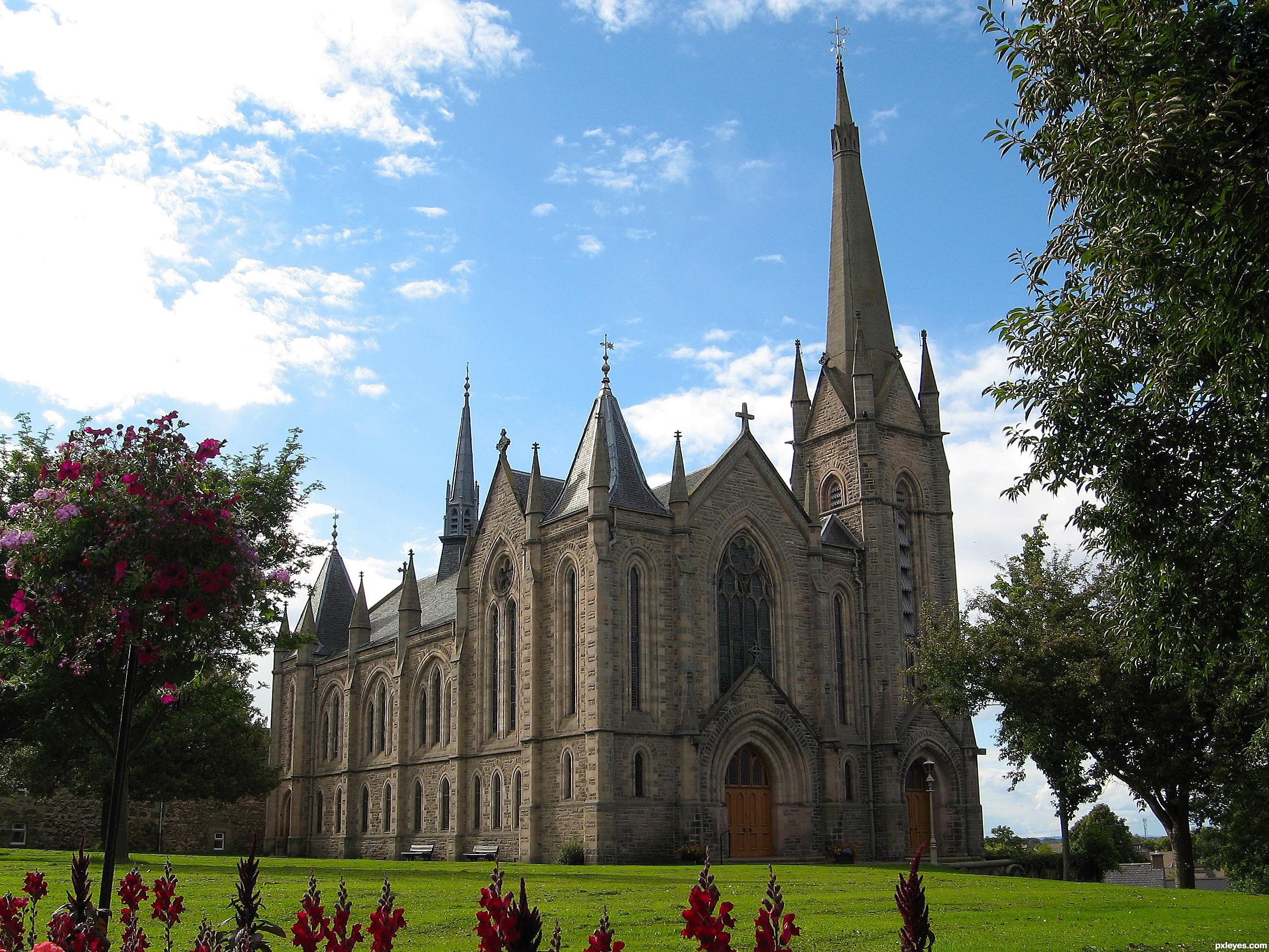
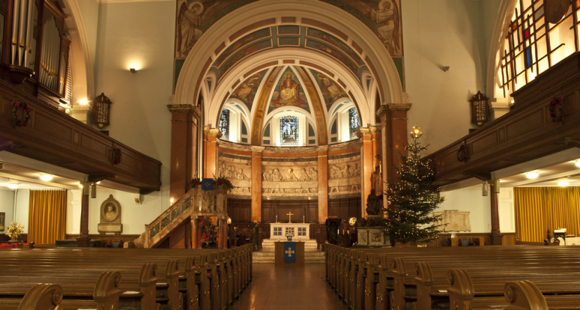
Just because we don't build golden shrines to saints, doesn't mean we don't have beauty. Some Scottish churches I'm fond of:
it's more of a system built on top of systems. your decision is backed by all these;
learning while still in womb > temperament > nationality > culture > wealthiness > upbringing > personality development/puberty > etc
everything is built upon circumstance and infinite other factors. influence is like strings in a bigger strand of rope that makes a big rope. like i said, system on top of systems. they make up everything that you are.
if anything, this is the best time to mention "Chaos Theory"
It really depends on the lens.
Wide angle lenses over-exaggerate distances, so the moon will appear further away - and thus smaller.
Telephoto lenses, on the other hand, make distances look smaller than they are, so the moon will appear bigger.
You need to take into account the lens the scene was shot with, which would create a similar effect to that of the human eye. When parallel lines are viewed that are close to the viewer, and range throughout the field of view, they will appear distorted, and therefore not parallel.
http://www.pxleyes.com/images/contests/bw-landscapes/fullsize/Trees-and-shadows-4ccb0e3e5f574_hires.jpg
The shadows in this image appear to not be parallel, yet if they were viewed from a top down perspective, it would be revealed that they are, in fact, parallel. Not only would the sun have to be a huge distance away, but so would the viewer in order for the shadows to appear parallel.
The wings create lift by pushing air down. Pushing air down means the wings get pushed up. The wings are held up by air and the body of the plane is held up by the wings.
By saying the wings do not hold up the plane, you are effectively claiming the same thing as saying that the middle of this bridge is not held up by the walls on the side of the channel. Which is to say, completely ridiculous and indicative of a fundamental misunderstanding of basic physics.
Edit: For anyone wondering what the deleted comments were, /u/PenisInBlender seemed to quite firmly believe that the wings of a plane do not hold up its body.
daily faceoff has him on the blueline of the second unit
not trying to draw too early of comparisons but this has shades of nyquist last year
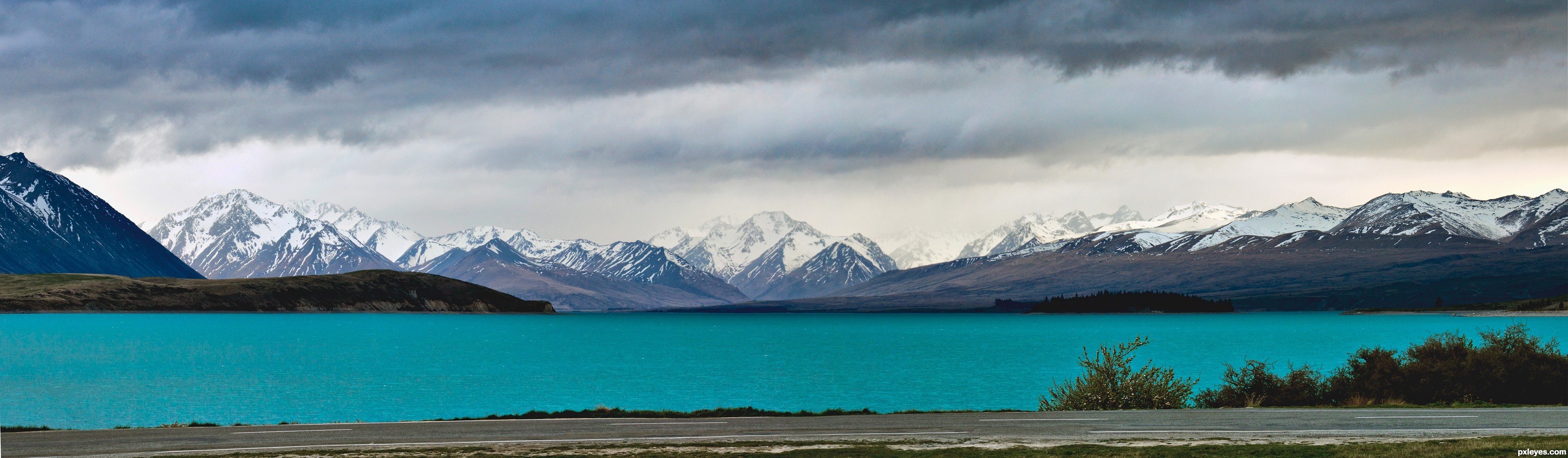
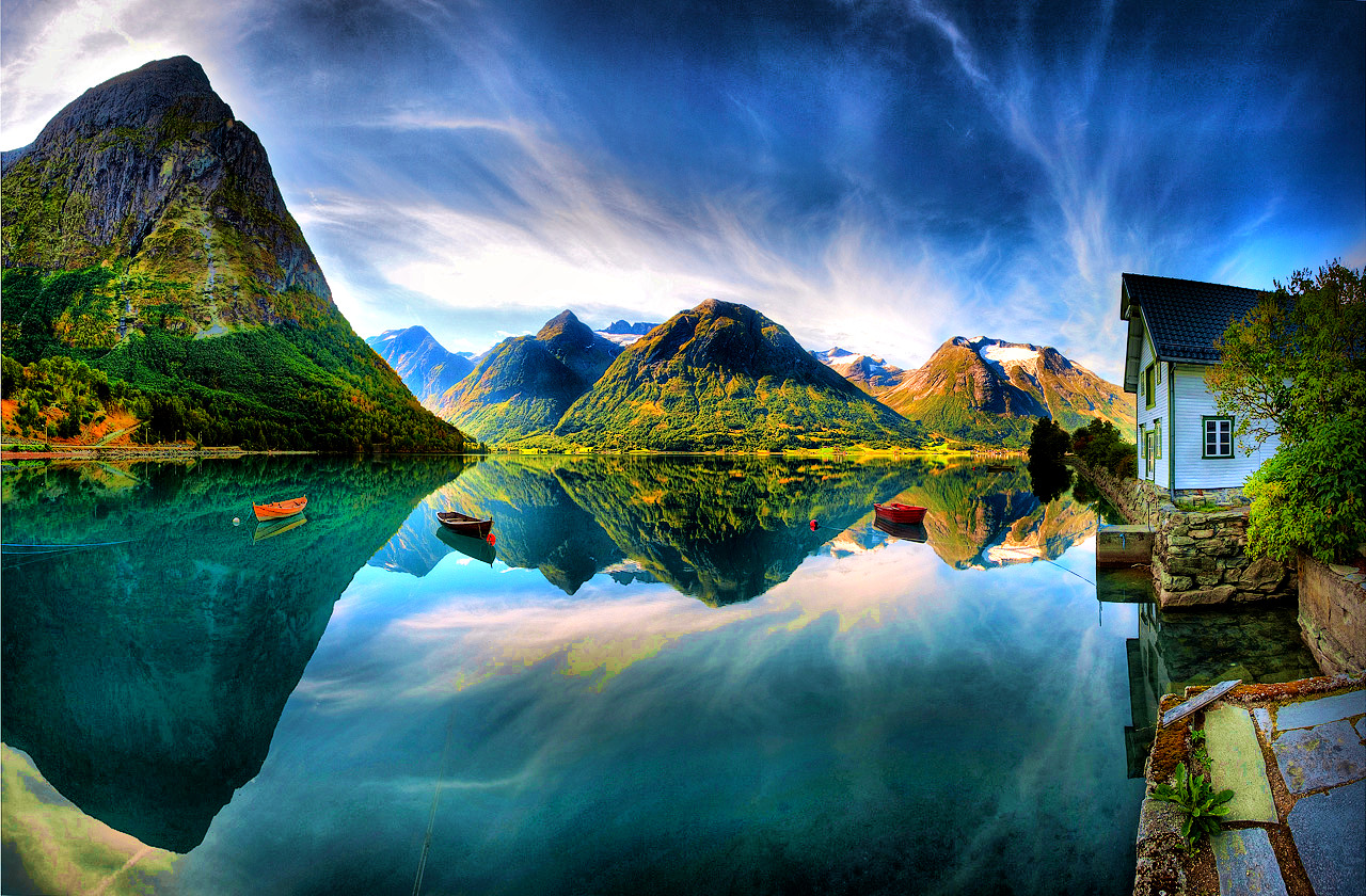
Looks like Lake Tekapo to me.
Fun fact: the water in Lake Tekapo is green due to glacial flour. It really is an amazing sight.
Here's an example link
So far we have "It's red" and "You can stack them"
Packouts are very expensive megablocks so far. Or perhaps apples
Honestly, I think contractors like being able to stack, connect, and store tools all in one 'system' Opening one of hose containers with the right adapters/organisers is like a programmers opening his laptop - everything you need is where you want it.
If done in very subtle way, and adds to context/story it can work out.
However, 99% of the times it's not. It doesn't make the picture stronger, does not add to its story. Then it becomes just a gimmick. It aims for that color contrast effect. Nothing more, nothing less.
Why not having a discussion? Show examples. Ask them, "does it (for you) make this a better picture?".
Some reference: http://www.pxleyes.com/blog/2010/03/50-outstanding-examples-of-selective-color-photography/
Or have the same picture; in color, with selective color; in B&W
​
​
Stairs would avoid bottlenecking but elevators are more space efficient.
I could imagine an open elevator like what we see in some of the hangers going right through the ship but I wouldn't be surprised if we saw some sort of crawlspaces similar to the Starfarer, albeit mainly vertical rather than horizontal, that be a means of avoiding bottlenecking and open access to the other decks.
I don't imagine any wide stairs but I could imagine some narrow, steep, stacked ones like you see on naval ships. I'm not sure how people would move between the upper and lower levels of the decks but I could imagine either a couple of narrow stairs or an open elevators both immediately behind the cockpit region.
This set up lets you see air density changes from temperature. In this case it's cold air. However, you can see that the swirling bubbling affect is similar to what you see on a hot pavement.
This is because light changes direction when it travels through different densities. That hot spot is less dense than the surrounding air so when light hits that spot it changes direction but when it leaves that spot it goes back to the same direction it was going.
When this happens the things behind the hot spot may appear to float above where they really are which is what we call a mirage.
Not totally unnatural,
Minerals such as silica can create that sort of turquoise colour - looks almost identical to how I saw lake Tekapo. (See this photo
However, this is probably unlikely, but still just offering an explanation that it can occur in the wild.
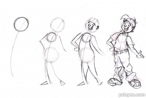
I think you're off to a good start.
I would most work on drawing torsos and planning your drawings before you line them. Here is simple progression of drawing torsos that might help you: ~~~~
It seems you skipped the planning phase and went right into lining, which makes drawing much more difficult. If you want to draw toony, you start with a line of action, then make a head circle and two torso circles. Planning our your drawing first will improve you 10 fold.
Good luck!
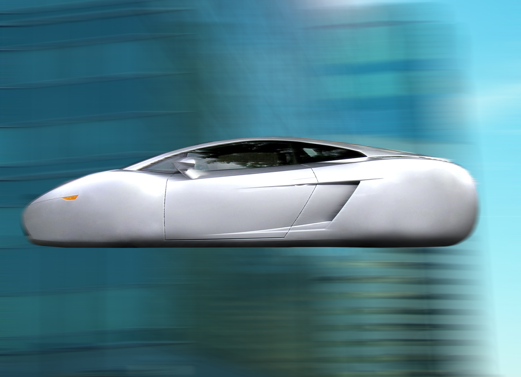
A plane with wings that fold is not a flying car. This company has been making this bullshit claim ever since they invented this personal airplane which looks nothing like a car. I appreciate how awesome it must be to have your own personal airplane, but it's not a car. When people say flying car, this is what they think. Hell it's what sci fi has been selling to us for decades now... so don't stick 4 wheels on a plane and call it a car with flying capabilities because I ain't buying it.
Hey dude you got some good work/talent, and i also loved your other previous ballpoint sketches. Miles better then any thing I could do.
Few critiques, the skin fold lines from the nose to the mouth, are suposed to touch the two peaks of the lips.
example of what I mean from google: http://www.pxleyes.com/images/tutorials/ext//4ad55457cee6f.jpg
At the corners of the mouth your lines are too heavy, and it draws a bad emphisis on the lips IMO. Lips are a little large for her face. I would guess you were probably going for that, and maybe just reducing those heavy lines would help.
These ballpoint sketches seem to have really dramatic lighting, problem is i can't tell where the lighting is coming from. On WR1 the scarf it looks like it might be coming from the below, and on the face it looks like it's coming form the right side of the page. I'm not sure if you were going for an ambient light, but i think if you stuck to one light source you would have better results in this medium. I would suggest thinking about a light source before doing any crosshatching.
Keep it up good stuff.
Just to add to that, the praying mantis is usually a symbol of serenity and balance. East Asian myths revere them, because of their "praying" stance, and they're also known for extraordinary patience -- as predators, they're ambushers that wait for the right time to strike (the philosophy that gave birth to the praying mantis martial art styles). ~~Is this BigHit telling us to be patient? lol~~
Also, I believe that the flowers in his video for him are white orchids? And everything else around him are blue orchids. Please correct me if I'm wrong. Anyway, orchids in general are considered to be symbols of virility and strength, but also beauty and luxury (in Victorian days orchids were only imported and owned by rich people I guess).
This is an amazing painting! the texture looks really nice.
I don´t know if you want to but you can experiment with layers of gray/yellow-ish to make it deeper. I'll post an example here, let's call it a "fog in the morning" effect:
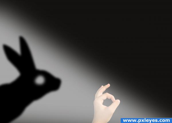
I'd put the shadow a reverse of the true image with transparent-to-white gradient, in case you care for a stranger's opinions
Edit: like so
No pen tool wont work well on such images with hairy edge. You need to apply masking for removing background for such pictures. You can follow these tutorials for help - https://www.youtube.com/watch?v=VEypottHOr8 https://www.clippingpathindia.com/blog/2014/03/14/how-to-remove-background-from-hair-image/ http://www.pxleyes.com/tutorial/photoshop/1272/How-To-Mask-A-Tree-In-3-Minutes.html
Photography is something i really enjoy doing as an hobby so let me try to give you a few tips.
Use a DSLR camera and take the pictures in RAW format to process it later on the PC. Raw files take much more data and allow you better results. More info on it here. Note the wider exposure range that you can get from it. Particularly good if your case have some really bright spots (leds) and some darker corners.
You can explore macro photgraphy too to capture some of the finnest details in your rig. You do not need special equipment for it unless you want some results like this. If you have a standard zoom lens with some wide aperture you can easily get pretty good pics.
Get your computer into a place with very good illumination. This is really really important. alternatively you can also use long exposure to produce very interesting results too but you will need a tripod or a place where your camera wouldn't move nor vibrate.
oh, and keep the camera flash off.
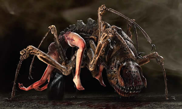
No. There's an artist that makes creepy stuff like that, I can't remember her name but this is one of her much more tamer pieces. Some of them are just terrifying.
EDIT: /u/NUMBERS145 her name is Patricia Piccinnini and she's from Australia.
Here's some of her work but there's still far creepier: http://www.pxleyes.com/blog/2010/03/the-most-controversial-art-sculptures-by-patricia-piccinini/
EDIT 2: I never saw this one before...it's titled "Nectar" (NSFW) https://a.1stdibscdn.com/archivesE/upload/a_60/40_14/patricia_piccinini_nectar/patricia_piccinini_nectar_l.jpeg
Photoshop CS5 and on have a feature call content-aware fill. It excels at automatically removing items from an image. Some of them will need some touching up, but it can do great things.
To use it, use the lasso (or whatever selection tool is appropriate), to select the item to be removed with just a little bit of a buffer. Then right-click and choose fill. Select Content-Aware from the fill dialogue, and press okay. If it doesn't look good you can try it again, it is a bit random so sometimes you'll get different results. Generally, even if it isn't quite right, it is much easier to patch up manually than it was before.
> pero en nuestra cultura a los bellos les va mejor
En cualquier cultura. Dicho esto, habría que definir que consideramos "bello".
El problema en México es que el estándar de belleza - impuesto por Televisa - es eurocéntrico. Es por eso que vemos a muchas chicas indígenas o morenas con los pelos pintados de rubio (mi tío diría "weras a webo") o con pupilentes azules y bañadas en polvo de arroz.
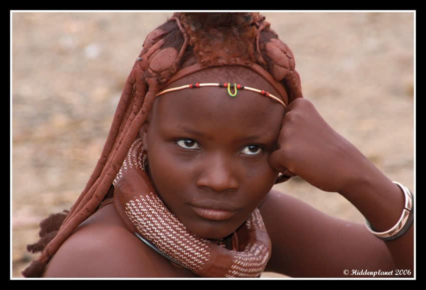
En namibia esta chica es considerada bella otra foto y esto era considerado el estándar de belleza en Japón hasta hace poco.
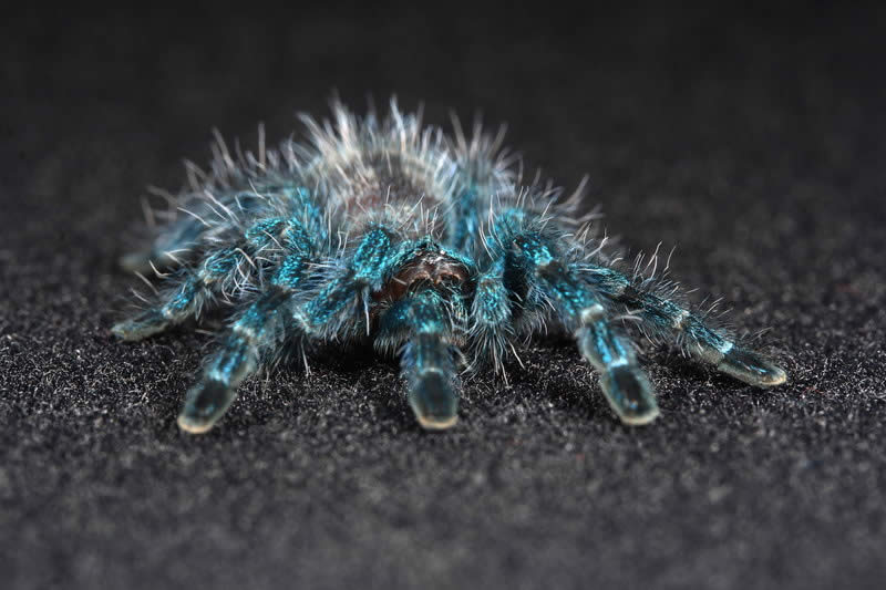
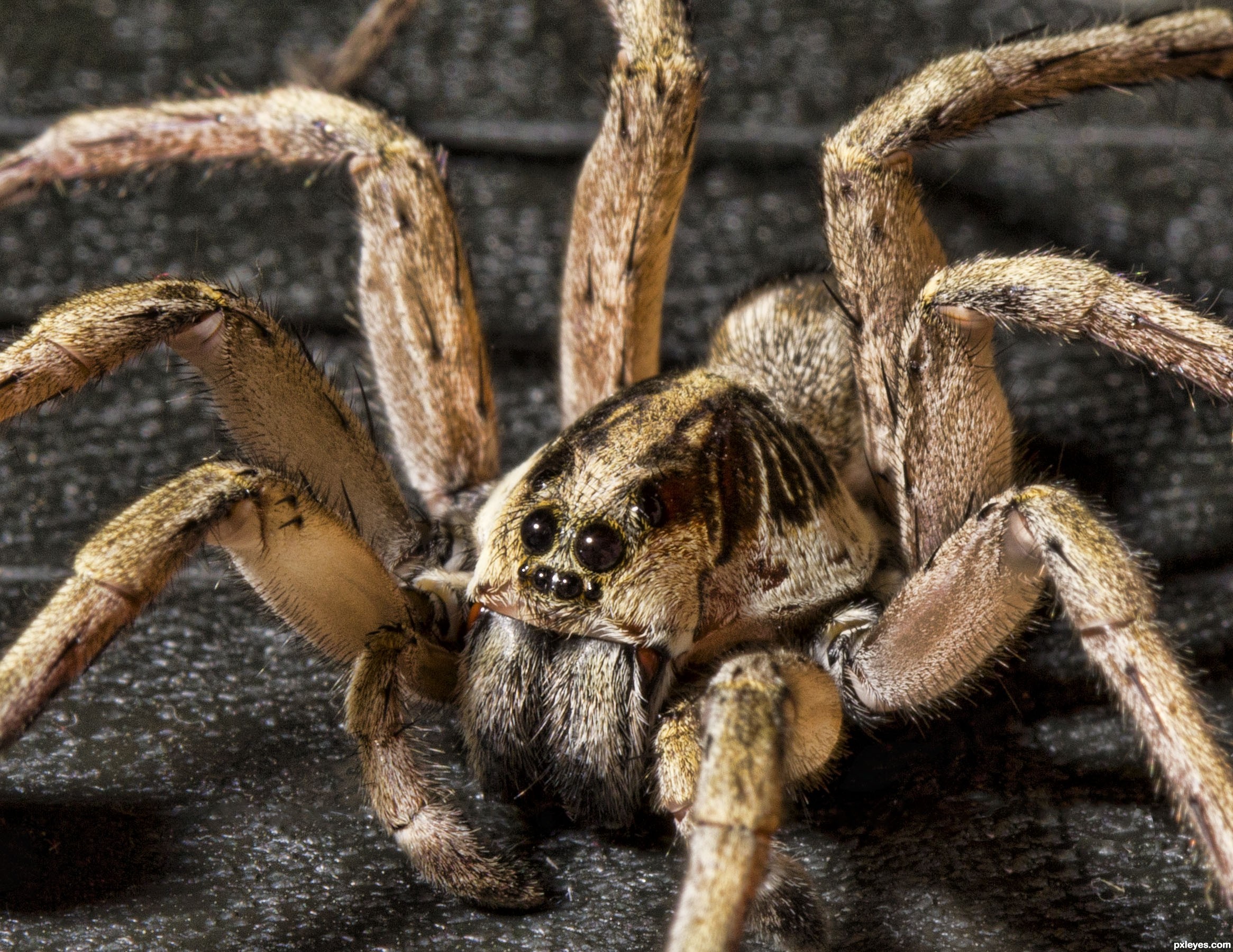
I agree with /u/loginyousay ... Definitely not Avicularia versicolor. Another reason why scientific names are an absolute must have.
Your spider does have a nice blueish hue to it, but A. versicolor spiderlings are absolutely fuckin electric blue at that size.
There should also be a sort of tree branch pattern (there's probably a better way to describe it) on the abdomen- which your spider lacks.
Here's an imgur album on my A. versicolor / Antillies Pink Toe: http://imgur.com/a/vt7OA
No apologies necessary :)
Lebanese, Palestinians, and to a lesser extent Syrians are very white for Arab standards, because the mandate period involved a lot of mixing with British and French. Having lived in the ME for ~5 years, I'd say your average Egyptian or Saudi is more representative of the typical 'Arab' appearance.
Armenians, Azeris, Georgians, and other South Caucasus peoples could easily be confused for Arab in a lot of instances, same with Turks. The topic of Armenians and whiteness is indeed quite sensitive - check this out (the second part, not the bit about the Kardashians) for some quick insight that is phrased much for eloquently than any attempt I could put forward.
And yeah, so you obviously have some experience with what it means to be white or nonwhite in Europe. The history of how the Irish became white in America is really quite fascinating, especially because it links the concept of whiteness to religion (specifically Protestantism) rather than physical appearance, which is how we tend to understand it today.
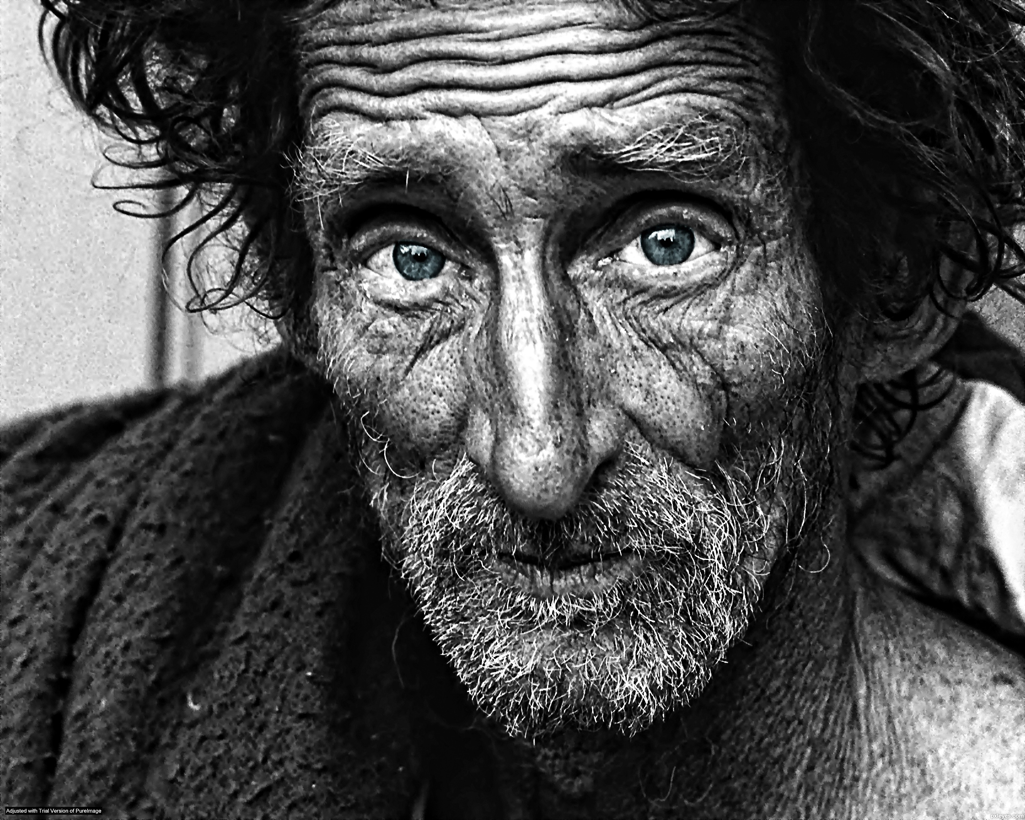
But man, how could ignore these deep, soulful eyes. It's profound work, really...
/unjerk. All good points though.
I main Ike but i'm not very good so here.
1: When recovering, using up+b to grab the ledge is really good, because you can hit your opponent for some damage as you do it. In particular, you can repeatedly fall (or fast-fall) and up+b while grabbing the ledge, and work on the timing while watching your opponent to get some free damage in.
2: If you're playing against someone better than you, or faster, I like to use neutral b sometimes just to throw them off, because it's bad so nobody knows how to counter it.
3: Use counter. A lot.
4: If you grab someone below 20-30%, you can down throw into up+b for a combo, and usually you can follow up with dash attack.
5: Up-tilt is a great finisher.
Fair enough - I'll buy the Z8 and the additional products you mentioned all at once. In the time it'll take me to familiarize myself with it, I'll also get the other essential accessories and set up a good area on my lawn.
And now, before I begin reading the post you linked to, I think that this conveniently relevant gif does a decent job (probably better than I could with as toneless a medium as my keyboard) of expressing my gratitude for your voluntary time, effort and patience. Many thanks.
better version here
the building had been cleaned probably using one of those high pressure water thingies
I'd hazard a guess at orchids. They don't like Lily of the Valley at all.
Wow, after playing LoL for a while I realized how much I can't wait for DOTA. Looks amazing. Even if I don't win, thanks for giving these keys out. And as for the pictures. Why give one picture when you can give 50 amazing photos. http://www.pxleyes.com/blog/2011/12/50-more-photos-that-will-blow-your-mind/ And here is my steam profile http://tinyurl.com/89jroye
Edit: If you are only looking for only one photo, then this will blow you away http://tinyurl.com/89jroye
Thanks again for a great PiF (:
Milk? http://www.flickr.com/photos/sventillack/4354368076
http://www.pxleyes.com/photography-picture/4dfb7f126894e/Milk-and-water.html
Seems like it would be easily killed by pool cleaner, it's protein right?
Here's a few sites that I've had bookmarked for years, though I've never actually followed any of the tutorials. I really should, I know I'd learn a lot, but I just continue to stumble along by myself. I don't even know what half of the tools do, or how to use them.
Best of luck.
Photos like this - basically combining images taken at different exposures, so that you get detail in the complete tonal range, rather than losing it in the highlights and lowlights. It creates a hyper-real image similar to that in a video game. HDR stands for High Dynamic Range :)
How's this simplicity? I'd call it highly complex and my eyes are flying all over the frame. Not very nice.
To create something visually simple and minimal I'd try something along these lines.
One time, when I was conquering the Mayans, they threw hornets nests at me and they got under my armor. Oh the pain, but it just pissed me off more so I cut a few heads off to make me feel right. Have a nice day.
I actually work in electron microscopy and this doesn't strike me as a SEM image? It lacks the artifacts that I associate with SEM (charging, notably, and bright edges and corners) and has a real depth of field. Also is just laying there -- no coating, no adherent, etc.
I also found the source image -- taken with a Canon. Source.
I've always thought Div 1 looked FAR superior to div 2. It's night and day.
Div 2 should've upped the ante, should've been set further in the future (though still using ballistic weapons. no plasma guns or anything lol) and have it be set In Hong Kong (or a made-up US city with a very similar look), seriously, tell me this, with some debris, clutter, and more fog, isn't a PERFECT environment for division.
Same ones <strong>here</strong> and <strong>here</strong> I guess, but no name there either… : /
>Me: It’s lovely but it’s not like its portrayed on TV shows, honestly.
Now im dissapointed. You're telling me Canada don't look like This? Well im not going then!
They didn't realize it until they got home.
Maybe instead of worrying about other people's morals, you should focus on your reading comprehension. Sorry not sorry.
Also, the employee likely isn't going to be "hurt" by this, so here
careful who you call a rat.
Immediately puts this image 2x in my mind in the middle of a church. Then the camera zooms out, the doors close and you hear the screams.
I’m in the middle of reading this book and I realize I am very late to this discussion but I thought I’d drop a link of a visual representation of a straw-eyed man for anyone who cares to check it out.
Like I say, didn't know that, searched it. Got filth. Pure, unadultarated filth. BBC everywhere!
I'd have expected this
Eugene Schieffelin is the man you seek. I can't find any info on the claims made in paragraph 3. This may be of use.
> Are you saying that one's response to the environment is part of one's physical brain?
Solely a brain response, yes. As opposed to brain + something (soul).
> ... beyond, I think, science in general for now.
Yeah, the initial comment was a silly response to people being Markov chains.
I was like, 'Huh... I guess you could actually model people as Markov chains.' and then I was like, 'Wait, could you?' and by the time people started replying to my I comment I figured, 'You probably could--depends on the answer to the mind-body problem.'
I then proceeded to explain this idea very badly.
> I think before you can stick MPs in there, you have to have some model of how people construct meaning in place, and that's at a rudimentary stage everywhere outside of the humanities.
Agreed.
> I don't believe in attaching random mathematical models to phenomena without understanding how these mathematical models arise out of the general laws that govern these phenomena...
Agreed again.
> baby, you know the kind of chains I like.
Such as, for instance, a wheat chain?
^(My chain innuendo game is weak. All I've got is) ^this
That's just it, I feel like I remember seeing the box at a video store when I was younger and it stood out to me. Whether I've actually seen the movie or not, I don't know -- maybe I invented a scenario to go with the image.
In my mind, it's similar to this image of E.T. but I feel like the camera is further back -- maybe like 10 feet away --and you can see the doors to the closet on both sides of the frame. Inside the closet is just a wall of toys and faces and, right in the middle is the face of the kid, looking terrified, but fairly well hidden. http://www.pxleyes.com/images/contests/spielberg-tribute/fullsize/In-The-Closet-510b2b5731b1b_hires.jpg
Tousen walked into the bar with a weird gem in his hand. It glowed strangely as he inspected it and a small robot flitted around it, shooting small sparks towards the rock.
"It seems like it's holding together well... looks like we'll be trying out stage one tonight... or should we wait til morning after sleep?" He looked at the robot as if he were waiting for some form of response, but of course he didn't really hear one, right?
He sighed in frustration as he sat down at the bar and looked around to see if he knew someone, of course not, it was probably too early to drink anyway.
"A dark and stormy, please, and keep 'em coming until i look like i'm getting dizzy." He smiled at the barlady, no point in starting off on the wrong foot, right?
One of those sequence shots usually requires all of the photos to be taken from (relatively) the same angle, usually using a tripod.
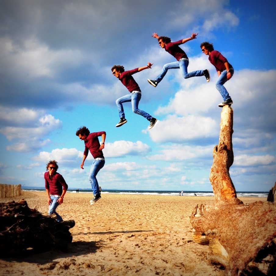
Using a telephoto lens compresses the spatial sizes of objects that are at various distances away allowing this sort of effect. It also allows shots such as this.
The shadow thing sounds kinda cool. I see then, though I doubt they would really mind to be honest.
Yeah, it has a very crystalline appearance with a very organic feeling to it. Like I said with Xylia though, she enters one of their structures at one point, and ends up getting stuck there for a while because the layout of the structure changes continuously xD. Combine that with a 8 - 10 AU diameter structure, and you can imagine how bad this situation can be.
I did some more image searching here to visualize what these races may look like. I couldn't find anything that would resemble the Xelcry though lol, but I did find some for the Pleadians. I did say they were based on Nordic aliens, and it turns out I have been spelling the name wrong this whole time xD. It's spelled Pleiadian, but I think I will keep it how it was originally lol.
Anyway, this is around how I envision their society, only with some blue and yellow lights and glyphs mixed in here and there. This is almost exactly how I imagine them, only more elven like, around 8 ft tall, with armor, and minus the wings (unless they want to pull them out from their armor lol).
I wonder what the gift is though? I bet it's just going to be another act of true love IDK why, but yes! More happy Elsa is always great, but I think we will be seeing more worried Elsa because she does affect the party in some way.
I saw clouds that looked like the 'Difference Clouds' in either PhotoShop or going as far back as Jasc Paint Shop Pro (can't remember).
I remember always using the plugin and saying "well that's bullshit.. clouds don't look like that."
That night they did, my good friends, that night they did.
[edit: Take that example and imagine a slight 3d effect with the white being closer and the night being further away.. I'm telling you, the ENTIRE SKY was blanked with that when you looked up EXACTLY like that.]
But actually I just forgot to look at supplementary products for the post, and then didn't change it because I was tired and lazy.
Source: Australian, I don't lie especially on the Internet where there are no obligations or reprocussions.
Great work so far.
Personally I'm a fan of your second attempt, the pink one. I think the 3D idea is good, but I think it'd be best to take it to the next level and go beyond just vectors to make it more effective.
Other wise, just stick to plain and simple.
I would say either sausage or beef.
If you want something really, really easy, get some pre-cooked farmers or chorizo sausage. All you would really be doing with it is heating it up and giving it some flavour from frying it like that. Just cut it into slices/disks and toss it in.
Beef is a great choice because it doesn't really matter if you "undercook" it. Meaning, so long as you aren't picky about if it is medium-rare or well done, you can just take it off when the veggies are done. The simplest thing you can do for spice is a little bit of salt.
My favourite vegetables to pan fry are mushrooms, onions, and bell peppers. With a little bit of oil or butter in the pan, you should be able to tell they are done when they get a little soft and brown.
For heat, err on the low side. It will take longer but it will be easier to get it right.
Best of luck. Let me know how it goes. Feel free to PM me any questions and don't worry about if I don't respond right away. I will probably not be online much in the next few weeks.
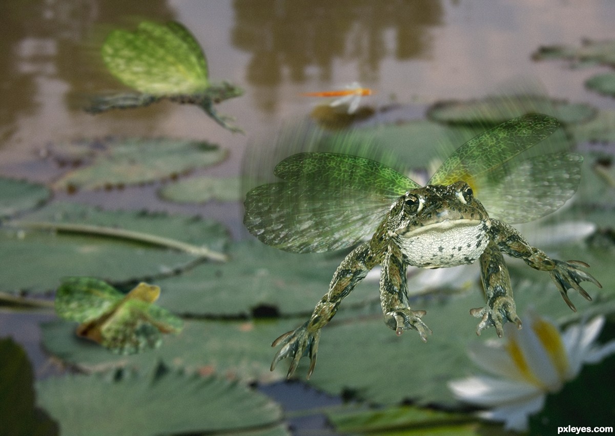
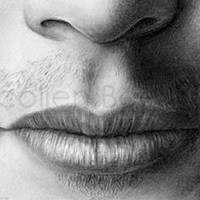
I don't think you can call it a caricature. A caricature is a sophisticated drawing of a person that exagerates unique particulars of the person. What you are doing is called naif. It has nothing to do with caricatures.
Caricature style - http://www.pxleyes.com/blog/2010/07/the-50-most-brilliant-celebrity-caricatures/
Naif style - http://www.artelista.com/en/artwork/4792725920220361-obradoartistanaifedilsonaraujocomajursp.html
It looks like you are too ignorant / illiterate for a graduate, how old are you?
If you want real caricatures, you need to ask somebody like this guy:
here you go :-) http://www.pxleyes.com/images/contests/backlit-portraits/fullsize/F-ck-the-police--4e2b3165f2843_hires.jpg
sun is behind him and he is nicely (a bit harshly but ok) lit by a flash
or here
http://www.dembflashproducts.com/popup/i/outdoor-comp-example.jpg
A man I very much identify, when asked what he would do if he only had one day to see Yosemite, said
"I'd sit by the Merced River and cry."
I've been there twice. Its a very difficult place to leave... If you ever end up visiting, consider taking me with you :D
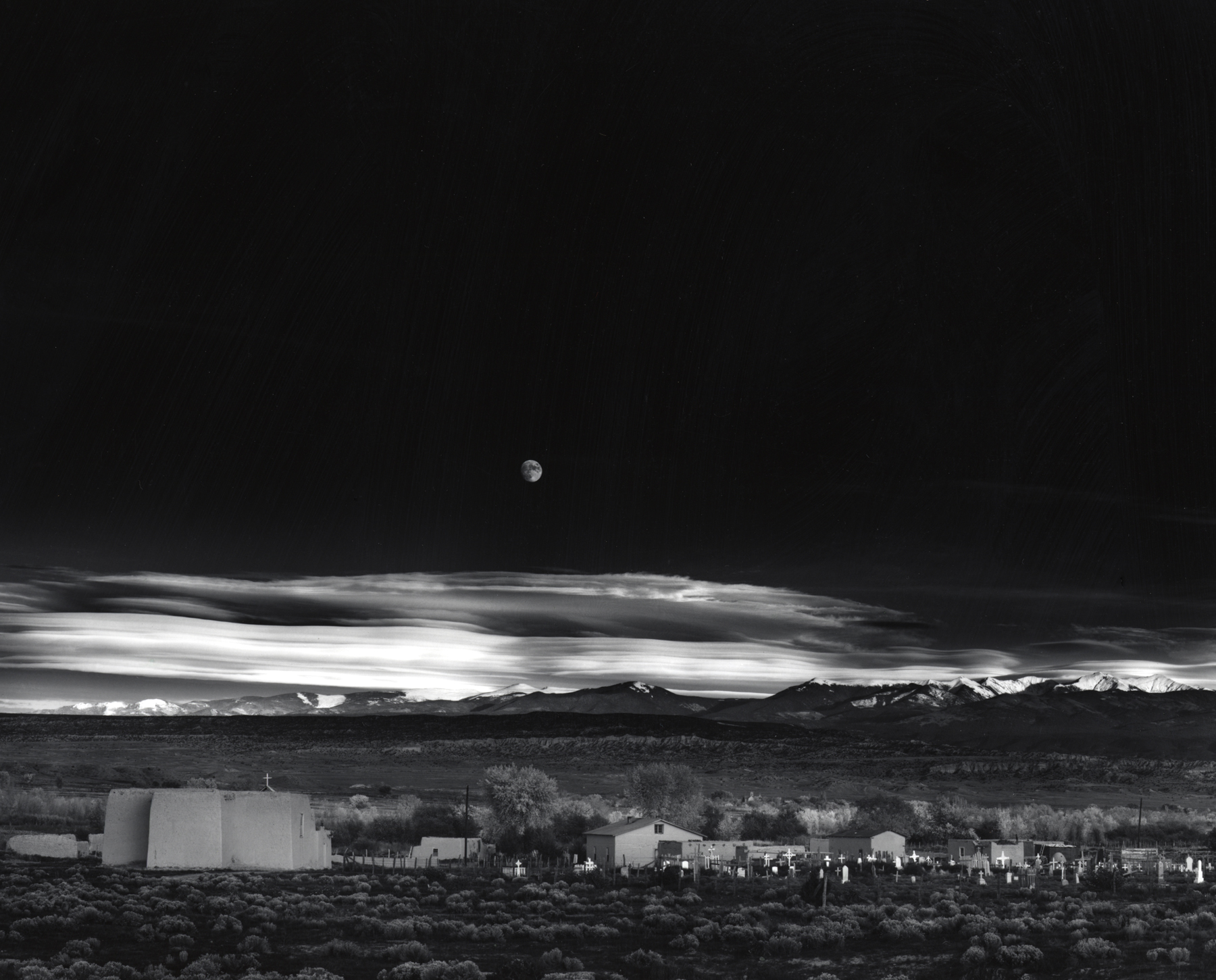
> I will select a winner between Thursday, November 1 to Friday, November 2.
Just in case you're being tricky with the wording, I'm going to choose November 1 :-) . It was on this date in 1941 that the photograph "Moonrise, Hernandez, New Mexico" was taken.
One of the most striking landscape photographs ever taken, the photographer would make and sell over 1,300 prints of it himself. All of these prints are slightly different due to the almost experimental process of manual printing.
Collectors in particular love the composition of the three layers: the black sky, the white clouds, and the grey landscape. The perfect blend of these, without Photoshop or retouching, allowed a print of this photo to fetch $609,600 in 2006.
I agree with you so very much on so many of these points. I started a little over a year ago and yea..all these topics had there era in my head. Just...just...http://www.pxleyes.com/images/users/a/angie1975/3984/fullsize/4f5f57ecab685.gif
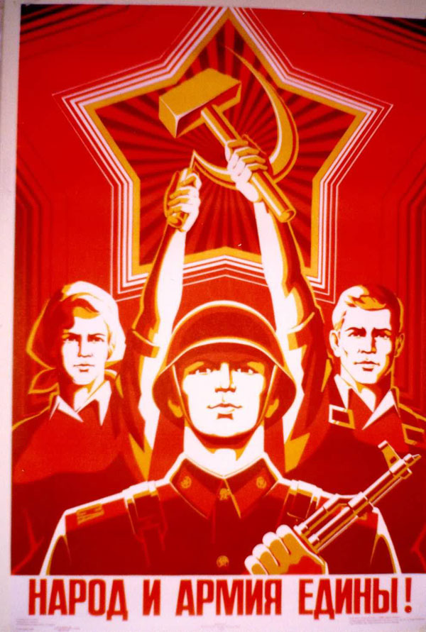
Not necessarily, but considering it is a scene that takes place in a bar built from salvaged parts from an area under the soviet flag it may very well be a communist poster. It could also be just a poster with some russian text on it.
For science I googled "Communist posters" and found this webpage
So yes. It is a communist poster.
But judging only by your criteria (Red Russian letters, must be communist) would also probably make you believe this is a nazi message. (It's not. It's a recipe for haschish brownies)
When I was six I dreamed I was in a spaceport. I lost my parents and as I was wandering, two women passed in front of me. Strapped on their shoulders around their midsections hung fetuses in bags of fluid. The backs of the fetuses had waffle shaped protrusions of skin, soggy and translucent. I was very repulsed by the image in my dream and I later was repulsed the endoplasmic reticulum, Golgi body and other biological shapes. The dream was inspired by the foaming cleaner on a classmate's vomit and the sick and savory smell.